Reinhard Grüner is a collector from Monaco. His passion is art books, which he collects – and sometimes exhibits – since the 1960s.
His website, www.buchkunst.info is a real “online museum”, where international artist books are catalogued and photographed. Amongst the artists there are Marc Chagall, Anselm Kiefer, Henri Matisse, Pablo Picasso and Andy Warhol. Books, but also works of art made of images and text, created by the artist often in collaboration with a writer and a publisher. For the high artistic quality – original graphics, unique designs, paintings and collages – these works are different from the usual picture books. Their manifestations are multiple: books with graphic effects, objects-book, artist’s books, sometimes printed in offset or illustrated by works of artists.
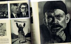
At the centre of Grüner’s attention there are Eastern German and Eastern European books (mainly Russia, Hungary, Lithuania). many of these works were created in response to specific social, political and cultural issues, with unimaginable insights into the culture of modernity.
Reinhard first came in contact with the art in book form with the English Edition, printed privately, of “A Dissertation Upon Roast Pig”, printed in 1975 by Shoestring Press on paper of the legendary Chiswick Press: from here begins a life of a book maniac among thousands of books. As Grüner states in an essay, the acquisition of artist books is more than a simple purchase: the artist, the life as a collector and thoughts are tied together, they influence each other, and a network of contacts with other collectors begins. With nearly all the books in his collection Grüner forms a symbiotic relationship: each of them describes, explains, and gets to the heart of some chapters of his life.
Download the pdf file with the essay on the collection of Reinhard Grüner (in English)
The Bloomberg website says of the project:
For Comma 38, artist and publisher Arnaud Desjardin will exhibit new, old, rare, and popular books while running an active printing press in Bloomberg Space. His COMMA commission, part of an ongoing project titled The Book on Books on Artists' Books, is intended to create an active and participatory review of current and historical practice. This exhibition is about both the display of books on artists' books and the production of a book about the books displayed. He intends to print a first edition, a book of books, a critical anthology and source book, alongside which a large range of books on artists' books will be displayed in a series of vitrines.
Artists' books have normally been sold and distributed through small networks of bookshops and galleries that often produce lists of available titles in printed form. The advent of the Internet has meant that information online has changed the nature of this documentary evidence. Desjardin's unique and extraordinary combination of display and production makes an exhibition that actively engages in both the making and disseminating in real time. The books themselves become both vehicles for information and documents that testify for artistic activity in its own right
Druck von rosidruckt.de, Raumplan von Malte Wandel.
Mit der diesjährigen Ausgabe von Super BOOKS leitet das Haus der Kunst den Münchner Bücherherbst 2023 ein. Seit dem Auftakt im Jahr 2019 erhält die sehr lebendige und aktive Künstler*innenbuchszene zum vierten Mal die Fläche für einen gemeinsamen Auftritt.
Am 3. und 4. November zeigen über 50 Künstler*innen, Gestalter*innen und alternative Verleger*innen sowie drei Hochschulen ihre aktuellen Produktionen im Haus der Kunst. Neben Produzent*innen aus Deutschland sind in diesem Jahr auch Aussteller*innen aus Spanien, Italien, Frankreich, Österreich, England, Belgien, den Niederlanden und Südkorea vertreten. Die Teilnehmenden sehen sich in der Tradition der 1960er Jahre, als sich im Umfeld der postavantgardistischen Kunstszene neue Kommunikations- und Distributionsnetze bildeten. Ihre Produkte wie Künstler*innenbücher, Magazine oder Zines sind autonome Kunstwerke.
Der Schwerpunkt von Super BOOKS liegt auf Publikationen, die die Grenzen des Mediums Buch hinterfragen, neu denken und deren Themen, Formate und Techniken sich ständig erweitern. Mit ihrer Ethik der Zugänglichkeit, die in Preisgestaltung und der Direktheit von Vertriebswegen zum Ausdruck kommt, bilden sie ein Gegengewicht zu den gängigen Spielregeln des Kunstmarkts. ...
... Super BOOKS ist ein Kooperationsprojekt zwischen Haus der Kunst, AAP Archiv Künstlerpublikationen, Bayerischer Staatsbibliothek, Akademie der Bildenden Künste München und Kunsthochschule Kassel. Projektleitung: Sabine Brantl (Haus der Kunst)
Text von der Webseite
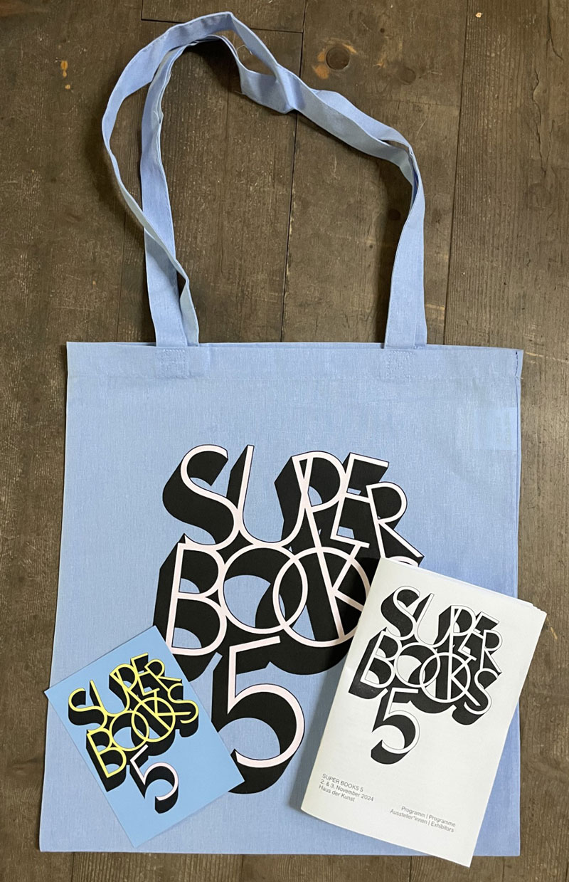
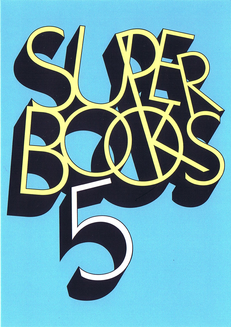
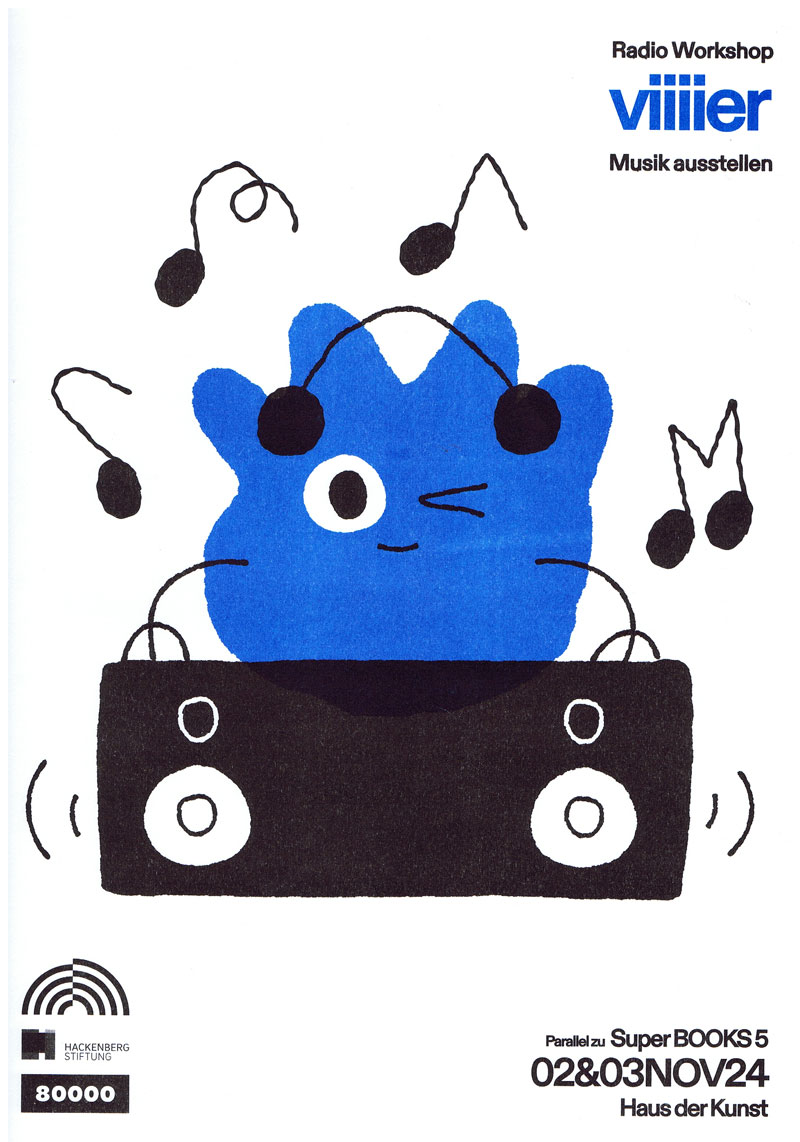
Am 02. & 03.11.24 richtet das Haus der Kunst die fünfte Ausgabe von Super BOOKS aus. Die jährlich veranstaltete, unabhängige Messe der Künstler*innenbuchszene bringt fast 70 Künstler*innen, Gestalter*innen und alternative Verleger*innen sowie Institutionen und Hochschulen zusammen, um ihre jeweils neuesten Produktionen zu präsentieren.
Der Schwerpunkt von Super BOOKS liegt auf Publikationen, die die Grenzen des Mediums Buch hinterfragen, neu denken und deren Themen, Formate und Techniken sich ständig erweitern. Mit ihrer Ethik der Zugänglichkeit, die in der Preisgestaltung und der Direktheit von Vertriebswegen zum Ausdruck kommt, bilden alternative Publizist*innen ein Gegengewicht zur herkömmlichen Verlagsbranche und ihren gängigen Spielregeln.
Super BOOKS wurde 2019 im Rahmen der Ausstellung „Archives in Residence: AAP Archiv Künstlerpublikationen“ im Haus der Kunst initiiert und hat sich seither zu einem wichtigen Forum für die unabhängige Kunstverlagslandschaft entwickelt. Das große Publikumsinteresse der vergangenen Jahre zeigt, wie sehr die Veranstaltung auch die breite Öffentlichkeit anspricht und zur lebendigen Auseinandersetzung mit Künstler*innenpublikationen inspiriert. Projektleitung: Sabine Brantl (Haus der Kunst)
Text von der Webseite
Atem Books is an independent publishing house based in Catalunya focused on photography & illustration, contemporary drawing and thinking created by emerging artists from around the world. Our aims are: to help emerging artists to get their work more known, create a collection of contemporary works, to gather illustrators, photographers & art lovers. Atem Books has been publishing Carpaccio Magazine since April 2009. Atem Books is a non-profit organization, so all the money earnt is always invested in new publications.
Why ‘Atem’?
‘Atem’ stands for “wind, breath” in german. This word is inspired by an illustrated poetry book published by Paul Celan (poet) and Gisèle Celan (illustrator) called Atemkristall.
Who we are
Atem Books curators are María Cerezo and Emma Llensa. We both do all the works involved with mantaining Atem Books.
What we can do
We’re also offering our services to help you self-publish your book (both digital -pdf, epub, mobipocket-, Ipad and Iphone apps and print). Whether if you need advise on how to start self publishing a book or you need our services as curators, designers, layouters and image retouchers, just ask us what we can do for you.
We’re also offering our services to help you create your own website and, if you need one, how to create an e-commerce to sell your own goods. And, of course, we can give you marketing and self-promotion advises and guidelines.
Atem Books is 100% independent!
We don’t receive any external money. This project survives with the earns we do selling our publications.
Von der Webseite
288 S., 23,6x15,8 cm, ISBN/ISSN 9780262018777 Hardcover Leinen
ZusatzInfos
In the 1960s and 1970s, the artist Ed Ruscha created a series of small photo-conceptual artist’s books, among them Twentysix Gas Stations, Various Small Fires, Every Building on the Sunset Strip, Thirtyfour Parking Lots, Real Estate Opportunities, and A Few Palm Trees. Featuring mundane subjects photographed prosaically, with idiosyncratically deadpan titles, these “small books” were sought after, collected, and loved by Ruscha’s fans and fellow artists. Over the past thirty years, close to 100 other small books that appropriated or paid homage to Ruscha’s have appeared throughout the world. This book collects ninety-one of these projects, showcasing the cover and sample layouts from each along with a description of the work. It also includes selections from Ruscha’s books and an appendix listing all known Ruscha book tributes.
Text von der Webseite
For several years, Paul Kooiker and Erik Kessels have organized evenings for friends in which they share the strangest photo books in their collections. The books shown are rarely available in regular shops, but are picked up in thrift stores and from antiquaries. The group’s fascination for these pictorial non-fiction books comes from the need to find images that exist on the fringe of regular commercial photo books. It’s only in this area that it’s possible to find images with an uncontrived quality. What’s noticeable from these publications is that there’s a thin line between being terrible and being awesome. This constant tension makes the books interesting. It’s also worth noting that these tomes all fall within certain categories: the medical, instructional, scientific, sex, humour or propaganda. Paul Kooiker and Erik Kessels have made a selection of their finest books from within this questionable new genre.
Text von der Verlagswebseite
Messe für independent Künstlerpublikationen 11.-12.11.2022 im Haus der Kunst, München, mit radio 80000, das Internetradio, Eintritt frei
Im November wird das Haus der Kunst die dritte Ausgabe von Super BOOKS ausrichten. An zwei Tagen zeigen Künstler*innen, Gestalter*innen und alternative Verleger*innen ihre autonomen Produktionen. Super BOOKS wurde 2019 im Rahmen der von Sabine Brantl kuratierten Ausstellung „Archives in Residence: AAP Archiv Künstlerpublikationen“ erstmalig im Haus der Kunst veranstaltet. Das Projekt sieht sich in der Tradition unabhängiger, individueller Orte für Künstlerpublikationen, die sich seit den 1960er-Jahren im Umfeld der internationalen, post-avantgardistischen Kunstszene gebildet haben.
Aktionen
Carina Müller und Dominik Wendland bauen während der Messe vor Ort das Superbook, Jürgen O. Olbrich bietet mit seiner Bodeninstallation PaperPolice seine Objekte dem Publikum zur Mitnahme an.
Sound
Radio 80000 wird während der Veranstaltung sein Studio in der Nordgalerie des Haus der Kunst aufbauen und live ein Programm mit DJs, Performance und Sound senden.
Am 11.11.22 ab 21 Uhr wird Cosmica Bandida im Rahmen von Super Books 3 performen. Das Künstlerduo spielt experimentellen lo-fi Cumbia, begleitet von Visuals des Münchner Künstlers Merlin Stadler.
Super BOOKS wurde 2019 erstmalig im Haus der Kunst veranstaltet und ist ein Kooperationsprojekt zwischen Haus der Kunst, AAP Archiv Künstlerpublikationen, Bayerischer Staatsbibliothek, Akademie der Bildenden Künste München und Kunsthochschule Kassel.
80 S., 26x21 cm, ISBN/ISSN 978-3-863350857 Katalog zur Ausstellung im MAK Wien, MGLC Ljubljana und UPM Prag, Klappumschlag
ZusatzInfos
Vorwort von Helena Koenigsmarková, Nevenka Sivavec & Christoph Thun-Hohenstein. Beiträge von Jianping He, Martina Kandeler-Fritsch, Kathrin Pokorny-Nagel, Florian Pumhösl, Lucie Vlcková, Lawrence Weiner & Maria White.
Um das vielschichtige Genre des Künstlerbuchs einer breiteren Öffentlichkeit näherzubringen, hat das MAK Wien in Kooperation mit dem UPM Prag und dem MGLC Ljubljana das EU-geförderte Projekt "Artists' Books on Tour. Artist Competition and Mobile Museum" initiiert. Im Rahmen des damit verbundenen europaweiten Wettbewerbs wurden Künstler dazu aufgefordert, sich mit der Thematik des Künstlerbuchs und seinen vielfältigen ästhetischen Ausdrucksformen auseinanderzusetzen. Die vorliegende Publikation stellt die fünf prämierten sowie 45 weitere ausgewählte Projekte vor.
To familiarize a broader public with the multi-faceted genre of artists' books, the MAK - Austrian Museum of Applied Arts, Contemporary Art in Vienna, the UPM - Museum of Decorative Arts based in Prague and Ljubljana's MGLC - International Centre of Graphic Arts have launched the EU-funded project "Artists' Books on Tour. Artist Competition and Mobile Museum". In a pan-European competition, artists were invited to deal with the subject of artists' books and their multiple forms of aesthetic expression. The present catalogue features the five winning projects and 45 other selected works.
68 S., 29,8x21,2 cm, 2 Teile. ISBN/ISSN 9780954702571 Klemmbindung mit schwarzem Papierstreifen, Softcover, Exlibris von Jürgen Peter Wegner eingeklebt. Brief von Jürgen Wegner beigelegt
A guide for the book artist – as the producer, publisher and distributor of their own artwork, to discuss some of the practical issues arising from this. A series of case studies explores artists’ experiences of making and marketing their books in the UK, France, Germany, EIRE, Spain, Denmark, Japan, Argentina, Australia and the USA. We selected a range of artists with 2 - 30+ years experience in artists’ books, zines and multiples and asked them to share their working practice, experience of book fairs, interaction with purchasers, discuss problems and offer advice. We also asked private and institutional collectors to tell us about the ways in which they would prefer to interact with artists selling their books and any issues arising from their own collecting.
Text von der Website.
Postkarte, von Teilnehmern auszufüllen, zum Projekt Books are Bridges, 11.03.-11.05.2021 bei A-Z, Berlin, Torstr.
How can we still find ways to connect with each other? Can books play a role in this connection? And from where to where can they take us? For the show in A — Z presents, I’ve come up with a strategy to bring people and ideas together. A participative, open, non-ending work that could exist in the space, but that couldn’t exist without a form of contact. A book that will construct itself throughout the duration of the show. The thickness, amount of pages, and content won’t depend on me but on the public. A book that functions as a bridge that connects people, ideas, ways of distribution and collaboration. The answers that are sent back to us before the end of the show, will be arranged into a growing bookwork inside of the exhibition space. Books are Bridges. Always under construction.
Text von der Webseite
Edited by Chapin Library of Williams College, Williamstown, texts by Robert L. Volz, Wayne G. Hammond.
The books from the Kaldewey Press are important documents of contemporary bookmaking that have been featured in exhibitions all over the world. Since the 1985 founding of his handpress, which Gunnar A. Kaldewey set up in Poestenkill, in upstate New York, over sixty unique artist books have been produced in cooperation with artists such as Jonathan Lasker, Mischa Kuball, or Richard Tuttle. Among the authors are famous names such as Samuel Beckett, Paul Celan, Marguerite Duras, and James Joyce. Published in small limited editions, the books are produced according to the highest level of craftsmanship. Kaldewey does the typesetting and prints the books, sometimes making the paper himself, too. The bookbinding is done by renowned workshops such as Christian Zwang's in Hamburg, or Jean de Gonet's in Paris.
This bibliophilic book is a catalogue raisonné of the books published to date by the press
2 S., 29,7x21 cm, keine weiteren Angaben vorhanden Flyer, gefaltet
ZusatzInfos
Flyer zur Veranstaltung Drucken Heften Laden der neuen Gesellschaft für Bildende Kunst in Berlin, vom 08.-18.01.2015
Teilnehmer adocs, Hamburg. Architektur in Gebrauch, Berlin. Archive Books, Berlin. Michael J. Baers, Berlin. Books People Places, Berlin. Botopress, Berlin. Edition Bernward Reul, Berlin. ernstundmund, Leipzig. Errant Bodies, Berlin/Los Angeles. form und sinn, Berlin. Fulcrum, London. image-shift, Berlin. Wolfgang Kil, Berlin. Metabook, Amsterdam/Berlin. metroZones, Berlin. nGbK, Berlin. Revolver Publishing, Berlin. Scriptings/Achim Lengerer, Berlin. Spector Books, Leipzig. Temporary Services/Half Letter Press, Chicago/Kopenhagen. The Green Box, Berlin. von hundert, Berlin. ztscrpt, Wien/Berlin
Texte: Markus Krajewski (“Bücher ungeschrieben lassen. Ein vergeblicher Versuch”), Jörg Scheller (“Bücher, Riegel, Bildungsbürger – und die Familie Mann”, E‑Mail-Dialog mit Albert Coers), Annette Gilbert (“Books to Do – Works to Do — Gespräch mit Albert Coers), Albert Coers (Kurztexte); Gestaltung: Andreas Koch mit Albert Coers Books to Do ist keine übliche Werkmonografie, sondern ein Meta-Buch über bereits realisierte und noch zu realisierende Buchprojekte von Albert Coers in Form einer To-do-Liste. Es ist Ideen- und Stoffsammlung, Dokumentation, Selbst-Anregung und lustvoll utopisches Arbeitsprogramm zugleich.
Text von der Webseite
Erschienen zur Ausstellung vom 16.01.-15.03.2015 in der Galleri Susanne Ottensen Kobenhagen. (Anm. Im Katalog werden drei verschiedene Daten für die Dauer der Ausstellung angegeben).
Text von Magnus Thorø Clausen. Interviews von Hans Ulrich Obrist.
Per Kirkeby and Lawrence Weiner have known each other for many years. The idea of making a collaborative work and an exhibition together already evolved in the mid eighties, but due to practical reasons the project was not realized back then. Last year during the fall, the idea returned to us in a new form, and we decided together with the artists that now was the time to make it happen. Per Kirkeby shows two brick works built directly within the gallery space. One work is a tall stele with a deep niche, a black line or a "metaphysical shadow" running vertically through it. The other piece is a monumental quadrangular block, an open/closed building or, if you will, a hollow slightly rotten tree. This new installation is made in collaboration with Lawrence Weiner, who has contributed with texts across the inner and outer brick walls, so that words, matter and space overlap and transform the whole. Lawrence Weiner is also showing two other textbased sculptures made site specifically for the gallery space.
Text von der Webseite
THE OTHER IS ONESELF is a kaleidoscope of texts and images about the issues of escape and exile. The publication brings together literary testimonies, interviews, factual reports and, poetic, philosophical and socially critical writing on the subject and sheds light on the complexity of the phenomenon of migration and its impact upon individuals and society with the help of entirely personal perspectives from a range of periods and places.
THE OTHER IS ONESELF ist ein Kaleidoskop von Texten und Bildern zu den Themen Flucht und Exil. Die Publikation versammelt literarische Zeugnisse, Interviews, Tatsachenberichte sowie poetische, philosophische und gesellschaftskritische Schriften zum Thema und beleuchtet die Komplexität des Phänomens Migration und seine Auswirkungen auf Individuum und Gesellschaft mit Hilfe ganz persönlicher Perspektiven aus unterschiedlichen Zeiten und Orten.
Übersetzt mit DeepL
1. Auflage, mit eingeklebtem Ex-Libris von Jürgen Wegner, mit Signatur Wegner mit Bleistift, "Melbourne '03". Preisangabe mit Bleistift "$ 15", mit einglegtem Papierstreifen mit Notiz.
"This work, one of the first full-length studies available of artists' books, provides both a critical analysis of the structures themselves and a basis for further reflection on the philosophical and conceptual roles they play. From codex to document, from performance to self-image, the world of artists' books is made available [...]
Text von der Webseite
2. Auflage 0817. Index is curated by Café Royal Books and supported by the Contemporary Arts Development Group at the University of Central Lancashire (Impressum)
Index began as an online open submission project. Criteria being, ‘submissions must have already been used to communicate, or be communicative in their own right’. All submissions have been removed from their original context, breaking the messages or ideas for which they were created. Using Index as a container, exhibition space and story telling device, the pages that follow have been edited to create pairs or combinations of images that can be read as new narratives. The book is an experimental exchange of out-of-context, repurposed text and image. Café Royal Books produce weekly photographic publications focussing broadly on aspects of change, usually within the UK. Founded in 2005 Café Royal Books is an independent publisher based in the North West of England.
(Text von der Webseite)
Elisabeth Tonnard is a Dutch artist and poet working in artists’ books, photography and literature.
She has published over forty books that are exhibited widely and held in numerous private and public collections including the Centre Pompidou, Columbia University, Getty Museum, Kunstbibliothek Berlin, MoMA Library, New York Public Library, Tate Library and the Walker Art Center. Much of her work involves responding to existing books, texts and images, reworking them into new (visual) literature. The works range in scale and method from a book that is completely invisible to a book that is a swimming pool. A catalogue of books is available here.
Text von der Webseite
3. erweiterte Auflage mit 600 farbigen Abbildungen, zur Ausstellung 03.02.-08.05.22 bei Allard Pierson der Universität von Amsterdam.
Die renommierte niederländische Designerin Irma Boom ist bekannt für ihre kühne und experimentelle Herangehensweise, mit der sie die Konventionen des traditionellen Buches sowohl in Bezug auf das Design als auch auf den gedruckten Inhalt in Frage stellt. Im "Book Manifest" (das 3. Buch der Reihe) präsentiert Irma Boom ihre Vision vom Wesen, von der Bedeutung und Relevanz des Buches. Grundlage hierzu waren intensive Nachforschungen, die Irma Boom zur Entwicklung des Buches in der Bibliothek des Vatikans angestellt hat. Die dabei gewonnenen Erkenntnisse teilt sie mit einer Auswahl von mehr als 350 von ihr gestalteten Büchern, in denen sie den Kontext und die Beziehung zum traditionallen Buch ausführlich erörtert. Mit diesem 1000seitigen, reich bebilderten Buch möchte Irma Boom die neue Generation von Designern inspirieren und zum Experimentieren anregen, um die Stellung des Buches für die Zukunft zu sichern. Die Bücher von Irma Boom befinden sich in der ständigen Sammlung des MoMA in New York und in den Sondersammlungen der Universität von Amsterdam: das Irma Boom Archiv.
World renowned Dutch designer Irma Boom is known for her bold experimental approach to her projects, often challenging the convention of traditional books in both physical design and printed content. In the book "Book Manifest" (the 3rd book in the series) Irma Boom presents her vision on the essence, meaning and relevance of the book. The basis for this book is formed by the in-depth research that Irma Boom carried out into the development of the book in the library of the Vatican. The knowledge she gained about this, and the inspiration it gave her, is shared with a selection of more than 350 books she designed, in which she extensively discusses the context and relationship with the old book. With this 1000-page, richly illustrated book, Irma Boom aims to inspire and encourage the new generation of designers to experiment, in order to ensure the book's position for the future. Boom's books in the permanent collection of MoMA in New York, and Special Collectons of the University of Amsterdam collect her complete oeuvre: the Irma Boom Archive.
Text von der Webseite des Verlages
29,7x21 cm, 4 Teile. keine weiteren Angaben vorhanden Gefaltetes Blatt, eingelegt ein Bogen Mail Order Form, eine Postkarte von Barbara Helmer mit handschriftlichem Gruß vom PrintRoom, eine gefaltete Risoprint Edition
Erschienen zu INEXISTENT BOOKS II at PrintRoom Rotterdam 17.11.2020-31.01.2021.
Inexistent Books wants to celebrate the invisible in times of hypervisibility, embrace paradox and explore the anti-heroic utopian potential of the anti-medium. We have asked artists for nonexistent books—a’ps that did not exist before, have been idle, deal with non-existence or simply refuse to exist.
The ephemeral bookstore organised by Jan Steinbach first appeared in collaboration with I Never Read at Schaulager in September 2020.
Text von der Webseite
Edition Holes [Special Edition], 2020 von Sveinn Fannar Johannsson, 13/50
2 S., 74x37,5 cm, 2 Stück. keine weiteren Angaben vorhanden schwarze Stofftasche, auf einer Seite mit dem weißen Aufdruck des Messenamens Super BOOKS und dem Logo des Münchner Haus der Kunst
Zum zweiten Mal seit dem Auftakt im Jahr 2019 zeigen über 50 Künstler*innen, Gestalter*innen und alternative Verleger*innen ihre Produktionen im Haus der Kunst. Damit erhält die in München sehr lebendige und aktive Künstlerbuchszene die Fläche für einen gemeinsamen Auftritt. Neben dem Schwerpunkt München sind diesmal auch Produzent*innen aus Österreich (Auslöser sowie Darja Shatalova und Kristian Ujhelji), der Schweiz (_957 Independent Art Magazine sowie GRRRR) und den Niederlanden (The Artist and the Others sowie Dutch Independent Art Book Publishers und Lula Valletta & HOK) vertreten. Tobi Huschka aus Köln stellt Bücher vom Kunsthaus Kat18 vor, einer inklusiven Kunstwerkstatt. Die Münchner piratInnenpresse, ein Verlag von Kindern und Jugendlichen, stellt Taschenbücher und Faltkarten her. Ihr üblicher Versammlungsort ist „die Kajüte unterm Dach der Seidl-Villa in Schwabing“. Iwalewabooks hat die jüngsten Entwicklungen in der zeitgenössischen Kultur Afrikas im Fokus. Die Teilnehmenden sehen sich in der Tradition der 1960er-Jahre, als sich im Umfeld der postavantgardistischen Kunstszene neue Kommunikations- und Distributionsnetze bildeten. Ihre Produkte wie Künstlerbücher, Magazine oder Zines sind autonome Kunstwerke. Mit ihrer Ethik der Zugänglichkeit, die in Preisgestaltung und der Direktheit von Vertriebswegen zum Ausdruck kommt, bilden sie ein Gegengewicht zu den gängigen Spielregeln des Kunstmarkts.
Super BOOKS ist eine Kooperation mit AAP Archiv Künstlerpublikationen, Akademie der Bildenden Künste München und fructa space.
Kuratiert von Sabine Brantl mit Hubert Kretschmer, Martin Schmidl
Text von der Webseite
194 S., 29,7x21,8 cm, Auflage: 600, ISBN/ISSN 2912483573 Xerox Schwarz-weiß, Spiralbindung, Deckblätter aus transparenter Folie
ZusatzInfos
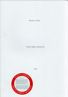
Eine konzeptionelle Sammlung von Xeroxen von Zeichnungen, Notizen und anderem Material von Künstlern und anderen Personen, zusammengestellt von Michalis Pichler. Der Titel ist eine Paraphrase von Mel Bochners wegweisendem Projekt aus dem Jahr 1966, das in Zusammenarbeit mit der SVA organisiert wurde und heute als die erste Ausstellung konzeptueller Kunst gilt. Die letzten beiden Worte "As Art" wurden im Originaltitel weggelassen. Produziert während eines Aufenthalts in der maison flottante, Chatou, auf den Fotokopierern des CNEAI, nämlich einem Toshiba e-studio 210c, einem Konica 2223 und einem Toshiba e-studio 120.
Die gesamte Ausgabe mit ihren mehr als 100.000 Fotokopien dient auch als Enzyklopädie der gelegentlich auftretenden Xerox-Fehler (Papierstaus, Hitzeflecken, verschmierte Tinte usw.).
Text von der Webseite, übersetzt mit DeepL
Dieses Buch erschien im Rahmen der Ausstellung "How to maneuver: Shapeshifting texts and other publising tactics" in Abu Dhabi im Warehouse421 vom 10.12.2019-16.02.2020.
Publizieren ist der Akt des Öffentlichmachens. Es ist nicht auf bestimmte Produzenten, Produktionssprachen, geheiligte Vertriebswege und privilegierte Leser beschränkt. Dies ist kein Verlagswesen, wie wir es kennen. In der arabischen Welt gibt es eine wachsende Zahl von Buchmessen und Kunstbuchmessen. Diese beiden Arten von öffentlichen Plattformen laufen parallel zueinander und repräsentieren unterschiedliche, wenn nicht sogar gegensätzliche Ökonomien des kulturellen Kapitals, Systeme der Repräsentation von Subjekten und Subjektivitäten sowie Strategien der Begegnung und des Gesprächs mit einem Publikum. Diese Ausstellung entstand aus dem Bedürfnis heraus, die Grenzen zu hinterfragen, die das Verlagswesen vom unabhängigen Verlagswesen oder die Mainstream-Kulturproduktion von der alternativen Kulturproduktion trennen. Der Raum, der diese verschiedenen Regime von Autorschaft, Verlagswesen und Leserschaft trennt, ist auch der Raum, in dem diese Unterschiede manövriert werden können - in dem Grenzen kreativ in Frage gestellt und verfestigte Praktiken dazu verleitet werden, in verschiedenen Sprachen zu sprechen. Dies ist der Raum, in dem sich diese Ausstellung bewegt. How to maneuver folgt den Spuren ausgewählter künstlerischer und verlegerischer Praktiken und der Räume, die sie zu schaffen versuchen. Die präsentierten Werke bieten eine reiche Vielfalt an historischen und zeitgenössischen Reflexionen über die Sprachen und Formate, die von der dominanten Verlagsindustrie an den Rand gedrängt werden - die brüskierten Genres, die geächteten Themen, die beunruhigenden Subjektivitäten, das Exzessive, das Minimale, das Unrentable und das Unergründliche. Durch die Ausstellung, ihre Kunstwerke, Publikationen und strukturellen Interventionen erhalten wir einen Einblick in einige der kulturellen Räume und Agenturen, die durch unabhängige künstlerische und verlegerische Praktiken zurückgewonnen werden. (Quelle: salonfürkunstbuch)
260 S., 16x11,5 cm, Auflage: 750, ISBN/ISSN 978-2-953934700 Softcover Klappeinband
ZusatzInfos
Das Buch basiert auf einem Gespräch von Christoph Schifferli, Christophe Daviet-Thery and Jérôme Saint-Loubert Bié über 12 Künstlerbücher.
The same year, in december 2009, Christophe Daviet-Thery asked to Jérôme Saint-Loubert Bié to take care of the catalog even if this book works independently from the exhibition. He invited Jonathan Monk and Yann Sérandour to have a conversation about 12 books: Bruce Nauman, Burning Small Fires, 1968 – Richard Prince, American English, London: Sadie Coles HQ and Cologne: Verlag der Buchhandlung Walther König, 2003 – Wade Guyton, Zeichnungen für ein grosse Bild, Cologne: Verlag der Buchhandlung Walther König, 2010 – Jonathan Monk, Cover Version, London: Book Works, 2004 – Mike Kelley, Reconstructed History, New York: Thea Weistreich and Cologne: Gisela Capitain, 1990 – Allen Ruppersberg, The New Five-Foot Shelf of Books, Brussels: Editions Micheline Szwajcer & Michèle Didier and Ljubljana: International Centre of Graphic Arts, 2003 – Claude Closky, Vacances à Arcachon, Paris: Editions Galerie Jennifer Flay, 2000 – Alejandro Cesarco, Dedications, New York: A.R.T Press, 2003 – Martin Kippenberger, The Happy End of Franz Kafka’s Amerika. Tisch Nr 3, Sankt Georgen: Sammlung Grässling, 1993 – Matt Mullican, Matt Mullican, Valenvia: IVAM Instituto Valenciano de Arte Moderno, 1995 – Batia Suter, Parallel Encyclopedia, Amsterdam: Roma Publications, 2009 – Yann Sérandour, Inside the White Cube: Overprinted Edition, Zurich : JRP Ringier, 2009.
Von der Webseite des Verlegers
Preface by Sarah Bodman, Essays by Walter Struve (librarian State Library of Victoria), Dr Scott McQuire (Associate Professor and Reader, School of Culture and Communication, University of Melbourne), Humphrey McQueen (freelance historian) and Des Cowley (Rare Printed Collections Manager, State Library of Victoria).
The Silent Scream: political and social comment in books by artists presents, not only a companion catalogue to an exhibition held at Monash University Rare Books, but also a journey through some of humanity's most inhumane and hypocritical moments. Reaching back to William Blake with a facsimile of his illuminated book America: A Prophecy then travelling through the two world wars and on to the modern era the catalogue provides insights into 77 influential books and works presented in book form.
Von der Webseite
7 S., 29,7x21 cm, keine weiteren Angaben vorhanden Schwarz-Weiß-Laserdruck nach Webseite, Drahtheftung
ZusatzInfos
Independent Publishing Fair Leipzig, 15th of March 2014
Event: "It’s a Book…” is an independent publishing fair taking place on 15th of March 2014 at the Academy of Visual Arts Leipzig, in correspondence to the Leipzig Book Fair. Entrepreneurs of the international independent publishing-scene are looking forward to meeting interested visitors and exchanging books and ideas.
Organisation: students of the graphic design department, Academy of Visual Arts, Leipzig.
30x14 cm, 2 Stück. keine weiteren Angaben vorhanden 5 Lieferverzeichnisse, jeweils mehrfach gefaltet, beidseitig bedruckt, mit Banderole zusammengebunden
ZusatzInfos
Titel der einzelnen Flyer "Books by Lawrence Weiner", "Books II by Lawrence Weiner", "Posters by Lawrence Weiner", "Multiples, Objects, Audio Work, Souvenirs by Lawrence Weiner" und "Card by Lawrence Weiner". Auf Rückseite der Banderole abgedruckt "Statements on type - Lawrence Weiner interviewed by Hendrike Nagel & Tino Grass, New York City 2011"
72 S., 13,8x21,5 cm, keine weiteren Angaben vorhanden Drahtheftung, farbiger Einband, Exlibris und braune Papiertüte mit Einstecker eingeklebt
ZusatzInfos
Katalog und Lieferverzeichnis zur Ausstellung in der Art Gallery of Southwestern Manitoba, 02.07.-21.08.1998.
Renegade Library was a major mail art project that challenged artists in the networks to collaboratively use postal systems to produce and circulate books, zines, book-objects, artists books, multiples and more. Over 700 artists participated, and over 500 artists books were produced.
Text von der Website
2 S., 16x11,5 cm, keine weiteren Angaben vorhanden Einladungskarte zur Ausstellungseröffnung, beidseitig bedruckt
ZusatzInfos
Einladung zur Eröffnung der Ausstellung am 02.06.2017.
Ausstellung des Zentrums für Künstlerpublikationen 03.06.2017-06.08.2017
Die Ausstellung möchte erstmals einen Überblick über die aktuelle Entwicklung und Verbreitung des Künstlerbuches geben und die Vielfältigkeit dieses Genres aufzeigen. Es werden Künstlerbücher gezeigt, die ca. in den letzten fünf Jahren international entstanden sind. Dazu lädt das Zentrum für Künstlerpublikationen mit einen "Call for Artists‘ Books" Künstlerinnen und Künstler aus aller Welt ein, sich mit einem Werk an der Ausstellung zum internationalen Künstlerbuch zu beteiligen. Unter dem Motto "Künstlerbücher für Alles - Artists‘ Books for Everything - Livre d'artiste pour tout" können bis Ende April 2017 Künstlerbücher eingereicht werden, die in einer größeren Auflage, also nicht als Unikate oder in Kleinstauflage, entstanden sind und über den Buchhandel oder Galerien bzw. die Künstlerinnen und Künstler selbst vertrieben werden. ...
Der Titel oder das Motto "Künstlerbücher für Alles" oder "Artists Books for Everything" bezieht sich auf den deutsch-schweizerischen Künstler Dieter Roth und seine "Zeitschrift für Alles", für die er ebenso Künstlerinnen und Künstler eingeladen hatte, sich mit künstlerischen Beiträge zu beteiligen.
Text von der Webseite
Reprint der Erstausgabe von 1982. Martin Parr's Bad Weather is the debut book from Britain's most world-renown and prolific photographers. Armed with wry humor (and a water-proof camera), Parr captured the social landscape of the UK during downpours, snow storms and the most challenging elements. Published in 1982, Bad Weather has been long out of print and is one of Parr's most sought after books. Books on Books #17 offers an in-depth study of this important photobook including a new essay by Thomas Weski called Even the Queen Gets Wet.
Text von der Webseite.
Präsentation 10.05.2019 (17—22 Uhr) bis 11.05.2019 (12—20 Uhr) im Haus der Kunst, München, mit Rahmenprogramm: Vortrag, Interviews, Music und permanent dabei radio 80k, das Internetradio.
Super BOOKS wird im Rahmen der aktuellen Ausstellung „Archives in Residence: AAP Archiv Künstlerpublikationen“ veranstaltet und ist ein Kooperationsprojekt zwischen Haus der Kunst (Sabine Brantl), AAP Archiv Künstlerpublikationen (Hubert Kretschmer), Akademie der Bildenden Künste München (Martin Schmidl) und fructa space (Quirin Brunnmeier, Malte Wandel), München.
Der Eintritt und die Teilnahme ist frei.
Super BOOKS versteht sich in der Tradition unabhängiger, individueller Orte, die sich seit den 1960er Jahren im Umfeld der internationalen, postavantgardistischen Kunstszene für Künstlerpublikationen und deren Rezeption gebildet haben. Nicht zufällig sind Künstlerpublikationen auch Ausdruck der emanzipatorischen Absicht, die Kunst und ihren Markt zu demokratisieren und neue Kommunikations- und Distributionsnetze aufzubauen.
Erschienen als Ankündigung der Künstlerbuchmesse Super BOOKS im Haus der Kunst in München, 12.+13.11.2021.
... Eine Ecke schwieriger wird es beim Künstlerbuch, zumindest wenn man Hubert Kretschmer nach einer Definition oder Beschreibung fragt. Was für ihn klar ist: „Ein Künstlerbuch ist immer selbst ein Kunstwerk, und das kann verschiedene Gründe haben.“ Ein erster: Das Buch ist „handwerklich sehr aufwändig gemacht“, es ist signiert, nummeriert und etwa mit einer Originalradierung versehen. „Dann gibt es Künstlerbücher, die von den Künstlern selber konzipiert sind … Das kann ein reines Buch sein, wo gar nichts drin ist. Dann können es reine Texte sein. Das können nur Bilder sein, ohne überhaupt ein Wort. Das gibt es alles.“ ... Gemeinsam mit Sabine Brantl vom Haus der Kunst, Martin Schmidl von der Akademie der Bildenden Künste sowie Quirin Brunnmeier und Malte Wandel vom Fructa Space hat er mehr als 50 Künstlerinnen, Gestalter und alternative Verlage aus Deutschland, Österreich, der Schweiz und den Niederlanden ausgewählt, die nun ihre Bücher, Zines oder Magazine in der Südgalerie des Hauses vorstellen. ...
Zitiert aus dem Artikel
4 S., 21x14,8 cm, keine weiteren Angaben vorhanden Faltblatt zur Ausstellung
ZusatzInfos
Temporary exhibition. 10 July 2014 - 01 Februar 2015
The exhibition An Infinite Conversation. Artists’ books, ephemera and documents was designed as an addendum to the permanent exhibition of Museu Coleção Berardo, and presents a selection of artists’ books, posters and other ephemera from the Teixeira de Freitas Collection. The exhibition illustrates the range of thought and process that surrounds art making and shows the various forms it can take, suggesting what is perhaps a more intimate view
A survey of the work of Michael Gibbs whose activities included poetry, performance, film, and publishing, and his immersion in what he called “a genuinely ‘underground ’ culture… which owed nothing to the official art establishment ”. As well as visual poetry and texts, the book includes his major study of blank books ‘All or Nothing ’, written in 2005, a selection of critical writing that originally appeared in Kontexts, and Artzien, journals that he edited and published, as well as articles from the photography journal Perspektief, and Art Monthly, for which he wrote a regular column. A chronology of examples of his visual and concrete poems, books and photography is reproduced, along with documentation of performances.
Text von der Website
A workshop and competition for book artists at the Bodleian Library, Oxford. 01.12.2017-11.03.2018
The exhibition Designing English at the Bodleian Library 2017-18 will illustrate the layout of English literature in handwritten manuscripts and inscriptions across the Middle Ages, from Old English picture books to early Tudor plays and manuals for handling swans. It will trace the different spaces granted to English through the first thousand years, from stray notes scratched into Anglo-Saxon herbals or fragments of lost medieval songs in the margins, to masterpieces placed centre-page and framed by illustration and illuminated borders. it will cover both books and other objects, from grisly tombs to charms written on food.
Text aus dem exhibition summery
1 S., 59,4x42 cm, keine weiteren Angaben vorhanden Ein Plakat, gefaltet, einseitig bedruckt, dazu persönliches Schreiben in Briefumschlag von Phyllis Dierick
Plakat zur Ausstellung vom 03.03-22.03.2018, KASK Gent.
FLIP is the sequel to the exhibition Copy Construct held at CC Mechelen in 2017. The exhibition focuses on displaying a temporary archive of artists’ books parallel to about a dozen filmic works. The term ‘FLIP’ associatively refers to the performative gesture of leafing through a book but also to notions of image sequences, reversal (printing), the flipbook, as well as the use of text and images in both books and video works. In short, the exhibition is an attempt to show these media together, emphasizing the use of narrative strategies and image construction as extensions of each other.
Text von der Website.
Publikation zur Ausstellung vom 03.03-22.03.2018, KASK Gent.
FLIP is the sequel to the exhibition Copy Construct held at CC Mechelen in 2017. The exhibition focuses on displaying a temporary archive of artists’ books parallel to about a dozen filmic works. The term ‘FLIP’ associatively refers to the performative gesture of leafing through a book but also to notions of image sequences, reversal (printing), the flipbook, as well as the use of text and images in both books and video works. In short, the exhibition is an attempt to show these media together, emphasizing the use of narrative strategies and image construction as extensions of each other.
Text von der Website.
Publikation zur New York Art Book Fair 2017. Printed Matter presents the twelfth annual NY Art Book Fair, from September 22 to 24, 2017, at MoMA PS1, Long Island City, Queens. Free and open to the public, the NY Art Book Fair is the world’s premier event for artists’ books, catalogs, monographs, periodicals, and zines. The 2017 NY Art Book Fair will feature over 370 booksellers, antiquarians, artists, institutions and independent publishers from twenty-eight countries. This year’s NY Art Book Fair will include an ever-growing variety of exhibitors - from zinesters in (XE)ROX & PAPER + SCISSORS and the Small Press Dome representing publishing at its most innovative and affordable, to rare and antiquarian dealers offering out-of-print books and ephemera from art and artist book history, plus the NYABF-classic Friendly Fire, focused on the intersections of art and activism. NYABF17 will host an array of programming and special events, including: The Classroom, a curated engagement of informal conversations, workshops, readings, and other artist-led interventions, for the eighth year running, as well as The Contemporary Artists’ Book Conference (CABC), in its tenth year, featuring two full days of conversation on emerging practices and issues within art-book culture.
Text von der Website.
27,3x21,6 cm, keine weiteren Angaben vorhanden Drahtheftung, Verzeichnis mehrerer zusammengeschlossener Verlage (Station Hill Press, Treacle Press, Printed Editions)
Charley is a contemporary art publication series edited by Maurizio Cattelan, Massimiliano Gioni and Ali Subotnick. A do-it-yourself magazine, Charley is an inclusive publication relying on assimilation, rather than on selection : Charley is a machine for redistribution, a mechanism for spreading and exploiting information, rumors, and communication. Like most information, it is partial, unstable, and untrustworthy. There are no hierarchies and no favorites in Charley : it flirts equally with celebrity and failure. Charley is a multiform creature, bound to transform with each issue. Charley is a pre-digested combine, with pages assembled from catalogues, brochures, press clips, postcards, and other visuals. But what is Charley really? Charley is a new publication on emerging artists. Prominent curators, writers, artists, and other arts professionals from around the world were asked to suggest up to 10 up-and-coming artists and/or submit materials on the artists for inclusion in Charley. 400 art makers from around the globe responded, and each of them is represented by one page of Charley
Auflage: 100, 5 Teile. keine weiteren Angaben vorhanden transparenter bedruckter Kunststoffschuber mit 3 Heften und 2 gefalteten Plakaten
ZusatzInfos
WHAT THE SHOP is an art project that first took place in Vienna 2012. WHAT THE SHOP was foundet by Mirjam Schweiger in collaboration with Michael Bäckström and Judith Rohrmoser. WHAT THE SHOP does not stay at one place for long. WHAT THE SHOP speaks several languages. WHAT THE SHOP is run by people who have worked with each other before and trust each other. WHAT THE SHOP always ends with a publication. WHAT THE SHOP is an investigation of artistic practice and the city. WHAT THE SHOP is not about selling things but about everything else. WHAT THE SHOP is open for change. WHAT THE SHOP is always up for tasty food. WHAT THE SHOP is a social sculpture and an artwork. WHAT THE SHOP what the fuck haters?!
Text von der Webseite
24 S., 28x21 cm, keine weiteren Angaben vorhanden Drahtheftung
ZusatzInfos
Illustrated with charming line drawings of urban love, this score includes music and lyrics for eight voices and clavichord, bell, flute, violin, oboe, horn, cymbal, drum. Each of the three acts are introduced with a plot synopsis of the amorous adventures of protagonists Pearl and Anthony. The libretto ends with a thoughtful epilogue: As young lovers Pearl and Anthony must acknowledge the reality of their sentiment for each other as a separate and a whole reality from their surroundings they must effectively substitute the ...skylines that they could inhabit for the places and constructs as spiritual parts of themselves and to the intuitions and instincts to their intentions and to their youth as ingenuous their present and their future have become realized as each other they must consider a different sort of naiveté
26x26,5 cm, keine weiteren Angaben vorhanden 10 Zoll Single, bedruckte Hülle, kleiner Zettel mit Downloadhinweis, schwarze one-side 10 Zoll Single (25,4 cm/10) Rückseite der Platte mit Prägedruck
ZusatzInfos
Tracks:
Side A Anticipation Generalized Other
Side B Etching
Production, Composition and Works by Toro Misawa: Sentimental Fool
Recorded at Hijack Studio MA, USA in Dez. 2014
Photo-Cover: Sukita (Model: Mika)
[52] S., 13,5x9,5 cm, Auflage: 300, ISBN/ISSN 09620672 Drahtheftung, Rückseite mit Metallfolienprägung, in transparenter Kunststoffhülle mit beigelegtem Blatt, Aufkleber
ZusatzInfos
Devoted to body and muscles, this issue of BLAD will explore the fascinating world of bodybuilding. Pictures, articles, ads and other good stuff about a strong and perfect body filled with rock-hard muscles. "Imagine walking through your local beach or neighborhood swimming area… Friends noticing your titanic legs, your manly shoulder, rock hard stomach muscles, and last but not least, your full high-peaked biceps that attract second glances from all." With other words, this issue is for strong and heavy readers!
Text von der Webseite
Candences: A Journal of Literature and the Arts in Cyprus is a multilingual literary magazine, publishing poetry, short fiction, life writing, experimental work, reviews, and other writings in all the languages of the island of Cyprus and of its visitors. Writers in Cyprus think, feel, and express themselves in several languages, with Greek, Turkish, and English being three of the most prominent. Cancences is a bridge between them, a meeting point at which writers of the diverse communities of the island may find each other, and learn from their encounters with difference.
Text aus dem Heft
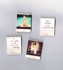
Teil einer Installation, die in der Ausstellung "Marlene McCarty – Mund Verkehr: In die Hose gegangen" in der NGBK Berlin, 6.06.–12.07.1992 gezeigt wurde. Aus der Pressemitteilung zur Ausstellung:
Marlene McCarty’ (1957) Interesse gilt dem Machtgebaren und den patriarchalen Strukturen, der von ihnen geprägten männlichen Umgangssprache. Die alltäglichen Sprüche die ihr, einer Frau, auf den Straßen New Yorks zugerufen werden, die unverstellten oder unverschämten Aufforderungen mit denen sie konfrontiert wird, sind das Ausgangsmaterial für ihre künstlerischen Strategien wie für ihre Kunstobjekte.
Marlene McCarthy zur Installation: “This is a floor sculpture and it’s 15,000 matchbooks. They’re standard matchbooks you can order from a catalog. On one side they have pinup girls on them, and on the other side I had them print, ‘I got a clit so big I don’t need a dick.’ If you’ll notice, clit and dick are handwritten. The company had called me up and were like, ‘Ummm, we have a problem. We can print dick but we can’t print THAT OTHER WORD.’ She wouldn’t even say the word clit. So I said OK, take the mechanical—this was in the olden days—and just slice the dick and the clit off. Then I got some friends together and we wrote them all in by hand. I’m reproducing these for the retrospective, but the curator is worried about whether we can have NYU students writing dick and clit 15,000 times. Maybe the seniors can do it.”
Texte von den Webseiten.
[124] S., 18x13,5 cm, ISBN/ISSN 9782954197401 Broschur, Buchrücken aufklappbar, gefaltetes Plakat in eingeklebter Papierhülle, Posterformat 85,4x64cm, in Schutzhülle mit Aufkleber
A journal written at the third person that seeks to depict Antoine d’Agata’s quest – the inexorable course from void to void.A literary and photographic experiment where words, sometimes descriptive, sometimes poetic, intersect with images in a narrative continuity. An example of the photographer’s existential choice and form of resistance which leads toward the subject’s disappearance and the ego’s negation within the neutral spectrum of the image while insisting on an intimate involvement with its matter and a perfect superposition of art and life. The pictures have been treated and reduced to the simple black and white contrast, following the main axis of this editorial project: shaplessness and the sense of fading-out. This flattening to a drawing effect releases the image as a shadow, a border between a recognizable sign and a blurry, ambiguous one, so that the photograph is both “trace” and “other”. The book, whose main language is English, also foresees a separate and folded poster, including texts in French on one side and, for the first time, in Italian on the other printed on a background colour image. The two languages allow to include texts in their original version, but allude as well to the artist’s double origins. In line with the book, the poster also reflects d’Agata’s search direction towards the interlacing of word and image and it finally refers to the idea of a topographic description of passions. Member of the Magnum agency, Antoine d’Agata (1961) is one of the most influential photographers of his generation. He lives in both Paris and Marseilles and he works around the world. He is represented by the gallery Les Filles du Calvaire, Paris.
Text von der Webseite.
Zum Release und zur performativen Lesung im Café Bellevue de Monaco in München am 06.12.2018 um 19 Uhr.
Adelaide Ivánova (1982, Recife/Brazil) is a journalist and political activist working with poetry, photography, performance, translation and publishing. Her poems were translated into German, Galician, English, Spanish, Greek and Italian. Her texts and photographic work were printed in publications such as The Huffington Post (USA), Marie Claire (BR), Clinic (UK), alba londres (UK), Lateinamerika Nachrichten (GER), artiCHOKE (GER), modern poetry in translation (UK). Her photo reportage are part of the collection of Kunst Museum Dieselkraftwerk (Germany), L’arthotèque – Museum of Fine Arts (France) and Galeria Murilo Castro (Brazil). She edits the anarco-feminist zine “MAIS PORNÔ, PVFR!” (proudly not online) and is co-founder of RESPEITA!, a coalition of Brazilian female poets and slammers. She lives in Berlin, where she tries earn a living as baby-sitter, life model, waiter and other alienating jobs.
Text von der Webseite
Ausgabe Februar 2020. „Arts of the Working Class“ ist eine Straßenzeitung für Armut, Reichtum und Kunst. Sie erscheint alle zwei Monate und enthält Beiträge von Künstlern und Denkern aus verschiedenen Feldern und in verschiedenen Sprachen. Sie richtet sich an die Arbeiterklasse, also an alle, und es geht um alles, das allen gehört. Jeder, der sie verkauft, verdient mit. Jeder Künstler, dessen Arbeit beworben wird, gestaltet mit.
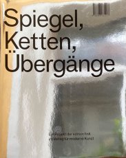
Century-old lore holds fast to the idea that a mirror is not only a reflection but a window from the facade of appearance into one's soul. For the superstitious, breaking a mirror tempts malignant forces, soul-splintering demons and seven years of bad luck. But what of the cracks at the edges of ancient mirrors or the spider web splintering across the screen in your pocket? We have yet to devise a reflection of ourselves that can weather time or violence. For what spills forth from cracks? What use is the time you spend looking in the mirror? For the survival of our souls we need to reflect one another and cultivate solidarity. To turn away from capitalist hegemony we must abandon our reflection and turn towards the other humans, and pull each other up through the cracks.
Text von der Webseite.
HORNBACH WERKSTÜCK Edition 003. Produktnummer 430-6-517-48076-9.
Als HORNBACH mich für dieses Projekt anfragte, war ich sofort begeistert. HORNBACH ist ein Unternehmen, das einen Bezug zum täglichen Leben der Menschen hat. Die Produkte befassen sich sowohl mit den praktischen Aspekten des Lebens als auch mit den dekorativen und angenehmen.
Kunst gehört allen. Alle können Künstler sein oder haben die Möglichkeit, Kunst zu schaffen. Kunst macht die Welt vielleicht nicht zu einem besseren Ort, aber sie hat die Macht, uns zu besseren Menschen zu machen.
Der Künstler Ai Weiwei hat ein Kunstwerk aus HORNBACH Material erschaffen. Als Gegenentwurf in einem entfesselten Kunstmarkt kann sich dieses Kunstwerk jeder selber bauen – zum reinen Materialpreis. Du brauchst nur diese Anleitung und etwas handwerkliches Geschick. Sei Teil dieser öffentlichen Kunstaktion und baue Dir einen original Ai Weiwei.
„Safety Jackets Zipped the Other Way“ ist ein Werk, das sich mit dem Konzept des Readymade befasst. Beide Installationen bestehen ausschließlich aus Materialien, die man in einem Baumarkt findet oder die von Bauarbeitern verwendet werden. Das einfache Zusammenzippen der Warnjacken – mehr ist es nicht – zerstört die ursprüngliche Bedeutung dieser sehr gut designten Jacken und transformiert sie zu etwas anderem. Das Werk besteht aus mehreren Warnschutzjacken, die mittels ihrer Reißverschlüsse miteinander verbunden sind und so eine funktionslose weiche Skulptur bilden, die in verschiedenen Variationen realisiert werden kann. Man kann zwei Jacken miteinander kombinieren, um eine einfache Skulptur zu erhalten, oder aber so viele, wie man will. Die Sprache ist dieselbe.
Im Buch enthalten ist außerdem ein Interview zwischen Hans Ulrich Obrist und Ai Weiwei und ein Echtheitszertifikat.
Text von der Webseite
5,8x9,4 cm, keine weiteren Angaben vorhanden Karte aus Papier, beidseitig schwarz bedruckt
ZusatzInfos
eine Seite: Ben's statement on the other side of this card is true. George Brecht
andere Seite: George Brecht's statment on the other side of this card is false. Ben
Es handelt ich bei dieser Karte um eine andere Version als die im MoMA vorhandene
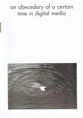
Heft mit einem "fotografischen Alphabet" bestehend Schwarz-Weiß Bildern, die bei der Buchstabensuche als erstes Ergebnis bei Google Bildern erschienen sind.
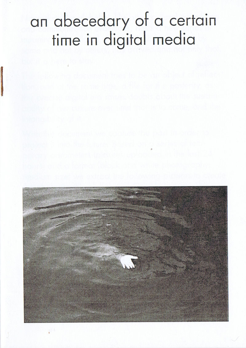
"Nowadays the alphabet, like other cultural paradigms and communication evolutions, hosts a new series of menaings. The digital era, despite it being liked by some and not by others, has arrived and not only that, but is there to stay. The following document tries to be an object of reflection, and the same time, a file for the posterity, as this precise digital era raises doubts about the sustainability of our culture over time that is to come, and the intangibility of it. With this document we capture the past in order to project it into the future. Based on a series of temporary parameters (pictures uploaded in the last 24 hours) and a format (black and white photography, medium size) we extract the following pictures to create the photographic alphabet of Google Images. This confirms the initial concept; the documentation which is exhibited here never again belonged to the momentary alphabet on the 3th of December in the present year, so we manage to capture the present (already the past as you read these precise words) and we leave it physically alive in the future, making the common belief of printing as old fashioned and didgital as actual lose its sense, finding the way to make contemporary, in other words, tangible or visible today, something which doesn't exist on the web anymore."
Text aus dem Heft
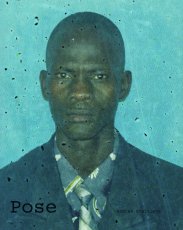
"For the first thirteen years of my life I lived with my parents in the Auckland suburb of Mt Roskill. Our family home was a modest, two bedroom, flat roofed, weather-board house, which my father had built around 1940. The suburb is known for its volcanic peak, 110 metres in height, one of the many extinct volcanic cones that dot the Auckland isthmus. Mt Roskill has been referred to as the Bible Belt of Auckland with more churches per capita than any other New Zealand suburb. Now, after more years than I care to think about I've gone back to look at my past. Where I grew up. So much has changed. Other things, very little. Here are some photographs. Against forgetting." - Harvey Benge
30,5x21,5 cm, 10 Teile. keine weiteren Angaben vorhanden Pressemappe mit geklammerten Infos, Pressefotos, geklammerte Infos zu Vangshui, 4 Postkarten (Sitzung, Vangshui, Trikont Verlag, Inside Other Spaces), Programmheft, Visitenkarte
Zur Ausstellung 08.09.2023-10.03.2024.
Die Gruppenausstellung „In anderen Räumen. Environments von Künstlerinnen 1956—1976“ beleuchtet die grundlegenden Beiträge von Frauen zur Geschichte der Environments. Es werden die Arbeiten von elf Künstlerinnen aus drei Generationen Asiens, Europas sowie Nord- und Südamerikas präsentiert: Judy Chicago, Lygia Clark, Laura Grisi, Aleksandra Kasuba, Lea Lublin, Marta Minujín, Tania Mouraud, Maria Nordman, Nanda Vigo, Faith Wilding, und Tsuruko Yamazaki.
Der Begriff „Environment“ geht auf das Jahr 1949 zurück und wurde erstmals vom italienisch-argentinischen Künstler Lucio Fontana verwendet, um seine experimentellen neuen Kunstwerke zu beschreiben, die sich durch einen progressiven und unkonventionellen Charakter auszeichnen. Environments befinden sich an der Schwelle zwischen Kunst, Architektur und Design; sie kreieren und verändern den Raum. Ihr immersiver und spielerischer Charakter lädt das Publikum dazu ein, sie zu betreten, sich auf sie einzulassen und mit ihnen zu interagieren. Auch wenn Environments schnell zu einem wichtigen Bestandteil der internationalen Kunstwelt wurden, konzentriert sich ihre Geschichtsschreibung bisher fast ausschließlich auf die Vereinigten Staaten und teilweise auf Europa sowie auf die Werke von Künstlern.
1
show brouwn the way in all cities, villages etc. on earth from point x to all other points in that cities, villages etc.
2
show brouwn the way from each point o a circle with x as centre and a radius of 1 angström to all other points
usw. bis 101
1 angström = 0,000 000 01 cm
17,6x13,8 cm, Auflage: 500, ISBN/ISSN 9780982969427 Buch zu einer Ausstellung in der Boo-Hooray Gallery New York, eingesteckt in ein mehrfach gefaltetes A2-Format-Blatt mit den Farbabbildungen der im Buch beschriebenen Bücher
ZusatzInfos
"Artists' book" is a troublesome term. There seems to be no single well-understood or generally-accepted working definition. Say "artists' book" in general conversation and you'll likely get a blank look, if not outright confusion. even with a specialized audience of bibliophiles, or art world cognoscenti, it may be necessary to clarify exactly what you mean...
Artists' Book Not Artists' Book is an exhibition co-curated by Johan Kugelberg and Jeremy Sanders. In it are about one hundred books and of course all of them either are, or are not, artists’ books, but whether it is even possible to say which ones fall into which category is a matter that's not entirely clear. And in any case, it's likely no two viewers would draw exactly the same conclusions.
Artists' Book Not Artists' Book.
Von der Webseite des Verlages
Self Publish, Be Happy is an organisation founded by Bruno Ceschel in 2010 with the aim of celebrating, studying and promoting self-published photo books through events (such as exhibitions, displays and talks), publications and online exposure. Self Publish, Be Happy also organises workshops that help artists and photographers make and publish their own books.
Self Publish, Be Happy Shop sells a selection of remarkable and rare contemporary books.
Self Publish, Be Happy Blog features daily photography by mostly emerging artists.
Text von der Webseite
10,3x14 cm, keine weiteren Angaben vorhanden 2 mp4-Filme aus YouTube auf CD gebrannt vom internationalen Symposium während der Buchmesse
ZusatzInfos
Arts Libris 2014 - Seminari Making Artists' Books, Arts Libris 2014 - Seminari Collecting Artists' Books
Bei den Podiumsgesprächen dabei Victoria Browne, Christophe Daviet Thery, Elizabeth James, Guy Schraenen, Ignasi Aballí, Alex Gifreu, Francesc Ruiz, Helena Tatay
1 S., 29,7x21 cm, keine weiteren Angaben vorhanden Farblaserkopie nach Webseite re-title.com
ZusatzInfos
Zur Ausstellung vom 14.04.-26.04.2014
The exhibition presents circa 300 books in an attempt to offer an overview, and initiate an archive, of recent artists’ books. It focuses on publication as a medium and context for art practices. It looks at the ways in which artists use the format of the book as an artistic strategy exploiting, and often expanding upon, its nature as a fixed but randomly accessible sequence of words and images. All the books selected are either self-published or participate in a minor economy of small publishers. Their modes of production and circulation, as well as the conditions under which they are experienced and stored, strengthen their content.
Text von der Webseite
International listings of artists’ books activity includes: collections, courses, dealers, publishers, galleries, centres, bookshops, libraries, artist-led projects, organisations, societies, print studios, fairs, festivals and competitions.
In the Artists’ Books Listings section you can also find 537 examples of new artists’ books, with information about their work sent in by 182 artists in the following countries: Australia, Belgium, Canada, Chile, China, Denmark, France, Germany, India, Ireland, Italy, Japan, Norway, Poland, Russia, South Africa, Spain, Sweden, The Netherlands, the UK and the USA.
Text von der Webseite
2 S., 9,3x14 cm, keine weiteren Angaben vorhanden Beidseitig bedruckter Flyer
ZusatzInfos
STET – livros & fotografias is book shop in Lisbon, specialized in Photo books, artist books and author editions. This project was born as a critival platform for the debate and presentation of photo editions, promoting the circulation of Portuguese artist and importing international publishers. We have independent and classical editions, artist books, author editions, cheap and expensive, weird and special.
Text von der Webseite
4 S., 10,5x21 cm, keine weiteren Angaben vorhanden Einladung, einmal gefaltet, beidseitig bedruckt,
ZusatzInfos
Zur Eröffnung der Ausstellung am 09.09.1988 in der Buchhandlung Hugo Frick, Tübingen. Der Verlag Kickshaws wurde 1979 von John Crombie und Sheila Bourne in Paris gegründet. Die Produktion von Kickshaws reicht von Künstlerbüchern und typographischen Büchern, die für bibliophile Sammler bestimmt sind, bis zu interaktiven und vielfältig kombinierbaren Büchern mit Spielcharakter. Sie sind alle in limitierten Auflagen erschienen, oft nur in wenigen Exemplaren. Einige sind für Kinder bestimmt, die meisten für Erwachsene, viele für beide.
Text aus der Einladung
The exhibition Copy Construct departs from different artistic practices and specific works by artists that are based on reproduction or copy. The selected works are inherent to the production of printed matter or artist’s books. This implies that different artistic media such as painting, drawing, photography, video, sculpture, and graphic design can manifest themselves through graphical problematics and their meanings. Alongside the 25 works of the artists, a little less than 300 books from the KASK collection (School of Arts, Ghent) and private collections from Belgium and England are displayed in the exhibition. The exhibition architecture is designed by Kris Kimpe and Koenraad Dedobbeleer and is accompanied by a publication, designed by Joris Dockx, which includes a bibliography of the exhibited books, different contributions by the artists, an interview with a book collector, etc.
Pressetext
The small publishing house is specialized in high quality artist books that are conceived as an integral part of an art work or as the art work itself that, often, plays with the format of the book and reflects its medium. In 2014, the first book of Bom Dia Kinder, a new series of children books made by artists, was launched.The books of Bom Dia are produced in close collaboration with a group of fellow artists.
Text von der Webseite
Established in 2009, ABC Artists’ Books Cooperative is an international distribution network created by and for artists who self-publish artists’ books. This book, made from found online reviews, shows the immense impact of ABC in the world.
Text von der Website
The exhibition Copy Construct departs from different artistic practices and specific works by artists that are based on reproduction or copy. The selected works are inherent to the production of printed matter or artist’s books. This implies that different artistic media such as painting, drawing, photography, video, sculpture, and graphic design can manifest themselves through graphical problematics and their meanings. Alongside the 25 works of the artists, a little less than 300 books from the KASK collection (School of Arts, Ghent) and private collections from Belgium and England are displayed in the exhibition. The exhibition architecture is designed by Kris Kimpe and Koenraad Dedobbeleer and is accompanied by a publication, designed by Joris Dockx, which includes a bibliography of the exhibited books, different contributions by the artists, an interview with a book collector, etc.
Pressetext
Thirty-four Madonna Inn postcards in a book with a red cover, entitled Replicated. If you prefer books with blue covers you may prefer Borrowed. Both books are part of ABCED, a multi-volume book project created by members of ABC Artists’ Books Cooperative to celebrate Ed Ruscha’s seventy-fifth birthday. ABCED was available from December 2012 until December 2013 only.
Text von der Webseite.
Nobuyoshi Araki's "Shokuji" (The Banquet) is a tribute to his late wife Yoko through a 'photo-diary' of the food they shared together in the last months of her life. Resembling brightly colored commercial food pictures made with a ring flash and a macro lens, and contrasted with bleak black-and-white images he photographed at home after doctors told Araki that his wife had only a month left to live, Books on Books #15 (1993) presents Araki's DeepLy personal diary of loss in its entirety along with an essay by Ivan Vartanian.
Text von der Webseite.
Englische Ausgabe. Erschienen anlässlich der Ausstellung "The Line of Fate" im mumok, Wien, 04.03.-29.05.2011.
Seven Books Grey is an updated, expanded version of Tacita Dean’s Seven Books (2003), and is an exploration of Dean’s oeuvre as it straddles film, drawing, photography, writing and book-making. Each book has a different focus and together they are an accurate survey of Dean’s work to date.
Book One: “Complete Works and Filmography 1991–2011”
Book Two: “Selected Writings 1992–2011” (Dean’s writings)
Book Three: “A Panegyric, Gaeta, Edwin Parker” (three projects made with and about Cy Twombly)
Book Four: “Film Works with Merce Cunningham”
Book Five: “Footage” (artist’s book with a text by Marina Warner taking a cultural-historical look at the foot and the significance of limping)
Book Six: “Post-War Germany and ‘Objective Chance’: W.G. Sebald, Joseph Beuys and Tacita Dean” (essay by Christa-Maria Lerm Hayes)
Book Seven: “Essays on the Work of Tacita Dean” (texts by Wolfram Pichler, Peter Bürger, Douglas Crimp and Achim Hochdörfer)
Text von der Webseite
Collected Works compiles eight of my books into one convenient volume. The books are combined together, so that page one of Collected Works is a "sandwich" of the first page of all eight books, page two contains the second page of each book, page three the third page, etc. Collected Works reproduces Squares With Sides And Corners Torn Off, Some Los Angeles Apartments, Real Estate Opportunities, The Location of Lines, and Records in their entirety, plus excerpts from 60 Years Later, Arcs Circles & Grids, and The Xeroxed Book. - Eric Doeringer
Text von der Webseite
BOM DIA BOA TARDE BOA NOITE — ‘good day, good afternoon, good night’ in Portuguese — conveys the idea that books can become part of everyday life, regardless of the time of day. BOM DIA was founded in 2011 by Manuel Raeder and Manuel Goller in Berlin, solely run by Manuel Raeder since 2013. BOM DIA is specialized in high quality artist books that are conceived as an integral part of an art work or as the art work itself that, often, plays with the format of the book and reflects its medium. A focus of BOM DIA lies in publishing contemporary artists from Latin America. The books of BOM DIA are produced in close collaboration with a group of fellow artists, among others Henning Bohl, Daniel Steegmann Mangrané, Mariana Castillo Deball, Haegue Yang, Leonor Antunes, Abraham Cruzvillegas, Danh Vo, Nina Canell, and BLESS.
Text von der Webseite
12,5x17,5x1,5 cm, signiert, keine weiteren Angaben vorhanden Schachtel aus Karton, beklebt und befüllt mit 17 kleinen Papierobjekten und eine gefaltete Laserkopie nach einem Zeitungsartikel zur Ausstellung
Ausstellung im Kunsttempel Kassel, Co-books & Co, Rod Summers + Jürgen O. Olbrich & Collaborateure. 20 Jahre Kunsttempel. 40 Jahre Zusammenarbeit R. Summers + J.O. Olbrich & 20 Künstler, 24.05.–30.06.2019
mit Anna Banana (CAN), Vittore Baroni (I), Carl Chew (USA), Johan Everaers (NL), Max Christian Graeff (D), Wolfgang Hainke (D), Robert Hirsch (USA), Martin La Roche (RCH), Hans Lemmen (NL), Jacqueline Machado de Souza (BRA), Gerhard Meerwein (D), Ásta Olafsdóttir (ISL), Cheryl Penn (SA), The Rapid Publisher (D), André Robèr (F), Günther Ruch (CH), Matthias Schamp (D), Linda Schwarz (D), Herbert Wimmer (A), Peti Wiskemann (CH).
Im Jubiläumsjahr des Kunsttempels realisieren Rod Summers(Maastricht) + Jürgen O. Olbrich (Kassel) das Projekt „Co-books & Co“. Beide haben seit 40 Jahren in verschiedensten Projekten weltweit zusammengearbeitet: Performances, Audio-Art, Künstlerbücher, Installationen, Ausstellungen, Mail-art, Publikationen etc.
Die viertägige öffentliche Arbeitssituation ab dem 20. Mai im Kunsttempel hat folgende Ausgangssituation: Summers + Olbrich nehmen sich von den beteiligten Collaborateuren jeweils eine Publikation vor, die sich in den Archiven der beiden befindet. Hieraus erstellen sie kollektiv 20 großformatige Collagen. Dazu haben die internationalen Collaborateure ihnen nochmals spezielles Material zur Verfügung gestellt.
Text von der Webseite
Präsentation 10.05.-11.05.2019) im Haus der Kunst, München, mit Rahmenprogramm: Vortrag, Interviews, Musik und permanent dabei radio 80k, das Internetradio.
Super BOOKS wird im Rahmen der aktuellen Ausstellung „Archives in Residence: AAP Archiv Künstlerpublikationen“ veranstaltet und ist ein Kooperationsprojekt zwischen Haus der Kunst (Sabine Brantl), AAP Archiv Künstlerpublikationen (Hubert Kretschmer), Akademie der Bildenden Künste München (Martin Schmidl) und fructa space (Quirin Brunnmeier, Malte Wandel), München.
Super BOOKS versteht sich in der Tradition unabhängiger, individueller Orte, die sich seit den 1960er Jahren im Umfeld der internationalen, postavantgardistischen Kunstszene für Künstlerpublikationen und deren Rezeption gebildet haben. Nicht zufällig sind Künstlerpublikationen auch Ausdruck der emanzipatorischen Absicht, die Kunst und ihren Markt zu demokratisieren und neue Kommunikations- und Distributionsnetze aufzubauen.
[32] S., 21x14,8 cm, Auflage: 100, signiert, 3 Teile. keine weiteren Angaben vorhanden Broschur, Digitaldruck. Einladungskarte, CD in Kunststoffhülle (Memory Soup), alles in Versandtasche
Edition des Kataloges (Vorzugsausgabe 40 Exemplare)zur Ausstellung im Kunsttempel Kassel, Co-books & Co, Rod Summers + Jürgen O. Olbrich & Collaborateure. 20 Jahre Kunsttempel. 40 Jahre Zusammenarbeit R. Summers + J.O. Olbrich & 20 Künstler, 24.05.–30.06.2019
2. Auflage. This artists’ book by David Horvitz is a guide on how to steal books. It details 80 ways in which one can steal a book, from the very practical, to the witty, imaginative, and romantic.
This publication originated in 2012 as a conversation in The Classroom at Printed Matter's NY Art Book Fair.
Text aus dem Buch und von der Webseite.
Publiziert als Begleitheft zu einer Ausstellung über Bücher aus der Privatsammlung des Autors, in der Oslo National Academy of Art.
Zitate aus Büchern und Künstlerbüchern über Künstlerbücher.
Ausdruck nach Datenbank, Titel des icon Verlags, die auf der Messe gezeigt wurden, mit Markierungen der Verkäufe. Super Books 5 im Haus der Kunst 02.-03.11.2023
Messe für independent Künstlerpublikationen 12.-13.11.2021 im Haus der Kunst, München, mit radio 80000, das Internetradio. Südgalerie 1. Stock, Eintritt frei
Zum zweiten Mal seit dem Auftakt im Jahr 2019 zeigen über 50 Künstler*innen, Gestalter*innen und alternative Verleger*innen ihre Produktionen im Haus der Kunst. Damit erhält die in München sehr lebendige und aktive Künstlerbuchszene die Fläche für einen gemeinsamen Auftritt. Neben dem Schwerpunkt München sind diesmal auch Produzent*innen aus Österreich (Auslöser sowie Darja Shatalova und Kristian Ujhelji), der Schweiz (_957 Independent Art Magazine sowie GRRRR) und den Niederlanden (The Artist and the Others sowie Dutch Independent Art Book Publishers und Lula Valletta & HOK) vertreten. Tobi Huschka aus Köln stellt Bücher vom Kunsthaus Kat18 vor, einer inklusiven Kunstwerkstatt. Die Münchner piratInnenpresse, ein Verlag von Kindern und Jugendlichen, stellt Taschenbücher und Faltkarten her. Ihr üblicher Versammlungsort ist „die Kajüte unterm Dach der Seidl-Villa in Schwabing“. Iwalewabooks hat die jüngsten Entwicklungen in der zeitgenössischen Kultur Afrikas im Fokus.
Die Teilnehmenden sehen sich in der Tradition der 1960er-Jahre, als sich im Umfeld der postavantgardistischen Kunstszene neue Kommunikations- und Distributionsnetze bildeten. Ihre Produkte wie Künstlerbücher, Magazine oder Zines sind autonome Kunstwerke. Mit ihrer Ethik der Zugänglichkeit, die in Preisgestaltung und der Direktheit von Vertriebswegen zum Ausdruck kommt, bilden sie ein Gegengewicht zu den gängigen Spielregeln des Kunstmarkts.
Die Publikationen können direkt vor Ort gekauft werden.
Super BOOKS ist eine Kooperation mit AAP Archiv Künstlerpublikationen, Akademie der Bildenden Künste München und fructa space.
Kuratiert von Sabine Brantl mit Hubert Kretschmer, Martin Schmidl sowie Quirin Brunnmeier und Malte Wandel.
Präsentation 11.11.-12.11.2022 im Haus der Kunst, München, mit Rahmenprogramm: Vortrag, Interviews, Musik und permanent dabei Radio 80000
Super BOOKS ist ein Kooperationsprojekt zwischen Haus der Kunst (Sabine Brantl), AAP Archiv Künstlerpublikationen (Hubert Kretschmer), Akademie der Bildenden Künste München (Martin Schmidl) Bayerischer Staatsbibliothek und Kunsthochschule Kassel. Super BOOKS versteht sich in der Tradition unabhängiger, individueller Orte, die sich seit den 1960er Jahren im Umfeld der internationalen, postavantgardistischen Kunstszene für Künstlerpublikationen und deren Rezeption gebildet haben. Nicht zufällig sind Künstlerpublikationen auch Ausdruck der emanzipatorischen Absicht, die Kunst und ihren Markt zu demokratisieren und neue Kommunikations- und Distributionsnetze aufzubauen.
Ausstellung 09.03.-28.04.2024.
Die Ausstellung zeigt Künstlerbücher, Buch- und Druckobjekte von Studierenden von drei Ausbildungseinrichtungen für Buchkunst in Deutschland: der Hochschule für Künste in Bremen, der Folkwang Universität der Künste in Essen und der Burg Giebichenstein Kunsthochschule Halle. Alle Arbeiten sind im Rahmen der Ausbildung entstanden.
Zur Eröffnung spricht Dr. Ralph Elster, Bürgermeister der Stadt Köln, Dr. Elke Purpus, Direktorin der Kunst- und Museumsbibliothek und Dr. Petra Oelschlägel, Direktorin des Kunstmuseum Villa Zanders.
12 S., 32x23 cm, keine weiteren Angaben vorhanden Blätter lose ineinander gelegt, beigelegt zwei geheftete Blätter mit der Liste der ausgestellten Exponate. Mit Stempel der Buchhandlung
[6] S., 31,8x23,3 cm, signiert, keine weiteren Angaben vorhanden Blätter lose ineinander gelegt, farbige Stempeldrucke, eingeklebtes Alupapier, eingeklebter gestempelter und monogrammierter Briefumschlag "Capetas Men 1978 Ivald Granato", in diesem ein sign. und num. bedrucktes Blatt
10 S., 31,9x23 cm, 2 Stück. keine weiteren Angaben vorhanden Blätter lose zusammen gelegt, rechts unten genietet, mit farbiger Collage und farbigen Stempeldrucken,
8 S., 31,8x23 cm, keine weiteren Angaben vorhanden Blätter lose ineinander gelegt, Papiercollagen, farbige Stempeldrucke, auf letzter Seite angeklammerter Stempeldruck auf Transparentfolie
8 S., 32x23 cm, keine weiteren Angaben vorhanden Blätter lose ineinander gelegt, eingelegt Nervo Optico Nr. 10, verschiedenfarbiges Papier, innen farbig gestempelt
Addenda: Just between you and me. There was no other. Who does our past belong to tonight? We understand at last. And while we slept, we vanished. The walls of the world fell in on us. We claimed always to abide by terms. Shattered mirrors and sliding panels. Always. Except when we choose not to. One must keep alert to all possibilities. The old Indian pearl diver clambered onto the dock, grinning and shaking the water from our body. At night we could hear our mind ticking like some cheap alarm clock. Radio broadcasts played on tribal feelings. Our voice trailed off. Truth was delay. A heavy splash followed many ripples. Food, batteries and water-purifying chemicals arrived over the week-end.
Text von der Webseite
496 S., 23,5x16,5 cm, 2 Stück. ISBN/ISSN 978-3-897702813 Broschur
ZusatzInfos
"Untersucht werden Geschichte und Bedeutung von Archiven für Künstlerpublikationen in der internationalen avantgardistischen Kunstszene während der 1960er bis 1980er Jahre: das Archive for Small Press & Communication (ASPC, B), das Archiv Sohm (D), das Art Information Centre (NL), die Exchange Gallery (P), OtherBooks and So (NL), Zona Archives (I) und Artpool Archive (H). Ohne ihre jeweiligen Besonderheiten außer Betracht zu lassen, müssen die Archive für Künstlerpublikationen als Vertreter eines eigenständigen Archivtyps betrachtet werden. Die Archive als solche, ihre Organisation und Materialien sind als Ausdruck ihrer Zeit zu betrachten und stellen per se (kunsthistorische) Dokumente dar, durch deren Analyse sich der Blick auf Kunstszene, Politik und Kultur erweitert."
Text von der Webseite
Mit Herausgeber sind: Forschungsverbund Künstlerpublikationen für Universität Bremen, Jacobs University, Hochschule für Künste, Forschungsstelle Osteuropa an der Universität Bremen. In Kooperation mit dem Institute for Cultural Studies in the Arts ICS an der Züricher Hochschule der Künste
292 S., 21,4x15,2 cm, Auflage: 550, ISBN/ISSN 3865880940 Fadenheftung mit flexiblem Plastikeinband
ZusatzInfos
First this was was a series of ephemeral situations in public space in New York 2002–2003. They become comprehensible through the publication of a book. The New York Garbage Flag Profile presents Berlin-based artist Michalis Pichler’s six month long project in which he collected and documented discarded paper cups, plastic bags, pizza boxes, newspapers and other mass-produced materials emblazoned with the American Flag.
Photographed in the public waste baskets, gutters and snow drifts of New York where he found them, the individual items are catalogued on a facing page with uniformly formatted information about their location, the date of their collection, number of flags depicted, number of stars, number of stripes, etc. Each record also includes a full transcription of the text found on the item. The nearly three hundred color photographs in the book are organized into forensic pairs showing the collection site before and after the artist’s intervention. This clinical presentation however belies the artist’s gentle, almost reverent approach to his material-garbage, after all. (Rachel Bers)
Text von der Webseite
224 S., 29,7x21 cm, ISBN/ISSN 978-1-870003339 Hardcover, Ecken abgerundet
ZusatzInfos
ABZ presents a fabulous collection of complete alphabets, emblems, logos, letters and signs, together with stunning graphics from classic modernist books and magazines, and from obscure professional manuals.. Drawn from collections, many of them private, in London, Paris, Amsterdam, New York and Mexico, most of this fascinating, rare and beautiful material is reproduced for the first time since its original publication
One of the most well-known of Ruscha's books from his early period is Every Building on The Sunset Strip, showing a famous stretch of real estate along Sunset Boulevard in Los Angeles, published in 1966. In July, 1973 he followed the same procedure while documenting Hollywood Boulevard.
Loading a continuous strip of 33 feet of Ilford FP-4 black & white 35mm film into his motor-drive Nikon F2 and then mounting it on a tripod in the bed of a pickup truck, he drove back and forth across the 12 miles of the street shooting, frame-by-frame, both the north and south sides of its entire length. The negatives were developed, contact sheets were made, and the materials were placed in storage.
Thirty years later, in 2003, a digital record of Hollywood Boulevard was created and it served as a reference guide for the traditional film/still documentary of 2004. For this shoot, the same type of camera equipment was used to re-photograph the street on 35mm color-negative film.
The resulting material of both shoots — 4500 black & white and 13,000 color images — have been scanned and digitally composed into four panoramics of the complete 12 miles. In THEN & NOW, the original 1973 North side view is shown along the top of the page and juxtaposed with its 2004 version underneath. Along the bottom of the page, you find the original 1973 South side view shown upside down, also juxtaposed with its 2004 version. The panoramics face each other and they are aligned.
Text von der Webseite
34 S., 21x14,8 cm, ISBN/ISSN 02104148 Drahtheftung
ZusatzInfos
Mit einem Beitrag über eine Ausstellung von Künstlerbüchern: Artists’ (Books and Other Publications), 1947-2013, July 23, 2014 – August 30, 2014 (S. 9).
The exhibit also consciously interweaves representative examples of collaborations between visual artists and poets, such as Joan Brossa and Antoni Tàpies’ Novel.la (Sala Gaspar, Barcelona, 1965) and Rafael Alberti and Manuel Millares’ Mutilados de paz (Madrid, 1965).
Text von der Webseite
Every item on the List is a transcript of a part of Kasper Andreasen‘s ongoing work Proofs. Since 2004, he collects sheets of paper: receipts, newspaper articles, packaging, tickets and other written traces which he is confronted with on a daily basis. Twice a year, he chronologically assembles these papers into hard cover books. These sheets compress the time of his daily life and are an attempt to capture lost time.
Text von Website
8 S., 32x23,3 cm, keine weiteren Angaben vorhanden Blätter lose ineinander gelegt, Stück eines Filmsstreifen in kleiner Papiertüte auf das Cover geklebt
[20] S., 18x14 cm, Auflage: 3.000, ISBN/ISSN 978-3-868740080 Drahtheftung
ZusatzInfos
Ruscha der Fischotter aka: Printed Matter And Other Visible Things On Paper Not Necessarily Meant To Be Viewed As After Ruscha aka: One Hundred Views Of One Hundred Views Of Mount Fuji, If Someone Says So aka: SIX HANDS AND A CHEESE SANDWICH is a book about books, a catalogue and an art/bookwork in its own right.
Content: By now the appropriation and paraphrasing of Ed Ruscha constitutes a genre of its own. The first were 1968 Bruce Nauman with 'Burning Small Fires' and 1971 'Ed Ruscha' (actually Joel Fisher) with 'Six Hands and a Cheese Sandwich', with further appropriations or hommages over the decades, and in the last years it almost became fashionable, the evidence is massive.
Text von der Webseite
Übersetzung Patricia Railing. Erschienen zur Ausstellung Critique et Utopie, Livres d'artistes et autres publications d'artistes en France, des années 60 à nos jours, 23.06.-25.09.2000 in der La Napoule Art Foundation
The project Tipo.pt is dedicated to editions created by Portuguese artists, illustrators and designers or related with Portugal. Tipo.pt aims to collect information on the largest number of books and other printed objects, produced in the context of contemporary art. The project comprises the www.Tipo.pt database and the Portuguese Small Press Yearbook.
www.Tipo.pt, still in development, is divided in two sections:
- Archive: Editions
- Archive: Periodicals and collections
Each file is on a piece of work and contains photos, technical information, a short description and, when available, critical texts.
Text von Website
Ausstellung vom 16.03.-10.10.2016 im Sabatini Building Floor 3.
A key figure in Mexican conceptual art, Ulises Carrión (1941, San Andrés Tuxtla, Mexico – 1989, Amsterdam) was an artist, editor, curator, and theorist of the post-1960s international artistic avant-garde.
Texts by Guy Schraenen, Felipe Ehrenberg and João Fernandes, among others, illustrate all aspects of his artistic and intellectual work. From his early career as a young, successful writer in Mexico to his numerous activities in Amsterdam where he cofounded the independent artists' run space In-Out Center and founded the legendary bookshop-gallery OtherBooks and So (1975–79), the first of its kind dedicated to artists’ publications.
Text von der Webseite
492 S., 32x24x4 cm, ISBN/ISSN 9788480265294 Sofctover, fadengeheftet, Rücken geklebt, Schutzumschlag zum Aufklappen, teilweise gedruckt auf farbigen Papier,
A book that accompanies an exhibition, but that it's in itself another work. The artist Ignacio Aballí (Barcelona, 1958) talks with curator João Fernandes about the creative process of his work, exploring the ways in which he classifies the world, questioning the conventions of art and the museum. On the other hand the images that accompany the text underline this idea and challenge readers to test their powers of observation. A compilation of photographs of works, books and listings scale 1: 1 where the time is revealed as an essential tool for understanding the artistic discourse.
Text von der Website
Anlässlich der gleichnamigen Ausstellung im Neuen Museum Weserburg, Bremen, 21.08.-27.11.2005, Museu D'art Contemporani de Barcelona, 17.05.-03.09.2006, Museu Serralves, Porto, Frühjahr 2008.
As creative talents began to design record sleeves, the standard 30 x 30 cm album cover came to be an especially attractive object. Now vinyl has an almost mythic character and real historical value. 'Vinyl' is a detailed catalogue of the collection held by the Archive for Small Press and Communication in the Neues Museum Weserburg in Bremen, which includes not only records and CDs but also books, posters and other objects.
Text von amzn.to/2odxfUv
Originalausgabe von 2011.
During the 1960s and 1970s, magazines became an important new site of artistic practice, functioning as an alternative exhibition space for the dematerialized practices of conceptual art. Artists created works expressly for these mass-produced, hand-editioned pages, using the ephemerality and the materiality of the magazine to challenge the conventions of both artistic medium and gallery. In Artists’ Magazines, Gwen Allen looks at the most important of these magazines in their heyday (the 1960s to the 1980s) and compiles a comprehensive, illustrated directory of hundreds of others.
Among the magazines Allen examines are Aspen (1965–1971), a multimedia magazine in a box—issues included Super-8 films, flexi-disc records, critical writings, artists’ postage stamps, and collectible chapbooks, Avalanche (1970-1976), which expressed the countercultural character of the emerging SoHo art community through its interviews and artist-designed contributions, and Real Life (1979-1994), published by Thomas Lawson and Susan Morgan as a forum for the Pictures generation. These and the other magazines Allen examines expressed their differences from mainstream media in both form and content: they cast their homemade, do-it-yourself quality against the slickness of an Artforum, and they created work that defied the formalist orthodoxy of the day. Artists’ Magazines, featuring abundant color illustrations of magazine covers and content, offers an essential guide to a little-explored medium.
In den 1960er und 1970er Jahren wurden Zeitschriften zu einem wichtigen neuen Ort der künstlerischen Praxis und fungierten als alternativer Ausstellungsraum für die entmaterialisierten Praktiken der Konzeptkunst. Künstler schufen Werke speziell für diese massenproduzierten, von Hand herausgegebenen Seiten und nutzten die Vergänglichkeit und Materialität der Zeitschriften, um die Konventionen sowohl des künstlerischen Mediums als auch der Galerie in Frage zu stellen. In Artists' Magazines befasst sich Gwen Allen mit den wichtigsten dieser Zeitschriften in ihrer Blütezeit (1960er bis 1980er Jahre) und stellt ein umfassendes, bebildertes Verzeichnis von Hunderten weiterer Zeitschriften zusammen.
Zu den von Allen untersuchten Magazinen gehören Aspen (1965-1971), ein multimediales Magazin in einer Box - die Ausgaben enthielten Super-8-Filme, Flexi-Disc-Schallplatten, kritische Schriften, Briefmarken von Künstlern und Sammelbücher, Avalanche (1970-1976), das durch seine Interviews und von Künstlern gestalteten Beiträge den gegenkulturellen Charakter der aufstrebenden Kunstszene von SoHo zum Ausdruck brachte, und Real Life (1979-1994), das von Thomas Lawson und Susan Morgan als Forum für die Generation Pictures herausgegeben wurde. Diese und die anderen von Allen untersuchten Magazine unterschieden sich in Form und Inhalt von den Mainstream-Medien: Sie stellten ihre hausgemachte Do-it-yourself-Qualität der Glätte eines Artforums gegenüber und schufen Arbeiten, die sich der formalistischen Orthodoxie der Zeit widersetzten. Artists' Magazines, mit zahlreichen Farbabbildungen von Titelseiten und Inhalten, bietet einen unverzichtbaren Leitfaden für ein wenig erforschtes Medium.
Übersetzt mit www.DeepL.com/Translator, Text von der Webseite
Erwähnt werden neben vorwiegend amerikanischen Magazinen auch europäische Magazine
Annahme erwünscht! - Die Idee einer offenen Gesellschaft: Künstlerische Netzwerke im Kontext des Archivs Kees Francke. - Acceptance Welcome! - The Idea of an Open Society: Artistic Networks in the Context of the Kees Francke Archive
Einladung zur Eröffnung der Ausstellung am 14.09.2017.
Ausstellung 14.09.2017-06.01.2018
The philosopher Karl Popper called in 1945 for an open society “in which one can breathe and think freely, in which each person has a value, and in which the society exerts no unnecessary pressure on the individual”. In the 1960s and 1970s a new generation of artists began to replicate works of art in the form of artists’ books, magazines, newspapers, small multiple objects, postcards, graphic posters or audio cassettes. These were sold for a small fee or exchanged internationally with artist colleagues, disregarding all political frontiers, from Eastern Europe to Latin America. An international network was thus formed via the post, enabling artists to circumvent the censorship of their work. This was the genesis of so-called Mail Art. Everyone could participate, nobody was excluded. there were no juries and no censorship. A societal vision in accordance with that envisaged by Karl Popper was apparent in the dehierarchisation and the democratisation of art. The exhibition shows works from the archive of the Dutch artist Kees Francke, who would have celebrated his 65th birthday this year, supplemented by works from other archives that help to form a picture of the networks though which these artists were interconnected. A cabinet exhibition in the series "On the Gallery"
Text von der Webseite
44x30,5 cm, 10 Teile. keine weiteren Angaben vorhanden Mappe aus Graupappe, 2 Laschen vernäht, eingelegt Druckmuster der geplanten Veröffentlichung, Buchdaten auf Karton, 2 Seiten Informationstext zur Edition, Infoblatt zum Verlag und Zettel mit handschriftlichem Gruß der Verlegerin, alles in Pergaminhülle
Infomappe zur mehrteiligen Publikation, mit Original-Druckseiten.
Jan von Holleben has constructed a kosmos of six planets with little more than a box of props, a team of willing humans, some clippings from the garden, and his camera. Click, click, click and strange things happen, right before the camera, with no digital manipulation: Ghosts flash through the Berlin cityscape. Plants cast shadows on the sky. Many places gather in the same place at once. The monsters imitate the flowers (or is it the other way around?). Each planet is an optical riddle. The only clues are visual. No answers are provided. This is a book for intrepid discoverers.
Note: the inventor of these planets avoids all references to god and to the cosmos. His kosmos is spelled with a K and is something quite different.
Six variably-sized softcover books housed in a printed and folded portfolio box.
The Soviet Union was unique in its formidable and dynamic use of the illustrated book as a means of propaganda. Through the book, the U.S.S.R. articulated its totalitarian ideologies and expressed its absolute power in an unprecedented way—through avant-garde writing and radical artistic design that was in full flower during the 1920s and ’30s. No other country, nation, government or political system promoted itself more by attracting and employing acclaimed members of the avant-garde. Among them were writers like Semion Kirsanov, Vladimir Mayakovsky, Ilya Selvinsky, Sergei Tretyakov and Kornely Zelinsky. artistic designers like Gustav Klutsis, Valentina Kulagina, El Lissitzky, Sergei Senkin, Varvara Stepanova, Solomon Telingater and Nikolai Troshin. and photographers including Dmitry Debabov, Vladimir Griuntal, Boris Ignatovich, Alexander Khlebnikov, Yeleazar Langman, Alexander Rodchenko, Georgy Petrusov—not to mention many of the best printers and book binders.
The Soviet Photobook 1920–1941 presents 160 of the most stunning and elaborately produced photobooks from this period and includes more than 400 additional reference illustrations. The book also provides short biographies of the photobook contributors, some of whom are presented here for the first time.
Text von der Webseite.
Lieferverzeichnis des Backworks Buchladen 1976. Documents and Relics of Experimental Art 1952-1970. Table of contents: Fluxus and related objects and documents, Reuben Gallery, other performances and events (Musik, Dance, Happenings).
Co-owners Moore and Hendricks established Backworks in SoHo in 1976, based on their mutual curatorial interest in the objects and events of the downtown art and performance scenes, particularly by artists associated with the Rueben Gallery, Judson Memorial Church, Happenings and Fluxus, with which they were both connected as collaborators and curators. Moore and Hendricks, each of who has written extensively about figures such as George Maciunas, Yoko Ono, Allan Kaprow and Ben Vautier, among others, have been instrumental in the development of major collections, including the Gilbert and Lila Silverman Fluxus Collection at MoMA, and the Barbara and Peter Moore Fluxus Collection at Harvard. Backworks closed in 1983.
Text von der Website.
20,5x13,5 cm, keine weiteren Angaben vorhanden 4 Bände in Schuber. Schuber geprägt in Gold und Schwarz, Rückseite mit Umkehr der Farben. einzelne Cover mit Reliefprägung, geometrische Formen, Farbschnitt schwarz. Einzelne Bände in Schweizer Broschur (Umschlag nur auf Rückseite angeklebt, Rücken mit Gewebestreifen eingefasst). Bd. 1 130 S., letzte Seite mit Kalender als Fold-Out. Bd. 2 160 S., Bd. 3 96 S., Bd. 4 Blindband, (Notizbuch), 72 S.
The Typographic Society Munich is the largest organisation in Europe for typographers and people who are interested in typography and design. Since being founded in 1874 the designers’ club establishes a foundation for sophisticated and interdisciplinary thinking and dialogues among content and form, text and photo, tradition and innovation, design and technology. The tgm represents quality and education for the branch of communication and offers a huge accompanying training program. As Chairwoman of the club I curated several lectures in the last years, inviting design and typography celebrities.Throughout the years designers like Stefan Sagmeister, Mirko Borsche, Eike König, Mario Lombardo, Sascha Lobe, Fons Hickmann, Amir Kassaei or Kurt Weidemann to name a view, followed these invitations and appreciated the warm welcome of our community.
To show the wide range of offerings we traditionally create a yearbook. More over I tried to give the content based complexity of our proposal a clear and neat arrangement. Therefore the new release is a compilation of four different books, which should invite the reader to inform themselves, to browse, to experience and to participate. The first one exposes all the topics, facts and dates for the further education programs. Part two presents all the people and their stories who are involved in the club, who are on stage and behind the scenes. The third book is a journey into the past and also the future of tgm’s conferences, excursions and other specials. And finally there is room for the reader’s own ideas, experiences and criticism as a foundation for a future dialogue with tgm.
Every offer under the roof of tgm is a result of solidarity. It is a result of people and companies who are united by the common interest in typographic quality. This project has only been possible with the support of Kösel Druck GmbH & Co Kg, Geese Paper, mycolorserver and the collaboration with Boah Kim.
Text von der Webseite
[32] S., 19x13 cm, Auflage: 500, keine weiteren Angaben vorhanden Drahtheftung, Schwarz-Weiss Offsetdruck
ZusatzInfos
The William Crawford Estate is owned and represented by Ampersand Gallery. William Crawford's drawings were discovered in an abandoned house in Oakland, California. His work brings to mind characteristics of prison drawings, an impression confirmed by the fact that several were made on the backs of prison roster sheets dated 1997. These printouts, however, were cut down the middle, so the exact prison from which they originate is unknown. But given their origin in the Bay Area and the fact that several drawings include San Francisco landmarks, it's possible that Crawford made the work in a California state prison. Other than this information drawn from the archive itself, nothing is known about Crawford's life. Indeed, we only know his name because he signed just a few of the drawings, either as Bill, William or WM Crawford. The archive appears to have consisted of several books, with individual drawings in sequences of 30 or more adding up to tell complex visual stories. Several include written captions or fragments of conversation between male and female characters. These sequences, however, have been broken up over the years and reach us now in a fragmentary and fascinating collection of hundreds of delicate pencil drawings. The work conveys the intense sense of sexual longing of a man with an urge to tell dynamic stories. The drawings, which resemble the eroticism of Eric Stanton, the exaggerated male anatomy of Tom of Finland or the ample breasts of a John Currin, show scantily dressed women, drug use, cuckolding and orgies. The details of his interiors, the hairdos and style of dress suggest that Crawford might have come of age in the late 70s or early 80s. A cast of recurring figures populate the drawings, notably one man with a short afro and a moustache who often figures at the center of events, presumably the artist William Crawford himself. Remarkably, given the number of drawings, there is little to no repetition in the work. Crawford’s inventive eye for sexual positions, facial expressions and gestures of hand and body was vast and masterful. Simple geometric details and architectural subtleties define the unusual settings where the action unfolds. We see rooms shown from unusual angles, features that are hinted at, erased or altogether omitted and articles of clothing that are drawn with obsessive precision. This singular and original drawing style compels us to immerse ourselves in the world William Crawford created, more dream than documentation, more fantasy than perversion. Crawford's drawings have been widely exhibited, notably at Galerie Susanne Zander (Cologne and Berlin), Zieher, Smith and Horton (New York), Freddy (Baltimore) and upcoming solo exhibitions at FARAGO (Los Angeles) and Richardson (New York). His work is also featured in the latest issue of Richardson Magazine and was included in "System and Vision" at David Zwirner, an exhibition organized in collaboration with Delmes & Zander. Reviewing it, The New Yorker wrote, "William Crawford's orgiastic illustrations on the backs of prison rosters haven an erotic intensity that rivals anything by Hans Bellmer or Pierre Klossowski."
Text von der Webseite
29.-30. November 2021, Online 16.45-20.30 Uhr. IN THE FRAME OF A COLLABORATION BETWEEN: Archivo lafuente (Santander) and Artpool-Art Research Center (Budapest), WITH THE SUPPORT OF: Department of Art History (Universidad Complutense de Madrid).
Dieses internationale Seminar dreht sich um den Begriff und die Praxis dessen, was der ungarische Künstler György Galántai "aktive Archive" nennt. Als kulturelle Untergrundinstitutionen in den 1970er und 1980er Jahren entstanden, übernahmen die aktiven Archive nicht nur die passive Rolle, die Erinnerung an künstlerische Praktiken zu bewahren, die für das offizielle Kunstsystem unsichtbar waren, sondern sie aktivierten diese Praktiken, speisten sie und gaben ihnen Rückmeldungen, indem sie als Knotenpunkte oder Kreuzungspunkte in einem ständigen kollektiven Austausch innerhalb der internationalen Netzwerke der Mail Art dienten. Die Archivinstitution selbst wurde so zu einer selbstreferentiellen künstlerischen Praxis, die performativ und konzeptionell ist, das Verhältnis zwischen künstlerischem Schaffen und der Schaffung von Wissen verändert und neue Wege des Denkens über, der Beschreibung und der Ausstellung von Kunst sowie der mit ihr verbundenen sozialen Prozesse fordert.
Das Seminar betrachtet das aktive Archiv sowohl aus einem spezifischen Blickwinkel, indem es sich auf drei zentrale Fallstudien konzentriert - Galantais Archiv Artpool Art Research (enter), Ulises Carrions OtherBooks and So Archive (OBASA) und Guy Schraenens Archive for Small Press & Communication (A.S.P.C.) -, als auch aus einer breiteren Perspektive, indem es die konzeptionelle Kraft des Begriffs des "aktiven Archivs" selbst untersucht: Tatsächlich bietet dieser Begriff ein fruchtbares Modell für das Verständnis eines breiten Spektrums performativer und intermedialer Kunstpraktiken, die sich seit den 1960er Jahren entwickelten und im Kontext des Kalten Krieges, insbesondere unter autoritären Regimen sowohl kommunistischer als auch kapitalistischer Ideologien, eine Dimension des politischen Widerstands und Aktivismus erhielten.
Dementsprechend eröffnet das Seminar, das aus einem gemeinsamen Forschungsprojekt von Artpool und OBASA hervorgegangen ist, natürlich auch für andere, ähnlich "aktive" Ansätze für Archive, kulturelle Praktiken und und kulturellen Praktiken und Institutionen, die in den internationalen Mail Art Netzwerken von den 1960er bis zu den 1980er Jahren.
Übersetzt aus dem Englischen mit DeepL
Verkaufskatalog Nr 237.
Mexikos nächstes literarisches Wunderkind, wandernder Student der Literatur und und Sprache, bildender Künstler, Buchhändler, Verleger und Verteiler, Archivar, Buchkünstler, Theoretiker des Künstlerbuchs (oder seines bevorzugten Begriffs "Buchwerke"), Herausgeber von Avantgarde-Zeitschriften, Ausstellungskurator, Videokünstler, Inszenator von sozialen Experimenten - all dies sind disparate Komponenten des dynamischen Leben von Ulises Carrión und die Verbindungen, die er geknüpft hat.
Der 1941 in San Andres Tuxtla, Veracruz, Mexiko, geborene Carrión zog nach Mexiko-Stadt, um an einer der renommiertesten Universitäten Mexikos Literatur und Philosophie zu studieren. Er arbeitete als Bibliothekar an zwei der berühmten kulturellen Einrichtungen der Stadt: Casa del Lago und Biblioteca Benjamín Franklin. Anschließend erhielt er Stipendien für eine weitere Ausbildung im Ausland, in Paris, Achenmühle (Deutschland) und Leeds. Bis 1970 veröffentlichte er zwei viel beachtete Sammlungen von Kurzgeschichten, La Muerte de Miss O (1966) und De Alemania (1970). Er galt als eine der Lichtgestalten der mexikanischen Literaturszene und von Octavio Paz gefördert, hatte Carrión dennoch ein Leben in Europa, wo die Gesellschaft Schwule und Lesben eher akzeptierte. ...
Text aus dem Buch
Übersetzt mit www.DeepL.com/Translator (kostenlose Version)
Verkaufskatalog Nr 245. der sich dem mexikanischen Literaten Ulises Carrión widmet und Teile seiner Arbeiten und seines privaten Archives präsentiert. Unter anderem stammen diese aus der Sammlung von Guy Schraenen (1941-2018).
Mexikos nächstes literarisches Wunderkind, wandernder Student der Literatur und und Sprache, bildender Künstler, Buchhändler, Verleger und Verteiler, Archivar, Buchkünstler, Theoretiker des Künstlerbuchs (oder seines bevorzugten Begriffs "Buchwerke"), Herausgeber von Avantgarde-Zeitschriften, Ausstellungskurator, Videokünstler, Inszenator von sozialen Experimenten - all dies sind disparate Komponenten des dynamischen Leben von Ulises Carrión und die Verbindungen, die er geknüpft hat.
Der 1941 in San Andres Tuxtla, Veracruz, Mexiko, geborene Carrión zog nach Mexiko-Stadt, um an einer der renommiertesten Universitäten Mexikos Literatur und Philosophie zu studieren. Er arbeitete als Bibliothekar an zwei der berühmten kulturellen Einrichtungen der Stadt: Casa del Lago und Biblioteca Benjamín Franklin. Anschließend erhielt er Stipendien für eine weitere Ausbildung im Ausland, in Paris, Achenmühle (Deutschland) und Leeds. Bis 1970 veröffentlichte er zwei viel beachtete Sammlungen von Kurzgeschichten, La Muerte de Miss O (1966) und De Alemania (1970). Er galt als eine der Lichtgestalten der mexikanischen Literaturszene und von Octavio Paz gefördert, hatte Carrión dennoch ein Leben in Europa, wo die Gesellschaft Schwule und Lesben eher akzeptierte. ...
Text aus dem Buch (Übersetzt mit DeepL)
I printed up some invites & Envelopes, going thru my old adress books, & Lo & Behold ! Klaus Groh is sending stuff, but not only that, He's still Alive! wow. sometimes, things change, & you got other stuff to do. But, Klaus got the Invite & sent this Picture, after sending snail mail, & for my computer to print the Portrait he sent on the e-mail, would have taken my computer 4 pages, so I just photoed him, while he was on my TV.
Text vom Blatt
152 S., 30 x 22,5 cm, ISBN/ISSN 978-3-903131-21-7 Ringbindung mit Kartonumschlag aus Chromolux, metallic, dreiteilig, Schwarz-Weiß Abbildung. Farbige Transparentpapiere, beigelegt ein Brief von Till Velten
This monograph is the first to bring together four different projects by Till Velten, not to mention reflections of these in texts by authors and art historians. This type of reflection is likewise evidenced in the graphic design of the volume, as well as in the title and the new sculptural work of the “chains”, which can be found at the center of the book. Velten replaces images with conversations through which he thus creates new, fluid portraits of his subject matter. In the process, he steps into the role of director of a never-ending documentary recording. The notion of the conversation as a sketch of the world provides those involved with an active part, and Velten therefor sees himself as a “sculptor of conversations”. It is as though he gives his collaborators his questions so that they may address themselves. The core issue of the work then becomes recognizing oneself in the other and translating human inner worlds into art.
Die vorliegende Monografie versammelt erstmals vier verschiedene Projekte von Till Velten sowie deren Reflexion in Texten von Autoren und Kunsthistorikern. Diese Art der Reflexion zeigt sich auch in der grafischen Gestaltung des Bandes sowie im Titel und in der neuen skulpturalen Arbeit der „Ketten“, die im Zentrum des Buches zu finden ist. Velten ersetzt Bilder durch Gespräche und schafft so neue, fließende Porträts seines Themas. Dabei schlüpft er in die Rolle des Regisseurs einer nicht enden wollenden dokumentarischen Aufzeichnung. Die Idee des Gesprächs als Skizze der Welt gibt den Beteiligten eine aktive Rolle, und Velten versteht sich daher als „Bildhauer von Gesprächen“. Es ist, als gäbe er seinen Mitarbeitern seine Fragen mit auf den Weg, damit sie sich mit ihnen auseinandersetzen können. Sich selbst im Anderen zu erkennen und menschliche Innenwelten in Kunst zu übersetzen, wird so zum Kernthema der Arbeit.
This book is part of the series of self-published ISBN Bookworks. It is a gradual and extensive accumulation and sequencing of homogeneous photographic imagery. These books consist entirely of halftone photographs (no text), printed full-pagebleed on newsprint
[1408] S., 20,4x20,4 cm, Auflage: 1000 /1000, numeriert, 2 Stück. ISBN/ISSN 9783814201528 Objekt in vier Dreiecke geschnitten und einzeln aufklappbar, in Schuber
Katalog zur Ausstellung in der Universitätsbibliothek Oldenburg, mit mehr als 1000 zeitgenössischen Künstlerbüchern aus aller Welt, Künstlerbiographien, Objektbeschreibungen.
Titel in Deutsch, Englisch, Französisch und Italienisch je auf einem Teil des Kataloges, Text von jeweils einem der Autoren.
Der Katalog dokumentiert die Ausstellung "Künstlerbücher - Buchobjekte", die im Februar 1986 an der Universität Oldenburg gezeigt wurde. Initiatoren dieser Ausstellung, in der circa 200 Künstler aus 28 Ländern mit ihren Werken beigetragen haben, waren Klaus Groh und H. Havekost. Circa 400 Bücher - objekthaft gestaltet und verfremdet - zogen sich, dem Konzept der Ausstellung entsprechend, durch die Räume der Bibliothek um den musealen Effekt zu vermeiden. Entsprechend unkonventionell ist die von H. Havekost geschaffene Gestaltung des Kataloges, wenn auch sein Inhalt, im wesentlichen die Dokumentation der Ausstellung, noch wie bei einem konventionellen Buch gelesen wird. Er präsentiert sich als "Leseobjekt" in Form eines vierteiligen Faltenbuches mit 1410 dreieckigen Seiten. Neben einführenden Texten zur Thematik der Ausstellung wird jeder Künstler - die meisten mit mindestens einer Werkabbildung - vorgestellt. Der Katalog enthält außerdem Antworten einzelner Künstler auf die Frage "Why artists' books?" und eine Bibliographie zum Thema.
Text von der Webseite
Lieferprogramm. Distributor for an international inventory of over 1,100 titles. records an periodicals as well as artists' books, 7 Lispenard Street, New York N.Y. 10013
21x12 cm, keine weiteren Angaben vorhanden gefaltetes Plakat zur Ausstellung im ZKM
ZusatzInfos
In den 1950er- und 1960er-Jahren durchlief London eine kulturelle Revolution, die die Sichtweise auf die Gegenwartskunst für immer veränderte und eine radikale Reformulierung des künstlerischen Schaffens auslöste. Vereint in ihrem Unglauben in die etablierte Kultur (und angesichts der besorgniserregenden, geopolitischen Lage während des Kalten Krieges) versuchte die Nachkriegsgeneration der KünstlerInnen, DichterInnen und SchriftstellerInnen neue Wege im Entfremdungsprozess von den vorherigen Generationen zu finden. Viele KünstlerInnen lernten sich erst kennen, als sie in Tony Godwins Buchhandel »Better Books« auf der Londoner Charing Cross Road Zuflucht fanden.
Text von der Webseite
2 S., 29,7x21 cm, keine weiteren Angaben vorhanden Schwarz-Weiß-Fotokopie. Zum Vortrag: Ambulo, ergo sum: Nature as Experience in Artists' Books, am 6.12.2013
332 S., 23,2x15,9 cm, ISBN/ISSN 978-3-775728331 Softcover, Klappbroschur mit Schutzumschlag, Text
ZusatzInfos
erschienen zur Ausstellung The Book(s) 1968-2010 im deSingel Antwerpen und im el Canodrom Barcelona 2011/2012.
Since the early seventies, he has incorporated text and line drawings into his books, later integrating maps and photos of urban spaces. His consistent and sharply delineated oeuvre is devoted to examining the meaning of “space.” In 1993, the publisher, book collector, and curator Guy Schraenen commented the following on Downsbrough’s publications: “We could talk about the zero degree of the book, since it presents itself here in its simplest form.” This catalogue provides an overview of the eighty-five books that have been published to date.
Text von der Webseite
20 S., 42x29,7 cm, Auflage: 15.000, keine weiteren Angaben vorhanden Drahtheftung
ZusatzInfos
Mit ausführlichen Beiträgen zu der Ausstellungen
Künstlerbücher_Artists' Books - Internationale Exponate von 1960 bis heute
Mechanische Tierwelt - Eine Fotosafari von Sebastian Köpcke und Volker Weinhold
Bücherschreiber - Bilder von Autoren der Antike und des Mittelalters.
Künstlerbücher aus den Sammlungen:
Bayerische Staatsbibliothek, München, Museum Angewandte Kunst, Frankfurt am Main, mumok Museum Moderner Kunst Stiftung Ludwig Wien, Wien, MAK Österreichisches Museum für angewandte Kunst, Gegenwartskunst ,Wien, Sammlung Wulf D. und Akka von Lucius, Stuttgart, Sammlung Hubert Kretschmer, Archive Artist Publications, München, Universitätsbibliothek der Universität für angewandte Kunst, Wien, Zentrum für Künstlerpublikationen, Weserburg, Museum für moderne Kunst, Bremen
[44] S., 25,3x17,8 cm, keine weiteren Angaben vorhanden Drahtheftung, in losem Pappumschlag, zwei verschiedene Papiere, in transparenter Kunststoffhülle mit Aufklebern
Begleitheft zur Ausstellung "Gasworks Yaoi" vom 26.11.2010 - 23.01.2011 im Gasworks in London.
"Gasworks Yaoi" is the first solo exhibition by Spanish artist Francesc Ruiz in London. The show is the culmination of Ruiz's research in the local area, conducted during his residency at Gasworks. Inspired by the longstanding gay establishments in Vauxhall, the artist has created a semi-fictional narrative that overemphasises the clichés around sexuality and lifestyle in the area.
For "Gasworks Yaoi", Ruiz will transform the front of the gallery into a bookshop specialising in yaoi comic books. Originating in Japan, this genre (translated as 'boys love') depicts male homoerotic narratives. However, unlike male-oriented gay erotica, yaoi comic books are both produced and consumed by women.
The yaoi comics, featured in Ruiz's bookshop at Gasworks are allegedly produced by female amateur illustrators who portray the encounters of a group of men whose nightlives revolve around Vauxhall's sprawling gay club and bar scene. By adopting the yaoi comic format and resorting to female authorship, Ruiz distances himself from the stories and characters he depicts, allowing for the imagination to run wild, indulging in stereotypes and idealised situations. Through the comics' humour and distortion of reality Ruiz gives himself license to explore a specific subculture and the way it sits within the wider fabric of the neighbourhood.
Turned into a specialised comic bookshop for women, Gasworks' space becomes an environment where sexuality, local context and its social dynamics are fictionalised and packaged into a product for consumption.
Text von der Webseite
176 S., 19,7x12,8 cm, Auflage: 500, ISBN/ISSN 978-1-907468032 Broschur
ZusatzInfos
The Perverse Library is the latest poetic bookwork from scholar, critic, and iam co-editor Craig Dworkin. The book comprises of a bibliography of Dworkin’s book shelves at home, a supplementary bibliography of absent and imagined books, and an accompanying essay arguing that libraries are in fact defined not by what they contain, but by what books they exclude or fail to include. The essay also investigates the histories of libraries, makes a theoretical argument about the relation of canons to architectural space, and explores the psychology of collecting — including the pathology of bibliomania.
Text von der Webseite
64 S., 29,6x20,8 cm, Auflage: 100, keine weiteren Angaben vorhanden Drahtheftung, Digitaldruck, Umschlag aus Karton, mit DVD und beigelegtem Werbeflyer
DVD: ca. 7 min, Gang durch die Ausstellung.Die Publikation erschien als Dokumentation der Ausstellung "Künstlerbücher_Artists' Books. Internationale Exponate von 1960 bis heute" im Museum Gegenwartskunst Stift Admont, 2.Mai bis 2.November 2014. Die Ausstellung umfasste acht Sammlungen aus Deutschland und Österreich und 113 Exponate. Beteiligte Sammlungen: Zentrum für Künstlerpublikationen Weserburg Museum für moderne Kunst Bremen, Bayerische Staatsbibliothek München, Universitätsbibliothek der Universität für Angewandte Kunst Wien, Archive Artist Publications München, Museum Angewandte Kunst Frankfurt am Main, Sammlung Wulf D. und Akka v. Lucius Stuttgart. Kuratiert von Barbara Eisner
Kunst-Bibliographien Band 1. Katalog zur Ausstellung vom 07.-29.09.2012 bei Stefan Schuelke Fine Books, Köln.
"Ein Buch beginnt und endet nicht: allenfalls täuscht es dies vor." Mallarmé
Das Zitat Mallarmés, welches Ferdinand Kriwet 1961 seinem ROTOR voranstellt, trifft in gewisser Hinsicht ebenso auf dieses Buch zu. So kann es, als Bibliographie verstanden, allenfalls vortäuschen, Anfang und Ende zu haben.
Das Werk des 1942 in Düsseldorf geborenen MixedMedia Künstlers reicht zurück bis in die Mitte der 1950er Jahre.
Schon mit 14 Jahren veröffentlicht Kriwet erste Gedichte und nutzt seither Schrift und Sprache als elementares Werkzeug seiner audiovisuellen Ausdrucksweise.
Nach seinem "Rückzug" aus der Kunstszene Mitte der 1970er Jahre beginnt er 2004 erneut künstlerisch zu arbeiten. 2011 widmet ihm die Kunsthalle Düsseldorf eine große Retrospektive.
Kriwets Gedichte, Rundscheiben und Lesebögen finden sich in vielen Schriften zur konkreten Poesie. Sie wurden zur Titelgestaltung von wichtigen Anthologien verwendet und tauchen bis heute auf Umschlägen zu thematischen Publikationen auf.
Dieses liebevoll recherchierte und gestaltete Buch erfasst zum ersten mal alle Publikationen und Tonträger des Künstlers, seine Einzel- und Gruppenausstellungen, sowie Beiträge von und über Kriwet in Büchern, Anthologien und Zeitschriften. Gezeigt werden zudem bisher unveröffentlichte Manuskripte, Briefverkehr und Zeugnisse seiner frühen literarischen Arbeit.
Text von der Webseite
72 S., 12,4x11,9 cm, Auflage: 500, ISBN/ISSN 978-3-934823808 Broschur
ZusatzInfos
Aus der Reihe Revolverle for all ages.
For this new series of children's books several artists have been commissioned to develop conceptual projects for all ages. Jonathan Monk's exercise in potato print is the pilot volume for more to come in 2004, such as new children’s books projects by David Shrigley, Tobias Rehberger, Martin Boyce, Sebastian Stöhrer and Rupprecht Matthies …
Text von der Webseite
Journal of Artists Books Ausgabe zu Les Editions Incertain Sens, Frühling 2015. Mit der Arbeit Left Right, Right Left von Bernard Villers in Briefumschlag, eingeklebt auf der letzten Seite.
Cover von Peter Downsbrough
Erschienen zu einer Ausstellung von 9 Künstlern im Städtischen Garten in Nikosia 04.02.-02.03.2012, mit Texten der Herausgeberin Elena Parpa. Beteiligt u. a. The infinite Library von Daniel Gustav Cramer und Haris Epaminonda. It is primarily an expanding archive of books, each created out of pages of one or more found books and bound anew. The online catalogue serves as an index.
20 S., 14,8x10,5 cm, Auflage: 300, 2 Stück. keine weiteren Angaben vorhanden Drahtheftung
ZusatzInfos
Erschienen am 10.07.2008 als Teil der Ausstellung Young Talents - Zweihundert Jahre Kunstakademie in der Galerie DIN A4 Projekte München vom 11.07.-25.07.2008
Der Newsletter heißt The shadowland newsletter – da die Geschichte von Druck, Papier usw wirklich in einer parallelen Schattenwelt existiert (die niemand sehen will!). Thema ist alles über Buch und Druck in Australien und Neuseeland... dazuzu noch “Reiseberichte”. Die Idee war Buch und Druck in Australien und Neuseeland zu fördern aber auch alles was so passiert zu dokumentieren. (Geschichte ist alles was vor heute passierte). Also alles mögliche enthaltend auch Informationen über artists’ books und Zines usw. Der neuste anbei – NB der Inhalt kann ganz unterschiedlich sein. Es wird mehrmals archiviert aber am einfachsten ist Pandora bei unserer Nationalbibliothek: http://pandora.nla.gov.au/tep/155108. Ich hatte auch Inhaltsverzeichnisse gemacht, also Sie können ganz einfach nach artists’ books und zines darinnen suchen.
Aus einer Email von Jürgen Wegner vom 02.02.2017
Reprint der Erstauflage von 1967, in der McLuhans Medientheorie von dem Grafikdesigner Fiore in experimentellem Collage-Stil mit Textpassagen, Zitaten, visuellen Elementen und Fotografie kombiniert wurde. Manche Seiten sind in Spiegelschrift gedruckt und nur mit einem Spiegel lesbar. Koodiniert von Jerome Agel
Diese Publikation des Medientheoretikers Marshall McLuhan und dem Grafikdesigner Quentin Fiore ist in experimentellem Collage-Stil mit Textpassagen, Zitaten, visuellen Elementen und Fotografie gearbeitet. Manche Seiten sind in Spiegelschrift gedruckt und nur mit einem Spiegel lesbar. Zusammengetragen von Jerome Agel.
Der Titel beruht auf einem Satzfehler, bei dem das e mit einem a im Wort Message versehentlich vertauscht wurde. McLuhan fand den Fehler gut, da das Medium die Sinne massiert.
Mit Statements zu Künstlerbüchern von 50 Künstler_innen. "The editors’ favorite issue, according to Art Forum." Cover gestaltet von Carl Andre.
Peter Frank mit einem Artikel zu den Vobereitungen der Künstlerbücher-Ausstellung bei der documenta 6 1977 in Kassel, zusammen mit Rolf Dittmar: Confessions of a professional bookie, S. 51
[28] S., 20x14,3 cm, Auflage: 100, numeriert, signiert, keine weiteren Angaben vorhanden Drahtheftung, Digitaldruck, in Briefumschlag, Post-it mit handschriftlicher Notiz
Spanning almost three decades, 'Moonshine' is a portrait of the American Appalachian folk, a mythologised region populated by ‘moonshiners’. Van Manen’s images are defined by a fierce intimacy with her subject, as the viewer teeters on the edge of the frame, perpetually trespassing on private moments: rollicking children practicing handstands on the couch. a kneeling daughter combing the hair of her grandmother.
Van Manen first visited the region in 1985, to the Appalachian areas of Kentucky, Tennessee and West Virginia, returning periodically up until 2013 to visit mining families with whom she lived: the Boggs family with their ten red-haired sons. miners Mavis and Junior. The intergenerational images subtly trace the insidious changes undergone by Appalachia – the slow and steady demise of the mining industry, and the migration of inhabitants from ramshackle wooden cabins to the city, or urban trailer parks. Van Manen intermixes black-and-white images with later colour work – another register of time passing and the inevitability of change.
Text von der Webseite.
2. Auflage. Stefan Wartenberg und Joachim Spurloser haben Graffiti über viele Jahre aufgelesen – und damit Gedichte geschrieben. Ihre Affäre mit dem "Gesamttext", dem Fundus von Graffitinamen als Wortschatz, entfaltet sich als ein Sprachspiel, in dem Fremdes wie Vertrautes, scheinbar Sinnloses wie scheinbar Sinnvolles selbstverständlich und gleichberechtigt auftreten. Losgelöst von ihren ursprünglichen, oft unklaren Bedeutungen und Zusammenhängen gehen die wilden Namen, Zahlen und Abkürzungen der Graffiti hier Beziehungen ein, die von einer Sehnsucht nach Unendlichkeit geprägt sind. Ordnung und Zerstreuung – in Verse gegossen, verformt und entstellt - Graffiti erklingen in CALYBA als das, was es eigentlich immer schon war: Weltsprache und Gestammel. Text von der Webseite
Eingelegt: Ticket ÖPNV Paris, 3x6,5 cm
Acclaimed artist Kenneth Goldsmith’s thousand-page beautiful homage to New York City. Here is a kaleidoscopic assemblage and poetic history of New York: an unparalleled and original homage to the city, composed entirely of quotations. Drawn from a huge array of sources—histories, memoirs, newspaper articles, novels, government documents, emails—and organized into interpretive categories that reveal the philosophical architecture of the city, Capital is the ne plus ultra of books on the ultimate megalopolis.
It is also a book of experimental literature that transposes Walter Benjamin’s unfinished magnum opus of literary montage on the modern city, The Arcades Project, from 19th-century Paris to 20th-century New York, bringing the streets to life in categories such as “Sex,” “Commodity,” “Downtown,” “Subway,” and “Mapplethorpe.”
Capital is a book designed to fascinate and to fail—for can a megalopolis truly be written? Can a history, no matter how extensive, ever be comprehensive? Each reading of this book, and of New York, is a unique and impossible passage.
[180] S., 14,8x10,5 cm, keine weiteren Angaben vorhanden Softcover, Umschlag hinten Klappbroschur, Grundriss/Floorplan mit Liste der Aussteller hintere Umschlagklappe, mit eingelegter Quittung
2. Auflage von 2018. In recent years, a little-known research group named Forensic Architecture began using novel research methods to undertake a series of investigations into human rights abuses. Today, the group provides crucial evidence for international courts and works with a wide range of activist groups, NGOs, Amnesty International, and the UN.
Beyond shedding new light on human rights violations and state crimes across the globe, Forensic Architecture has also created a new form of investigative practice that bears its name. The group uses architecture as an optical device to investigate armed conflicts and environmental destruction, as well as to cross-reference a variety of evidence sources, such as new media, remote sensing, material analysis, witness testimony, and crowd-sourcing.
In Forensic Architecture, Eyal Weizman, the group’s founder, provides, for the first time, an in-depth introduction to the history, practice, assumptions, potentials, and double binds of this practice. The book includes an extensive array of images, maps, and detailed documentation that records the intricate work the group has performed.
Text von der Webseite
Published on occasion of the traveling exhibiton Michalis Pichler Greatest Hits, 05.06.-31.06.2015, printed matter, New York, and 22.10.-19.11.2015, Kunstverein Mailand.
This book is the first monograph focused on the practice of artist/author Michalis Pichler. Featuring eleven critical essays, an extensively illustrated catalogue, a conversation with John Stezaker, and selected writings by the artist, the book delivers a solid introduction into conceptual poetics.
Text von der Webseite
Auflage: Broschur 2000, Hardcover 400
Mögliche zukünftige Publikationen sind gesammelt, skizziert, in Form einer Liste, als Ideensammlung. Die Publikationen sind teils real und bereits in Arbeit, jedoch größtenteils fiktiv, für die Jahren 2020-2024 angesetzt. Angefertigt zu Super Books, Haus der Kunst 2019
[4] S., 23x16 cm, Auflage: 700, 2 Stück. keine weiteren Angaben vorhanden Leichter Karton, bedruckt, einmal gefaltet, eingelegt ein Paar weiße Handschuhe bedruckt und in Plastikhülle, in bedrucktem Briefumschlag. Einmal ungeöffnet
ArtsLibris, International Fair of Artists' Books and Contemporary Edition, holds its 9th edition from 21.04.-23.04. at Arts Santa Mònica. The ArtsLibris Barcelona 2018 program includes the 5th International Symposium on Editions and Collecting and the Speakers' Corner presentations, as well as the exhibitions Biblioteques insòlites, curated by Glòria Picazo, and Nova York en fotollibres, curated by Horacio Fernández. the presentation of the fourth book of the AL Series, by Wilfredo Prieto, and several workshops. Besides, as every year, the ArtsLibris–Banc Sabadell Foundation Award will be granted. ArtsLibris has two projects of limited editions: the AL Series, a collection of artists' books produced with the support of Fundació Banc Sabadell, and the limited edition of tote bags and gloves, sponsored this year by Blueproject Foundation and designed by Ignasi Aballí.
Wirklichkeit Books 002.
Während seiner Arbeit im Museumsshop zeichnet der Künstler und Lyriker Kyrill Constantinides Tank auf postkartengroße Schmierzettel, was ihm in den Sinn oder vor die Augen kommt. Die Zeichnungen betitelt er mit „Der neue Kollege“, „wie mich meine Chefin sieht, wenn ich sauer bin“, oder „Daniel Richter verliert den Draht zur Jugend“. Sie bilden Szenen des Arbeitsalltags im Museum ab oder Ideen, auf die man nur dort kommt und erzählen aus dem Leben des Künstlers zwischen Lohnarbeit und künstlerischem Schaffen. Doch nicht nur seinen subjektiven Blick, sondern auch das höchst Allgemeine bringt Constantinides Tank zu Papier: Garfield, Twipsy, Glurak und die Simpsons sind für alle da und wurden genauso schon unzählige Male gezeichnet. Wenn auf der Zeichnung ein Pflaster klebt, oder sie, wie etwa bei „Fidget-Spinner Drawing“ – offensichtlich das Ergebnis eines Versuchs, mithilfe eines Fidget Spinners zu zeichnen – zum technischen Experiment wird, dann lässt sich erahnen, dass der Autor ganz in der Malerei zuhause ist und sich gleichzeitig mit ihren Möglichkeiten und Grenzen auseinandersetzt. Indem er sie zeichnet, bezwingt Kyrill Constantinides Tank, in der Tradition einer bayrischen Antibürgerlichkeit, die Dämonen und Banalitäten des Alltags, der Massenmedien und der Kunstgeschichte.
Kyrill Constantinides Tank ist Künstler, Dichter und Mitarbeiter in einer Filiale der Buchhandlung Walther König. Er ist Preisträger des 26. Open Mike in der Sparte Lyrik und lebt in München.
Text von der Webseite
The ABYB is a biennial reference publication focusing on international activity in the field of book arts. It serves as a resource for artists, academics, students, collectors, librarians, dealers, publishers and researchers, in fact anyone interested in artists’ books!
The 2020-2021 issue will have essays, articles, and lots of useful information on: Artist’s Book Publishers & Presses; Bookshops for artists’ books; Artist’s Book Dealers; Artist’s Book Galleries & Centres; Collections, Libraries & Archives; Artist’s Book Fairs and Events; Book Arts Courses and Workshops; Design, Print & Bind; Print Studios; Journals and Magazines; New Reference Publications; Organisations, People, Projects and Societies. Artists list up to 3 of their recent book works.
Text von der Webseite
S. 49, Text und Fotos von Jürgen Wegner, A visit to Archive Artist Publications and its exhibition in the Haus der Kunst, München, Germany
S. 111, Collections, Libraries & Archives
Radikale Interventionen zur Occupy-Bewegung in den USA. Noam Chomsky ist Professor fur Linguistik und Philosophie am Massachusetts Institute of Technology in Cambridge. DEr Band enthalt Abschriften seiner Beitrage zu Occupy-Veranstaltungen in den USA.
Occupy is the first major public response to thirty years of class war.
Since its appearance in Zuccotti Park, New York, in September 2011, the Occupy movement has spread to hundreds of towns and cities across the world. No longer occupying small tent camps, the movement now occupies the global conscience as its messages spread from street protests to op-ed pages to the highest seats of power. From the movement's onset, Noam Chomsky has supported its critique of corporate corruption and encouraged its efforts to increase civic participation, economic equality, democracy and freedom. ...
Text von der Webseite
Erschienen zum TALK: «The Life and Opinions of an Artist Book, A conversation with a book» bei rRoom in der Lothringer Halle am 05.12.2019 mit Patrizia Dander (Chefkuratorin, Museum Brandhorst), Dr. Lilian Landes (Kuratorin der Künstlerbuchsammlung, Bayerische Staatsbibliothek), Maria VMier (Künstlerin, Verlegerin Hamman von Mier Verlag), Hubert Kretschmer (Privatsammler, AAP Archive Artist Publications) und den Machern von Edition Taube und dem Galeristen Johannes Sperling.
Der Performancekünstler und Künstlerbuch-Verleger Thomas Geiger (Künstler bei SPERLING, Verleger Mark Pezinger Books) hat für den Talk ein Künstlerbuch entwickelt, das selbst zum Moderator des Abends wird. In einer offenen Runde soll eine lebhafte Diskussion und Austausch über das Leben von und die Meinungen zu Künstlerbüchern entstehen.
Jeder Teilnehmer der Abendveranstaltung konnte ein Buch kostenlos mitnehmen.
14,8x10,5 cm, 2 Stück. keine weiteren Angaben vorhanden Postkarte, rückseitig metallic
ZusatzInfos
Künstlerbücher von Grafik- & Produktdesigner*innen und Architekt*innen, ausgewählt aus drei Privatsammlungen (u.a. Volker Albus und Wolfgang Maurer) - ein sehr kleiner, sehr subjektiver Essay über verschiedene Weltentwürfe und Weltverbesserungsvorschläge, 10.01.-23.02.2020
Bücher von Produkt- oder Grafikdesignern und Architekten, die nach Kriterien des Künstlerbuches betrachtet: ein autonomes Werk in Buchform.
Werbeflyer für Print on Demand. So funktioniert BoD. Mit BoD veröffentlichen und verkaufen Sie Ihre Bücher und E-Books im Buchhandel. Ihre Druckvorlagen und E-Book-Dateien werden in allen wichtigen Katalogen geführt und innerhalb kurzer Zeit produziert, sobald eine Bestellung eintrifft. Gleichzeitig wird Ihnen für jeden Verkauf eine Marge gutgeschrieben, die Sie selbst über den Verkaufspreis Ihres Titels bestimmen. Ihre Vorteile: Es entstehen keine Vorabkosten für Druckauflagen und Sie behalten stets die volle Kontrolle über Ihre Projekte.
Text von der Webseite
Ausdruck nach Datenbank, alle Titel des icon Verlags, die auf den beiden Messen gezeigt wurden, mit Markierungen der Verkäufe. Vienna Art Book Fair #2 20.-22.10.2023, Super Books 4 im Haus der Kunst 03.-04.11.2023
140 S., 25x21,4 cm, ISBN/ISSN 978-1-907840104 Gelochte Seiten mit Musterbeutelklammern zusammen gehalten, in Klappumschlag, mit 18 roten Punkten beklebt. Innen teils andere Papiere
The Piracy Project is an international publishing and exhibition project exploring the philosophical, legal and practical implications of book piracy and creative modes of reproduction. Through research and an international call for submissions, the Project has gathered a collection of more than 150 modified, appropriated and copied books from all over the world. The collection, which is catalogued online, is the starting point for talks and work groups around the concept of originality, the notion of authorship and politics of copyright. The Piracy Project is not about stealing or forgery. It is about creating a platform to innovatively explore the spectrum of copying, re-editing, translating, paraphrasing, imitating, re-organising, manipulating of already existing works. Here creativity and originality sit not in the borrowed material itself, but in the way it is handled. The Piracy Project is an collaboration between AND Publishing and Andrea Francke. The Piracy Project The Piracy Project is an international publishing and exhibition project exploring the philosophical, legal and practical implications of book piracy and creative modes of reproduction. Through research and an international call for submissions, the Project has gathered a collection of more than 150 modified, appropriated and copied books from all over the world. The collection, which is catalogued online, is the starting point for talks and work groups around the concept of originality, the notion of authorship and politics of copyright. The Piracy Project is not about stealing or forgery. It is about creating a platform to innovatively explore the spectrum of copying, re-editing, translating, paraphrasing, imitating, re-organising, manipulating of already existing works. Here creativity and originality sit not in the borrowed material itself, but in the way it is handled. The Piracy Project is an collaboration between AND Publishing and Andrea Francke.
Text von der Webseite
“Böhmkobayashi Encyclopedia” is an almanac covering the A to Z of Boehm/Kobayashi, from the projects they’ve done, places they’ve been, artists they’re connected to, books they’ve read and more. Entries appear in German or in the language in which they originated, including English, Japanese and French.
Text von der Webseite.
Basiert auf einem Faximile von Ludwig Wittgensteins Manuskript für den Traktacus Logico-Philosophicus mit faksimilierten handschriftlichen Texten.
The book’s point is an ethical one. I once meant to include in the preface a sentence which is not in fact there now but which I will write out for you here. … What I meant to write, then, was this: My work consists of two parts, the one presented here plus all that I have not written. And it is precisely this second part that is the important one. My book draws limits to the sphere of the ethical from the inside as it were, and I am convinced that this is the only rigorous way of drawing those limits.
Text von der Webseite
Erschienen zur Wanderausstellung A Black Hole Is Everything a Star Longs to Be im Kunstmuseum Basel (Juni-September 2021), in der Schirn Kunsthalle Frankfurt (Oktober 2021-Januar 2022) und im De Pont Museum, Tilburg (Februar-Juli 2022).
Diese Publikation bietet die einmalige Gelegenheit, das gefeierte und einflussreiche Universum von Kara Walker kennenzulernen. Sie versammelt mehr als 600 Arbeiten auf Papier, die die Künstlerin zwischen 1992 und 2020 geschaffen hat - fast alle werden zum ersten Mal reproduziert, da sie aus ihrem bisher eifrig gehüteten Privatarchiv stammen.
Bekannt für ihre jüngsten monumentalen Installationen, bleibt die Zeichnung auf Papier das Fundament von Walkers kreativer Praxis und bietet einen Hauch von Spontaneität und ungefilterter Emotion, die diesen Band zu einem beispiellosen Einblick in Walkers Welt, Einflüsse und Themen machen. Viele ihrer Arbeiten auf Papier sind mit dem Pinsel ausgeführt, was ihnen eine fließende und offene Dynamik verleiht. Kleine Skizzen, Studien, Collagen und akribisch ausgeführte großformatige Arbeiten erscheinen Seite an Seite mit tagebuchartigen Notizen, maschinengeschriebenen Reflexionen auf Karteikarten und Traumtagebüchern. Die Intimität jeder einzelnen Seite kontrastiert mit der überwältigenden Bandbreite der Werke. Beim Durchblättern dieser Publikation wird der Leser quasi zum Augenzeugen der Entstehung von Walkers Kunst und beobachtet sie dabei, wie sie ihr Denken auf dem Papier umsetzt und Figuren und Erzählungen anpasst, erfindet und umgestaltet. Walker hinterfragt ihre eigene Identität - als Künstlerin, Afroamerikanerin, Frau und Mutter - sowohl in ihrer persönlichen Dimension als auch in ihren sozialen Auswirkungen im Kontext aktueller Ereignisse. Letzterer Aspekt steht in vier neuen, aufsehenerregenden Porträts im Vordergrund, die sich mit der Präsidentschaft und dem anhaltenden Einfluss von Barack Obama befassen.
Text von der Webseite, übersetzt mit www.DeepL.com
Erschienen als Dokumentation zur ersten Ausstellung in der Archiv Galerie, in der Reihe Archives in Residence: AAP Archive Artist Publications im Haus der Kunst, 05.10.2018-09.06.2019, kuratiert von Sabine Brantl.
Mit einer performativen Buchvorstellung, Haus der Kunst - Texte und Noten, am 21.03.2019
Mit der Sound-Textil-Performance von Mediendienst Leistungshölle, Beihilfe zum Bankrott am 04.06.2019
Mit Super BOOKS 2019, Messe für Künstlerpublikationen, Bücher, Zines & Magazine, 10./11.05.2019, mit Radio 80000 und der Book-Dance-Performance von Marshall Weber von Booklyn aus New York.
Super BOOKS ist eine Kooperation mit AAP Archiv Künstlerpublikationen, Akademie der Bildenden Künste München und fructa space. Kuratiert von Sabine Brantl mit Hubert Kretschmer, Martin Schmidl sowie Quirin Brunnmeier und Malte Wandel.
Man bekommt, was man findet.
Das Werk von Erik Steinbrecher (*1963, Basel) hat sich in zwei Hauptrichtungen entwickelt: in die Bereiche Architektur und Skulptur im Zusammenschluss mit der Fotografie. Der Künstler realisiert immer mehr Projekte im öffentlichen Raum und setzt sich auch mit den Massenmedien auseinander.
Steinbrechers "Superfundi", eine Sammlung von Fotografien mit Hügeln, Gräben und Gräbern, ähnelt einem Magazin. Als zusammenhängende Bilderserie könnte "Superfundi" auf ein skurriles, geheimnisvolles Territorium verweisen, das gleichzeitig unberührt und verwüstet ist.
Übersetzt mit www.DeepL.com
What you find is what you get
The work of Erik Steinbrecher (*1963, Basel) has developed in two main directions: the areas of architecture and sculpture and the realm of photography. The artist not only realizes more and more projects in public spaces, but also takes a passionate interest in mass-media.
Steinbrecher’s “Superfundi,” a collection of photographs featuring hills, trenches, and graves, resembles a magazine. As a connected series of pictures, “Superfundi” could refer to a ludicrous, mysterious territory, pristine and devastated at the same time.
Text von der Webseite
Die Publikation erschien im Rahmen der Ausstellung "Books & Prints" in der Sammlung Drucke und Zeichnungen in der Eidgenössischen Technischen Hochschule Zürich/Grafische Sammlung der ETH Zürich vom 19.02.-11.04.2014.
Mondaufnahmen – ein fotografischer Urtopos – erhalten mit Erik Steinbrechers MONDFOTOGRAFIE einen neuen Twist. Der Schweizer Künstler sammelt Mondbilder, die er wiederum mit Finger in der Linse abfotografiert. Dabei entstehen aus den jeweiligen Vollmonden obskure Mondsicheln. MONDFOTOGRAFIE ist ein dunkles und gleichsam humoristisches Künstlerbuch, das hintergründig den Diskurs über das fotografische Bild und das Interpretieren und Lesen von Bildern im Allgemeinen aufnimmt.
Text von der Webseite
Allgemein Kunstinteressierten kaum bekannt und als Gegenstand eher verschlossen, ist das Künstlerbuch eine Art Ikone und Kultobjekt der Kunst- und Bibliotheksgeschichte geworden. Das Buch an sich ist einer der funktionalsten und liberalsten, oft auch preiswertesten Informationsträger der Kulturgeschichte. Doch welche Rolle spielt dabei das Künstlerbuch?
Ausgehend von einer der umfassendsten Künstlerbücher-Sammlungen der Schweiz, derjenigen der Nationalbibliothek, hat die Herausgeberin und Autorin Susanne Bieri anhand von 112 Interviews das schweizerische Artist’s Book im internationalen Kontext verhandelt, rund 450 Fragen gestellt, jedoch mehr als 450 Antworten erhalten, da diese erneut zu rund 650 Annotationen, Assoziationen und Anekdoten führten. Damit liegt mit Schweizer Künstlerbücher – Livres d’artistes suisses – Libri d’artista svizzeri – Swiss artists’ books erstmals ein einzigartiges enzyklopädisches Künstlerbücher-Kompendium vor.
Text von der Webseite
Im Kompendium sind alle Texte auf Englisch, je nach Nationalität der Interviewten zudem in der jeweiligen Landessprache - deutsch, französisch oder italienisch - publiziert worden. Das Nachwort von Susanne Bieri, Mitarbeiterin der Schweizer Nationalbibliothek, ist in allen vier Sprachen abgedruckt.
Die Buchvernissage fand am 17.06.2022 im Rahmen der Veranstaltung I Never Read, Art Book Fair Basel in Basel statt.
Alle erwähnten Künstlerbuchtitel sind an Ort und Stelle mit einem Permalink versehen, welcher zu dem Bucheintrag in der Schweizer Nationalbibliothek führen soll.
Auf den Seiten 214-217 Interview mit Hubert Kretschmer vom AAP Archive Artist Publications. Weitere Interviewpartner aus München sind Albert Coers (Seite 60 ff), Lilian Landes von der Bayerischen Staatsbibliothek (Seite 226 ff), Jan Steinbach von der Edition Taube (Seite 350 ff).
Artists' Books, booklets, pamphlets, catalogues, periodicals, anthologies and magazines almost all published since 1970, selected for a travelling exhibition organised by the Arts Council of Great Britain.
Künstlerbücher, Broschüren, Prospekte, Kataloge, Zeitschriften, Anthologien und Magazine, fast alle seit 1970 veröffentlicht, ausgewählt für eine vom Arts Council of Great Britain organisierte Wanderausstellung.
Text aus dem Buch, Übersetzung mit Deepl
Liste der Publikationen, die auf der Messe im Haus der Kunst angeboten wurden, Super BOOKS 3 11. + 12.11.2022, incl. aller so-VIELE.de Hefte (bis Nr. 82)
16,5x22,5 cm, Auflage: 20, numeriert, 20 Teile. keine weiteren Angaben vorhanden Kartonbox mit Siebdruck, Konvolut aus 19 Zines mit Drahtheftung, ein Faltblatt
Sammlung von Zines aus Hongkong bezüglich der Proteste 2019/20, zusammengestellt von dem Kollektiv Zine Coop
Thanks to the artist researcher and activist Joanna Wong, I have been well informed of the situation in Hong Kong since the beginning of the movement. So when I saw the Hyperallergic article about the protest zines gathered and distributed by the artist collective Zine Coop, I thought people in Paris should know about this. The exhibition Freedom Hi! happened in many places in the world, I welcomed it at 本 \hon\ books. To cover the cost production of the exhibition, I decided to make a catalogue box set of 19 zines, with an index of all them and an interview of one of ZineCoop founders Forrest Lau.
Dank der Forscherin und Aktivistin Joanna Wong bin ich über die Situation in Hongkong seit dem Beginn der Bewegung gut informiert. Als ich also den Hyperallergic-Artikel über die vom Künstlerkollektiv Zine Coop gesammelten und verteilten Protest-Zines sah, dachte ich, dass die Menschen in Paris davon wissen sollten. Die Ausstellung Freedom Hi! fand an vielen Orten der Welt statt, ich begrüßte sie bei 本 \on\ books. Um die Produktionskosten der Ausstellung zu decken, beschloss ich, einen Katalog mit 19 Zines zu erstellen, mit einem Verzeichnis aller Zines und einem Interview mit Forrest Lau, einem der Gründer von Zine Coop.
Begleitpublikation zur Ausstellung SIGNAL BOX in den KW 18.09.-10.11.2013, in Zusammenarbeit mit Spector Books Leipzig.
Signal Box ist Merlin James' erste institutionelle Ausstellung in Deutschland. Sie zeigt Arbeiten aus drei Jahrzehnten seines Schaffens und gibt einen Einblick in die Spannbreite seiner Bildsprache, in die Genres, mit denen er arbeitet, sowie in seine technischen und stilistischen Ansätze.
James beschäftigt sich ausgehend von seinen Kenntnissen der Malereigeschichte mit den verschiedenen Möglichkeiten, heute Bilder zu malen. Er untersucht die Rahmenbedingungen, an die ein Gemälde gebunden ist und fordert diese immer wieder heraus, um neue Blickwinkel zu entdecken, von denen aus er die Welt adressiert.
Text von der Webseite
Begleitmaterial zu gleichnamigen Ausstellung am 30.11.2009 im ARTSPACE in Nicosia.
Die Fotografien sind im vom Künstler mitverfassten Buch "Re-Envisioning Cyprus" abgedruckt.
Künstler und Akademiker schließen sich zusammen, um gemeinsam Zypern "neu zu denken". Das Ergebnis ist ein Sammelband sowie eine Foto- und Multimedia-Ausstellung. Die Autoren von "Re-envisioning Cyprus" kommen aus verschiedenen Disziplinen - wie Anthropologie, Sozialwissenschaften, Kunstgeschichte, Literatur, Kulturtheorie und bildende Kunst. Sie wenden verschiedene Methoden an - einige graben Bilder aus der Vergangenheit aus, andere produzieren oder kommentieren neue Bilder. Sie nutzen alle Arten von Materialien, wie Presse-, Studio- oder volkstümliche Fotos, Statuen, Wahrzeichen, städtische Bauten und religiöse Räume. Was sie eint, ist erstens der Wunsch, Zypern mit eigenen Augen und mit dem eigenen Verstand zu sehen, und nicht durch die Brille der Offiziellen oder durch Erzählungen. Zweitens interessieren sie sich für die Fotografie und dafür, wie sie zu unserem konzeptionellen Verständnis der Insel beitragen kann.
Text von der Webseite, übersetzt mithilfe von DeepL.
Heft mit 27 gedruckten Zeichnungen des Künstlers Sam Prekop. Beiliegend ein Anschreiben von Winnes Rademächers an Hubert Kretschmer.
"Schon die erste Seite verspricht: Es geht ums Ganze. Wer die mit Buntstiften gezeichneten simplen geometrischen Formen einzeln betrachtet, glaubt vielleicht, bestimmte Objekte zu erkennen. Trotz direkter Sprache geben sie jedoch nicht vor, irgendetwas Bestimmtes darzustellen. Sie stellen ihre pure Konstruktion aus. Dabei scheint die geheimnisvolle Ordnung dieses aufregenden Baukastens unveränderlich zu sein. Die Schönheit Prekops Zeichnungen ist wie ihr Rhythmus nur am Stück zu haben.
Der in Chicago lebende Musiker/Künstler Sam Prekop ist Gründungsmitglied von The Sea and Cake und hat mehrere Soloalben veröffentlicht. Dieses Buch versammelt 27 seiner Zeichnungen aus dem Herbst 2023, gedruckt in Originalgröße."
(Text übernommen von der Internetseite https://www.felderbooksberlin.de/samprekop/)
"Das Bilderbuch HEB MAL EIN BEIN! stellt ganz viele Fragen: Wer spricht in einem Buch? Wann werden Bilder lebendig? Was ist eine Geschichte? Was ist überhaupt ein Buch? Was hat die Autorin damit zu tun? Die Antworten erscheinen nicht einfach, aber in dieser Geschichte sind sie am Ende genau das. HEB MAL EIN BEIN! wurde von der Stiftung Buchkunst als eines der 25 schönsten deutschen Büchern 2023 ausgezeichnet. Die Jury schreibt in ihrer Begründung: „Dieses Buch statuiert ein Exempel der grenzenlosen Ausdrucksmöglichkeit visueller Phantasie.”"
(Text übernommen von der Internetseite https://www.felderbooksberlin.de/heb_mal_ein_bein/)
"Gekritzelt wird fast alles, schon immer und überall. Sogar Pferde! Wer weiß schon, was ein toller Strich ist? Ein gerader, sauberer oder ein krummer, verschmierter? Im Bilderbuch KRITZEL spricht kein Geringerer als Kritzel. Und wir hören zu, sehen genau hin und stellen uns Fragen wie „Wann ist eine Linie ein Arm?” In diesem Buch ist sie der Anfang einer Geschichte. KRITZEL zeigt Kindern, dass man schon mit ein paar schnellen Strichen ganz schön viel anfangen kann. Und dass man Kritzel nie unterschätzen darf."
(Text übernommen von der Internetseite https://www.felderbooksberlin.de/kritzel_doodle/)
Englische Version des Buchs "KRITZEL" der gleichen Autorinnen.
"Doodled is almost everything, always and everywhere. Even horses! Who knows what a great line is? A straight, clean one or a crooked, smeared one? In the picture book DOODLE, Doodle himself is talking. And we listen, look closely, and ask ourselves questions like, “When is a line an arm?” In this book, the arm is the beginning of a story. DOODLE shows kids that you can do quite a lot with just a few quick strokes. And that you should never underestimate Doodle."
(Text übernommen von der Internetseite https://www.felderbooksberlin.de/kritzel_doodle/)
"Unsere Serie FELDER MINI wird sich insbesondere den Themen Kunst, Design und Comic widmen. Unsere MINIs beginnen bereits mit einem Umfang von 8 Seiten im Format Din A7. Wir starten unsere FELDER MINI Serie mit I’VE KNOWN RIVERS, ein Ein-Lied-Buch. Die Schrift wird mit Grafik überschwemmt. Titel und zitierter Text stammen von Gary Bartz. „I’ve known rivers” ist der Titelsong seines 1973 aufgenommenen Live-Albums. Großen Dank für seine Unterstützung!"
(Text übernommen von der Internetseite https://www.felderbooksberlin.de/iveknownrivers/)
"Ein Blick zurück und nach vorne.
RING RING ist eine Reihe gemalter Smartphones von Winnes Rademächers. Punkt für Punkt wird hier viel mehr gezeigt als die minimalistischen Zeichnungen zunächst vermuten lassen."
(Text übernommen von der Internetseite https://www.felderbooksberlin.de/ringring/)
"Deskjet Drucker sind billig. Und manchmal sogar gratis. Wie die Drucker auf Berliner Straßen. Warum das Papierfach oft geöffnet ist, bleibt ein Rätsel. OUT OF ORDER zeigt Deskjet Drucker, die wir über einen Zeitraum von einem Jahr in Berlin fotografiert haben."
(Text übernommen von der Internetseite https://www.felderbooksberlin.de/outoforder/)
"Autos in Städten sind omnipräsent, schon alleine durch ihre Anzahl. Die meisten Logos gehören also ihnen. Sie sind nahezu unantastbar, eine Art Heiligtum, fette Brand Style Guides regeln das. Mike D legte das VW-Logo an seine goldene Kette, Autologos sind immer noch Trophäen. In CAN I BORROW YOUR LOGO? sind sie als Frottage, also in ihrer Originalgröße versammelt: ein Krieg der Sterne, Blitze, Wappen und simplen geometrischen Konturen. Die Frottage frisst jeden Bling-Bling und Markenschutz. Und darf behalten, was sie schluckt."
(Text übernommen von der Internetseite https://www.felderbooksberlin.de/caniborrowyourlogo/)
"Camouflage wird zur Tarnung verwendet, um Menschen, Tiere oder Gegenstände unsichtbar zu machen. Im Gegensatz dazu wird sie in der Mode oder auf der Straße zum Blickfang und bleibt es – unabhängig von Zeitgeist, Modetrends oder politischer Lage. In "Musterung" werden aktuelle Fotos mit Bildern aus dem Internet kombiniert und modifiziert."
(Text übernommen von der Internetseite https://www.felderbooksberlin.de/musterung/)
"Ein stummer Dialog mit überraschendem Ende auf einem weißen Blatt Papier. Spontanität und Tempo spielerisch kombiniert. Das erste Ergebnis: ein Fantasieauto. Die Gedanken kurven anscheinend weiter auf den Straßen der Welt: Auf den kommenden Blättern konstruieren wenige Striche immer wieder die Konturen deutlich erkennbarer Autos, Farbe und Größe variieren. Striche, die die Vehikel umgeben, markieren Räume oder sind sichtbare Lichtstrahlen, deren Ausrichtung in „Wrong Light“ zuletzt korrigiert wurde. Auch die wiederkehrende finale Frage „Was sehe ich in diesem Bild?“ wurde sehr schnell auf jedes Blatt geschrieben.
"Wrong Light" zeigt 15 Zeichnungen von Winnes Rademächers in Originalgröße."
(Text übernommen von der Internetseite https://www.felderbooksberlin.de/wronglight/)
Pressekonferenz am 05.09.2025 zur Ausstellung des künstlerischen Koillektivs Pussy Riot, sowie einer Vorschau auf das Herbst-Winter-Programm 2024-2025
• Pussy Riot wandeln repressive Werkzeuge eines autoritären Staates in eine kollaborative Kraft für Kreativität um;
• das künstlerische Kollektiv erfindet mit dem fundamentalen Kapitel der jüngeren Geschichte Mediensprache neu;
• händisch geschriebene Texte verschmelzen mit einer Flut von Videos und Fotografien, mit Humor, Punk und Lärm.
Velvet Terrorism: Pussy Riot’s Russia im Haus der Kunst ist die bislang größte Präsentation der Arbeiten des künstlerischen Kollektivs und die erste Museumsausstellung in Deutschland, die Pussy Riot gewidmet ist. Sie stellt die drängende Frage, was Widerstand in der Kunst bedeutet, und welche Geschichten heute wesentlicher Bestandteil von Ausstellungen sein müssen.
Durch die Darstellung der zunehmend feindlichen Beziehung zwischen dem feministischen Kunstkollektiv und den Staatsbehörden bietet die Ausstellung wesentliche Einblicke in die Entwicklung von Putins Russland im letzten Jahrzehnt, die in der militärischen Invasion der Ukraine gipfelte. Im Laufe der Jahre haben Pussy Riot durch ihre künstlerische Praxis die repressiven Werkzeuge eines autoritären Staates in eine kollaborative Kraft für Kreativität umgewandelt, und sind dabei furchtlos Risiken eingegangen. ...
Die Ausstellung wird in der LSK-Galerie präsentiert, die sich im Luftschutzkeller des Haus der Kunst befindet, einem Ort, an dem die herausfordernde Vergangenheit des 1937 eröffneten Gebäudes besonders spürbar ist. „Velvet Terrorism: Pussy Riot’s Russia“ folgt den Einzelausstellungen des afroamerikanischen Künstlers Tony Cokes (2022) und des Indigenen, in Australien ansässigen Filmkollektivs Karrabing (2023), die übersehene Geschichten durch neue Sprachmittel darstellten. Wie diese beiden vorherigen Ausstellungen im ehemaligen Bunker zielt „Velvet Terrorism: Pussy Riot’s Russia“ darauf ab, die Grenzen der Ausstellungsgestaltung zu erweitern und eine dichte Erfahrung zu schaffen, die ein fundamentales Kapitel der jüngeren Geschichte und die Präsentation einer bahnbrechenden Praxis darstellt, die Mediensprache neu erfindet.
Die Ausstellung lädt ein, sich Zeit zu nehmen und eine persönliche Reise zu erleben, um die von Maria Alyokhina händisch an die Wände geschriebenen Texte in einem Raum zu lesen, in dem eine Flut von Videos und unzähligen Fotografien in Farben, mit Humor, Punk und Lärm verschmelzen.
„Velvet Terrorism: Pussy Riot’s Russia“ im Haus der Kunst entstand aus leidenschaftlichen Gesprächen mit dem isländischen Künstler Ragnar Kjartansson, der Maria Alyokhina erstmals in Moskau traf. „Velvet Terrorism: Pussy Riot’s Russia“ ist von Maria Alyokhina und Kling & Bang, Reykjavik organisiert und auf Tournee gebracht.
Das Haus der Kunst plant die Ausstellung seit Anfang 2023. Kuratiert von Ragnar Kjartansson, Ingibjörg Sigurjónsdóttir und Dorothee Maria Kirch (Kling&Bang, Reykjavik); Lydia Antoniou, Andrea Lissoni und Margarita (Haus der Kunst München).
aus der Pressemitteilung
Mit dem Herbstprogramm 2024/25 setzt das Haus der Kunst seinen Weg der Vernetzung und Verflechtung transdisziplinärer Ansätze, transnationaler Perspektiven und der Neubewertung des Kanons durch generationenübergreifende Vordenker*innen fort. Die Auseinandersetzung mit der Stimme steht weiter im Zentrum, und wird um die Themen Sprache und neue Sprachen erweitert.
Andrea Lissoni, Künstlerischer Direktor, Haus der Kunst: „Die Transformation geht weiter. In der kommenden Saison ist der wichtigste Schritt in Richtung digitale Kultur. Das zeigt sich mit der visionären Ausstellung von Philippe Parreno, der wegweisenden Erfahrung von Shu Lea Cheang, und den Blicken in die Zukunft, die die jungen Künstler*innen der Live-Ausstellung ECHOES vorwegnehmen. In der LSK-Galerie präsentieren wir ein fundamentales Kapitel der jüngeren Geschichte mit einer Praxis, die Mediensprache neu erfindet. Das Museum wird zu einem organischen Ort, an dem sich jede*r Besucher*in als Bestandteil einer lebendigen Gemeinschaft verstehen kann.“
aus der Pressemitteilung
weitere Ankündigungen zur Veranstaltungsreihe TUNE, sowie der Super BOOKS 5
Plakat zur vierteiligen Workshopreihe im Haus der Kunst, 05.-11.2024, u.a. im Rahmen der Super Books 5 am 02. & 03.11.2024.
Der Radiosender präsentiert in seiner Arbeit die Arbeitsschritte bei der Auswahl und Sendung von Musik:
Musik entdecken (eins),
Musik auswählen (zweii),
Musik auswählen (dreiii)
und Musik ausstellen (viiiier)
30,5x21,5 cm, 6 Teile. keine weiteren Angaben vorhanden Pressemappe mit geklammerten Infos, Pressefotos, geklammerte Infos zu Philippe Parreno, 2 Postkarten, Visitenkarte
Dieser Faksimile-Nachdruck der Ausgabe von 1972 aus dem Jahr 2022 wurde von der UDP-Ausgabe von SONNET(S) aus dem Jahr 2021 inspiriert.
Im Taschenformat, mit digitalem Satz und ohne die leeren Rückseiten im ganzen Buch, erinnert der Nachdruck von Carrións SONNET(S) der Ugly Duckling Presse aus dem Jahr 2021 ein wenig an hellenistische Kopien klassischer griechischer Skulpturen aus der Römerzeit. Sie sind nicht sehr originalgetreu; sie sind eine Aktualisierung, eine Verwertung und Aufrechterhaltung innerhalb der Ökonomie der Mittel ihrer eigenen Zeit. Es waren vor allem die hellenistischen Kopien klassischer Skulpturen, die dazu beitrugen, die Wertschätzung der Antike zu fördern. Abgesehen von den Skulpturen von Lysipp, die nur als römische Kopien erhalten sind, haben einige physische Exemplare von Carrións verschiedenen Büchern in ihrer ursprünglichen Form überlebt, und der Nachdruck in der Reihe Lost Literature bei Ugly Duckling Presse wird die Leser dazu motivieren, sich mit Ausgrabungen zu beschäftigen. Der Nachdruck ist jedenfalls eine großartige Lektion im Lesen.
In Anlehnung an Rilke lautet der Imperativ: „Du musst dein Lesen ändern.“ Oder anders ausgedrückt: Wie Carrión schon wusste, impliziert The New Art of Making Books eine neue Kunst, Bücher zu lesen.
Text von der Website, übersetzt mit DeepL
Beschriftet mit "(a "greatest hits" project )" auf der Rückseite
Die Independent Publishing Fair It’s a book, …, das jährliche Zusammenkommen von Publizierenden und unabhängigen Verlagsprojekten, findet 2025 zum fünfzehnten Mal statt. Sie ist Markt- und Tauschplatz von Publikationen verschiedenster Art wie auch von Ideen und Debatten und ist etabliert als ein offener Raum, der alle willkommen heißt.
Die ineinandergreifenden Bereiche der It’s a book, … – Buchmesse, Symposium, eine räumliche Intervention, grafische Gestaltung, Publikation und Website – wurden im Rahmen eines Projektseminars mit Studierenden der Hochschule für Grafik und Buchkunst Leipzig und in Kooperation mit dem Verein open book society e.V. entwickelt, ausgestaltet und organisiert.
Neben zahlreichen Verlagen aus dem In- und Ausland werden zum diesjährigen Symposium Maria L. Felixmüller, Katrin Mayer, Philipp Neumann, Raimar Oestreich, Anna-Sophie Springer und Eveline Wüthrich begrüßt.
Ein umfassender Reader mit Beiträgen von u.a. Gabriela Halac, Alessandro Ludovico, Abigail Reynolds, Yvonne Schürer und Eva Weinmayr lädt zur vertiefenden Lektüre und Nachlese ein.
Der Dreiklang It’s a book, it’s fragmentary, together it’s a library spricht das diesjährige Thema sehr konkret an und öffnet zugleich ein weites Feld: Bibliotheken werden als Orte für Bücher und als Räume für Menschen betrachtet.
In Bibliotheken sind Bücher und Menschen aufs Engste verbunden. So sind Architektur, Gestaltung und Ausstattung von Bedeutung, denn sie begrüßen, tragen und beherbergen Menschen wie Bücher gleichermaßen. Dies lässt auf die Formen und Formate von Bibliotheken blicken sowie auf Strukturen, die ihre Agency und den sozialen Raum, den sie bilden, prägen – ideengeschichtlich, als Konstellation und als Denkraum.
Bibliotheken sind vor allem auch Orte des Sammelns und Archivierens, des Organisierens und Teilens. Hier bilden einzelne Publikationen und ihre Inhalte zusammen ein größeres Wissensnetz. Ihre Vielstimmigkeit lässt neue Beziehungen und Assoziationsketten entstehen. Heute werden Bibliotheken zunehmend als dynamische Orte des Wissenstransfers neu gedacht. Denn Bibliotheken sind niemals nur architektonische und physische Räume, sondern immer auch kulturelle Konstrukte, die – historisch betrachtet – eng an hegemoniale Strukturen gekoppelt sind. Sowohl aus wissenschaftlichen wie auch aus künstlerischen Perspektiven wird dies kritisch hinterfragt und in vielen Initiativen und Projekten aufgebrochen.
Diese Entwicklungen sind eng mit Herausforderungen des digitalen Zeitalters verknüpft und digitale Bibliotheken, die Monopolisierung von Wissen und alternative anarchische, oft in den Schatten agierende Modelle bleiben weiterhin viel diskutierte Themen. Festhalten lässt sich, dass das totgesagte Buch seinen eigenen Untergang schon so oft überlebt hat, wie er verkündet wurde.
Text von der Website https://www.itsabook.de/books
"Seelensysteme" erscheint zur grossen Einzelpräsentation Till Veltens im Helmhaus Zürich und dokumentiert mit zahlreichen Bild- und Textmaterialien die aktuelle Auseinandersetzung des Künstlers mit C.G. Jung und gibt Einblick in eine repräsentative Auswahl bisheriger Werkkomplexe.
Ausgehend von der Beschäftigung mit Phänomenen der Parapsychologie in der Ausstellung "Spuk" im Kunstverein Freiburg im Breisgau ist Velten auf Bilder gestossen, die in Traumerzählungen vorkommen. Dadurch angeregt, begann er sich für C.G. Jungs Arbeit mit den Bildern seiner Patienten und dessen Archetypen-Lehre zu interessieren. Und da Velten seinen Interessen nachgeht, indem er mit Betroffenen spricht, wandte er sich zunächst an Psychoanalytiker und dann an Pfarrer und an Priester. Für Till Velten stellen sich die Gespräche mit diesen beiden Berufsgruppen insofern als speziell heraus, als das Gespräch sowohl für die Psychoanalyse wie für die Seelsorge selber zentral ist.
Textbeiträge von Simon Maurer, Lilian Pfaff sowie einem Gespräch von Jeanette Fischer mit Till Velten
Text von der Website https://www.sfkb.at/books/seelensysteme/
Dayanita Singh ist eine Buchkünstlerin, die die Vorstellungskraft dessen, was ein Buch sein kann, ausdehnt und die Grenzen zwischen Verlagswesen und Kunst überschreitet. Book Building zeichnet die Reise von Singhs Büchern nach, vom ersten, Zakir Hussain (1986), bis zu ihrem neuesten, Zakir Hussain Maquette (2019), und zeigt das Spektrum ihres Buchbauprozesses, von der Idee bis zum materiellen Objekt, und wie sie diese erfinderisch in der Kunstwelt und darüber hinaus in Umlauf bringt.
Dayanita Singh is a book artist who stretches the imagination of what a book can be, transcending the spaces between publishing and art. Book Building traces the journeys of Singh’s books, from the first, Zakir Hussain (1986), to her latest, Zakir Hussain Maquette (2019), showing the spectrum of her book-building process, from idea to material object and how she inventively circulates them in the art world and beyond.
Text von der Webseite
Übersetzt mit Deepl
Flyer zur Zine Fair im Mildura Arts Centre, die vom 02.-04.08.2019 stattfand.
Currently in the midst of another comeback, zines are set to take centre stage at MAC from 2 – 4 August as part of Mildura Zine Fair 2019.
Councillor for Arts and Culture Jason Modica said the idea to host a zine fair in Mildura was sparked by a recent travelling exhibition by State Library Victoria entitled Self-Made: Zines and Artist Books. ...
“Based on the positive response to the exhibition, the Mildura Arts Centre team set about developing a national zine fair aimed at connecting and uniting zine-makers from across the country.” (Monica Syrette)
Next month’s event has attracted both local and metropolitan-based artists, who will feature their works with 20 zine-maker stalls set up in the MAC foyer.
Die Zines, die derzeit ein weiteres Comeback erleben, werden vom 2. bis 4. August im MAC im Rahmen der Mildura Zine Fair 2019 in den Mittelpunkt gestellt.
Jason Modica, Stadtrat für Kunst und Kultur, sagte, dass die Idee, eine Zine-Messe in Mildura zu veranstalten, sich durch eine kürzlich von der Staatsbibliothek Victoria veranstaltete Wanderausstellung mit dem Titel Self-Made: Zines and Artist Books entzündete. ...
"Aufgrund der positiven Resonanz auf die Ausstellung machte sich das Team des Mildura Arts Centre daran, eine nationale Zine-Messe zu entwickeln, um Zine-Macher aus dem ganzen Land zu verbinden und zu vereinen." (Monica Syrette)
Die Veranstaltung im nächsten Monat hat sowohl lokale als auch in der Metropole ansässige Künstler angezogen, die ihre Werke an 20 Zine-Macher-Ständen im MAC-Foyer ausstellen werden.
Text von der Webseite, übersetzt mit DeepL.
Publikation zur gleichnamigen Ausstellung im Kunsthaus Pasquart vom 07.06.-03.08.2003.
Dieses Buch enthält eine Reihe von Bildern, die der Künstler gesammelt hat (Barrikaden, Stacheldrahtzäune, Bambusstäbe, Holzzäune), die das Thema der Grenzen und ihrer eigenen Begrenzungen illustrieren.
Texte von der Webseite und Wikipedia, übersetzt mithilfe von DeepL.
Vier Hefte über Dinge und Orte. Some Things That Anyone Who Knows Everything The Is To Know, Knows (I), Some Other Things That Anyone Who Knows Everything The Is To Know, Knows (II), A Partial List of Everything In The World There Is To Know (III), Some Places That Anyone Who Knows Everywhere There Is To Know, Knows (IV).
A Magazine of Writing by Artists.
Founded in 1978 in Chicago by artist Buzz Spector and writers Reagan and Roberta Upshaw, Whitewalls began as a publication for artists working with language. For the most part Whitewalls is a straight-up sampler of artists' experimental projects for the page: each issue contains from half a dozen to several dozen artists employing text, image, and other notations in various combinations. While Whitewalls featured an international cast of emerging and established artists, it also provided a showcase for the Chicago area's experimental art community, including artists such as Jeane Dunning, Joseph Nechvatal, and Christopher Wool. Text von der Website
Mit Texten u. a. von Richard Artschwager, Andrea Blum, Christo, Mike Kelly, Lawrence Weiner, Mark Staff Brandl, Rosemary Mayer, Paolo Colombo, Joel Hubaut
1966 kuratierte Bochner eine Ausstellung von Arbeitszeichnungen, die er von Künstlerfreunden und Kollegen zusammengetragen hatte. Diese bahnbrechende Schau der konzeptionellen Zusammenarbeit umfasste Arbeiten von Donald Judd, Robert Smithson, Eva Hesse, Sol LeWitt, Robert Mangold, Dan Graham, John Cage und anderen. Hinzu kamen Beiträge von Komponisten, Mathematikern, Choreographen und Ingenieuren. Die Arbeiten wurden vervielfältigt und anschließend in vier identische Bände gebunden, die auf Sockeln in der Mitte der Galerie aufgestellt wurden.
Übersetzt mit DeepL
40 S., 20.5x12.5 cm, signiert, 2 Stück. keine weiteren Angaben vorhanden Broschur
ZusatzInfos
Quick Response is a hands-on introduction into the realm of QR code applications and demonstrates a way in which two-dimensional bar codes can be used to view images. People have to “read” this book by taking photos of each page using a cameraphone. The phone’s QR code reader will then decode the abstract image to reveal that each of them is an encoded URL for a photograph hosted on Flickr. The series of photos demonstrates the variety of modern commercial, artistic and subversive QR code applications. In addition, the book demonstrates a new way of appropriating other people’s photographs.
Text von der Website des Künstlers
8 S., 10,5x10,5 cm, Auflage: 100, numeriert, 2 Stück. keine weiteren Angaben vorhanden Schwarz-Weiß-Fotokopie, gefaltetes und geschnittenes Blatt, mit Banderole
42x29,7 cm, keine weiteren Angaben vorhanden gefaltetes Plakat zur Ausstellung, Performance, Lesung und Konzert, beidseitig bedruckt, Veranstaltung im MaximiliansForum, Passage für interdisziplinäre Kunst
6 S., 14,810,5 cm, 2 Stück. keine weiteren Angaben vorhanden 6-seitiger Leporello
ZusatzInfos
PINGO is a biannual fine art magazine based in Amsterdam. The magazine is published by kinder buenos, a non-profit organization devoted to contemporary art.
PINGO is distributed throughout Europe with its base in the Netherlands. It is comparable to other international photography titles such as Boris in Germany, Camera Austria and Katalog in Denmark.
The first issue was published in 2007 dealing then with drawings, book reviews and photojournalism. Since 2010 it is primarily concerned with fine art. In January 2011 PINGO relaunched in a new format.
Text von der Webseite
múltiplos is an independent structure for the dissemination and distribution of artists’ publications.
múltiplos’ actions include the opening of a bookshop in Barcelona, in July
2011, which stocks a national and international catalogue. a distributor of
publications produced in Spain, Portugal and South America. and the conception
and production of projects related to artists’ publications, in collaboration
with other related initiatives.
von der Webseite
The artists Claudio Wichert & Clemens Wilhelm spend 90 days in a house to make a book. Each day they produce one page. Like in a match of ping-pong, each page is a reaction to the other artist's work from the day before. The two resulting storylines are presented in this book full of duels and duets. The media mix and only one thing is for certain: it's all or nothing.
Text von der Webseite
312 S., 29,7x21 cm, Auflage: 1, keine weiteren Angaben vorhanden Laserausdruck auf DIN A3 gefaltet, Blätter lose ineinander gelegt, Ausdruck einer PDF-DAtei
ZusatzInfos
A Historical Atlas for the Post-Fluxus Movements as Mail Art, Visual Poetry, Copy Art, Stamp Art & Other Relative Trends with Addresses, Projects, Publications & Exhibition Events
(Unedited manuscript for letter size)
315 S., 29,7x21 cm, Auflage: 1, keine weiteren Angaben vorhanden Laserausdruck auf DIN A3 gefaltet, Blätter lose ineinander gelegt, Ausdruck einer PDF-DAtei
ZusatzInfos
A Historical Atlas for the Post-Fluxus Movements as Mail Art, Visual Poetry, Copy Art, Stamp Art & Other Relative Trends with Addresses, Projects, Publications & Exhibition Events
(Unedited manuscript for letter size)
The New Art Practice was a term created for a generation of artists in the former Yugoslavia active in the late 1960s and throughout the 1970s. These artists shifted their practice to spaces outside the traditional studio, onto city streets, into artist-run spaces, and in multimedia performances and experimental publications. Focusing on artists working in the city of Zagreb, this exhibition documents aspects of this shift and highlights the ability of artists' publications to record these often ephemeral gestures and ideas. While artists such as Goran Trbuljak, Braco Dimitrijević, Sanja Iveković, Mladen Stilinović, and Vlado Martek, among others, worked in a variety of mediums, they shared a common impulse to produce publications. These artists questioned and played with ideas about the place of an artist within this particular political and socioeconomic context. Their work often involved public participation and blurred traditional notions of authorship through collective activities, chance operations, and the appropriation of language and imagery from the state and commercial media. The materials in this installation resonate with other contemporaneous scenes in Eastern and Central Europe and with broader international trends, while also providing an insight into very local networks of experimental artists and writers in Zagreb. All materials are drawn from the collection of the Museum of Modern Art Library.
Text von der Webseite
Karaoke – spoken not sung!
Speech Karaoke – as the name suggests – works in a similar way as a traditional karaoke. Instead of choosing between songs from a booklet, the user chooses between speeches. Within a relaxed atmosphere one can listen to speeches delivered by other karaoke bar guests – or try out how it feels to interpret someone´s speech.
Speech Karaoke is a constantly expanding project by The Speech Karaoke Action Group. When the Speech Karaoke-project arrives to a new city, local speeches are added to the Karaoke archive.
The project was created in Finland, the promised land of karaoke bars.
Karaoke - gesprochen, nicht gesungen!
Speech Karaoke - wie der Name schon sagt - funktioniert ähnlich wie eine traditionelle Karaoke. Anstatt zwischen Liedern aus einem Booklet zu wählen, wählt der Benutzer zwischen Reden. In entspannter Atmosphäre kann man sich die Reden anderer Karaoke-Bar-Gäste anhören - oder ausprobieren, wie es sich anfühlt, die Rede eines anderen zu interpretieren.
Speech Karaoke ist ein ständig wachsendes Projekt von The Speech Karaoke Action Group. Wenn das Speech Karaoke-Projekt in einer neuen Stadt ankommt, werden die dortigen Reden dem Karaoke-Archiv hinzugefügt.
Das Projekt wurde in Finnland ins Leben gerufen, dem gelobten Land der Karaoke-Bars.
Übersetzt mit DeepL, Text von der Webseite
40 S., 28,5x20,5 cm, Auflage: 2.600, numeriert, ISBN/ISSN 20148542 Drahtheftung, Fanzine Deluxe Limited Edition Number
ZusatzInfos
This is an innovating project with personality..!
Box1466 concept is directly related to new tendencies, being music and visual arts in general the leitmotiv of each issue.
Photography, music, fashion, illustration, drawing, words and fantasies…!
Seeing, looking, reading, watching, listening..
Thanks to all those QR codes you will find in the magazine, you will be directly guided to more information online..!
The new concept of Box1466 is in its interactivity, that made it totally fresh and different to any other publication.
A new endless way to discover, to learn, to find out..
The aim of Box1466 is to transmit and divulge from an original point of view, its contents of interviews and visual proposal of fashion.
Box1466 is an Arty numbered deluxe limited edition independent publication.
Text von der Webseite und facebook
A distance of 312 feet and an imaginary distance of 587 feet intersect each other in such a way that the intersection divides each distance in two equal distances on monday 24 january 2005 at 13.18 in africa ... u. a.
Text aus dem Buch
68 S., 23,3x15,1 cm, Auflage: 1.000, ISBN/ISSN 20003749 Drahtheftung
ZusatzInfos
Alphabet Prime is a new biannual arts journal presenting critical texts, artist contributions, and fictional works, among other content. The publication takes as its focus the problem of language in contemporary discourse, and its limitations within the established framework of “theory”.
Featuring Asli Cavusoglu, Goldin + Senneby, Jen Kennedy and Liz Linden, Ginny Kollak, F. Zahir Mibineh, Hans Ulrich Obrist, Sarah Rifky, Irit Rogoff, Johanne Nordby Wernø, Olav Westphalen
[100] S., 32,7x23,3 cm, Auflage: 200, numeriert, keine weiteren Angaben vorhanden in transparenter Kunststoffhülle, eingeschlagen in mehrfach gefalteten Plakat (59,4x54 cm) mit eingespannter Gummikordel und angeheftetem Geldschein, innen verschiedene Papiere, eine original Sprüharbeit (gest. und num.), weitere kleinerformatige Seiten
ZusatzInfos
As we are developing print media for our art work this is the first publication of Hammann & von Mier dealing with the question how to do an exhibition in a book. The whole material is linked to each other and comes from a trip to New York during October 2012, including photos, notes, found objects, an athmospheric part about the hurricane Sandy and Halloween at the same time, a kind of a diary, an interview with the performance artist Arleen Schloss, a talk between the artists Peter Kogler and Tony Oursler, etc.
Text von der Webseite
52 S., 14,7x21 cm, Auflage: 350, numeriert, ISBN/ISSN 9789078937166 Drahtheftung, Katalog zur Ausstellung vom 18. Februar bis 11. März 2012
ZusatzInfos
The 16mm film Bike and Bolex echoes Mai Hofstad Gunnes’ ongoing reflection on the construction of identity. A group of five women bicycle in circular paths while filming each other with Bolex cameras. The revolving movements captured by the five subjective cameras draw a molecular structure without a fixed center and convey an idea of a non-hierarchical multiple subjectivity. A publication will be launched alongside the exhibition.
Text von der Webseite
45x30,6 cm, Auflage: 15.000, keine weiteren Angaben vorhanden Blätter lose zusammengelegt, farbiger Druck auf Zeitungspapier. Mit der Beilage des Metrolit Magazin Nr. 2
3 S., 29,7x21 cm, keine weiteren Angaben vorhanden Schwarz-Weiß-Laserdruck nach Email, zu einem dreitägigen Symposium an der Universität Wisconsin, Lawton Gallery, vom 2.-4.6.2014
This symposium seeks to provide a venue for dialogue between researchers, artists, publishers, librarians and others interested in artists’ periodicals in order to bring into focus the many issues and themes that constitute the terrain of these publications. We have chosen the 1950s as the starting date for this symposium as we believe this decade is the crucial moment in which artists’ periodicals develop as a distinct and identifiable medium.
Das Symposium hat folgende Themenschwerpunkte:
- Looking back and looking ahead: Histories
- Temporality/Periodicity of the artists’ periodicals
- Artists’ periodicals: Collective or Individual Practices?
- The Economics of artists’ periodicals
- Artists’ periodicals as Alternatives
- Artists’ periodicals and other Territories
- Exhibiting and Preserving artists’ periodicals
110 S., 20,5x14,6 cm, keine weiteren Angaben vorhanden verschiedene Papiere
ZusatzInfos
Notes and Projects is about making something because you love something else. In light of this, the first chapter of Versuch is on forms of notation that use preexisting things, for example quotes or other objects, to try to articulate, or just share, that indeterminate quality that can make something so important to us.
Text von der Webseite
This issue of Bulletins of the Serving Library doubles as a catalog of sorts to "Ecstatic Alphabets/Heaps of Language," a group exhibition curated by Laura Hoptman at the Museum of Modern Art, New York, from May 6 to August 27, 2012. It is a *pseudo*-catalog in the sense that, other than a section of images at the back, it bears no direct relation to the works in the exhibition. Instead, the bulletins extend in different directions from the same title, and could be collectively summarized as preoccupied with the more social aspects of Typography.
Text von der Webseite
[24] S., 21x14,7 cm, Auflage: 30, numeriert, signiert, keine weiteren Angaben vorhanden Drahtheftung, zwei verschiedene Papiere, in Pergaminhülle
ZusatzInfos
'say cheese', 'please laugh', 'show your smile' - this is what people usually say, when they take a private picture of their friends or family. These pictures normally remain in the private sphere of the photographer and are only shown to a selected audience. For this conceptual and experimental photo-series such private images have been forcefully appropriated: individual prints have been taken randomly from drug stores and photo developers, the pictures where selected and then set in relation to others. The negatives of these images were not taken. Unlike the concept of the objet trouvé, where found objects and materials are the basis for creative work, the images used in this project are objets appropriés, they have been actively taken rather than found. They are documents of other peoples memories, memento mori of their existence, beautiful in their own right. By blurring and distorting them, the concept of remembering and forgetting, documentation and memory is questioned.
Text von der Webseite
Blue Seven Phenomenon is the result of the Sant Andreu Contemporani (SAC) order to the jury members of Miquel Casablancas prize: the organization of an exhibition with the selection of several artists who signed up at the last 2012 call. Blue Seven Phenomenon is the result of the collaboration between hablarenarte: and Sonia Fernández Pan and presents the publications by:
Paco Chanivet, "Mi reino no es de este mundo"
Raúl Díaz Reyes, "Sasquatch"
Cristian Herrera Dalmau, "Rescatar un elefante"
Marla Jacarilla, "Sacchoaromyces Cerevisae"
Samuel Labadie, "The flying skull fragment"
Martín Llavaneras, "Esto no es alpinismo"
Pep Vidal, "Movimiento 44".
The project don't seek to work with artists who have a wide experience directly working with this medium, but working with those their production is focused on other artistic formats, emphasizing the ability to generate explicit or remembered storys more than an experience and knowledge on the formats of the book as a medium of artistic production
[160] S., 20,3x12,7 cm, 2 Stück. keine weiteren Angaben vorhanden Broschur
ZusatzInfos
... is a collection of observations made during years of traveling. Some of the things that are different here were observed by the book’s author himself, some of them were observed in other people’s descriptions of their own travels. The collection is a riddle composed of empirical facts, generalizations and popular assumptions, an encyclopedia of truisms that may be true here – whereever that might be – but not necessarily anywhere else.
Text von der Webseite
Morris’ new bookwork, Getting Inside Jack Kerouac’s Head, is a performative retyping of the recently published original scroll edition of Jack Kerouac’s beat classic, On the Road. Morris’ project first appeared as an ongoing journey through the book, read and re-typed on a WordPress blog one page per day. This newly published codex version pours the content of that performative retyping back into the format of the paperback source book. It follows the default logic of a blog archive to put the last post, page at the start and stores the rest of the entries in reverse order. In other words, whereas Kerouac traveled from the East coast to the West coast, Morris crosses America from West to East.
Text von der Webseite
90 S., 29,6x20,9 cm, Auflage: 400, ISBN/ISSN 978-3-868740097 Broschur. Mit Sticker auf dem Cover
ZusatzInfos
In 1972, Ulises Carrión produced his first artist's book "SONNET(S)" which consists of a 44 variations of a sonnet by Dante Gabriel Rosetti titled "Heart"s Compass".Using the langage like a material, Carrión writes Rossetti's poem over and over again on a typewriter, in slightly different versions. This book today is considered Carrión’s first “artists book”, where he still uses language, but quite differently.
In 2009 Michalis Pichler, in a similar approach but using a computer, probably word or open office, created 44 new variations and published a book titled "SOME MORE SONNET(S)". - On the last page of this book announced a multitude of OTHER SONNET(S), mostly imaginary.
Text von der Webseite
82 S., 24,3x17,2 cm, keine weiteren Angaben vorhanden Broschur
ZusatzInfos
From what started as a music blog aimed at sharing the best music acts of ‘tomorrow’, nearly 3 years on, TMRW is not only a quarterly printed lifestyle magazine, but an industry-recognised brand and voice.
As a fresh faced, naïve 21 year old, Founding Director and Editor, Joe Brine was oblivious to the potential of what he had incepted. Having made the conscious step in to the world of print, Joe adopted a simple but effective design, which would give TMRW a niche and set the magazine apart from any other on the market. The attention to detail shows exactly this. The thicker paper stock and the smaller size made the quarterly print high quality and aesthetically pleasing, because of this the magazine is more sought after and such is looked after more by readers and shared around with friends and family. For any brand associated with TMRW it means that the reader is more inclined to notice and is more inclined to make a purchase.
Text von der Webseite
Inhalt: Einzelblatt (Manifest contra el Populisme Pervers), gefaltete Pappe mit Baumwollsocke, 3 Hefte, Leporello, Heft mit Originalnegativ, geschlossener Umschlag, gefaltetes Poster mit Sand, Folder.
In the wake of the worldwide glorification of Barcelona via the 1992 Olympics Games, a group of publishers felt that it was time to revive the creative and critical spirit at a cultural level, in the form of a magazine, in order to demonstrate the prevailing level of creativity - via manifestos and works without intermediaries. As a result, Vicenc Altaió, Claret Serrahima, Manel Guerrero, Joaquim Pibernat and Manel Sala launched the magazine, Cave Canis, (which literally means "beware of the dogs") in Barcelona, in 1996.
Starting with its first edition the magazine announced that it would have a short-lived existence - only 9 issues were published, each corresponding to one letter of the publication’s name. The magazine was constituted by a cardboard box, designed by Claret Serrahima, a manifesto, an artist’s book and sometimes contained CDs with recordings and other artistic objects, all associated with the same monographic topic. Each issue had a letter on the front cover designed by an artist. Cave Canis wasn’t available in the usual retail outlets. Each issue was presented in an unusual place in the city, where the manifesto was read, copies were distributed and the magazine then disappeared from sight. The last issue was published in 1999.
Text von der Website
2 S., 29,7x21 cm, keine weiteren Angaben vorhanden Ausdruck einer Email vom 28.2.2015
ZusatzInfos
Independent. Contemporary. Art. 24 April – 31 May 2015.
OFF-Biennale Budapest is a series of exhibitions and art events in and beyond the city of Budapest. Its concept is different from traditional biennials as we know them. Not affiliated with any institution, it is a voluntary collaborative initiative of artists, groups of artists, curators, art managers, gallerists and collectors. OFF-Biennale Budapest is a civil initiative, whose aim is to bring a segment of culture, contemporary art, closer to the public at large. OFF proclaims the importance of independent thinking and action, breaking away from clichés and habitual routines. It is meant to demonstrate that contemporary art can foster and catalyse this kind of activity – in other words, that contemporary art is much more than mere luxury and a source of aesthetic pleasure.
Text von der Webseite
17x17 cm, keine weiteren Angaben vorhanden Broschiert
ZusatzInfos
Dark Matter is a dialogue of images between Mishka Henner, Jean Keller, Jonathan Lewis and Andreas Schmidt. Produced over a period of three weeks between late August and early September 2011, the artists took turns to send each other single photographs by email, each one a response to the previous image, creating a continuous and meandering photographic exchange.
Auszug des Klappentexts
[44] S., 27,6x19,6 cm, Auflage: 330, keine weiteren Angaben vorhanden Fadengeheftet. Mehrfarbiger Risographie und Ricoh
ZusatzInfos
This publication is the result of a book-residency of 14 days Gijs Deddens did at Knust, Extrapool. It’s part of Art Prison, an ongoing project in which an artist gets invited to come and make a stencilprinted book at Knust, Extrapool. Som is filled with very detailed and hatched drawings of animals, structures/patterns, landscapes and other nature subjects with a hazy, yet a bit dark and pleasant feel.
Text von Website
152 S., 29,7x21 cm, ISBN/ISSN 0728702002 Softcover, Fadenheftung
ZusatzInfos
Ausstellung vom 03.05-17.06.1979. Veranstaltet vom Arts Coucil of Great Britain.
Part 1. 1910-40: Birgit Hein: Futurist Film, Herzogenrath: Light-play & Kinetic Theatre, Documts on German Abstract Film, LeGrice: German Abstract Film, Christie: French Avantgarde Film in the 20s, Weibel: Eisenstein, Vertov & Foormal Film, Dusinberre: Other Avantgardes, Moritz: Nonobjective Film: 2nd Generation.
Part 2: 1940-75: Hein: Structural Film, Weibel: Viennese Formal Film, Le Grice: The History We Need, Group Statement: Women & the Formal Film, Lis Rhodes: Whose History? Maya Deren: The Artist as God in Haiti, and Statement of Principles, Writings by Alice Guy and Germaine Dulac, Filmographies 1940-75
Zum Teil mit kryptischem Nonsense. Finally - after a long break - Munich's Best Underground Magazine Trennlinie Zwischen Gesten is back again with Volume 3. The artwork changed from A5 format to a sexy square-like individual cutting. This time the magazine is even "more arty" and includes several great german product reviews of the super-special kind. Still very obscure Pasing-scene stuff. Forget Berlin - the dead corpses walk around the Pasing Arkaden in Munich's worst district. Surely nothing for industrial listeners or other narrow-minded people. This one is for true aliens.
Text von der Webseite
512 S., 30x23 cm, keine weiteren Angaben vorhanden Broschur
ZusatzInfos
In dieser Nummer: Welsh actor Rhys Ifans and intriguing young songwriter Sky Ferreira took to the covers for , the launch issue of The Hunger. Other highlights of the issue include Terence Stamp on why being shunned by the film industry as a young actor was a blessing in disguise, The Winstone family invite us to their family home for an old-fashioned knees up, Anna Friel grills her friend, folk star Fionn Regan, on what inspires him, and Erin O’Connor divulges why she is finally ready to express her often ignored femininity. For our fashion stories, we shot Kelis, Cheryl Cole, Holliday Grainger, Portia Freeman, Heidi Klum, Milla Jovovich, Giggs and DELS.
Text von der Webseite
33,0x33,0 cm, Auflage: 100, numeriert, keine weiteren Angaben vorhanden LP, vorderseitig bedruckter Karton in transparenter Hülle fest vernietet, weiße one-side LP
ZusatzInfos
Beiträge von:
FluxRus Gr. Belka & Strelka (Viktoria Barwenko/Svetlana Pesetskaya) - BI
Daniel Spicer - The Diamond Life (for Henry Flynt)
Keith A. Buchholz - sound sample #2
Wolf Vostell - de-coll/age manifesto
DADA Action Group (James Banner/Mark Schomburg) & Kommissar Hjuler und Frau - Die Antizipation des Generalized Other #1
Milan Knizak - Multisong
Paul Ramsey - eTude 23 (Flux Mix)
[12] S., 42x29 cm, Auflage: 22, numeriert, 5 Teile. keine weiteren Angaben vorhanden Blätter lose zusammengelegt, einmal gefaltet, 2 verschiedene Formate (A3 und A4), abwechselnd, mehrfarbige Risographie. Mit SOYBOT-Aufkleber und Werbekarte von Marie Mutant
The Office for Anti-Propaganda was founded by Marina Naprushkina in 2007.
Started as an archive on political propaganda with the focus on Belarus the „The Office for Anti-Propaganda“ drifted to a political platform. In cooperation with activists and cultural makers Office lounges and supports political campaigns, social projects, organizes protest actions, and publishes underground newspapers.
The emphasis lies on projects which work outside the white cube and has social and political relevance. The 16-page newspaper-size novel illustrates the events which happened in Belarus during 2010 Presidential Elections. This is a story about the elections and, in particular, of the day and night of December 19, when the citizens’ peaceful demonstration against falsified elections was brutally suppressed by the police. The novel presents two views on the developments in parallel. The first one shows how the events are interpreted by the state regime and currently widely publicized by state-run newspapers and television. The other version was assembled from information presented by independent media, which for the most part can exist only in the Internet, i.e. blogs, oppositional websites, users’ comments, testimonies of victims and political activists.
Text von der Website
Mit Untzerstützung der Konrad Adenauer Stiftung und der Zeit-Stiftung Ebelin und Gerd Bucerius
[64] S., 13,5x9,5 cm, Auflage: 250, ISBN/ISSN 09648973 Drahtheftung, leere Seiten, Rückseite mit Metallfolienprägung, in transparenter Kunststoffhülle mit beigelegtem Blatt, alle Seiten sind weiß
ZusatzInfos
Plain Pages is the name of our brand new release. A 52 page booklet of arctic white paper. In this edition the owner has the possibility to elaborate their own content. A 100% democratic booklet in other words. Tee se itse lehti. Released 2011.
Text von der Webseite
[100] S., 23x16,7 cm, Auflage: 300, signiert, ISBN/ISSN 9789963228102 Broschur mit aufklappbarem Schutzumschlag aus Papier und eingelegtem Poster. Signiert und datiert
Mit Texten von Peter Eramian und Evagoras Vanezis.
Stelios Kallinikou's Flamingo Theatre is situated across and beyond a 7km stretch of undeveloped flat land on the East coast of the Akrotiri peninsula in Limassol, Cyprus, titled Lady's Mile. The beach is located within the British Western Sovereign Base Area, one of two territories (the other being Dhekelia) controversially retained by the British under the 1960 treaty of independence. A playful nod to the past, it received its name after the first British governor's horse 'Lady', which he would exercise along the coastal stretch.
Text von der Webseite
As a visual artist, Simon Cutts is a poet, and as a poet he is a visual artist. This is no glib turn of phrase, but a lived reality insofar as he conceives how one artistic practice can show the ways of opening the other. For some time now he has insisted that the book is not merely (or simply) a vehicle for poetry, but is itself part of a poem’s form. He extends the idea of a poem being a field of dynamic action beyond the boundaries of the page so as to encompass the book as whole. To read Letterpress is to become a participant in its total and encompassing range. Text von der Webseite
Erschienen anlässlich der Ausstellung "Roman Signer - Straßenbilder und Super-8-Filme" im Aargauer Kunsthaus, 28.01.22.04.2012, herausgegeben von Peter Zimmermann und Madeleine Schuppli.
This book presents photos taken by Roman Signer on a 2005 journey through the Carpathian Mountains, which took him to the Ukraine and Romania. The photographs evidence brief stops at the side of the road and present subjects that fall into two distinct catagories: home-grown fruits, vegetables and other produce for sale, carefully displayed on stools or small tables, and loving memorials of flowers, crosses and wreaths for deceased family members and friends who were road casualties.
Text von der Webseite
Fazal Sheikh made his first trip to the holy Indian city of Vrindavan in 2003. Each year thousands of women make their way there to join the community of widows who spend their days in the temples, worshipping their god Krishna, and preparing for death. Over the next three years, Fazal Sheikh became accepted by the widows, who agreed to sit for their portraits and talked to him about their lives. Their stories revealed how powerless some of the women had been under the strictures of traditional Hindu law. They were victims of enforced marriage, physical violence, sexual abuse and neglect. Some had been evicted from the family home once their children were married. Others had left of their own accord. As Fazal Sheikh discovered, what the women find in Vrindavan is not just religious solace, but in the sisterhood of other widows they find companionship and support. In his portraits their faces are suffused with calm – in some cases they already seem to have reached a half-life, somewhere between this world and the next – and their religious faith, in many ways the source of their past troubles, finally brings them peace. This project was published as Moksha
Text von Website
[12] S., 32x21 cm, 2 Teile. keine weiteren Angaben vorhanden Drahtheftung, Heft und Abfall-Fundobjekte zusammengesteckt und in verschließbarer Plastikhülle, beides in Plastikhülle,
ZusatzInfos
Die Publikation beinhaltet Collagen, zusammengestellt aus verschiedenem Material, wie Comics, Filme sowie fiktionale und theoretische Schriften. Die einzelnen Seiten können als eigenständige Collagen oder zusammenhängend gelesen werden.
Text aus der Publikation
Erschienen zu einer Veranstaltung bei Circuits 30.10.-31.10.2015: Circuits and Currents is run by students of the Athens School of Fine Arts.
It hosts exhibitions, talks and workshops, bringing together artists , theoreticians and people from other fields. Supported by DAAD Programme: Partnerships with Greek Institutions of Higher Education 2014 – 2016, A Cooperation between the Academy of Fine Art Munich (ADBK) and the Athens School of Fine Arts (ASFA)
[36] S., 22,5x16 cm, ISBN/ISSN 978-3-905714371 Broschur, Softcover, Farbdruck
ZusatzInfos
Peaceable Kingdom is the first book of collaborative work by the two American artists Chris Johanson and Jo Jackson partners in life and art. All paintings feature a mix and match of both artists' styles, from Johanson's political, social themes and color patterns, to the oneiric, provocative and ambiguous side of human identity represented by Jackson's softer tones. Each painting being none like the other, and showing an incredible combination of shapes, forms, colors and ideas through a fascinating imaginary world, almost childlike.
Text von der Website
Ausstellung 28.06. - 31.08.2014
Der italienische Künstler Guglielmo Achille Cavellini (1914-1990) stand mit zahlreichen internationalen Künstlerinnen und Künstlern in regem Austausch. In hohen Auflagen produzierte er im Rahmen seiner „Selbst-Historisierung“ Dokumente, Künstlerbücher, -postkarten, -briefmarken, oder auch einen weit verbreiteten Aufkleber in den italienischen Farben, mit dem er eine groß angelegte Ausstellung zu seinem diesjährigen 100. Geburtstag in Venedig voraussah. Ihm zu Ehren präsentiert das Zentrum für Künstlerpublikationen, kuratiert von Guy Schraenen, Künstlerpublikationen von Cavellini aus den Beständen des Archive for Small Press & Communication. Außerdem umfasst die Ausstellung eine Auswahl weiterer Projekte, die von einer vielfältigen, grenzüberschreitenden künstlerischen Kommunikation zeugen.
Text von der Website
[18] S., 42x29,7 cm, keine weiteren Angaben vorhanden lose Einzelblätter, links oben geklammert, einmal gefaltet, Schwarz-Weiß-Fotokopien, teilweise mit Originalstempeldrucken
Mit Hinweis: Artistamp crreative Exchange Continues. If you send me four or more artistamps you'll receive the same number in exchange. No time limited. Pregnant Women: Please send drawings, prints, photocopies, or other artwork of or about pregnant women for my collection.
Whose heritage are we dealing with? With this one-day conference, we want to create an overview of the contemporary discussions on museums dealing with old and new formats of heritage. The morning session has been set up as an informal “World Café”. In this interactive format, the guests are invited to address pertinent topics such as transnationality, transculturality, shared heritage, intellectual property, “Deutungshoheit”, restitution, museological concepts & categorisations and the management of meaning in art and culture. In the afternoon, the conference will bring together honourable guests from the academic and practical museum-fields. The podium is not only dedicated to aspects of how to deal with/handle/encounter so called “other” cultures but also in addressing questions of our own cultural and intellectual heritage. We would like to encourage the audience to participate in the debate.
Text von der Webseite
29,7x21 cm, 58 Teile. keine weiteren Angaben vorhanden Konvolut bestehend aus einem Brief, 58 Briefmarken in Sammelmappe, perforiert, teilweise Künstlerbriefmarken
Das Konvolut ist das Ergebnis eines Mail Art Projekts von Philippe Charron. Do you remember my mail-art project? It was about the least expensive stamps in your country. I did receive your letter and I thank very much. As promised, I enclose a leaf with the stamps you sent me and stamps of other friends.
Text aus dem Brief.
George Maciunas was the founding member and leader of the most radical and experimental art movement of th 1960s: "Fluxus". Associated with artists such as Joseph Bueys and Yoko Ono, Fluxus rejected traditional systems of high art and practised a form of "anti-art" encompassing everything from photography and pavement art to poetry and drama. This biography of one of the key figures in the history of 20th-century art recounts in text and archive photographs the life story of this contradictory and unorthodox man. Emmett Williams provides anecdotes and impressions from former Fluxus colleagues and other friends (and enemies), to produce a portrait of this crusader, whose mission was to change the world - beginning with the world of art. Although tempered with wit and wisdom, his iconoclasm won him few friends amongst the art establishment during his lifetime, but Fluxus prevailed as an acknowledged force behind the upheavals in the art of the 20th century.
Text von der Webseite
Edition of 2000
Martin Parr’s Scottish Postboxes have been described as the prolific photographer’s ‘only contribution to landscape photography’. However, what Mr. Parr has achieved with these images is more a series of portraits of the lonely outposts of civilisation. The Postboxes in each place, standing out red and awkward against the lonely and beautiful Scottish backdrops each have a personality and a character of their own.
The postboxes are not only characters in the places they inhabit, they are symbols. the steadfast outposts of the institution that is the British postal service set against the untamable Scottish landscape invite the viewer the pause and ponder on their own place in the world.
“When you are in the middle of nowhere, in a bleak landscape and in wild weather, these little post boxes are strangely comforting, a sign that other people are around, that life is going on, and that you are connected to the world” – Susie Parr
This box contains twelve of Parr’s Postboxes, presented as postcards – a most appropriate form for the images to find themselves in, whether their fate is to be collected and cherished or themselves posted and shared.
Text von der Webseite.
Nur Bilder, ohne Text. KENZINE ist eine Kollaboration zwischen TOILETPAPER Magazine und KENZO.
“For the third installment in our collaboration with TOILETPAPER for our advertising campaigns, we worked with Maurizio, Micol and Pierpaolo to take people on a mysterious journey to an unfamiliar world. A place where the ordinary is slightly disorted, mirrors lead to other dimensions and the strange and beautiful coexist in singular harmony. We love that David Lynch’s (the inspiration for our collections) skewed and somewhat disruptive sense of storytelling seamlessly fits with how the TOILETPAPER approach image making and the final results speak for themselves. Needless to say we’re delighted with the out come and hope everyone else enjoys the images as much as we do.” Carol Lim & Humberto Leon
Text von der Webseite
37x28,6 cm, Auflage: 1.500, 7 Teile. ISBN/ISSN 978-3-944630014 Sammelmappe aus Karton mit Leinenband und sechs Heften (Fadenheftung) in unterschiedlichen Formaten, jeweils mit einem Buchstaben bedruckt.
Jan von Holleben has constructed a kosmos of six planets with little more than a box of props, a team of willing humans, some clippings from the garden, and his camera. Click, click, click and strange things happen, right before the camera, with no digital manipulation: Ghosts flash through the Berlin cityscape. Plants cast shadows on the sky. Many places gather in the same place at once. The monsters imitate the flowers (or is it the other way around?). Each planet is an optical riddle. The only clues are visual. No answers are provided. This is a book for intrepid discoverers.
Note: the inventor of these planets avoids all references to god and to the cosmos. His kosmos is spelled with a K and is something quite different.
Text von der Webseite.
Eizeltitel: Planeta Symmatrius, Planeta Visumbra, Planeta Microidi, Planeta Florala, Planeta Phantafulgeo, Planeta Isolametro
Erstauflage 2003.
"The Big Book of Color in Design" focuses on color as a tool to create moods and symbolic images.The book is categorized into 30 different sections, such as “classy,” “hot,” “regal,” or “corporate.” Each section features current graphic design projects that fit into these moods. For each of the featured projects, a “color chip” appears, with the CMYK formula for creating a similar tone. In all, hundreds of examples of use of color in brochures, ads, logos and other categories of graphic design appear in this breakthrough book.
Text von der Webseite.
[32] S., 15x11,2 cm, Auflage: 125, keine weiteren Angaben vorhanden Drahtheftung, zweifarbiger Siebdruck, Infotext auf Flyer, mehrfach gefaltet und eingelegt
This is a small selection from the Tom Law collection which is now in the collection of Stanford Libraries. The whole collection features over 1400 hand bills from San Fransisco's 80's music scene from bands like Flipper, Sonic Youth, Dead Kennedys, Sun Ra, The Dicks, Hüsker Dü, Grateful Dead and many more. This zine is printed in different colours, therefore there is no copy like the other. What you see here is just an example of the colours. A small story about the collection is also included.
Text von der Website.
2 S., 13x18,5 cm, Auflage: Unikat, signiert, keine weiteren Angaben vorhanden Fotodruck auf Wellpappe geklammert, rückseitig 4 Stempeldrucke, Briefmarke und persönlicher Gruß
European-art.net connects different art archives and their digital databases. Widely ramified information (basic data, texts, images) on individuals, groups and institutions as well as details about exhibitions and literature can be obtained free of charge by means of a central search engine.
As a meta-database, european-art.net does not itself provide any data on artists and other related subjects but refers to the intrinsic data of its institutional partners. The highly professional profile of the partner institutions stands for the reliability of its contents.
Names, groups and institutions are listed alphabetically. You can either search per letter and get all the listed references to artists, groups and institutions, or you can type in a name (minimum 3 letters) and will get the references to the databases, where you can find more material. If you misspell the name or if the artist is listed with more than one name, you will find different entries.
Text von der Webseite
Schwarz-Weiß-Drucke, Nr. 006 aus der Reihe !00for10
Grady gordon is originally from santa fe, nm. His art is DeepLy influenced by various mythologies from across the world. In each new series he finds a particular myth to re-appropriate into a new version, and of course creates the images solely in black and white. Grady utilizes the most crude mark-making instruments to bring about the characters that inhabit the invisible plane. He works entirely by removing thick black ink from a plexiglass surface. The monotype print is a study of impermanence. Unlike other forms of printmaking the monotype offers only one copy.The original image on the plate is then given back to the ether, back into the fabric.
Text von der Webseite.
Schwarz-Weiß-Drucke, Nr. 010 aus der Reihe 100for10.
Leo-Leander Namislow, born in 1983 in Essen, lives and works as a freelance artist in Essen. Growing up in a rural environment in Rhineland-Palatinate, he started to creatively engage with his surroundings early on. After his training
as a stonemason, Leo worked for an animation company in Frankfurt. When he moved back to Essen in 2007 he eventually started living off his creative output. Since then he has had several solo exhibitions and took part in
many group shows in a variety of institutions such as the Kunstverein Essen-Werden. His works fascinate by opening up new fantastic worlds to the viewer on the one hand and by proving of a large multiplicity of techniques on the other hand. This book gives an insight into a sample, mainly comprised of black and white works, of a much larger, colourful and ever increasing artistic universe.
Schwarz-Weiß-Drucke, Nr. 014 aus der Reihe 100for10.
After graduating with a degree in Graphic Design (London and Augsburg) Mirko Borsche worked as an art director for advertising agency Springer & Jacoby where he was responsible for several campaigns. From 1999 to 2002 he was art director of jetzt magazine (spin-off of Süddeutsche Zeitung). From 2002 M. Borsche was art director for Mini-International BMW Group for several years. Also in 2002 he launched the youth magazine NEON for Stern/Gruner+Jahr as art director. In 2004, he returned to jetzt for the magazine’s relaunch and stayed until 2007. Since 2007 he is creative director for weekly newspaper DIE ZEIT and every other publication of the Zeit-Verlag such as Zeitmagazin and Zeit Wissen. In 2007 Borsche also founded his design studio Bureau Mirko Borsche in Munich. His clients hail from all fields, from culture and media to business: Bavarian State Opera, Bavarian Radio Symphony Orchestra, Thalia Theater, Harper’s Bazaar, Audi, BMW Group, Saskia Diez, Stefan Diez, Kostas Murkudis, Nike… Mirko Borsche received numerous national and international awards for his work. Amongst many national exhibtions, his work was exhibited in Amsterdam, Barcelona, Florence, Stockholm, Seoul and Tokyo.
Schwarz-Weiß-Drucke, Nr. 022 aus der Reihe 100for10.
Living in Paris, Étienne Hervy is art director of Chaumont design graphique where he has in charge the programmation of the Festival and prefigures a permanent center related to graphic design. He is also freelance curator and writer, some other times teacher or workshop animator. In a way, he loves to be involved in various projects working together with graphic designers and clever people. He is convinced that graphic design has no interest but he’s quiet interested in its effects. Before this, he has been chief editor of étapes: magazine.
Schwarz-Weiß-Drucke, Nr. 032 aus der Reihe 100for10.
I’m a young illustrator currently moored on the Thames in my houseboat. Working from my home studio I like to draw in a variety of mediums, more recently focusing on vector graphics. I enjoy the fast paced nature of vectors, which allows me to capture vivid ideas in a hopefully bold, interesting and thought provoking manner. Working regardless of brief I like to continue to produce a body of work to satisfy my creative habits. This has led to sharing daily drawings online via Instagram, which is a great platform to discover and meet other creatives. I have had the honour of working with some fantastic individuals over the past year, which I try to share online via my website. This September I plan to go to Central Saint Martins to further my studies, devote my time to and produce more art! I’m looking forward to all that this opportunity has to offer.
18x18 cm, Auflage: 300, numeriert, signiert, keine weiteren Angaben vorhanden zwei Vinylschallplatten 7", 45 rpm, Hülle Kunststoff und Papier (zwei gefaltete Drucke), signiert auf Umschlag Vorderseite, mit Bauchbinde
This edition contains two vinyl 7″. singles with music by Doctorella and Justus Köhncke as well as two exclusive prints designed, handnumbered and signed by Cosima von Bonin. Limited Edition of 300 only.
You can’t really fully understand the work of Cosima von Bonin without looking at her collaboration with other artists. Even when invited to produce a solo exhibition, von Bonin rarely shows up without the input of her friends, either through music, lyrical fragments, fashion accessories, cameo performances, or, and, or… And let’s be clear, the musicians get the von Bonins thing.
Text von der Webseite
Inspired by the press images from the Vietnam War that told a very different story to the official government statements, James Nachtwey found his calling that he would pursue with determination and compassion that are admirable: to document the effects of war, terror and disease. In the hope of raising awareness and inspiring intervention and change, his photographs are neither easy to look at nor easy to forget. Having witnessed and reported on the defining conflicts and tragedies of the past three decades – from the revolutions of South America and Eastern Europe to the famines in Africa, from 9/11 to the wars in Iraq and Afghanistan – Nachtwey’s photographs focus on the costs of war: the suffering of civilians, the damage and the scars. There is no doubt that Nachtwey’s images are a challenge – to the powers that be by proposing an unflinching look at the reality on the ground, at the effects of politics on human lives, but also to us as their audience, by questioning our implication and, quite simply, by opening our eyes to the world. In a rare and frank interview with mono.kultur, James Nachtwey talked about his struggles with photography, the different realities of war, and why images have the power to create change. Graphically, the issue is at its most reduced, giving ample space to let the words and images unfold: coming in two separate booklets, it presents a personal and uncommented selection of James Nachtwey’s work in one, and a highly intriguing and challenging conversation in the other.
Text von der Website.
Edmund de Waal is a potter. His pots, plates, and vessels are the result of craft and mastership, but they are also so much more than that: they are experiments in form and function, abstractions of thoughts on silence and space, on repetition and failure, on substance and fragility, on memory contained. Edmund de Waal is an artist. He arranges his objects in complex choreographies that are as mysterious as they are mesmerizing. Displayed in galleries and institutions worldwide, his considered installations play with architectural concerns, integrating ideas of space, light and obscurity. Edmund de Waal is a writer. Whether he sculpts with words or with clay, what Edmund de Waal works with are concepts, ideas, and desires. In a body of work that is at odds with our times and yet oddly successful, his writings and objects overlap and integrate each other in an attempt to understand and transcend our complex relationship with objects and our surroundings. In an interview with mono.kultur structured like an A-Z of notes and ideas, Edmund de Waal talked about his rules of attachment, the impossibility of repetition, and why ‘doubt’ is the most beautiful word. Visually, the issue takes inspiration from that most perfect of materials: porcelain. Printed entirely in double-sided splendour, the two finishings of the paper – shiny gloss and smooth matt – evoke the texture of ceramics before and after glazing.
Text von der Website.
Meg Stuart’s work is not about the elegance and beauty of dance, or at least not in the conventional sense. It is about exploring the outer edges of movement, where bodies age, fail, and surrender, where individual spaces disintegrate and bleed into each other, where physical memories are exposed like open wounds. Meg Stuart’s work is located at the vanishing point where dance meets visual arts. Within just two decades, Stuart’s dance company Damaged Goods, which she founded in 1994, have produced a lengthy and diverse list of projects, ranging from countless full-length feature works to multi-disciplinary dance installations, improvisations, and films that spread far beyond the theatre stages of the world, into museum spaces, film festivals or the wide open street. With mono.kultur, Meg Stuart talked about her first physical memories, the healing power of dancing and the thrill of disorientation. Following Meg Stuart’s interest in abundance and complexity, the design discards all notions of top or bottom, left or right, with text and images set in different and ever-changing directions. A magazine as a physical object that wants to be handled and turned. Reading as a dance.
Text von der Website.
Attention! This is not a drill! Please be advised that the following pages you are about to read may give you the impression that you actually have no idea what space is and never have. Later on, this may turn out to be true. It should also be noted that exploration of the subject requires controlled conditions and safety measures even when conducted by professionals. Contemplations about the definitions of space are highly dangerous procedures and should not be attempted at home. All liability for collateral damage from any cognitive activities undertaken by laymen as a result of the ideas contained herein is hereby excluded. Thank you for your understanding.
Text von der Webseite
Does anyone remember Plastic Bertrand? They thought he’d be unforgettable. And do you remember when the word plastic had a positive ring to it? In a scene from Mad Men a child is running around with a plastic bag over his head and his mother doesn’t bat an eyelash. It was the sixties. But even then, usage of the word could be confusing: plastic bomb, plastic surgery, plastic sculpture. Let us build an imaginary bridge between Henry Moore and rubbery explosives. Naturally, I’m building mine out of plastic. I can’t imagine it any other way. Plastic is the pre-manufactured utopia of the past. Plastic is the present. Plastic Bertrand is sure to make a comeback soon. Ça plane pour moi. Text von der Webseite.
Einladungskarten zur Ausstellung And you could have a limp, Diplomausstellung, D21 Kunstraum Leipzig, 24.01.-07.02.2009, Proposals for Commissioned Work, Bruch und Dallas, Köln, 18.01.2013, Sinking Holes, Circles, Holes and Other Holes, Künstlerhaus Bethanien, 07.10.-30.10.2016
Munich Jewellery Week, held from 11.03.-17.03.2019 showcases avant-garde contemporary jewellery by both established and up-and-coming designers from all around the world. This yearly gathering is by far the most significant event on the contemporary jewellery calendar. it’s a unique phenomenon, and it sets the pace for the contemporary jewellery field. Current Obsession Magazine and Platform coined the title Munich Jewellery Week in 2015 to give a name to this extraordinary collective effort and to associate it with other professional fashion and design weeks around the world.
Text von der Website.
A project on digital communications. Based on Caren Florance's project. swiping as a momentary way of making something move in a long time row of other developments. This is about pressure and leaving impressions. Or not being able to.
Text aus dem Heft.
Katalog zur Ausstellung im Museion, Museum für Moderne Kunst Bozen, 13.09.-17.11.1996, Frankfurter Kunstverein, 21.01.-03.03.1997."Purely visual perception and viewing of pictures is impossible. We always encounter pictorial images - as in this book description itself - in contexts. It is to this complex of interrelationships between text and photography and the aesthetic potential it holds that the book photo text text photo is dedicated. Based upon a representative selection of important examples of this work across media boundaries from recent photographic history since 1967, the theme of the fertile tension between words and images is explored in images (more than 100 works by 32 different artists) and words (texts by Andreas Hapkemeyer and Peter Weiermair). This revealing look at the art of combining text and photography begins with the milestone works of Conceptual Artists such Joseph Kosuth, Robert Barry, Douglas Huebler, On Kawara, John Baldessari and Hamish Fulton. Alongside other early examples from Italy - Maurizio Nannucci, Giulio Paolini, and Vincenzo Agnetti - the book also features representatives of utopian and critical approaches to social issues, including Josef Beuys and Klaus Staeck. The 1970s and 1980s are represented by the artists Ketty La Rocca, Jochen Gerz, Karen Knorr and Urs Luthi. More recent and current positions are evident in the works of Louise Lawler, Jenny Holzer, Barbara Kruger, Ken Lum, Heiner Blum, Laura Padgett and Marie-Jo Lafontaine. The publication photo text photo provides a long-awaited inventory of the most recent developments in the aesthetic exploration of the relationships between text and images in contemporary art."
Text vom Schutzumschlag
The other New Zealand literary journal. Brief is an independent biannual print journal. It is primarily a space for writing that does something interesting, experimental, adventurous, challenging, or exploratory. Brief publishes poetry, prose, essays and criticism, hybrid forms, and occasionally visual art. Issues typically contain a mixture of new, established and emerging writers. The present issue is wide-ranging and engages with everything from aestethic to the ontological, rats and war and love and art.
Text von der Website und aus der Publikation.
[72] S., 29,7x22,5 cm, Auflage: 500, ISBN/ISSN 978-3-864851704 Hardcover, fadengeheftet, Cover schwarzer Prägedruck auf blauem Leinen
ZusatzInfos
he King’s Beards or Hair. As a tribute to Elvis Presley on the occasion of the 40th anniversary of his death, Volker Renner stages the King as a collectible silhouette complete with the beard he never wore. The lips and famous hip swing are missing, but the hairline and above all the forelock are unmistakable. Elvis’s haircut is an early example of the pop icon trademark feature; many other heads would follow. Yet he, too, may have emulated earlier stars—the quiff bears a dangerous resemblance to that sported by Captain Marvel, Jr., an eternally youthful superhero, exactly what Elvis wanted to become and became. Conscious of the fact that Elvis was actually blond, making his hair just as fake as a fake beard, Renner’s game of mistaken identities plays out in color and black-and-white.
Text von der Webseite.
no one should call you a dreamer / 60 Minutes Later - A Collaborative Zine about Identity / ok werner / We Need Our Days To Be Quiet / days of each other,
[20-36] S., 21x14,8 cm, 5 Teile. keine weiteren Angaben vorhanden Drahtheftung, Schwarz-Weiß-Fotokopien
ZusatzInfos
"Ok Werner" is a handmade fanzine made in collaboration with my brother, Glasgow-based musician Brian McEwan about our favourite filmmaker, Werner Herzog.
The zine was made over a period of 4 days in late July 2012 at my house in Yorkshire on a self appointed 'Herzog holiday' and contains our personal and collaborative responses to Herzog and his films via interviews, quotes, images and writing.
"We Need Our Days To Be Quiet" is a sketchbook in zine format, containing collected drawing and collage, text and photography and thoughts, reading and findings from summer 2012.
Text von der Webseite
Last year, Slanted editor in chief Lars Harmsen visited the Venice Biennale with his students from the Dortmund University of Applied Sciences and Arts, together with students from universities in ltaly, Spain, and Turkey. They worked on the theme Behind the Scene-with the aim of directing the observer's gaze to "the foreign" and "the other," to better define one's own positions, and to breakdown prejudices. ...
For this issue, we invited over 300 designers, authors, and activists from all over Europe. As Jonny Leya (Traumnovelle) says, we "really don't
want to imagine a Europe divided again, even if it's the direction being taken everywhere ... So let's try to be more involved."
Textauszug vom Klappentext
Greetings from the other side, 2012
HTSAR TV Video still, 2016
Anna McCarthy , Mear Dealer coat, Sperling, 2017
Bloodless Boutique, im Deutschen Fleischermuseum, 2019
184 S., 24x16,5 cm, ISBN/ISSN 978 88 6749 351 7 Broschur mit Klappen; Einband mit aufgeprägtem Foto, Papier Einband mit textilähnlicher Struktur, Vorsatz/Nachsatz bedruckt mit Foto schwarzweiß, innen verschiedene Papiersorten für Fotos, Texte und Zeichnungen. Druck: Tipografia Valdostana
Erscheint zur Ausstellung im S.M.A.K., Gent, Belgien,11.03-04.06.2017.
"Welcome to the world of Dirk Zoete. Because that’s what his work is: a conceived universe. The way someone leaning over a table makes a plan and imagines the world. While technology takes us into several intangible dimensions with virtual reality and other applications, Zoete makes us believe the world is still flat. Everything seems to have only a front and a back. As if we still believed that the earth is just a disk, and we can fall off. Zoete’s drawings are clumsy, intermittent, naive, adventurous, simple. It’s like a child’s imagination, depicting in a heap what you otherwise cannot fit on a piece of paper." Philippe Van Cauteren. Published in occasion of his first major solo exhibition in a Belgian museum, To be determined. According to the situation, held at S.M.A.K. in Gent in 2017, this catalogue explores Dirk Zoete’s peculiar practice. Enriched by essays and texts by Philippe Van Cauteren, Stephan Berg, Koen Peeters and Ann Hoste, the book is a journey through the artist’s process—who, starting from a drawing, generates models, sculptures, architectural constructions, photos, films. An all-encompassing approach that makes the Belgian’s work outstand as a natural successor of the German Bauhaus and Russian Constructivism, but with a more human touch.
The catalogue features a wide selection of images, presenting the many different stages of transformation of a drawing into a three-dimensional piece, and the hybrid nature of the exhibition set-up, a mix of a museum show and an artist’s studio, both essential characteristics of Zoete’s art."
Text von der Webseite
Publikation zur Ausstellung im Kunstverein München, 07.03.–03.05.2020. "In diesem Frühjahr präsentiert der Kunstverein München die erste posthume institutionelle Einzelausstellung von Pati Hill in Europa. Hill (geb. 1921 in Kentucky, gest. 2014 in Frankreich) hinterließ ein künstlerisches Werk, das sich über 60 Jahre erstreckt und verschiedene Disziplinen umfasst. Ohne Kunstausbildung begann sie Anfang der 1970er Jahre einen Fotokopierer als künstlerisches Werkzeug zu nutzen, wobei sie ein umfassendes Oeuvre schuf, das zwischen Bild und Text oszilliert. Neben diesem umfangreichen xerographischen Werk veröffentlichte sie vier Romane, ihre Memoiren, mehrere Kurzgeschichten, schrieb Gedichte und zeichnete."
Text von der Webseite
Die Magie der Kopie - Maurin Dietrich gestaltet den Münchner Kunstverein um. Unter anderem mit einem Archivraum und einer Ausstellung der US-Künstlerin Pati Hill
Zur Ausstellung im Kunstverein München, 07.3.-03.5.2020.
... Das gilt auch für das Werk von Pati Hill, nur muss man dafür zur Arcadia University Art Gallery in Glenside, Pennsylvania, fahren. Dort im Archiv lagert der Nachlass der 1921 in Kentucky geborenen und 2014 im französischen Sens gestorbenen Künstlerin und Schriftstellerin, von der der Kunstverein mit „Something other and either“ die erste institutionelle Einzelausstellung in Europa zeigt. Es ist eine Entdeckung und das war es auch für Dietrich, als sie sich im Archiv unter anderem 17 unveröffentlichten Romanmanuskripten und mehr als 20 000 Fotokopien gegenüber sah. Denn Hill war Fotokopierkünstlerin. Ihr Hauptinstrument war der IBM Copier II. ...
Text aus dem Artikel
[40] S., 29,7x21 cm, keine weiteren Angaben vorhanden Farblaserdruck, gefaltete Einzelblätter, mit Gummiband zusammengehalten. PDF-Download von der Webseite
“We want you to GO INSIDE — your house, and your self. Everything is about interiors now: the interior of your home, your mind, your archive, your hard drive. Mine it all for insight and purpose.
Once that’s done, show off what you find – just because you’re alone doesn’t mean you can’t share from within. There is no such thing as “too much information” now; COVID-19 took out “TMI.” In fact, there is no more “enough” — enough data, enough circulation, enough fodder. Binge on it. Burn out on it. Document it. Post it. Build a website for it. Get turned on by it. Get freaked out by it. Open up your screens, talk about your dreams, slide into those DMs. Get dressed up to go absolutely nowhere. Never go out, but leave nothing “behind the scenes” – there is no “behind,” and no “in front of” either. There is only “now,” and it is Big and Flat. Closeness happens at a distance here, but dialogue has never been this intimate. Your private hygiene is a matter of public health, your personal cloister backdrops community debate. Dualities — east and west, north and south, us and them, out and in — melt into each other and coat the old world like lava, like an act of god. In the New Interior isolation is a commons, the self that inhabits it is a collective. Historical moments stack vertically and occur simultaneously, around the globe. Welcome to the novel sanctum sanctorum, the single-occupant House of We.
Text von der Webseite
[48] S., 17,5x12,5 cm, Auflage: 143, numeriert, keine weiteren Angaben vorhanden Drahtheftung
ZusatzInfos
mehrfarbiger Risodruck, gedruckt bei Department of Volxvergnuegen.
Ch!ps is an artist book created by Infinite Livez using the riso printing process. Made in conjunction with department of volxvergnuegen (Munich) it continues to chronicle his investigation into automatic and digital art. This investigation is in every way the perfect compliment to his music but rather than a blend of sonic free association we see depictions of other worldly chimeras and mutations staged in landscapes of ambiguity and layered distortion.
Text von der Webseite
Living Sculpture Performance für die Gwangju Biennale René Landspersky.
A perfomative art-piece to raise questions about the very concepts of preservation, ‘heritage’, immateriality and meaning. Symbolic values build the conceptual frame for the research on the relationship between words and images in the digitized world, transhistorical authorship, coded connectivness, digital diversification and the residues of the significant other. What remains gallery will focus the limits of perception through the digitized perspective of non-linear history.
MATERIAL LAURE PROUVOST. ... Die französische Turnerpreisträgerin Laure Prouvost nimmt sich in ihrer unnachahmlich direkten Art dieses historische Mauerwerk zum Anlass, um einen Blick unter die martialische Oberfläche des Marmors der Ehrenhalle des heutigen Haus der Kunst zu werfen [2015-2016]. Gleich einem chirurgischen Eingriff hebt sie die äußere Hautschicht des fleischfarbenen Marmors zeltartig empor und gewährt dem Besucher den Blick in eine dunkle Vergangenheit des Materials, in dessen eingeschriebene Erinnerung. ...
Text aus dem Magazin
29,7x21 cm, signiert, 28 Teile. keine weiteren Angaben vorhanden Sieben Fotografie-Collagen, neun Postkarten, mehrere Blätter, geklammert, fünf Flyer, mehrfach gefaltet, fünf lose Blätter, mehrfach gefaltet, ein Plakat, mehrfach gefaltet, ein Briefumschlag, beklebt und gestempelt.
Mail Art Postkarten u.a. aus dem Verlag Lutz Wohlrab, mit Motiven von Helmut Zielke und Robert Rehfeldt, ein Flyer "How Important Was Ray Johnson For Mail Art?" von Lutz Wohlrab. Mail Art Fotocollagen und Informations-Text von Horst Tress. Postkarten-Einladung zu "Meisterwerke zu Gast: Gerhard Richter - Himmel" ab 10.11.2020 im Museum Folkwang Essen. Postkarten zu den Veranstaltungen Alexandra Bircken "Top Down, Bottom Up" und Trisha Baga "Hope" November 2020 im Fridericianum, Kassel. Einladung zum Medienrundgang "Hauptsache Malerei: Werke aus der Hilti Art Foundation" November 2020 im Kunstmuseum Liechtenstein. Flyer des Kunstmuseum Krefeld zu den Ausstellungen Marcel Odenbach - "plötzlich konnte eins wie das andere sein, suddenly, one could be just like the other" und Ignacio Uriarte - "Den Zufall ordnen, Structuring chance". Flyer zur Ausstellung "A Darker Shade Of Black" im Kunstmuseum Bochum 25.10.2020-10.01.2021 mit Werken von Frank Gerritz, Apostolos Palavrakis, Bruno Querci und Kasimir Malewitsch.
In this simple saddle stitched magazine like publication you enter several photo studios in Uganda, see some of their products and meet some of their customers, who seem to attempt to enter other worlds in the portraits they have made.
Text von der Webseite
Hipgnosis created some of the most innovative and surreal cover art of the 1960s, 70s, and early 80s for the biggest names of the era—Pink Floyd, Led Zeppelin, Wings, Yes, Genesis, 10cc, Peter Gabriel, Bad Company, Syd Barrett, and Black Sabbath, to name just a few.
The sublime prism cover for Pink Floyd’s The Dark Side of the Moon continues to be one of the most pervasive images in all popular culture. Hipgnosis’s highly conceptual approach and graphic appeal earned them five Grammy nominations for cover design, and they profoundly influenced not only the history of music, but also all other creative fields from advertising to fashion.
Hipgnosis Portraits explores an endless stream of creative ideas in two sections. Part I, "Imagination," tells the story behind the artwork from germination through to the final sleeve design, supported by a wide array of archival materials. Part II, "Realization," contains beautiful and extremely photographic portraits of the musicians the agency counted as clients. Several of these images were taken but not used for projects and have remained buried in archives ever since.
The book is filled with playful, abstract compositions from a remarkably prolific collective that redefined the possibilities of concept-driven art and design.
Text von der Webseite artbooksonline.eu
Im Interview: Terrorgruppe (Ullah), Horror Vacui (Ronja+Rob), Red Dons (Dennis Degenerate), Kotzreiz (Ronja), Rogers (Häktor), Romano (Philipp), Schnipo Schranke (Lars), Oliver Polak (Philipp), the Shrine (SaRah+Rob), Schwach (Stemmen), Instinct of Survival Teil2 (Rob), Frittenbude (Basti), Idle Class (Häktor), the Boys (Basti), Iffi/Static Shock (Helge)
Außerdem im Heft: Michas Top 15: UK Punk (Teil2), Punk in der Provinz: Juz Peine (Lars), Über den Tellerrand: Türkischer Psych Funk (Lars), Punkrock Almanach (Maks), Geschichten aus der Gruft: Dr.Axel Stoll (Basti), Pork Pie zur SkaSkaSkandal-Reihe (Basti), Platzhirsch Festival in Duisburg (Daniel), Denice Bourbon Kolumne (neu!!!), Kurzabrisse zu AntilopenGang, Torsun, The Other
Text von der Webseite
A perfomative art-piece to raise questions about the very concepts of preservation, ‘heritage’, immateriality and meaning.
Symbolic values build the conceptual frame for the research on the relationship between words and images in the digitized world, transhistorical authorship, coded connectivness, digital diversification and the residues of the significant other. What remains gallery will focus the limits of perception through the digitized perspective of non-linear history.
DIRECTORS´S NOTE
Dear Viewer, dear Reader,
the following issue of what remains gallery magazine focuses the artist´s role and his work through the lense of a public imagery and the needs of a visual culture. The series wants to sharpen the focus on different aspects of an exposure to art and its objects. The changing scenes and actions are taking place impromptu and exemplify the limits of control from an artists perspective, when a piece of art gets abandoned and the idea of originality gets fostered. The perspectives on the scenarios are fully invented and have nothing to do with any form of reality.
Der Inhalt bezieht sich auf diverse Kunstwerke aus den Jahren 2004 bis 2015.
Schwarz-Weiß fotokopierter Text, der verschiedene Happenings von Allan Kaprow beschreibt. Die Künstlerin hat diese übersetzt und kommentiert, weshalb der gedruckte Text ihre handschriftlichen Anmerkungen enthält.
Reprint nach einer Publikation des Visual Studies Workshop in Rochester, 1979, erschienen zur posthumen Ausstellung im Kunstverein München Something other than either, von März bis August 2020.
The book is composed of images and texts by Hill through which she intended to contextualize and explain her working methodology to Jill Kornblee, her New York gallerist. Untrained as an artist, Pati Hill began to use the photocopier as an artistic tool in the early 1970s, leaving behind an extensive oeuvre that oscillates between image and text. Besides this comprehensive body of xerographic work, she published four novels, a memoir, several short stories, wrote poetry, and made drawings. Instead of an exhibition catalog that would offer an interpretation of her work, this publication provides space for Hill’s own writing that interrogates and accompanies her visual work.
Text von der Webseite
... The photo 'contact' sheets, their excerpts and other material collected in this book are the responses to a request list circulated via a postal network of 'contacts' between many people on a global scale ...
Text aus dem Buch
His mustache looked like it would tickle. That’s probably the only reason why I didn’t want to kiss him.
He was a weirdo, but not weird enough, if you know what I mean. He certainly had a flair for details. It wasn’t that. I mean, it’s not like he was wearing a mullet, no. Nor like the kind of guy to gift me a Chinatown Gucci bag. He hated scented soaps and he’d drag me out of any decent party if he found scenty sticks near the toilet. That kind of thing drove him nuts. It’s not like he had anything against grapefruit.
Early on in our friendship, he gave me a box of Gioconda pencils from Koh-I-Noor. He knew how to get me hooked. But that damn mustache. It was so thick, so neatly trimmed. He paid too much attention to the kind of things I didn’t want to pay attention to. The cappuccino foam in it, however, was a kind of turn-on.
This is no doubt why you are holding this book in your hands. His mustache, right? Admit it. It’s the bowl of bonbons by the register. But then you go undercover, under the sheets to find a lot of nudity, thwarted porn. Ja, ja, ja: bodies. Corporeality. Corporation, cooperation. Protest. Violence. Religion. Collage. A torn sheet at the back. A misbound book? A defect or just vulnerable?
Selbsthilfe ist auch keine Lösung (even self-help is not a solution) and Protestvorbild Frankreich (protest “role model” in France?) is the only text you can make out other than mine. You’re meant to struggle to read it, or maybe Erik (who has no mustache) was being intentionally casual about the way he cut out these pictures. It’s an awareness of being sloppy that is so aware, it’s no longer sloppy. A man standing with his fist held high. He’s standing in the window frame of an apartment at least one story up from the ground. He is forty and mad and he enjoys his Bud. His form of protest is a form of solidarity from the sofa. A window protest: comfy. So fucking clever. Then there’s the picture abutting it of a woman holding out her bra. We are meant to take it. She’s offering it to us. Go ahead. She wants you to.
And then there’s the spooning bodies with their tube socks in a wad next to… a bed. A solar bed. You got it? This book is brown sugar. Stinky Swiss cheese. Bad, bad, good, good.
April von Stauffenberg
Text von der Verlagsseite
This project auctions artworks from photographers, musicians, painters and other artists as NFTs and donates the contributions to organisations that support Afghans.
Text von der Webseite
Gefunden bei DRIFT Sympoietic Worldings in der Kaulbachstraße 1a in München, 16.-26.05.2022
Virtual Reality, Installation und Live Acts im Rahmen von FREISPIEL im Rosa Stern Space 25.05.-22.06.2022
We are happy to announce the fourth edition of FREISPIEL: a series of short-term residencies and presentations by (inter)national artists dealing with issues of cultural orders and their aesthetic and socio-political influences in our future-driven present. Our next guests will be Munich based artists Barbara Herold feat. Kim Twiddle LIVE with the synaesthetic challenge PARCOUR – suspend traditional patterns of perception, explore visual borderline experiences and enable a new transcendental seeing while generating surreal soundscapes! In her artistic practice, Barbara Herold explores playful systems in the threshold space of the real and the digital and develops interactive AR and VR worlds that can be physically experienced in the overlapping of the virtual and the real. In collaboration with e-composer Kim Twiddle, Barbara Herold developed the colour-form-music composer PARCOUR, a VR experiment on „Neues Sehen" (according to W. Benjamin). Through optical abstraction, stereoscopic overlays and interactive sound modulation, retro video game landscapes become an aesthetic sensual and new consciousness experience.
PARCOUR will be premiered at Rosa Stern Space. The VR will be graphically extended into the physical space, accessible via a gate. Kim Twiddle will realize electronic live acts and a sound installation based on sound material generated by VR users at Rosa Stern Space and other venues – PARCOUR on tour (tba)...
Barbara Herold, VG Bild-Kunst, Bonn, 2022
Text von der Webseite
[32] S., 15x11,2 cm, Auflage: 125, 2 Stück. keine weiteren Angaben vorhanden Drahtheftung, zweifarbiger Siebdruck auf 170g Papier, mittig eingebundener gefalteter Flyer auf orangenem Papier
Zweite Edition. Die erste erschien 2018 als ein einzelnes Heft und ist ebenfalls im AAP archiviert. Manche der Motive wiederholen sich, andere sind neu.
This is a small selection from the Tom Law collection which is now in the collection of Stanford Libraries. The whole collection features over 1400 hand bills from San Fransisco's 80's music scene from bands like Flipper, Sonic Youth, Dead Kennedys, Sun Ra, The Dicks, Hüsker Dü, Grateful Dead and many more. This zine is printed in different colours, therefore there is no copy like the other. What you see here is just an example of the colours. A small story about the collection is also included.
Text von der Website
[32] S., 15x11,2 cm, Auflage: 125, 2 Stück. keine weiteren Angaben vorhanden Drahtheftung, zweifarbiger Siebdruck auf 170g Papier, in verschiedenen Farben gedruckt
Zweite Edition. Die erste erschien 2018 als ein einzelnes Heft und ist ebenfalls im AAP archiviert. Manche der Motive wiederholen sich, andere sind neu.
This is a small selection from the Tom Law collection which is now in the collection of Stanford Libraries. The whole collection features over 1400 hand bills from San Fransisco's 80's music scene from bands like Flipper, Sonic Youth, Dead Kennedys, Sun Ra, The Dicks, Hüsker Dü, Greatfull Dead and many more. This zine is printed in different colours, therefor there is no copy like the other.
Text von der Website
246 S., 28x23 cm, ISBN/ISSN 9789728848859 Fadenheftung, eingelegt in Einband aus schwarzem Karton. Cover und Rückseite geprägt. Bögen in kleinerem Format ins Buch eingebunden. Kassenzettel beigelegt.
Katalog zur gleichnamigen Ausstellung, die vom 20.07.-21.10.2012 im Museum Catalouste Gulbenkian stattfand und in Kooperation mit der internen Bibliothek entstanden ist. Kuratiert wurde sie von Paulo Pires do Vale. Es wurden Bücher aus dem Bestand der Museumsbibliothek ausgestellt, mit dem Konzept die Grenzen von Kunst aber auch die Grenzen von Büchern bzw. der Schneidestellen (wenn es diese bzw. eine Grenze überhaupt gibt?) darzustellen.
10,8x21,9 cm, Auflage: 300, numeriert, ISBN/ISSN 9788409211067 Zwei Poster (39,8x29,6), dreifach gefaltet und ein Stück Karton - mit Informationen zur Ausgabe -, eingelegt in ein Kuvert mit Fenster. Verpackt in einer Plastikhülle.
In this publication the author utilizes a memory exercise to evoke an enjoyable moment in the Matur tourist complex, located to the East of Madeira Island. The title SARABANDE alludes, in a figurative sense, to the synchronized actions that took place in two contiguous spaces of this facility, connected to each other through a glass divider.
Text von der Website
Der Verlag Raum Editions ist auf Risographie spezialisiert und wurde 2013 von Laura Pilar Delgado und Miguel Ângelo Martins gegründet.
Das Buch mit dem Untertitel "All you'll ever need to know about schocking & abstracting" vom australischen Künstler Alexander Jackson Wyatt, der in Wien lebt. Die Ausgabe ist in Kooperation mit der Stadt Wien entstanden. Bestehend aus Text, Anleitungen und dazu passenden Illustrationen soll das Buch ein Ratgeber sein, für mehr Enthusiasmus und Zufriedenheit, denn "peer-pressure and pessimism, like any other pervasive task, calls for a certain amount of effort, care and common sense".
Kombinierte Text aus Gebrauchsanweisungen und psychologischen Ratgebern
Begleitmaterial zu einem Projekt des Kuratorenprogramms 2023 von de Appel. Die gleichnamige Ausstellung fand vom 05.10.-23.11.2023 statt.
Das abschließende öffentliche Projekt im Rahmen des Kuratorenprogramms von de Appel basiert auf Mariame Kabas Idee "Hope is a Discipline" - eine Hoffnung, die weder nur ein Gefühl noch ein Horizont ist, sondern ein Projekt gemeinsamer Arbeit. Hoffnung ist eine tägliche Praxis, die wir gemeinsam ausüben, indem wir die Ressourcen nutzen, die wir bereits haben. In Anlehnung an Kabas Worte bringt "Hope is a Discipline" Menschen zusammen, welche die Politik der Freundschaft erforschen, und schafft Zeit für Fragen wie: Wie schaffen wir Orte? Wie kümmern wir uns um Solidaritäten?
Text von der Webseite, übersetzt mithilfe von DeepL.
Learn more about the history of the movement in a retrospective at Winter Park's CFAM. Zur Ausstellung Pushing the Envelope im Rollins College's Cornell Museum, Mail Art aus den Archiven Amerikanischer Kunst, Smithsonian Institution.
Pushing the Envelope is curated by Miriam Kienle, an assistant professor of art history at the University of Kentucky, with the help of some of her intrepid students, with materials sourced from the Smithsonian's extensive holdings. The exhibition has been displayed at the Smithsonian Institute of American Art and other museums, and arrives at Rollins College at an oddly appropriate time.
The New Yorker recently opined that "mail art, which requires neither exhibition space nor Zoom conferencing, is poised for a comeback" — and we agree. During a time when social interactions for most of us are fewer and farther between, taking a peep at the ol' mailbox or getting a package on the doorstep is often the day's highlight. The exhibition's exploration of mail artists' unique ways of creation, collaboration and connection are energizing and inspiring in the present now. ...
Textausschnitt aus dem Artikel
12x12 cm, 3 Teile. keine weiteren Angaben vorhanden drei Leporellos, zwei davon noch verpackt in silberner Folienhülle mit Postkarte, A5 Karte mit Spiegelfolie signiert, schwarze Visitenkarte mit Prägung
Ein Projekt von Funs Kurstjens, das sich mit der Wahrnehmung von Formen beschäftigt. Die Grundidee ist eine Passage aus Ovids Metamorphosen:
'Nothing keeps its own form, and Nature, the renewer of things, refreshes one shape from another. Believe me, nothing dies in the universe as a whole, but it varies and changes its aspect, and what we call 'being born' is a beginning to be, of something other, than what was before, ...´ (Ovid, Metamorphoses, Book XV, Pythagpras)
Nichts behält seine eigene Form, und die Natur, die Erneuerin der Dinge, erneuert eine Form aus der anderen. Glaubt mir, nichts stirbt im Universum als Ganzes, aber es variiert und verändert sein Aussehen, und was wir 'geboren werden' nennen, ist ein Beginn des Seins, von etwas anderem, als das, was vorher war, ...'
Übersetzt mit Hilfe von DeepL
Challenge: Mapping New Relations Between Art, War and Society
Madrid - SdA Innovation Challenge, Spring, 2025
Can you solve it?
How to Differentiate Between Art and Cognitive Warfare?
On the one hand, art is weaponized and securitized; on the other, warfare is producing new models of inescapable reality enhanced in cognitive and artificial ways. What concept of art could be separated from war? Or, if that is not even the purpose anymore, how does one distinguish weaponized art that is friendly from art that is hostile?
Friday, January 17, 2025, 6--9 pm Information event
Saturday, February 22, 2025, 5-9 pm Pilehing event
Herausforderung: Kartierung neuer Beziehungen zwischen Kunst, Krieg und Gesellschaft
Madrid - SdA-Innovationswettbewerb, Frühjahr, 2025
Können Sie die Aufgabe lösen?
Wie kann man zwischen Kunst und und kognitiver Kriegsführung unterscheiden?
Auf der einen Seite wird die Kunst bewaffnet und abgesichert, auf der anderen Seite produziert die Kriegsführung neue Modelle einer unausweichlichen Realität, die auf kognitive und künstliche Weise verbessert werden. Welcher Begriff von Kunst könnte vom Krieg getrennt werden? Oder, wenn das nicht einmal mehr der Zweck ist, wie unterscheidet man dann bewaffnete Kunst, die freundlich ist, von Kunst, die feindlich ist?
Freitag, 17.01.2025, 18 bis 21 Uhr Informationsveranstaltung
Samstag, 22.02.2025, 17-19 Uhr Pitching-Veranstaltung
Übersetzt mit DeepL
[300] S., 28,5x21,3 cm, Auflage: 100, numeriert, signiert, keine weiteren Angaben vorhanden Hardcover mit Schnürsenkel verschlossen, Digitaldruck, 11 eingelegte Risodrucke, gedruckt bei Extrapool/Nijmegen, mit handschriftlicher Widmung
ZusatzInfos
So what was it like before everything went hell-bent batshit crazy? Enter Prof. Dr. of Pseudology, Anna McCarthy, with her HOW TO START A REVOLUTION book and its endless footnotes and twists and turns. She explains to us the chronology of politics and personal occurrences through this haze of a microcosm.
HOW TO START A REVOLUTION is a multi-layered work that deals with clichés of rebelliousness. It is embedded in socio-political events from 2007 to 2015 and their mediated and subjective reception. It deals with rebellion in limbo, in which change seems ominent, mirroring the current political atmosphere. Geographically anchored in Munich and Bavaria, it reaches beyond the local peculiarities and relocates them into the context of historical global events. A microcosm of reoccuring people and places stand in as exemplary figures for global events in a humorous, absurd, and critical manner. Examples are documentaries such as 'Bored Rebel in Oberpfaffenhofen' or ridiculously provocative political actions in public spaces, numerous "in-flux" archives, a pathetic musical, which was first performed in 2013 at Haus der Kunst, and even a permanent installation in Tito’s ex-Bunker in the hills of Bosnia and Herzegovina.
The project has been exhibited internationally, including at Nottingham Gallery for Contemporary Art, Chisenhale Gallery London, Schloss Ringenberg, Galleribox Akureyri Iceland, Goethe University Frankfurt, D-0 Ark Underground, Konjic, and at Transmission Gallery in Glasgow, amongst other locations. ...
Text von der Website
In recent years Valencia has been posting the so-called Campus Party. In this type of social-cultural gatherings, thousands of young adults —software developers, lovers of digital works and robots, hackers and defenders of free software, gamers and simulation fanatics, ciber-apostles and modding artists— come together to exchange archives and share their experiences, living for a week connected to each other.
For these super-users — digital natives that make computer technology a way of life and who are often classified as the new urban tribe of the geeks — computers are much more than just a device for work, they are an extension of their identity and the digital ecosystem where they decide to live.
< YO >< YO >< YO > Sets out a journey from the plug into the computer, with the intention of portraying along the way this kind of super-user: an exaggerated reflection of our relation with technology.
Text von der Website.
56 S., 35,2x25,8 cm, keine weiteren Angaben vorhanden Lose ineinander gelegte Blätter, Druck auf Zeitungspapier, Einlage einer Doppelseite in der Mitte der Zeitung: Berlin Global, The Berlin Exhibition at the Humboldt Forum
„Arts of the Working Class“ ist eine Straßenzeitung für Armut, Reichtum und Kunst. Sie erscheint alle zwei Monate und enthält Beiträge von Künstlern und Denkern aus verschiedenen Feldern und in verschiedenen Sprachen. Sie richtet sich an die Arbeiterklasse, also an alle, und es geht um alles, das allen gehört. Jeder, der sie verkauft, verdient mit. Jeder Künstler, dessen Arbeit beworben wird, gestaltet mit.
Is our family like a tree, firmly rooted, or like a fan, unfolding in many directions? The notion of family has long been framed as a stable, secure entity. Yet today, family values are shaped by forces that generate profound insecurity— economic, ecological, and social. Drawing from Astra Taylor's insights in The Age of Insecurity, this issue exam- ines how systems designed to create security, like money and property, paradoxically deepen our anxiety and uncertainty.
As we approach the end of a year marked by wars and destabilization, we rethink the family nucleus as more than just a biological or historical unit. We explore it through artists like Ayumi Paul, Danh Vo, and Leiko Ikemura, who offer alternative visions of interconnectedness. Taylor’s argument that capitalism is an “insecurity-producing machine” applies here, as the traditional family model is manipulated by power structures to uphold inequality, creating both division and a false sense of safety.
Inspired by Japanese graphics from the Edo period (1603–1868), safeguarded at the Langen Foundation— celebrating its 20th anniversary as a family-run art collection—we explore how contemporary artists reinterpret the era’s sustainable practices of togetherness, where human and ecological bonds coexisted in both peace and crisis. Through artists like Michikazu Matsune and Ayami Awazuhara, we see how family ties, like other social structures, are fluid and shaped by their surroundings. Yet, as Taylor notes, insecurity invites solidarity. Even the privileged are not immune to financial or environmental precarity, as Joshua Citarella and Catherine Liu discussed in their conversation on the rise of the new managerial class.
As curator Sohrab Mohebbi reminds us, “Art is where we practice freedom,” and that freedom opens new possibilities for collective strength. In this light, artists like Paulina Nolte, Malte Bartsch, and Katrin Mayer explore how expanding our concept of families—and by extension, cities and societies—can offer a path toward resilience. We hope you enjoy this edition, carefully curated to introduce Arts of the Working Class in Japan first as an e-paper and now in print on the streets of Berlin and elsewhere.
Ist unsere Familie wie ein Baum, fest verwurzelt, oder wie ein Fächer, der sich in viele Richtungen entfaltet? Der Begriff der Familie wurde lange Zeit als stabile, sichere Einheit verstanden. Doch heute sind die Werte der Familie von Kräften geprägt, die zu tiefgreifender Unsicherheit führen - wirtschaftlich, ökologisch und sozial. Auf der Grundlage von Astra Taylors Erkenntnissen in The Age of Insecurity (Das Zeitalter der Unsicherheit) wird in dieser Ausgabe untersucht, wie Systeme, die Sicherheit schaffen sollen, wie Geld und Eigentum, paradoxerweise unsere Angst und Unsicherheit vertiefen.
Da wir uns dem Ende eines von Kriegen und Destabilisierung geprägten Jahres nähern, überdenken wir die Kernfamilie als mehr als nur eine biologische oder historische Einheit. Wir erforschen sie mit Hilfe von Künstlern wie Ayumi Paul, Danh Vo und Leiko Ikemura, die alternative Visionen der Zusammengehörigkeit anbieten. Taylors Argument, dass der Kapitalismus eine „Unsicherheit produzierende Maschine“ ist, trifft hier zu, da das traditionelle Familienmodell von den Machtstrukturen manipuliert wird, um Ungleichheit aufrechtzuerhalten und sowohl Spaltung als auch ein falsches Gefühl von Sicherheit zu schaffen.
Inspiriert von japanischen Grafiken aus der Edo-Periode (1603-1868), die in der Langen Foundation - die ihr 20-jähriges Bestehen als familiengeführte Kunstsammlung feiert - aufbewahrt werden, erforschen wir, wie zeitgenössische Künstler die nachhaltigen Praktiken des Miteinanders dieser Epoche, in der menschliche und ökologische Bindungen sowohl in Frieden als auch in Krisen koexistierten, neu interpretieren. Anhand von Künstlern wie Michikazu Matsune und Ayami Awazuhara sehen wir, dass Familienbande wie andere soziale Strukturen fließend sind und von ihrer Umgebung geprägt werden. Doch, wie Taylor anmerkt, lädt Unsicherheit zur Solidarität ein. Selbst die Privilegierten sind nicht immun gegen finanzielle oder umweltbedingte Prekarität, wie Joshua Citarella und Catherine Liu in ihrem Gespräch über den Aufstieg der neuen Managerklasse erörterten.
Der Kurator Sohrab Mohebbi erinnert uns daran, dass „Kunst der Ort ist, an dem wir Freiheit praktizieren“, und dass diese Freiheit neue Möglichkeiten für kollektive Stärke eröffnet. Vor diesem Hintergrund untersuchen Künstler wie Paulina Nolte, Malte Bartsch und Katrin Mayer, wie die Erweiterung unseres Konzepts von Familien - und damit auch von Städten und Gesellschaften - einen Weg zur Resilienz bieten kann. Wir wünschen Ihnen viel Spaß mit dieser Ausgabe, die sorgfältig kuratiert wurde, um Arts of the Working Class in Japan zunächst als E-Paper und nun in gedruckter Form auf den Straßen von Berlin und anderswo vorzustellen.
19x26,5x1,5 cm, ISBN/ISSN 0969074514 Eingelegtes Kärtchen
ZusatzInfos
Epigraph: Eyes half-closed. Nothing as strong as solace. Do the themes still connect? A Venus day is longer than a Venus year, the National Geographic Society says. A selection was assembled from more than 2000 photographs taken over an eight month period the year before last. Erect walking became necessary when female pre-hominids lost their estrus cycle. The street runs below the window which is above the cinema. Everything in place. Nothing is ever forgotten, only displaced. The planet spins on its axis once every 243 Earth days and orbits the Sun every 224.7 Earth days. Pyramids have always been. What you once thought still holds. The man who invented the first lighthouse perished in his own primitive model. "It was a totally whimsical point. It's inarguable of course. The evidence is all around. The facts are there."
Text von der Webseite
176 S., 22,3x15,1 cm, Auflage: 700, 2 Stück. ISBN/ISSN 978-3-923205-653 Paperback mit Schutzumschlag aus Transparenzpapier
ZusatzInfos
Aus dem Inhaltsverzeichnis:
"Vielleicht fragt jemand, wozu dieser Kram hier gemacht worden ist" (Diter Rot).
"Metamorphosen des Buches auf der Documenta 6: Das Buch an sich (Peter Frank) - oder - Ein Buch ist nicht nur Lesegriesbrei" (Rolf Dittmar).
"Ungereimtheiten und Widersprüche: a limbo between art and literature" (Lucy Lippard).
"Gruppenausstellungen in Europa: Wiederentdeckung des Buches, demokratisches Medium oder prätentiöse Attraktion".
"Gruppenausstellungen in Amerika: Ah, ta hell with all these sub-sub-categories ..." (Peter Frank).
"Einzelausstellungen. Fehlanzeige: das Buch, diese Kreatur" (Konrad Balder Schäuffelen).
"Themenhefte, Zeitschriften, Verlage und Vertriebe: These are marginal arts" (Peter Frank).
"Einzelne und gesammelte Aufsätze: Einladungen zum Leerlauf (H. M. Enzensberger) - oder - Das Buch wird immer schöner und dichter" (Michel Butor).
"Anmerkungen".
"Nachweis der Motti".
"Bibliographischer Anhang" (20 Seiten mit chronologischem Verzeichnis von Ausstellungen bis 1982, Zeitschriften, Verlags- und Vertriebskatalogen, Bibliographien, Monographien und Zeitschriftenaufsätze)
Kochbuch mit an der italienischen Mafia in New York angelehnten Rezepten, Original in Chicago 1970 erschienen bei Ballatine Books, Joe Cipolla ist ein Pseudonym
16 S., 21,5x21,5 cm, keine weiteren Angaben vorhanden Drahtheftung, Bücher - und Ausstellungsverzeichnis u. a
ZusatzInfos
Das International Center of Photography (ICP) ist ein 1974 gegründetes Museum, Forschungs- und Ausbildungsinstitut für Fotografie in Midtown Manhattan (New York City).
Farsi von M. Serdani und S. Bastani.
"Seltener Ausstellungskatalog mit etwa 200 Exponaten der Documenta VI aus dem Jahr 1977 für das Museum für zeitgenössische Kunst in Teheran, 1977 eröffnet und durch die iranische Revolution 1979 geschlossen und komplett vernichtet.
190 Blätter S., 21,5x23 cm, Auflage: 500, ISBN/ISSN 3923205007 3 geschraubte Kataloge im Schuber
ZusatzInfos
Die Kataloge zu den drei umfangreichen Ausstellungen in der Produzentengalerie Adelgundenstraße München, von 1979 bis 1980, über Künstlerbücher, Objektbücher und Buchobjekte. Insgesamt wurden 556 Künstlerbücher von 268 internationalen Künstlern präsentiert. Zum ersten mal wurden hier in Deutschland, vielleicht sogar in Europa, künstlerische Bücher derart umfassend öffentlich gezeigt, als eine Künstlerinitiative ohne öffentliche Förderung und Unterstützung, jedoch mit Hilfe bekannter privater Sammler, Galeristen und Künstlerfreunde.
Teile dieser Ausstellungsreihe waren anschließend noch in Würzburg, Heidelberg, Bonn, Darmstadt, Bern und Paris zu sehen.
Siehe dazu Artur Brall, Künstlerbücher, Artists' Books, Book as Art - Ausstellungen Dokumentationen Kataloge Kritiken. Eine Analyse, ab Seite 54
Lieferprogramm. Art Metropole is an artist directed non-profit organization specializing in materials related to the avant-garde practice, particularly multiple format and media-related works. Art Metropole operates a bookshop and mail order operation which stocks artists' books, exhibition catalogues, critical writings, audio works, videotapes and multiples. Both current and out-of-print titles are available offering an in-depht source of international contemporary art over the last twenty years.
Text aus dem Heft
Evidence of the Avant Garde Since 1957 : Selected Works from the Collection of Art Metropole Including Audiotapes, Records, Videotapes, Film, Multiples, Kitsch, Manuscripts, Stamps, Buttons, Flyers, Posters, Correspondence, Catalogues, Porn, T-Shirts, Postcards, Drawings, Poems, Mailers, Books, Photographs and Ephemera
Ritchies erörtert die sich entwickelnden Ziele der Avantgarde, während Gale eine frühe Geschichte der Art Metropole bietet. Enthält ein Nachwort von Bronson über das Sammeln sowie eine Chronologie der Art Metropole-Veranstaltungen und -Publikationen.
Eine Publikation zum 10-jährigen Bestehen von Art Metropole, 17.11.-08.12.1984.
mit Beiträgen über das 1984 Olympic Arts Festival, "Alsino and the Condor" von Miguel Lattin, Westdeutsche Filmpolitik, Filme über Atomkrieg und nukleare Abrüstung
23,5x23 cm, Auflage: 1.000, keine weiteren Angaben vorhanden zwei Bücher in Schuber. Buch 1 gestanzte lose Blätter Schwarz-weiß in Umschlag, Buch 2 gestanzte lose Blätter blau-rot in Umschlag
128 S., 22,8x20,3 cm, 2 Stück. keine weiteren Angaben vorhanden exhibition organized and catalog edited by Donna Stein with contributions by Ron Padget and George Peck
Dokumentation zur Ausstellung vom 06.10.-05.11.1981 mit 737 Teilnehmern aus 33 Ländern, u. a. mit 9 Titeln aus dem Verlag Hubert Kretschmer.
Mit Texten von Ulises Carrion, Hubert Kretschmer, Luis Mata und Guy Schraenen.
Alle Abbildungen Schwarz-Weiß, Teilnehmer mit Postadresse, Bibliografie
16x12x2,8 cm, Auflage: 110, numeriert, signiert, keine weiteren Angaben vorhanden Vorzugsausgabe, Legespiel, signierte Karten in Holzschachtel mit Schiebedeckel
16,8x11,8x2,7 cm, keine weiteren Angaben vorhanden in drei Teile geschnittene Spielkarten mit 33 gemalten Künstlergesichtern, ein Legespiel in Karton, mit Spielanleitung
92 S., 58x36 cm, Auflage: 400, ISBN/ISSN 3865880819 lose ineinandergelegte Zeitungsdrucke, gefaltet, New York Times überdruckt, Blatt mit Erklärung beigelegt
Copyrighthinweis: Das Copyright für die abgebildeten Publikationen bleibt bei den jeweiligen Rechteinhabern (Autoren, Künstlern, Fotografen, Gestaltern, Publizisten). Die Abbildungen und Textzitate dienen der künstlerischen und wissenschaftlichen Recherche.
Hier werden Werke dokumentiert, die sonst nur schwer oder gar nicht zugänglich wären. Wer nicht damit einverstanden ist, dass sein Werk auf dieser Webseite gezeigt wird, kann die Abbildung umgehend durch mich löschen lassen.
Für wissenschaftliche Recherchen können die großen Abbildungen auf Antrag freigeschaltet werden.
Wenn Sie als Rechteinhaber möchten, dass Ihre Abbildungen bei Klick größer gezeigt werden (Höhe x Breite = ca. 800 x 1200 Px), dann melden Sie sich bitte bei mir: