Die Entstehung des Buches in dieser Form ist allein dem großen Engagement und der Mithilfe von Joseph Beuys zu verdanken, der eine Fülle bisher unveröffentlichten Materials zur Verfügung stellte.
Text aus dem Buch.
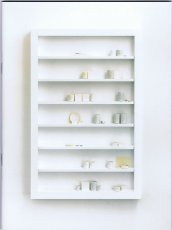
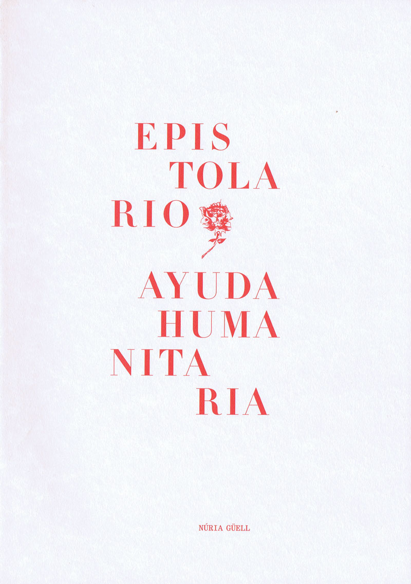
27,4x21,3 cm, Auflage: 500, keine weiteren Angaben vorhanden Einzelblätter in Umschlag gelegt, Cover Prägedruck, Buchdruck und Siebdruck auf verschiedenen Materialien
A Magazine of Writing by Artists.
Founded in 1978 in Chicago by artist Buzz Spector and writers Reagan and Roberta Upshaw, Whitewalls began as a publication for artists working with language. For the most part Whitewalls is a straight-up sampler of artists' experimental projects for the page: each issue contains from half a dozen to several dozen artists employing text, image, and other notations in various combinations. While Whitewalls featured an international cast of emerging and established artists, it also provided a showcase for the Chicago area's experimental art community, including artists such as Jeane Dunning, Joseph Nechvatal, and Christopher Wool. Text von der Website
Mit Texten u. a. von Richard Artschwager, Andrea Blum, Christo, Mike Kelly, Lawrence Weiner, Mark Staff Brandl, Rosemary Mayer, Paolo Colombo, Joel Hubaut
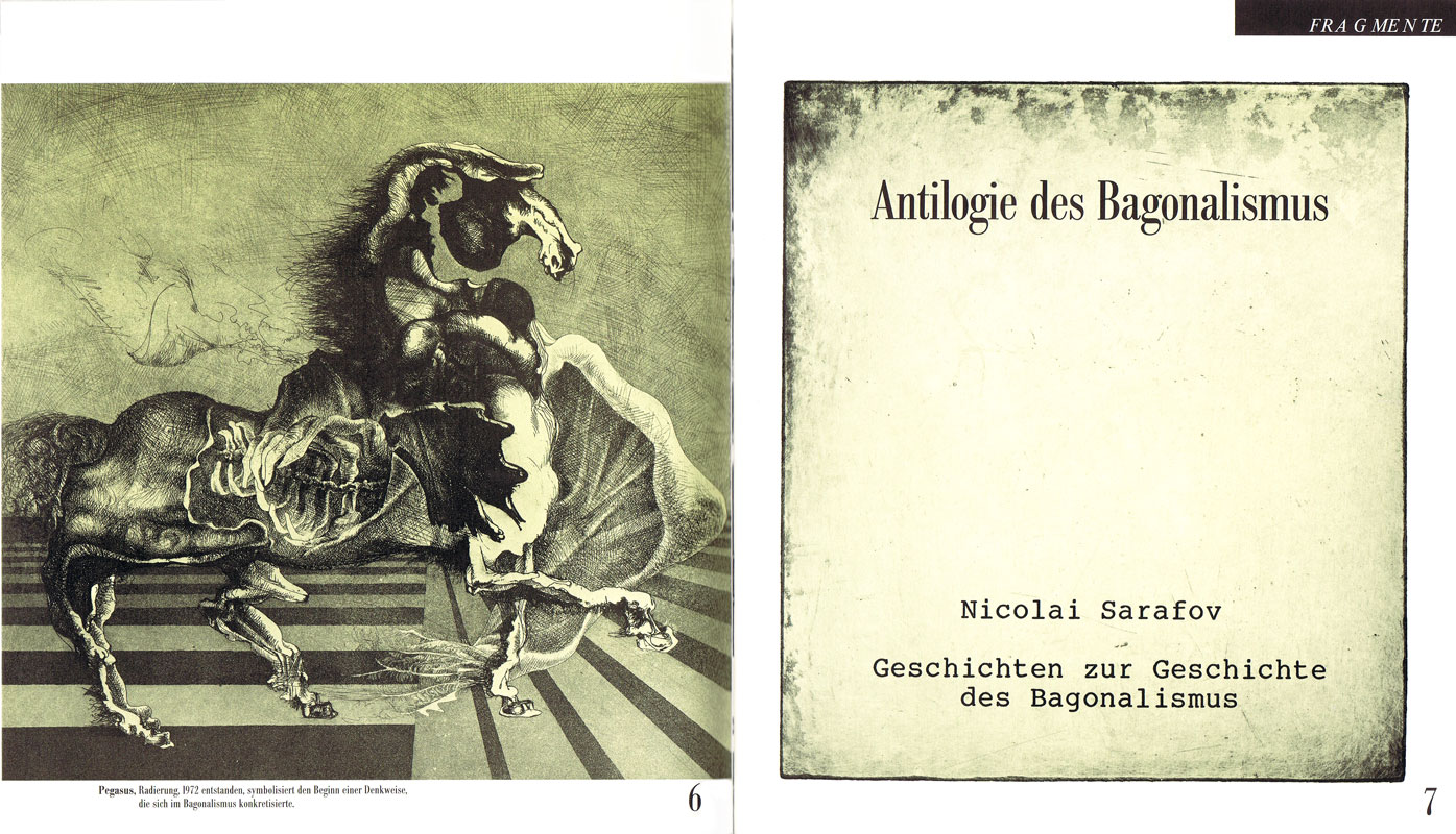
Die "Anthologie des Bagonalismus", eine Anthologie der vergeblichen Meinungen, des Kontextes der Mißverständnisse, der Vorbeugung komplexer ISMEN durch die Treffsicherheit unbeteiligter Distanz, etcetera - kurz die "Anthologie des Bagonalismus", die sich Stück für Stück, nach jeder neuen Ausgabe der FRAGMENTE immer weiter vervollständigt. Von Stück zu Stück werden auch die Darstellungsformen variieren (Text, Text-Bild, Bild, ??).
Text aus dem Heft.
24x21 cm, Auflage: 380, numeriert, signiert, keine weiteren Angaben vorhanden Drahtheftung, mit Briefmarken, verschiedene Papiere, mehrfarbiger Druck, Umschlag mit Prägedruck, S. 321 - S. 400
56 S., 24x21 cm, Auflage: 380, numeriert, signiert, keine weiteren Angaben vorhanden Drahtheftung, verschiedene Papiere, Klappbilder, eingeklebt eine International-World-Landscape-Card, Prägedruck rückseitig, S. 55 - S. 110
Fortsetzung folgt: Nun liegt die zweite Ausgabe der FRAGMENTE vor. Das bedeutet noch ein Fragment des Großen und Ganzen dazu. Bagonalismus ist die absurde Inszenierung eines ernsthaften Hintergrunds, der wiederum in der Bagosophie beinhaltet ist, die über die allerletzte Klarheit und Wahrheit hinaus Ursprünge und Zusammenhänge der Dinge in der Welt erklärt, die vom Sein im Unsinn handeln und dem Wissen darüber Sinn geben.
Text aus dem Heft.
185 Blatt S., 28x21,5 cm, Auflage: 1.000, keine weiteren Angaben vorhanden Offsetdruck nach original Fotokopierarbeiten, je Künstler 25 Seiten, First Edition
Siegelaub in einem Interview: The Xerox book - I now would prefer to call it the Photocopy book, so that no one gets the mistaken impression that the project has something to do with Xerox – was perhaps one of the most interesting because it was the first where I proposed a series of requirements for the project, concerning the use of a standard size paper and the amount of pages the container within which the artist was asked to work.
Das Buch ist/war die Ausstellung
15,7x11,8 cm, Auflage: 60, numeriert, signiert, ISBN/ISSN 3928804022 Acht signierte Postkarten mit Hardcover-Ausgabe des Kunstkalenders und Biografie in Hardbox mit Prägedruck
Charley is a contemporary art publication series edited by Maurizio Cattelan, Massimiliano Gioni and Ali Subotnick. A do-it-yourself magazine, Charley is an inclusive publication relying on assimilation, rather than on selection : Charley is a machine for redistribution, a mechanism for spreading and exploiting information, rumors, and communication. Like most information, it is partial, unstable, and untrustworthy. There are no hierarchies and no favorites in Charley : it flirts equally with celebrity and failure. Charley is a multiform creature, bound to transform with each issue. Charley is a pre-digested combine, with pages assembled from catalogues, brochures, press clips, postcards, and other visuals. But what is Charley really? Charley is a new publication on emerging artists. Prominent curators, writers, artists, and other arts professionals from around the world were asked to suggest up to 10 up-and-coming artists and/or submit materials on the artists for inclusion in Charley. 400 art makers from around the globe responded, and each of them is represented by one page of Charley
160 S., 20.5x13 cm, 2 Stück. keine weiteren Angaben vorhanden Broschur, Schwarz-weiß Drucke
ZusatzInfos
Arriving in China, most visitors turn into illiterate fools the moment they step off the airplane. Surrounded by signs written in an incomprehensible code, messages meant to guide, to inform, to convince or to sell become little more than abstract pictures. The photographs in this book were produced by one such illiterate as he wandered through a world of signs oblivious to their meaning. Selected from the thousands of pictures made while traveling through China, these pictures reflect the author’s interest in the transformation of image to text and back again.
Text von der Webseite
44 S., 29x22,5 cm, ISBN/ISSN 9781935202592 Drahtheftung
ZusatzInfos
Brought to you by the aberrant, animated mind of Italian-born provocateur, mischief-maker, and macabre witness to our times Maurizio Cattelan, Toilet Paper 2 follows closely on the heels of the inaugural issue of Cattelan's most recent print extravaganza. "The magazine springs from a passion/obsession that Maurizio and I have in common," collaborator photographer Pierpaolo Ferrari said in an interview in Vogue Italia. "Each picture springs from an idea, even a simple one, and then becomes a complex orchestration of people who build tableaux vivants. This project is also a sort of mental outburst." Published by Deste, this part magazine, part artist's book blends commercial photography with warped narratives and surrealistic imagery, creating a series of powerful images that are as appropriate for the coffee table as they are for the WC
8 S., 33x24,5 cm, Auflage: 1.000, numeriert, ISBN/ISSN 9788896501009 Blätter lose ineinander gelegt, gefaltet in transparenter bedruckter Kunststoffhülle
ZusatzInfos
Peep-Hole was an independent contemporary art center operating in Milan from 2009 to 2016. During seven years, Peep-Hole has organized many exhibitions involving some of the most interesting international contemporary artists. It published 28 editions of the quarterly journal of artists writings Peep-Hole Sheet with texts and developed projects in partnership with numerous institutions.
Text von der Website.
28 S., 14,8x14,8 cm, ISBN/ISSN 9783940548276 Drahtheftung, in Transparenthülle
ZusatzInfos
The colorful and almost symbolic forms are scratched out of a black vibrating surface reminding one of spaceships, architecture, prehistoric and indian symbolism seamlessly blending a contemporary or even futuristic pictographic language with the most basic forms
16 S., 14,8x14,8 cm, ISBN/ISSN 9783940548092 Drahtheftung, in Transparenthülle
ZusatzInfos
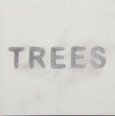
´TREES´ is a series of tree drawings from 2008 and 2009 by the german artist Stephane Leonard.
Different trees without any leaves captured at their most naked, most fragile moment right in between life and death. The pencil describes sceleton like structures giving the trees an airy transparency leading one towards their momentary state of existence
13x13 cm, keine weiteren Angaben vorhanden Musik-CD in KlappPapphülle, transparenter Kunststoff, mit Infoblatt in transparenter Kunststoffhülle, cover art: Stephane Leonard
ZusatzInfos
written.produced.performed.recorded by Stephane Leonard between 2002 - 2003 in Berlin and Bremen, Germany.
nr 1.1 - 1.8 originally released on Sinnbus in 2003.
nr 2 ´maintain´ (Bonustrack) recorded in 2004 is filmmusic for ´Die Begegnung´- a short film by Claudio Pfeifer and Stephane Leonard.
´Schmalfilmer´ is the first official album (ep) by Stephane Leonard. Tracks 1.1 to 1.8 belong together and can be seen as one song. ´Schmalfilmer´ shows early experiments including beats, rhythm and loop based music. Most parts of this EP were build with an old 8 track cassette recorder. Some beats were created on a neighbour´s PC and Fruity Loops, the rest of the sounds are guitar noise, found objects, filter and loop machine
AFTER MODERN HISTORY is a report on world events that re-edits the news of the day by linking together images according to a totally idiosyncratic perspective of pattern recognitions and typologies. AFTER MODERN HISTORY lifts photos from daily newspapers and re-organizes disparate, often atomized subjects into newly imagined affinities. For most people caught on the hard end of luck, the newspaper can be a lonely place. But in this second draft of history, bad news is no longer so isolated. There is no dateline
AFTER MODERN HISTORY is a report on world events that re-edits the news of the day by linking together images according to a totally idiosyncratic perspective of pattern recognitions and typologies. AFTER MODERN HISTORY lifts photos from daily newspapers and re-organizes disparate, often atomized subjects into newly imagined affinities. For most people caught on the hard end of luck, the newspaper can be a lonely place. But in this second draft of history, bad news is no longer so isolated. There is no dateline
borderless ist ein Ausstellungsprojekt des Masterstudiengangs Photography der Burg Giebichenstein Kunsthochschule Halle. borderless meint nicht grenzenlose Beliebigkeit, sondern verfolgt den Anspruch Bilder und Serien auszuwählen, die das Thema inhaltlich oder konzeptionell aufschlüsseln, sinngemäß stimmen sowie wesentliche Zusammenhänge einbeziehen.
In der Ausstellung werden individuelle Standpunkte nicht aufgegeben, um sich als eine Einheit zu präsentieren. Die Ausstellenden nutzen ihre Vielfältigkeit und Internationalität. So entstand ein Konzept, in dem zum Einen den Teilnehmern keine Grenzen gesetzt werden, und das sich zum Anderen durch zeitgemäße Fotografieansätze und Bildsprachen auszeichnet.
Teilnehmer: Armen Asratyan, Sonja Foerster, Gregor Herse, Kristin Hoell, Ina Jungmann, Orestia Kapidani, Wolfram Kastl, Isabel Gathoni Kinyanjui, Michel Klehm, Thomas Lewandovski, Sascha Linke, Mako Mizobuchi, Yvonne Most, Annett Poppe, Justus Richter, Rudolf Schäfer, Alina Simmelbauer, Gabriela Solis, Lena Stadler, Mila Teshaieva, Sandy Worm
64 S., Auflage: 700, keine weiteren Angaben vorhanden Dokumentation, Drahtheftung, Umschlag mit Prägedruck, mit eingestecktem Papierstreifen mit asiatischen Schriftzeichen
44 S., 29x22,5 cm, ISBN/ISSN 9781935202608 Drahtheftung
ZusatzInfos
Brought to you by the aberrant, animated mind of Italian-born provocateur, mischief-maker, and macabre witness to our times Maurizio Cattelan, Toilet Paper 2 follows closely on the heels of the inaugural issue of Cattelan's most recent print extravaganza. "The magazine springs from a passion/obsession that Maurizio and I have in common," collaborator photographer Pierpaolo Ferrari said in an interview in Vogue Italia. "Each picture springs from an idea, even a simple one, and then becomes a complex orchestration of people who build tableaux vivants. This project is also a sort of mental outburst." Published by Deste, this part magazine, part artist's book blends commercial photography with warped narratives and surrealistic imagery, creating a series of powerful images that are as appropriate for the coffee table as they are for the WC
Preface by Sarah Bodman, Essays by Walter Struve (librarian State Library of Victoria), Dr Scott McQuire (Associate Professor and Reader, School of Culture and Communication, University of Melbourne), Humphrey McQueen (freelance historian) and Des Cowley (Rare Printed Collections Manager, State Library of Victoria).
The Silent Scream: political and social comment in books by artists presents, not only a companion catalogue to an exhibition held at Monash University Rare Books, but also a journey through some of humanity's most inhumane and hypocritical moments. Reaching back to William Blake with a facsimile of his illuminated book America: A Prophecy then travelling through the two world wars and on to the modern era the catalogue provides insights into 77 influential books and works presented in book form.
Von der Webseite
Hundert Jahre nach Marcel Duchamps dreimonatigem Besuch in München (1912) wird ... eine ... Lücke ("le mystère") im kunsthistorischen Wissen zu füllen versucht. ... mit einer Ausstellung, gut organisiert vom Lenbachhaus, zwei beachtlichen Publikationen, einem Duchamp Journal und einem seltsam gekippten Wohnungsmodell neben der Alten Pinakothek, das dem Betrachter mit 'kalten' Wänden in etwa Duchamps ehemalige Wohnsituation in der (später ausgebombten) Barerstr. 65 vorführt. Dieses Modell ist das Werk des Bildhauers und promovierten Kunsthistorikers Rudolf Herz, der auch eines der beiden Veröffentlichungen und das Journal verantwortet ...
Text von der Webseite: www.sehepunkte.de
On June 21, 2012, precisely one hundred years will have passed since Marcel Duchamp arrived in Munich. He spent three months in the city, three months that were to radically change his art and turn him into one of the most influential artist of modernism. He is regarded as pioneer of conceptual art influencing numerous artists from Sol LeWitt to Ai Weiwei and still today continuously inspires new generations of artists.
On the anniversary of the French artist’s arrival, Munich’s Architecture Museum is presenting Rudolf Herz’s latest art project “Marcel Duchamp – Le mystère de Munich”, in which the artist investigates the background story of his predecessor’s stay in the Bavarian capital. The project includes a sculpture as well as a new book.
Text von der Webseite duchamp-munich.org
The Ecart Group published artists’ books, presented exhibitions and performances, and opened a bookstore/gallery that is considered to be “one of the most important alternative spaces in Europe in the 1970s” (Ken Friedman). Ecart worked with many artists. The exhibition features artworks made by Armleder and Ecart and includes a complete set of Ecart publications, works on paper, mail art projects, films, and sound works created for Paul McCarthy’s Close Radio.
Text von der Webseite
224 S., 29,7x21 cm, ISBN/ISSN 9781870003339 Hardcover, Ecken abgerundet
ZusatzInfos
ABZ presents a fabulous collection of complete alphabets, emblems, logos, letters and signs, together with stunning graphics from classic modernist books and magazines, and from obscure professional manuals.. Drawn from collections, many of them private, in London, Paris, Amsterdam, New York and Mexico, most of this fascinating, rare and beautiful material is reproduced for the first time since its original publication
44 S., 29,7x21 cm, keine weiteren Angaben vorhanden Verkaufsprospekt zu einer Sammlung von Zeitschriften, Farbloserkopien nach PDF, Blätter lose ineinander gelegt
ZusatzInfos
This catalogue describes more than 450 graphzines that represents 30 years of «post-punk» graphic movement. The collection gathers major works of most of the artists that were involved in this movement. One or several titles as well as collective works represent them. Many periodicals are included, especially a very important run of Elles sont de Sortie. This emblematic publication directed by Pascal Doury and Bruno Richard also welcomed the most original publishers linked to this movement. Exhibition catalogues and numerous invitation cards completes the collection
1000 S., 24,8x21,5x10,2 cm, Auflage: 90, numeriert, signiert, 23 Teile. keine weiteren Angaben vorhanden 12 Hefte zusammen im festem Schuber, Vorderseite mit Loch. Alle Drahtheftung, Umschläge mit Prägedruck, Seiten 5 - 1000, einzeln signiert, numeriert und gestempelt, verschiedene Papiere und Drucktechniken, Collagen
ZusatzInfos
In ihrer Eigenschaft als Sporadicum zur Sache Bagonalismus, stellen die FRAGMENTE eine Betrachtungsweise dar, die als Schrägstrich der kulturellen Orthographie des vergangenen Jahrtausendstel beigefügt werden könnte.
Durch Wort im Wort, Bild im Bild, Sinn im Unsinn werden die Vorzüge einer modernen ANTILOGIE der Gegensätze und Grundbegriffe bagonalistischer Erkenntnis zielstrebig verbunden, um die Unkenntnis über die gegenwärtige BAGOSOPHIE zusammenführend zu vertiefen.
Die inhaltliche Ladung des Gesamtwerkes ist dazu gedacht, das dritte Jahrtausend zu bereichern, ist aber auch dem schäbigen Geist davor gewidmet.
Welche Motive, Kräfte, Methoden und Prinzipien wirkten damals, als FRAGMENTE entstanden und vollbracht wurden? Nun, die sind identisch mit dem, was der BAGONALISMUS vermitteln möchte. Mehr auf der Webseite
29,5x22,5 cm, signiert, ISBN/ISSN 387173781X Hardcover, Druck der Bilder auf Transparentpapier, in Schuber. Cover Prägedruck. Von Brodwolf und Härtling signiert
246 S., 43,6x30,3 cm, Auflage: 250, numeriert, signiert, ISBN/ISSN 9780847811595 Leineneinband mit Prägedruck in Schuber und Pappkarton. Monogrammiert und handnum. Herausgegeben von Coosje van Bruggen.Mit eingeklebten Fotografiener Sprache
Dieses opulente Künstlerbuch zeigt eine Auswahl des zwischen 1987 und '88 entstandenen Werkes Urzeit/Uhrzeit der Konzeptkünstlerin Hanne Darboven (1941-2009), welches im Original aus 26 einzelnen Bänden besteht. Die vorliegende Ausgabe beschränkt sich auf 148 Blätter des Originals, wobei vier Blätter jeweils auf einer Seite präsentiert werden.
Text: artbook cologne
32,5x24,3 cm, ISBN/ISSN 9783931201401 zwei Hefte in Schuber mit Prägedruck. Jedes Heft drahtgeheftet. Ein Heft mit einem gefalteten Plakat als Teileinband. ein Heft mit einem Cover das kleiner ist als der Innenteil, mit Loch und dahinter montierter Minidisk, mit Schallplatte
Self Publish, Be Happy is an organisation founded by Bruno Ceschel in 2010 with the aim of celebrating, studying and promoting self-published photo books through events (such as exhibitions, displays and talks), publications and online exposure. Self Publish, Be Happy also organises workshops that help artists and photographers make and publish their own books.
Self Publish, Be Happy Shop sells a selection of remarkable and rare contemporary books.
Self Publish, Be Happy Blog features daily photography by mostly emerging artists.
Text von der Webseite
30x22,8 cm, ISBN/ISSN 17668832 Cover mit Prägedruck, zusammen mit zwei Heften von Richard Prince
ZusatzInfos
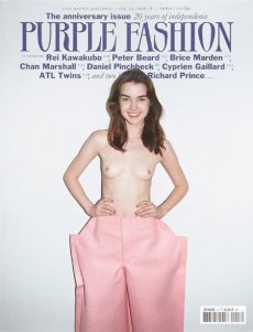
We launched Purple Prose in the early 1990s without any means, and without any experience, because we wanted to make a magazine that was radically different. We wanted to support the artists around us that noone else supported, much less talked about. [..] It would be a form of opposition of our own, different from the critical jargon of the generation of '68. [..] From a visual standpoint, we represented the break from '80s imagery (like Richard Avedon's photography for Versace, for example). From an artistic standpoint, the artists of the early '90s were rising up against art as capital fetish [..]. In saying that Purple is the portrait of a generation, I mean it's a portrait of those who embody their times. At the same time, it's a portrait of myself and Elein Fleiss, our ideas, our lives, and our aesthetics.
aus Wikipedia
12,4x14,52 cm, keine weiteren Angaben vorhanden CD in Jewelcase mit booklet
ZusatzInfos
Overgrown is the second album of British electronic musician James Blake.[2] It is set to be released on 8 April 2013 through ATLAS, Blake's own record label, and Republic Records.[3] It was supported by first single "Retrograde" and a series of concert appearances including one at Coachella. It is being promoted as Blake's most expansive piece of work to date, with guest features from legendary electronic producer Brian Eno and Grammy Award-winning rapper and producer RZA.
Text aus Wikipedia
32 S., 23x11 cm, Auflage: 20, numeriert, signiert, keine weiteren Angaben vorhanden Heft aus rosa Papier, signierter Karton, (vermutlich Linolschnitt auf) Japanpapier, alles zusammen in transparenter Kunststoffhülle
ZusatzInfos
Finally finished the first personal project of the year. It's a zine and print package about a pretend statistical analysis I did to kill some time in 2010. It's taken me a couple of years to get round to collecting all the raw material I collected into this 32 page zine. I limited the run to 20 and I tried to make it as nice as possible. I'm pleased with it. In some ways it's the most complex personal project I've made in the real world...
Text von der Webseite
20 S., 21x15 cm, Auflage: 40, numeriert, signiert, keine weiteren Angaben vorhanden Drahtheftung, Farbkopien auf verschiedene Papiere, 2 aufgeklebte Spielzeug-Augen auf Vorderseite, Rückseite mit Prägedruck
ZusatzInfos
Future Fantasteek! brings together a trichotomy of investigation. art-zines and independent publishing. artist as social commentator and drawing as a means of immediate visual communication. The series explores obdurate boundaries between journalism and authorial illustration using satire to reflect notions of ‘Britishness’. The series can be read as a sequence, from just prior to the ‘credit crunch’ through to the ‘age of austerity’. The series is independently published as a limited edition art-zine, with two issues per year. The approach is experimental, incremental and reflective focussing on both the microcosm and macrocosm of living in the UK. Visual humour is developed throughout as a vehicle for change, combining techniques such as pastiché, parody and socratic irony. Typography and images are juxtaposed to create new narrative possibilities. Language is explored using different ‘voices’ such as anecdotal, colloquial or profane. This text is then translated into drawn commentaries on etiquette, politics and advertising. The ‘anxiety of the individual’ is a running theme throughout the series with many reoccurring protagonists and antagonists soliloquizing their notions of ‘Das Unheimliche’. The series also explores changing technologies with regard to notions of ‘the book’ with online versions of Future Fantasteek! available via a blog and online PDF reader (issuu and .swf).
Text von der Webseite
20 S., 21x15 cm, Auflage: 40, numeriert, signiert, keine weiteren Angaben vorhanden Drahtheftung, Farbkopien, aufgeklebter Papierstern auf neonfarbiger Vorderseite, Rückseite mit Prägedruck
This publication contains a selection of 60 photographs from the documenta Archive, one of the oldest and most esteemed exhibition of contemporary art in the world. The photographs — belonging to different ages — depict the two elements that make art history possible: artwork and spectator. This amazing journey through time not only concerns the history of one of the most important exhibitions in the world, but also traces the evolution, customs, and traditions of the society that created it. The book portrays a love story between two subjects — a human being and an inanimate element — that are capable of a relationship even if they speak a different language. The photographs capture the moment of these encounters, and this is what their distinctive feature consists in. Of course we are not able to listen to the dialogues, but we can still imagine them.
Text von der Verlagswebseite
[20] S., 14,7x10,3 cm, Auflage: 100, keine weiteren Angaben vorhanden Drahtheftung
ZusatzInfos
Illustrated zine about the russian mathematician Grigori Perelman, who in 2002 solved one of the most difficult problems of our time.
Text von der Webseite
[96] S., 20,4x17 cm, keine weiteren Angaben vorhanden
ZusatzInfos
BOLO 1 includes the contributions from 45 artists and is distributed in the most important cities in Europe, US, and available on the website. Printed in 2 colors, 100 pages of graphics, photography, illustration and typography, all mixed together. Different techniques, combined by a main theme.
Text von der Webseite
240 S., 24x17 cm, signiert, ISBN/ISSN 9783866787889 Herausgegeben vom ZKM, Zentrum für Kunst und Medientechnologie Karlsruhe. Cover mit Prägedruck. Mit Widmung
ZusatzInfos
Jürgen Claus arbeitet universell, ist Maler, Kritiker, Theoretiker, Lehrender und Medienkünstler und interdisziplinär zeigt sich auch diese Autobiografie. Es ist ein Rückblick auf 40 Jahre Kunstschaffen. Durch seine enge Bindung zu Zeitgenossen wie Peter Weibel, Otto Piene oder Herbert Bayer, die sich in vielen Jahren des Austausches aufgebaut hat, wird das Œuvre des Künstlers mittels des für Claus wichtigen Mediums Sprache erschlossen. Dabei geht es immer auch um die Positionen des Gegenübers und so erklärt Claus anhand gemeinsamer Erinnerungen, Gespräche und Tagebucheinträgen seine Weise Kunst zu sehen, zu schaffen und zu lieben. Er selbst nennt es „erlebte Zeitgenossenschaft“.
Text von der Verlagswebseite
12 S., 20,3x13,4 cm, keine weiteren Angaben vorhanden Drahtheftung, Schwarz-Weiß-Laserdrucke, Umschlag aus farbigem Papier
ZusatzInfos
Das Konzept:
1. Anonymous Press (Α,–Π,) is a self-sufficient publishing platform.
2. Every publication by Α,–Π, is a byproduct of an individual and a database, i.e. Google Image Search.
3. Human author defines the topic, the content and the form is generated from the most relevant images found online.
4. Each publication is added to a public library.
5. Every item in the library can be printed on-demand and is available to everyone for a small fee covering shipping and production costs.
6. Publications are sorted in a chronological order.
7. Α–Π does not own, nor is responsible for the content generated by its users.
Text von der Webseite
Edited by Gabriele Wix, By Gabriele Wix, graphic design by Lawrence Weiner, Anja Lutz.
Most of his oeuvre, which comprises more than a thousand language-related works, has already been presented in the German-speaking world—some of it either translated by Weiner himself or conceived using German as a basis. Featuring over 350 works, this is the first list of the English/German works. The artist assumed responsibility for the typography and cover design, as if the publication were one of his own works. Accompanying text and visual documents shed light on the creative process, in-situ installations, and Weiner’s way to work with text.
Text von der Webseite
[48] S., 23,2x18,2 cm, Auflage: 500, ISBN/ISSN 1870699041 23 bedruckte Einzelblätter, gestanzt, abgeheftet auf in Pappumschlag montierten Metallstäben mit Schließmechanik, Vorder- und Rückseite mit Prägedruck
ZusatzInfos
A collection of photographs, diagrams, text, and a short story by Craigie Horsfield.
Text von der Webseite
[24] S., 21x14,8 cm, Auflage: 50, numeriert, keine weiteren Angaben vorhanden Drahtheftung, zwei verschiedenfarbige Papiere
ZusatzInfos
Begleitheft zur Ausstellung vom 19.09.-31.10.2013 in der Galerie Espacio Visible in Barcelona
Jacob invites us into an intimate space that serves as a shelter for a nomadic subject, the pilgrim. Free of any territorial attachment, this figure sets out on a devotional journey, motivated by the desire to seek the sacred. Thus, the pilgrim wanders into inhospitable lands, submitting himself to absolute isolation. A solitary exodus towards uncertainty, far away from the worldly, from society, and in a way, from the self. This figure of the pilgrim becomes the leitmotiv of Jacob’s work - its isolation, loss of identity, but also, its vitality. Concepts which she also invokes in her intuitive drawings, that are aesthetically close to Art Brut. "The Room of the Pilgrim" explores the liberty and emancipation that arises from this retreat. In that way, the abandoned refuge built by Jacob speaks of lost rights. The rights to anonymity and intimacy being some of the most recently expropriated and commodified values.
Text von der Webseite
23x18,5 cm, keine weiteren Angaben vorhanden Drahtheftung, Pappumschlag, bestehend aus drei ausklappbaren Teilen, verschiedene Papiere, perforiert, metallverstärkte Ecken, in transparenter Kunststoffhülle, mit angebrachten Aufklebern
ZusatzInfos
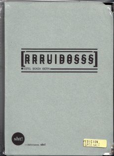
"RRRUIDOSSS" is a handmade publication divided in three parts that wants to take in the noises that has been established like the most annoying, noxious including the ultrasonics and infrasonics. This damaging sounds, written in paper using onomatopoeias, are reduced and convert into harmless ones. In addition, this is a very special edition as you can unfold and streap through the micro holes! So you have the possibility to get three books in one or an unfold one.
Text von der Webseite
zur Ausstellung 12.04.2003 — 08.06.2003
For their exhibition at Modern Art Oxford, the Chapmans present sculptures, paintings, drawings and a major new installation in the main Upper Gallery. The exhibition develops on the artists’ delight in cultural confusion and in challenging our assumptions about taste and meaning in art, explored most recently in The Chapman Family Collection, a faux-museographic display of hand-carved wooden fetish objects infected with the iconography of the global food outlet McDonalds.
Text von der Webseite
One of the most well-known of Ruscha's books from his early period is Every Building on The Sunset Strip, showing a famous stretch of real estate along Sunset Boulevard in Los Angeles, published in 1966. In July, 1973 he followed the same procedure while documenting Hollywood Boulevard.
Loading a continuous strip of 33 feet of Ilford FP-4 black & white 35mm film into his motor-drive Nikon F2 and then mounting it on a tripod in the bed of a pickup truck, he drove back and forth across the 12 miles of the street shooting, frame-by-frame, both the north and south sides of its entire length. The negatives were developed, contact sheets were made, and the materials were placed in storage.
Thirty years later, in 2003, a digital record of Hollywood Boulevard was created and it served as a reference guide for the traditional film/still documentary of 2004. For this shoot, the same type of camera equipment was used to re-photograph the street on 35mm color-negative film.
The resulting material of both shoots — 4500 black & white and 13,000 color images — have been scanned and digitally composed into four panoramics of the complete 12 miles. In THEN & NOW, the original 1973 North side view is shown along the top of the page and juxtaposed with its 2004 version underneath. Along the bottom of the page, you find the original 1973 South side view shown upside down, also juxtaposed with its 2004 version. The panoramics face each other and they are aligned.
Text von der Webseite
352 S., 21x15 cm, ISBN/ISSN 9782915859416 Broschur mit Banderole, eingelegt ein Informationsblatt
ZusatzInfos
Originalausgabe erschienen bei Artists Press, Bern, 1980.
This book is the third and final version of the first artist’s book published in 1960 by herman de vries, who is currently the author of more than one hundred publications.
The story of this book dates back to 1960. Closely associated with the Zero Group, but also drawn to the buddhist concept of emptiness, herman de vries had just produced a series of white monochromes when he self-published a twenty-page booklet in Arnhem. It had no title, its cover was blank and its pages were unprinted. It contained nothing but a short final poem celebrating, in four languages, the superabundance of white: “wit is overdaad”. In 1962, this manifesto appeared in another version, now entitled wit: two hundred blank pages, four white collages by the artist and an introduction, itself completely blank, by the poet J. C. van Schagen, published in arnhem in only five copies by M. J. Israel. It was followed in 1967 by a second “revised” edition, wit weiss: two hundred and fifty blank pages, pocket-sized, in five hundred copies, published by Hansjörg Mayer in Stuttgart. The only printed elements were the artist’s name, the title and the publisher’s name on the cover, the word “introduction” and the name of its author on the very first page and a colophon on the final page. In 1980 the Artists Press in Berne published the “third revised edition”, in a larger format and with more pages. The original title wit was translated into english and japanese and into sanskrit with a word that means “white” in the sense of bright, pure, immaculate. The title itself does not appear on the book, which remains completely blank. It is printed with the paratext on a broad strip of paper in the form of a detachable publicity strip. The inside flap contains a brief statement initially dating back to the 1962 edition, stating that this book incorporates all aspects of reality. Of the five thousand copies advertised, only a hundred were published. It is this last edition, the most radical, which is republished here, the only addition being the french translation of the statement.
On 1 april 2012, herman de vries wrote of his book, insisting on the importance of the final comma:
white is white
0 = 0
no name
no idea
not even emptiness,
176 S., 33x24,5 cm, 2 Stück. ISBN/ISSN 9783899042931 Hardcover mit Prägedruck
ZusatzInfos
erscheint zur Ausstellung im Museum für Kunst und Gewerbe, Hamburg
Ein Kunstprojekt in drei Sitzungen von je 24 Stunden: Jonathan Meese wird von Peter Hönnemann in dessen Atelier fotografiert. Aber es bleibt natürlich nicht beim Fotografieren. In einer intensiven, ja exzessiven Arbeit haben sie versucht, Fantasien über die menschliche Existenz und das Dasein in Bilder zu fassen. Einem umfangreichen Teil mit hochwertigen Abbildungen schließt sich unter dem Titel »Ein Kampf um Bilder in drei Runden« ein Gespräch von Jonathan Meese und Peter Hönnemann mit dem Journalisten Andreas Platthaus an
112 S., 24x16,5 cm, keine weiteren Angaben vorhanden Broschur
ZusatzInfos
We Are Dublin is a magazine dedicated to the city. We combine the lo-fi and the high-end - expect long form journalism, poetry, humour and short stories, as well as striking photography. This is immersive publishing at its finest - a long-form postcard from one of the most interesting cities in the world. Published every three months, the magazine is available to buy online and in selected retailers in Dublin and around the world.
Text von der Webseite
720 S., 21x15x4.5 cm, Auflage: Print on demand, keine weiteren Angaben vorhanden Softcover, Schwarz-Druck auf Papiere, Titel und Autor in weißer Schrift auf dem Buchrücken. Gedruckt bei Lulu
Ink used for digital printing is one of the most precious substances in the world. A single gallon of ink costs over four thousand dollars and this is one reason why digitally printed books are so expensive.
However, the price of a book is not calculated according to the amount of ink used in its production. For example, a Lulu book of blank pages costs an artist as much to produce as a book filled with text or large photographs. Furthermore, as the number of pages increases, the price of each page decreases. A book containing the maximum number of pages printed entirely in black ink therefore results in the lowest cost and maximum value for the artist.
Combining these two features, buyers of The Black Book can do so with the guarantee that they are getting the best possible value for their money.
Text von der Webseite
31x31 cm, Auflage: 300, keine weiteren Angaben vorhanden Schallplatte, LP, in 2 Hüllen, Infoblatt und gefaltete Grafik
ZusatzInfos
Hans Rudolf Zeller (b. 1934 in Berlin) is best-known for being a music theorist, essayist and writer on contemporary music. His essays on Dieter Schnebel, Iannis Xenakis, microtonality etc., often published in the German journal "Musik-Konzepte", are deemed being among the best ever written on new music. Apart from that, he has since the 1960s maintained his own artistic work, most of which has not been published or only seen the light of day in private micro-editions. Zeller's work often involves combining multiple dimensions (texts, vocals, visual projections) into one cinematological literature.
Text von der Webseite
Side A: 1. Tesa-Klänge, 2. Vokalphantasie, 3. Scriptophonie, 4. Musiktext
Side B: 1. Parallelität, 2. Stimmimprovisation
80 S., 20,8x14,8 cm, keine weiteren Angaben vorhanden Broschur, Softcover, Druck auf hellblauem Papier
ZusatzInfos
Modul-dance was a multi-annual cooperation project with the participation of 20 European dance houses from 16 countries.
Its main aim was to support development, mobility and exchange for dance artists.
Led by Mercat de les Flors in Barcelona, the project operated under the umbrella of the European Dancehouse Network (EDN) and was funded by the European Commission through its Culture Programme.
Modul-dance lasted from June 2010 to December 2014 and it was one of the most important sponsored EU cultural projects.
Text von der Webseite
21x14,9 cm, 2 Stück. keine weiteren Angaben vorhanden Drahtheftung, Softcover mit Prägung
ZusatzInfos
Modul-dance was a multi-annual cooperation project with the participation of 20 European dance houses from 16 countries. Its main aim was to support development, mobility and exchange for dance artists.
Led by Mercat de les Flors in Barcelona, the project operated under the umbrella of the European Dancehouse Network (EDN) and was funded by the European Commission through its Culture Programme. Modul-dance lasted from June 2010 to December 2014 and it was one of the most important sponsored EU cultural projects.
Text von der Webseite
226 S., 23,8x16,7x2 cm, 2 Stück. keine weiteren Angaben vorhanden Broschur, Softcover, schwarzer Rundumfarbschnitt
ZusatzInfos
Modul-dance was a multi-annual cooperation project with the participation of 20 European dance houses from 16 countries.
Its main aim was to support development, mobility and exchange for dance artists. Led by Mercat de les Flors in Barcelona, the project operated under the umbrella of the European Dancehouse Network (EDN) and was funded by the European Commission through its Culture Programme. Modul-dance lasted from June 2010 to December 2014 and it was one of the most important sponsored EU cultural projects.
Text von der Webseite
112 S., 22,7x16,5 cm, keine weiteren Angaben vorhanden Hardcover, fadengeheftet, Prägedruck
ZusatzInfos
Unsere Bühne ist die Straße: Plakate fürs Theater von Studierenden der Folkwang Universität der Künste, Schrift I, wurde herausgegeben für den Fachbereich Gestaltung.
Buchkonzept, Satz, Illustration von Nora Prinz
16 S., 29,7x21 cm, keine weiteren Angaben vorhanden Drahtheftung, ein Sticker eingelegt. Cover mit Prägedruck. Risographie. In braunem Papierumschlag mit Aufkleber
OWK is an independent visual library for words and images that create linear or abstract stories providing a structure for publishing and archiving projects. We focus on graphic design, illustration, photography, art and creative writing.
OWK is a Riso print project, meaning that color will fail to present photographs in its purest form. Registration too will fail and colors will be imperfect. It is what it is. An experimental electronic single drum screenprint with its own unique aesthetic and feel.
33x23,5x9,3 cm, keine weiteren Angaben vorhanden Dreiteilige Pappschachtelmit Prägedruck, mit 4 Musterfächern: Umformen, Beschichten, Trennen, Fügen, im Deckel eingelegtes Blatt, 3 Karten
ZusatzInfos
Entwickelt von der Projektgruppe Veredelungslexikon.
Die funktionale Musterbox enthält in der Startauflage zunächst 8 Veredelungstechniken: Lentikulardruck, Beflocken, Reliefprägen, Blindprägen, Kaltfolientransfer, Sonderfolienkaschierung, Lasergravur und Laserschneiden. Das Fächerprinzip der Musterbox erleichtert die Handhabung und gewährleistet eine Erweiterbarkeit.
Jede Veredelungstechnik wird hinsichtlich dem technischen Hintergrund, der Wirkung, den Einsatzmöglichkeiten, den Grenzen und den Kosten betrachtet. Ein Testelement ermöglicht eine absolute Vergleichbarkeit zwischen den Techniken und zeigt die angesprochenen Grenzen optisch und haptisch erlebbar auf. Ein Showelement zeigt die besondere Wirkung der Technik im Zusammenhang mit der jeweiligen Gestaltung. Beide Elemente wurden je Veredelungstechnik mit einem Kooperationspartner aus der Industrie realisiert. Mit Angaben zur Herstellungsweise und zum verwendeten Bedruckstoff vervollständigt die Musterbox sowohl ein ästhetisches als auch ein produktionstechnisches Bild der Veredelungstechniken in der grafischen Industrie.
Text von der Webseite
682 S., 31x24x5,8 cm, Auflage: 300, keine weiteren Angaben vorhanden Hardcover mit Schutzumschlag und Prägedruck, Banderole, verschiedene Papiere, div. eingelegte Einzelblätter, Goldfolie (S. 405), von Hand gestempelt, eingeklebte Bilder, eingearbeiteter Leporello. 19teilige Reproduktion eins Streifens eines lebensgroßen Ö
ZusatzInfos
Nicht für den Buchhandel bestimmt. Für die beteiligten Künstler und Sponsoren, 45 Exemplare für die Edition mit Kirschholzbox.
Im Jahre 1992 kuratierte der Künstler Wolfgang Hainke (*1944) die Ausstellung W(H)/ALE – Auftauchen/Abtauchen in der Städtischen Galerie im Buntentor, in deren Zentrum das soeben aus dem Depot des Übersee-Museums entrollte große Walbild von Franz Wulfhagen (heute wieder in der oberen Rathaushalle) und die Schachtel im Koffer von Marcel Duchamp standen.
Nach über 23 Jahren wird mit dem für die Box vorgesehen Buch W(H)/ALE – On View an diesem Abend der Schlußstein des gesamten Projektes gesetzt.
The book kicks evolved out of the first two Letterpress Workers Summits. It tells about the participants and shows the materials printed during these events. Hence the title: The experience. The book itself is a collective experience: the partecipants contributed to the production in different ways and at different times.
Text von der Webseite
I wanted to show how cars appear in typical street view, which is rarely the subject of photographs. Cars are usually avoided in photography - one waits until a car has exited a view. The ordinary presence of cars is rarely worthy of representation. It's always the special car, or the extreme traffic jam or, of course, the exciting crash that is being pictured. The Cars pays tribute to the shapes and forms we look at every day. How much time we spend with them, sitting inside them, the endless hours we stare at a dashboard. Even if we don't own a car ourselves, their presence is unavoidable. Cars are everywhere. Their sheer number is the most crazy thing about them. They appear in our lives with excessive omnipresence. In their volume cars intrude upon public space, and the way they occupy streets and open areas is rarely challenged.
Ich wollte zeigen, wie Autos in typischen Straßenansichten erscheinen, die selten Gegenstand von Fotos sind. Autos werden in der Fotografie in der Regel gemieden - man wartet, bis ein Auto die Ansicht verlassen hat. Die gewöhnliche Anwesenheit von Autos ist selten der Darstellung würdig. Es ist immer das besondere Auto, der extreme Verkehrsstau oder natürlich der aufregende Unfall, der abgebildet wird. The Cars ist eine Hommage an die Formen und Gestalten, die wir jeden Tag sehen. Wie viel Zeit wir mit ihnen verbringen, in ihnen sitzen, die endlosen Stunden, die wir auf ein Armaturenbrett starren. Auch wenn wir selbst kein Auto besitzen, ist ihre Anwesenheit unvermeidlich. Autos sind überall. Ihre schiere Anzahl ist das Verrückteste an ihnen. Sie tauchen in unserem Leben mit übermäßiger Allgegenwart auf. In ihrer Masse dringen Autos in den öffentlichen Raum ein, und die Art und Weise, wie sie Straßen und Freiflächen besetzen, wird selten in Frage gestellt.
Text von der Webseite, übersetzt mit DeepL.
Herausgegeben von Alice Dusapin & Christophe Daviet-Thery. Beiträge von Steve Roden & Oscar Tuazon.
Allan Kaprow is considered to be the founding father of the Happening, of Environments and Activities: terms that he continued to redefine throughout his career. With a wide selection of images, this publication documents Kaprow's posters, a lesser-known side of his work, produced between 1953 fand 1996. Most of these posters were designed by Allan Kaprow and are characterized by their aesthetic quality, the earliest ones in particular a combination of hand-lettered text and drawings and the later ones of photographs and typographic text in a minimalist style. More than merely advertising Happenings or Activities, these posters act as scores/tools for the participants to the Happenings and as everyday objects that blur the boundaries between art and life.
Text von der Webseite
This year the Vienna Ringstraße is celebrating the 150th anniversary of its existence. For this occasion the BAWAG P.S.K. is publishing a special edition of the Parabol Art Magazine. Parabol is duly inviting the architecture curator Oliver Elser to analyse via this medium one of the most striking and prominent buildings in the Ringstraße ensemble, Otto Wagners Postsparkasse. Together with the architecture photographer Hagen Stier, Elser pays tribute to this paragon of Viennese Modernism.
Text von der Webseite
26x26,5 cm, keine weiteren Angaben vorhanden 10 Zoll Single, bedruckte Hülle, kleiner Zettel mit Downloadhinweis, schwarze one-side 10 Zoll Single (25,4 cm/10) Rückseite der Platte mit Prägedruck
ZusatzInfos
Tracks:
Side A Anticipation Generalized Other
Side B Etching
Production, Composition and Works by Toro Misawa: Sentimental Fool
Recorded at Hijack Studio MA, USA in Dez. 2014
Photo-Cover: Sukita (Model: Mika)
134 S., 26,7x19 cm, Auflage: 100.000, keine weiteren Angaben vorhanden Broschur mit Prägedruck auf dem Cover. Beilage zu Brand eins
ZusatzInfos
Die Geschäftsberichte informieren ausführlich über die Geschäftsentwicklung und die Ertrags-, Vermögens- und Finanzlage des Audi Konzerns. Der Audi Geschäftsbericht gliedert sich auf in einen Magazinteil und einen Finanzteil.
Text von Website
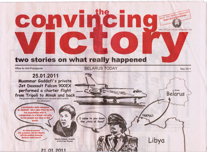
The Office for Anti-Propaganda was founded by Marina Naprushkina in 2007.
Started as an archive on political propaganda with the focus on Belarus the „The Office for Anti-Propaganda“ drifted to a political platform. In cooperation with activists and cultural makers Office lounges and supports political campaigns, social projects, organizes protest actions, and publishes underground newspapers.
The emphasis lies on projects which work outside the white cube and has social and political relevance. The 16-page newspaper-size novel illustrates the events which happened in Belarus during 2010 Presidential Elections. This is a story about the elections and, in particular, of the day and night of December 19, when the citizens’ peaceful demonstration against falsified elections was brutally suppressed by the police. The novel presents two views on the developments in parallel. The first one shows how the events are interpreted by the state regime and currently widely publicized by state-run newspapers and television. The other version was assembled from information presented by independent media, which for the most part can exist only in the Internet, i.e. blogs, oppositional websites, users’ comments, testimonies of victims and political activists.
Text von der Website
Mit Untzerstützung der Konrad Adenauer Stiftung und der Zeit-Stiftung Ebelin und Gerd Bucerius
zur Veranstaltung vom 10.-12.06.2016 in der Akademie der Künste Berlin.
Miss Read: The Berlin Art Book Fair brings together a wide selection of the most interesting artists/authors, artist periodicals and art publishers and is accompanied by a series of lectures, discussions, book launches and workshops exploring the boundaries of contemporary publishing and the possibilities of the book.
In conjunction, the Conceptual Poetics Day will explore the imaginary border between visual art and literature.
In 2016 Miss Read: The Berlin Art Book Fair will return to Akademie der Künste, Berlin, who will provide their main exhibition halls at Hanseatenweg.
Text von der Webseite
254 S., 29x23 cm, ISBN/ISSN 9780989911726 Klappbroschur, verbautes Fach mit eingelegtem Heft, diverse eingelegte, teils gefaltete Blätter auf verschiedenen Papieren, eingebundenes Plakat, gestanzte menschliche Figuren, eingeklebte Audio-CD in Schutzhülle,
Esopus 23 includes stunning artists’ projects by Marilyn Minter (a brand-new series of work—including a removable insert—incorporating metallic and translucent specialty papers.), Mickalene Thomas (a mesmerizing collection of collaged images created for the issue including die-cuts, embossing, and specialty varnishes—and another detachable insert). Karo Akpokiere (a beautiful series of drawings, perforated for easy removal by readers, by the Lagos- and Berlin-based artist dealing with the challenges related to moving between two distinctly different cultures). Jody Wood (an in-depth look at the artist’s most recent iteration of her “Beauty in Transition” project, in which she provides hair-care and therapeutic services to homeless-shelter residents and their caregivers). Chuck Kelton (the master printer for photographers such as Mary Ellen Mark and Danny Lyon creates his own series of dramatic photogram “landscapes,” including a stand-alone, frameable print). and Stefan Kürten (an exquisite series of drawings incorporating complex folds related to mirrored elements within the images themselves).
Text von der Webseite
31,5x32 cm, Auflage: 500, keine weiteren Angaben vorhanden Vinyl Schallplatte in Schuber, aufklappbar
ZusatzInfos
Sounds of Silence is an anthology of some of the most intriguing silent tracks in recording history and includes rare works. In their own quiet way, these silences speak volumes: they are performative, political, critical, abstract, poetic, cynical, technical, absurd… They can be intended as a memorial or a joke, a special offer, or something entirely undefined. The carefully chosen silences of this anthology are intrinsically linked to the medium of reproduction itself and reveal it's nude materiality. They expose their medium in all its facets and imperfections, including the effect of time and wear.
Text von Website
The food industry has provided us with some of the most funny, hilarious and absurd logos and illustrations to promote their products. The good thing, they are everywhere. And we collected a big bunch of them, some well known, but most of them not. In this 80 page extended issue of BLAD we give you our best finds, sliced and in pieces! The magazine also includes a text by Erlend Hammer. Hope you enjoy a nice meal after reading this issue.
Text von der Webseite
[52] S., 13,5x9,5 cm, Auflage: 300, ISBN/ISSN 09620873 Drahtheftung, Rückseite mit Silberprägung, in transparenter Kunststoffhülle mit beigelegtem Blatt, Aufkleber
ZusatzInfos
Faces of Feces is the title of the third issue out. This time we will explore the fascinating and deep original work of Finland's master mind Vilunki 3000. The Helsinki based artist shows us a small overview of his most inspiring and sought after works, which includes drawings, graphics, posters, ads and jokes. It can be called a small retrospect, and it's a perfect opportunity for those outside Finland to get familiar with his unique style. He has been a true inspiration for a whole decade in Finland, and we understand why.
Text von der Webseite
Alla Carta is a bi-annual international publication that approaches high-end fashion, art and design in a unique Italian way. We truly believe in paper, carta in Italian.
At a time when the web may appear to be the only valid avenue of communication, Alla Carta is an ode to the most precious of mediums and to the most precious moment of the day: our interviews always take place around a table, to celebrate one of the oldest Italian habits, conviviality. Text von Website
Zur Ausstellung 23.02.-07.04.2012 in Paris. Hello Yellow Glove opens with one of Dine’s most treasured motifs, Pinocchio. Using dense charcoal and dripping washes, Dine depicts the sinister edge to Carlo Collodi’s story and Pinocchio’s isolation in his quest to become a real boy. In addition to these bodies of work, Hello Yellow Glove presents Dine’s portrait of Gerhard Steidl, an ambitious suite of nine drawings made by the artist in his Göttingen studio.
Text von der Webseite
Publikation zur gleichnamigen Ausstellung vom 10.11.2015-21.03.2016.
A conversation between Hito Steyerl and João Fernandes, curator of the exhibition, an essay by Carles Guerra and Steyerl herself, introduced us to one of the most relevant contemporary artists in the field of Video art. Steyerl approaches current themes in her work, for instance the impact the proliferation of images and the use of the Internet and technology have on our lives. She uses these issues as a starting point for developing, not just through her video pieces but also through writing and essays, critical work about control, surveillance and militarisation, migration, cultural globalisation, feminism and political imagery, questions she believes have the capacity to create realities.
Text von Website
16 S., 19x14,5 cm, 2 Stück. keine weiteren Angaben vorhanden Drahtheftung, ein Klebesticker mit "OWK"-Logo eingelegt, Cover mit Prägedruck, Risographie
The novella is based on the author's true life experiences as a porter in a county asylum in the late 1970's. Nicht für den Wiederverkauf, kostenlose Verteilung
Since August 2015 thousands copies of Childish's new novella The Ward Porter have been distributed for free in major cities around the world without a clue to their origin or true author.
From Chatham to Cyprus, from Berlin to Bangkok, from London to LA, Childish representatives have inserted rogue copies in the fiction section of unsuspecting bookshops, left them in cafes and phone boxes, on trains and on the tops of bins in the street. It is hoped that at least several copies will have found safe homes, though we realise that most will have been trashed without a thought
59x42 cm, keine weiteren Angaben vorhanden Plakat,
ZusatzInfos
The Office gallery is delighted to present the most recent work from the controversial, British artist/taxidermist Polly Morgan titled ‘FOUNDATIONS AND REMAINS’. Since 2005 the London based artist has managed to create a visual language of her own through the use of animals as raw materials of her work and their placement as protagonists in scenes that are unnatural to them.
Though her peculiar work, she is forcing us to look at the animals used, as if for the first time, free from previous associations, deliberately challenging the fragile relationship between humans and animals.
The major work of the exhibition titled ‘FOUNDATIONS/REMAINS’ has been made using 2428 cast crow femurs that are each painted by hand. The glue used is identical in colour to the fat present in the joints of bones, so it bears the same colour and consistency of a real animal skeleton. This work is inspired by Charnel Houses (Ossuaries) which were decorative buildings essentially used to pile high skeletons in order to save space. The structure was built using plans from Sol Lewitt's spiral tower “Untitled” 1989.
Text aus der Presseerklärung
Candences: A Journal of Literature and the Arts in Cyprus is a multilingual literary magazine, publishing poetry, short fiction, life writing, experimental work, reviews, and other writings in all the languages of the island of Cyprus and of its visitors. Writers in Cyprus think, feel, and express themselves in several languages, with Greek, Turkish, and English being three of the most prominent. Cancences is a bridge between them, a meeting point at which writers of the diverse communities of the island may find each other, and learn from their encounters with difference.
Text aus dem Heft
Katalog zur Ausstellung der The Morgan Library & Museum, New York, 10.05.- 08.09.2013 und der Bibliothèque Nationale de France, Paris, 08.10.2013-05.01.2014.
Drawing has always been an incredibly important part of Matthew Barney's practice: his first major work completed while still at Yale Art School involved him creating a wall drawing while harnessed to the ceiling of his studio. In this exhibition and accompanying catalogue, one hundred of the artist's most important drawings are presented from his major series of works including "The Cremaster Cycle," "The Drawing Restraint" series, and most notably "Ancient Evenings," the body of work that has occupied the artist in the last few years (and is based on Norman Mailer's ancient Egyptian-inspired novel of the same name).
Text von der Website
240 S., 34x22,5 cm, ISBN/ISSN 9781419706292 Broschur mit Klappumschlag
ZusatzInfos
Punk was born on the East Coast in the late 1960s, later crossing the Atlantic and exploding in London and Paris. This dynamic countermovement churned out heaps of professional magazines and photocopied, hand-stapled fanzines, all expressing ideas on music, art, and current events. By creating its own press, the punk movement secured its place in the history of 20th-century culture. Featuring collages, cutouts, and handcrafted typography, Punk Press compiles the stunning graphics created by these publications, spanning from the East Village to East London to the Left Bank. With unforgettable images of punk’s greatest bands—the Ramones, the Sex Pistols, the Clash, the Dead Kennedys, Iggy Pop, and more—this is a captivating look at some of music’s most fascinating personalities and greatest talents.
Text von der Webseite
208 S., 29,3x21,6 cm, ISBN/ISSN 3791320475 Hardcover mit Prägedruck und Schutzumschlag, im Vorsatz einmontierte, unsignierte Originalfotografie (Joseph Beuys, Hirschjagd, 1968)
ZusatzInfos
Erschienen zur Ausstellung in der Bayerischen Akademie der Schönen Künste, München 17.11.1998-17.01.1999. Mit Texten von Wieland Schmied und J.A. Schmoll gen. Eisenwerth, mit Schwarz-Weiß-Fotografien von Künstlern, Schriftstellern, Musikern, Wissenschaftlern, Philosophen, Schauspielern u.v.m
[34] S., 30,2x21,5 cm, Auflage: 33, numeriert, signiert, keine weiteren Angaben vorhanden Heft mit Klebebindung, 20 gefaltete Digitaldrucke in Mappe aus grauem Karton mit Prägedruck, 1 gestanzter Karton, 1 Button an Karton gesteckt, alles in einer Mappe aus Graupappe
Originalausgabe von 2011.
During the 1960s and 1970s, magazines became an important new site of artistic practice, functioning as an alternative exhibition space for the dematerialized practices of conceptual art. Artists created works expressly for these mass-produced, hand-editioned pages, using the ephemerality and the materiality of the magazine to challenge the conventions of both artistic medium and gallery. In Artists’ Magazines, Gwen Allen looks at the most important of these magazines in their heyday (the 1960s to the 1980s) and compiles a comprehensive, illustrated directory of hundreds of others.
Among the magazines Allen examines are Aspen (1965–1971), a multimedia magazine in a box—issues included Super-8 films, flexi-disc records, critical writings, artists’ postage stamps, and collectible chapbooks, Avalanche (1970-1976), which expressed the countercultural character of the emerging SoHo art community through its interviews and artist-designed contributions, and Real Life (1979-1994), published by Thomas Lawson and Susan Morgan as a forum for the Pictures generation. These and the other magazines Allen examines expressed their differences from mainstream media in both form and content: they cast their homemade, do-it-yourself quality against the slickness of an Artforum, and they created work that defied the formalist orthodoxy of the day. Artists’ Magazines, featuring abundant color illustrations of magazine covers and content, offers an essential guide to a little-explored medium.
In den 1960er und 1970er Jahren wurden Zeitschriften zu einem wichtigen neuen Ort der künstlerischen Praxis und fungierten als alternativer Ausstellungsraum für die entmaterialisierten Praktiken der Konzeptkunst. Künstler schufen Werke speziell für diese massenproduzierten, von Hand herausgegebenen Seiten und nutzten die Vergänglichkeit und Materialität der Zeitschriften, um die Konventionen sowohl des künstlerischen Mediums als auch der Galerie in Frage zu stellen. In Artists' Magazines befasst sich Gwen Allen mit den wichtigsten dieser Zeitschriften in ihrer Blütezeit (1960er bis 1980er Jahre) und stellt ein umfassendes, bebildertes Verzeichnis von Hunderten weiterer Zeitschriften zusammen.
Zu den von Allen untersuchten Magazinen gehören Aspen (1965-1971), ein multimediales Magazin in einer Box - die Ausgaben enthielten Super-8-Filme, Flexi-Disc-Schallplatten, kritische Schriften, Briefmarken von Künstlern und Sammelbücher, Avalanche (1970-1976), das durch seine Interviews und von Künstlern gestalteten Beiträge den gegenkulturellen Charakter der aufstrebenden Kunstszene von SoHo zum Ausdruck brachte, und Real Life (1979-1994), das von Thomas Lawson und Susan Morgan als Forum für die Generation Pictures herausgegeben wurde. Diese und die anderen von Allen untersuchten Magazine unterschieden sich in Form und Inhalt von den Mainstream-Medien: Sie stellten ihre hausgemachte Do-it-yourself-Qualität der Glätte eines Artforums gegenüber und schufen Arbeiten, die sich der formalistischen Orthodoxie der Zeit widersetzten. Artists' Magazines, mit zahlreichen Farbabbildungen von Titelseiten und Inhalten, bietet einen unverzichtbaren Leitfaden für ein wenig erforschtes Medium.
Übersetzt mit www.DeepL.com/Translator, Text von der Webseite
Erwähnt werden neben vorwiegend amerikanischen Magazinen auch europäische Magazine
Anlässlich der gleichnamigen Ausstellung in der Tate Britain, London, 09.02.-29.05.2017. Kuratiert von Chris Stephens, Andrew Wilson und Helen Little.
This exhibition gathers together an extensive selection of David Hockney’s most famous works celebrating his achievements in painting, drawing, print, photography and video across six decades.
Text von der Website
1. Auflage.
First published in 1956, Allen Ginsbergs Howl is a prophetic masterpiece, an epic raging against dehumanizing society that overcame censorship trials and obscenity charges to become one of the most widely read poems of the century. Now a major motion picture, starring James Franco. Howl was directed by two-time Academy Award-winners Rob Epstein & Jeffrey Friedman, who hired Eric Drooker to animate the poem. Howl: A Graphic Novel visualizes the poem with full color animation art Drooker designed for the film.
Text von der Webseite
1. Ausgabe.
From one of the most influential artists of his generation comes a provocative, moving novella about what it means to be a creative person under today's digital regime. In the course of a gripping, headlong narrative, Price's unnamed protagonist moves in and out of contemporary non-spaces on a confounding and enigmatic quest, all the while meditating on art in the broadest sense: not simply painting and sculpture but also film, architecture, literature, and poetry. From boutique hotels and highway bridges to PC terminals and off-ramps. from Kanye West and Jeff Koons to George Bush and Patricia Highsmith. from the playground to the internet to the mirror, Price's hybrid of fiction, essay, and memoir gets to the central questions not only of art, but of how we live now
Text von Amazon.com
Zur Eröffnung am 26.10.2017. Dauer 27.-29.10.2017 in Alte Bayerische Staatsbank.
In the central located Alte Bayerische Staatsbank and during the simultaneously held Highlights in Munich, 35 international galleries from 6 countries will present their most significant artistic positions of contemporary and modern art with focus on paper works: drawings, collages, paper cuttings, photography, art books and objects will be shown.
Text von der Webseite
Messe 27.-29.10.2017 in Alte Bayerische Staatsbank.
In the central located Alte Bayerische Staatsbank and during the simultaneously held Highlights in Munich, 35 international galleries from 6 countries will present their most significant artistic positions of contemporary and modern art with focus on paper works: drawings, collages, paper cuttings, photography, art books and objects will be shown.
Text von der Webseite
Stickers have become an essential element of contemporary street art used by the most underground of artists. With stickers, anyone can plant their flag, gain notoriety, recognition and attain instant coverage while the action itself is inconspicuous. This book documents the best submissions from the first international sticker awards which have been established to record this constantly evolving movement.
Low-tech and prepared in advance, stickers are made from a multitude of materials and techniques from hand, photocopies, posters and wheat pastes to walls. From drainpipes and crosswalk boxes to street signs and walls, stickers can be found almost anywhere at eye level on public surfaces blending into and becoming part of the streets. Motifs vary from scribbles and characters to intricate figurative images, often personal logos or tags functioning as trademarks. Stickers have created a revolution in communication – proving to be effective tools in establishing dialog, inspiring reaction and feature messages that are subversive, fun and often cryptic.
This extensive volume presents over 800 examples from around the world and includes 2 pages of award winning real stickers for the reader’s enjoyment.
Text von der Webseite
Sticker aus Asien, Israel, Latein- und Süd-Amerika, Nordamerika, Europa
George Maciunas was the founding member and leader of the most radical and experimental art movement of th 1960s: "Fluxus". Associated with artists such as Joseph Bueys and Yoko Ono, Fluxus rejected traditional systems of high art and practised a form of "anti-art" encompassing everything from photography and pavement art to poetry and drama. This biography of one of the key figures in the history of 20th-century art recounts in text and archive photographs the life story of this contradictory and unorthodox man. Emmett Williams provides anecdotes and impressions from former Fluxus colleagues and other friends (and enemies), to produce a portrait of this crusader, whose mission was to change the world - beginning with the world of art. Although tempered with wit and wisdom, his iconoclasm won him few friends amongst the art establishment during his lifetime, but Fluxus prevailed as an acknowledged force behind the upheavals in the art of the 20th century.
Text von der Webseite
From the author of Strapless and Guest of Honor, a book about a little-known road trip Andy Warhol took from New York to LA in 1963, and how that journey—and the numerous artists and celebrities he encountered—profoundly influenced his life and art.
In 1963, up-and-coming artist Andy Warhol took a road trip across America. What began as a madcap, drug-fueled romp became a journey that took Warhol on a kaleidoscopic adventure from New York City, across the vast American heartland, all the way to Hollywood and back.
With locations ranging from a Texas panhandle truck stop to a Beverly Hills mansion, from the beaches of Santa Monica to a Photomat booth in Albuquerque, The Trip captures Warhol’s interactions with Dennis Hopper, Peter Fonda, Marcel Duchamp, Elizabeth Taylor, Elvis Presley, and Frank Sinatra. Along the way he also met rednecks, beach bums, underground filmmakers, artists, poets, socialites, and newly minted hippies, and they each left an indelible mark on his psyche.
In The Trip, Andy Warhol’s speeding Ford Falcon is our time machine, transporting us from the last vestiges of the sleepy Eisenhower epoch to the true beginning of the explosive, exciting ’60s. Through in-depth, original research, Deborah Davis sheds new light on one of the most enduring figures in the art world and captures a fascinating moment in 1960s America—with Warhol at its center.
Text von der Webseite
Edition of 2000
Martin Parr’s Scottish Postboxes have been described as the prolific photographer’s ‘only contribution to landscape photography’. However, what Mr. Parr has achieved with these images is more a series of portraits of the lonely outposts of civilisation. The Postboxes in each place, standing out red and awkward against the lonely and beautiful Scottish backdrops each have a personality and a character of their own.
The postboxes are not only characters in the places they inhabit, they are symbols. the steadfast outposts of the institution that is the British postal service set against the untamable Scottish landscape invite the viewer the pause and ponder on their own place in the world.
“When you are in the middle of nowhere, in a bleak landscape and in wild weather, these little post boxes are strangely comforting, a sign that other people are around, that life is going on, and that you are connected to the world” – Susie Parr
This box contains twelve of Parr’s Postboxes, presented as postcards – a most appropriate form for the images to find themselves in, whether their fate is to be collected and cherished or themselves posted and shared.
Text von der Webseite.
This gorgeously illustrated deluxe volume shows the full range of Warhol’s work for magazines—which will surprise even his most ardent fans—and includes cover art, editorial illustration, and ad work.
Beginning with the cover of a 1948 issue of Carnegie Tech’s student magazine, Cano, and ending with a 1987 issue of Jet Society International, this stunning book explores, for the very first time, the full story of Warhol’s collaborations with some of the most influential publications of the 20th century, including Harper’s Bazaar, Vogue, Time, TV Guide, Vanity Fair, and Playboy. Generously illustrated with images of the magazine layouts, this landmark publication collects more than 400 issues, revealing the artist’s full range of styles while also charting his artistic development over the decades. From charming drawings of shoes, hats, flowers, and cats to iconic illustrations of cars and cosmetics, from glitzy celebrity portraits to sexy pinups made with collaged Polaroids, this catalogue raisonné sheds new light on the influence of the media and consumerism on contemporary art (and vice versa) even as it offers a unique perspective on Warhol’s deep and lifelong connection to popular culture.
Text von der Webseite
There are many Joachim Schmids. Some play a role in public life, others don’t. People who wish to learn what we do or what we did, what we wrote or what we said, begin by searching the internet. It’s all there: names, dates, pictures and the rest. Thanks to the search engine the world has become transparent and there are no more secrets. Or so we think. If it’s me you’re looking for, most of the information you’ll find is not correct.
This book was first published in 2012. The original print-on-demand edition is discontinued and replaced by this second edition, re-designed in a different format.
Text von der Webseite.
Reprint der Erstausgabe von 1982. Martin Parr's Bad Weather is the debut book from Britain's most world-renown and prolific photographers. Armed with wry humor (and a water-proof camera), Parr captured the social landscape of the UK during downpours, snow storms and the most challenging elements. Published in 1982, Bad Weather has been long out of print and is one of Parr's most sought after books. Books on Books #17 offers an in-depth study of this important photobook including a new essay by Thomas Weski called Even the Queen Gets Wet.
Text von der Webseite.
Ein fotografischer Blick auf eine Stadt, die gemeinhin nicht unbedingt als „schön“ bezeichnet wird, aber einen hohen Wiedererkennungswert und eine seltsame Einzigartigkeit besitzt, denn selbst Wüst, „der Rostock und Paros, San Cristobal und Hiddensee in irrlichternde Vergleiche setzen kann, hat in Köln nichts anderes gefunden – als Köln.“ (Rolf Sachsse)
Text von der Webseite
Anlässlich der gleichnamigen Ausstellung von Paulo Nozolino im Museu de Arte Contemporanea de Serralves, Porto, 07.05.-10.07.2005.
Paulo Nozolino only makes black and white photographs and they are dominated by an impossible darkness that seems impenetrable to light. The photographs were made all over the world - notably in countries of the Arab world - but in the majority of cases it would be difficult to attribute a specific location to them.
Photographs from Auschwitz are the decisive exception. Auschwitz appears as the absolute place and time that orientates everything else. In thirty years of a career as a photographer, Nozolino has constantly intensified his tragic vision of reality: this is visualised in pictures that originate from his own biography and travels. in pictures of men, women and children. in pictures of birth, love making and death.
This publication assembles for the first time photographs from Nozolino's different projects over the years, to form a new narrative, untold until now: the narrative of beginning and ending, and at the same time the narrative of his life's work.
Text von der Webseite
Christiane F. – Wir Kinder vom Bahnhof Zoo ist ein deutscher Spielfilm aus dem Jahr 1981. Das Filmdrama, zugleich eine Filmbiografie, erzählt aus dem Leben der drogenabhängigen Jugendlichen Christiane Felscherinow. Der Film entstand nach dem Buch Wir Kinder vom Bahnhof Zoo, das mit Hilfe von Christiane F. nach Tonbandprotokollen und Recherchen von Kai Hermann und Horst Rieck 1978 veröffentlicht worden war. 1981 gewann der Film die Goldene Leinwand. Im selben Jahr wurde Christiane F. – Wir Kinder vom Bahnhof Zoo beim Montreal World Film Festival in der Kategorie Most Popular Film ausgezeichnet.
Info von Wikipedia.
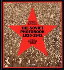
The Soviet Union was unique in its formidable and dynamic use of the illustrated book as a means of propaganda. Through the book, the U.S.S.R. articulated its totalitarian ideologies and expressed its absolute power in an unprecedented way—through avant-garde writing and radical artistic design that was in full flower during the 1920s and ’30s. No other country, nation, government or political system promoted itself more by attracting and employing acclaimed members of the avant-garde. Among them were writers like Semion Kirsanov, Vladimir Mayakovsky, Ilya Selvinsky, Sergei Tretyakov and Kornely Zelinsky. artistic designers like Gustav Klutsis, Valentina Kulagina, El Lissitzky, Sergei Senkin, Varvara Stepanova, Solomon Telingater and Nikolai Troshin. and photographers including Dmitry Debabov, Vladimir Griuntal, Boris Ignatovich, Alexander Khlebnikov, Yeleazar Langman, Alexander Rodchenko, Georgy Petrusov—not to mention many of the best printers and book binders.
The Soviet Photobook 1920–1941 presents 160 of the most stunning and elaborately produced photobooks from this period and includes more than 400 additional reference illustrations. The book also provides short biographies of the photobook contributors, some of whom are presented here for the first time.
Text von der Webseite.
Katalog erschienen zur Ausstellung in Arts Santa Mònica, Barcelona, 06.04.-28.05.2017
Legible-Visible. Between the Film Frame and the Page explores the relationship between print publications and audio-visual documents, two of the most important media underpinning the social and cultural landscape of our time which also define the evolution of contemporary art in the 20th and 21st centuries.
The emergence of relatively inexpensive home video technologies in the 1970s brought with it an alternative model for the creation and diffusion of artist publications, and a prolific period of exploration, reflected in the work of Baldessari, Gilbert & George, Boltanski, Carrión, Rucha and Rosler, among others. The popularization of digital media at the beginning of the 21st century sparked a revolution in the systems of production of both audio-visuals and books, exemplified by a new generation of artists, such as McGeorge, Kentridge, Cine Quieto or Van Leijsen.
Mela Dávila proposes a theoretical and historical framework for works that the market long dismissed as secondary on account of their serial nature. This characteristic, together with the particular space of experience they generate, and the linearity and temporality common to both media, have opened up a range of new narrative (or anti-narrative) possibilities which have enabled artists to redefine contemporary art.
Starting from a detailed study of 24 double works, Maite Muñoz looks at how different artists have taken advantage of the permeability between publications and audio-visuals, in which ideas and strategies of narration and editing intrinsic to both mutually infect and enrich one another through the play of opposition, complementarity and dialectics.
Text von der Webseite
Katalog zur gleichnamigen Ausstellung in der Fondadtion Cartier pour l'Art Contemporain, Paris, 30.03.-10.06.2018.
In Freeing Architecture, Ishigami elaborates upon his most recent research into function, form, scale and the environment in architecture, thereby revealing his vision for the future of the field. Through over 40 models, as well as numerous films and drawings, the exhibition presents twenty projects from their genesis to the complex process of their realization. Far from being tools prior to construction, the models assembled in the exhibition were made specifically for the occasion. As viewers contemplate these hand-crafted works, assembled in the architect’s studio over the course of one year, one can see the many steps and the painstaking work that led to the development of their final form. All different in terms of their material, size and level of detail, they offer a glimpse of the slow maturation process, necessary for the creation of Ishigami’s architectural works. Works infused by a poetics that is achieved as much through experimentation, as it is by theory, knowledge, and technology.
Text von der Webseite
This is the first in a series of reprint programme of the most representative titles from the TRAX catalogue, one for each letter of the name: T for Traxman, the comics series created for Frigidaire magazine by Massimo Giacon and Vittore Baroni. R for Rednight, a collective homage to the work of William S. Burroughs. A for Anthems, alternative national hymns for real and imaginary countries. X for Xtra, audio works composed at distance through a process of crossed interferences. Each reprint, accompanied with old and new texts, contemplates a digital remastering of the original works with the addition of remixes, remakes or new compositions created in concordance with the peculiar and distinctive "modular" approach of TRAX.
A version of this book was published in installments on the Internet during 1996 and 1997.
It’s nearly 50 years ago that my book of conceptual instructions Grapefruit was first published. In these pages I’m picking up where I left off. Now it's being published in book form. I'm riding a time machine that's going back to the old ways! Great! I added my dot drawings to give you further brainwork. I’m just planting the seeds. Have fun.
Text aus dem Buch.
Erschienen zur Ausstellung bei der FOR-SITE Foundation, San Francisco 27.09.2014-26.04.2015.
Internationally renowned Chinese artist and activist Ai Weiwei is one of contemporary art's most newsworthy figures, noted for both his groundbreaking work and his outspoken stance on human rights, which ultimately resulted in his controversial 2011 detainment. In an astonishing new large-scale project, he turns his attention to Alcatraz—a place he could not visit because he was not permitted to leave China, but that stands as a world-famous symbol of both incarceration and protest. This book showcases the major exhibition presented by FOR-SITE Foundation of site-specific, multimedia installations and sculptures Ai Weiwei create for the island, on view from the fall of 2014 through the spring of 2015. Featuring beautiful photographs and thought-provoking text, At Large is the essential document of this remarkable happening from one of today's most celebrated artists.
Text von der Website.
Special issue published to celebrate the 22nd edition of L'Étrange festival, dedicated to the strangest and most provocative cinema. Published on the occasion of the 22nd edition of L'Étrange festival, Forum des images and Cinéma les Fauvettes, Paris, 07.-18.09.2016.
30x21,4 cm, 2 Teile. keine weiteren Angaben vorhanden Hardcover, Leineneinband, Prägedruck, Fadenheftung. Beigelegt eine Liste der Künstlerinnen mit ihren Arbeiten
ZusatzInfos
Dokumentation des ersten Austellungsprojekts von Projekt Perineum 2000 in der Färberei in München, einem Ausstellungsraum des Kreisjugendrings, 06.05.-27.05.2009. Gezeigt wurden 119 Arbeiten von 60 Künstlerinnen. Projekt Perineum ist eine offene Plattform für Künstlerinnen, gegründet im Dezember 2008.
Mit einem einführenden Text von Sophia Süßmilch
Publikation zur New York Art Book Fair 2017. Printed Matter presents the twelfth annual NY Art Book Fair, from September 22 to 24, 2017, at MoMA PS1, Long Island City, Queens. Free and open to the public, the NY Art Book Fair is the world’s premier event for artists’ books, catalogs, monographs, periodicals, and zines. The 2017 NY Art Book Fair will feature over 370 booksellers, antiquarians, artists, institutions and independent publishers from twenty-eight countries. This year’s NY Art Book Fair will include an ever-growing variety of exhibitors - from zinesters in (XE)ROX & PAPER + SCISSORS and the Small Press Dome representing publishing at its most innovative and affordable, to rare and antiquarian dealers offering out-of-print books and ephemera from art and artist book history, plus the NYABF-classic Friendly Fire, focused on the intersections of art and activism. NYABF17 will host an array of programming and special events, including: The Classroom, a curated engagement of informal conversations, workshops, readings, and other artist-led interventions, for the eighth year running, as well as The Contemporary Artists’ Book Conference (CABC), in its tenth year, featuring two full days of conversation on emerging practices and issues within art-book culture.
Text von der Website.
Acclaimed artist Kenneth Goldsmith’s thousand-page beautiful homage to New York City. Here is a kaleidoscopic assemblage and poetic history of New York: an unparalleled and original homage to the city, composed entirely of quotations. Drawn from a huge array of sources—histories, memoirs, newspaper articles, novels, government documents, emails—and organized into interpretive categories that reveal the philosophical architecture of the city, Capital is the ne plus ultra of books on the ultimate megalopolis.
It is also a book of experimental literature that transposes Walter Benjamin’s unfinished magnum opus of literary montage on the modern city, The Arcades Project, from 19th-century Paris to 20th-century New York, bringing the streets to life in categories such as “Sex,” “Commodity,” “Downtown,” “Subway,” and “Mapplethorpe.”
Capital is a book designed to fascinate and to fail—for can a megalopolis truly be written? Can a history, no matter how extensive, ever be comprehensive? Each reading of this book, and of New York, is a unique and impossible passage.
Begleitpublikation zur Ausstellung "Daniel Knorr - Scherben bringen Glück" in der Kunsthalle Fridericianum Kassel, 07.12.2008-04.01.2009, und der Ausstellung "Daniel Knorr - Led R. Nanirok", Kunsthalle Basel, 20.09.–15.11.2009.
The book is the first monograph on Daniel Knorr, one of the most important Romanian artists of the younger generation. Designed by Ludovic Balland in close collaboration with the artist, the publication is produced as an independent project alongside with Knorr's comprehensive survey exhibition at Kunsthalle Basel.
Text von der Webseite
Flyer aus der Ausstellung The Most Dangerous Game - Der Weg der Situationistischen Internationale in den Mai 68, im Haus der Kulturen der Welt, 27.09.—10.12.2018
The Bermuda Love-Triangle, from 1988, is Tom Grothus's most elaborate production. The printing is all offset-lithography on quality stock. The black, red, and yellow cover includes some spot varnish highlights. The 24 leaves inside are printed in blue and black ink, for 48 pages of content. Interspersed among the pen-and-ink drawings are several beautiful duotones of pencil and ball-point-pen drawings. Some of the images in this book are like those of a dream that haunts you with an elusive meaning. The common literary thread throughout is a list of various proposed freedoms, such as the "Freedom to Obey Puppets." These may fill in some of the gaps left in the U.S. Constitution by that nation's founding fathers. Editor's Note: Gripping, lovely, haunted, serene, and impeccably surreal, this book of gentle hallucinations defies categorization. You might call them cartoons, but they will make you laugh silently for weeks. This is one of the nicest books we have ever held.
Text von der Website.
Flyer zu der Ausstellung 27.09.—10.12.2018.
Zwischen 1957 und 1972 konzipierte die Situationistische Internationale (S.I.) zunächst eine „Revolutionäre Front in der Kultur“ und verlegte ihre Propaganda dann auf das politische Feld. Mit den Methoden des Spiels übte die Bewegung grundsätzliche Kritik am Spektakel der Warengesellschaft. In einer Zeit, in der marktwirtschaftliche Prinzipien zunehmend alle Lebensbereiche durchdringen, regt The Most Dangerous Game eine Neubetrachtung der Jahre an, in der die S.I. ihre Kritik formulierte.
In Bezug auf eine verschollene Collage des S.I.-Mitbegründers Guy Debord erinnert der Ausstellungstitel einerseits an den revolutionären Ernst, mit dem die S.I. die Auseinandersetzungen der Nachkriegszeit radikalisierte. Andererseits betont er das Element des Spiels, das sie auf all ihren Wegen umtrieb. Als „Spielraum“ dienten ihnen die Großstadt und das Alltagsleben. Hier suchten sie die Konfrontation mit dem bürgerlichen System – ästhetisch durch eine „Konstruktion von Situationen“, theoretisch durch genaue Analysen der modernen Warengesellschaft.
Text von der Webseite
[44] S., 36x28,5 cm, Auflage: 1.000, ISBN/ISSN 1590051742 Hardcover, Fadenheftung, Leineneinband, Titel geprägt. ehem. Bibliotheksexemplar, Loyola Marymount University, siehe Etikett im Vorsatz und Aufdruck auf den Schnitt
Recto, Verso is the latest attempt to grasp the magnitude of the monumental archive of photograms that Robert Heinecken created during the past 40 years. In this current sampling, comprised of work from his own archive, Heinecken offers a look back at the decade of the 1980s, where decadence and narcissism inhabit the same space as spirituality and family values. Though the patinas of these color photograms speak of that generation, their revelations are contemporary in their incisiveness. In looking at the history of the photogram, beginning with Henry Fox Talbot’s ‘photogenic drawings’ and Man Ray’s ‘Rayographs’, Heinecken must be viewed as its most rebellious practitioner – unflinching, enigmatic and alert. Robert Heinecken’s work has been widely exhibited in the United States, Europe and Asia, and is included in many major collections, including the Museum of Contemporary Art, Chicago. LA County Museum of Art. and the Center for Creative Photography, Tucson. Recto/Verso is printed in a first edition of 1,000 casebound copies, with an introduction by Rod Slemmons, Director of the Museum of Contemporary Photography, Chicago.
Text von der Webseite
Schwarz-Weiß-Drucke, Nr. 006 aus der Reihe !00for10
Grady gordon is originally from santa fe, nm. His art is DeepLy influenced by various mythologies from across the world. In each new series he finds a particular myth to re-appropriate into a new version, and of course creates the images solely in black and white. Grady utilizes the most crude mark-making instruments to bring about the characters that inhabit the invisible plane. He works entirely by removing thick black ink from a plexiglass surface. The monotype print is a study of impermanence. Unlike other forms of printmaking the monotype offers only one copy.The original image on the plate is then given back to the ether, back into the fabric.
Text von der Webseite.
Schwarz-Weiß-Drucke, Nr. 029 aus der Reihe 100for10.
Christoph Vieweg is a drawer and illustrator, based in Berlin. He realizes his art mainly through drawings which focus on everyday observations. Most recently, Vieweg was engaged in the project SOWEIT DIE MELDUNGEN in which he attempts to artistically explore daily news delivered through radio podcasts. The challenge of the project is to keep up the artistic output of at least one drawing per day, each of it representing one received news item. Vieweg’s work presents itself in complex serial blocks which again and again aim to visualize and capture the undertone of the society we live in.
erschienen zur Ausstellung 30.04.-25.07.2010
Mit Essays von Benjamin H.D. Buchloh und Birgit Pelzer sowie einem Text von Herman und Nicole Daled.
The Brussels-based collectors Herman Daled and Nicole Daled refuse to perceive art as decoration and to, thereby, exploit it. They approach art in a fundamentally different way: Basis for their activities are their relationships and conversations with artists.
In keeping with the aim of Conceptual Art that places the intellectual content of a work above its realisation, they consider themselves not collectors but communicators and producers: They provide artists with the opportunity to also realise works outside of established market mechanisms. Their intense engagement with Conceptual Art, one of the most important movements in recent art history, goes far beyond usual collecting practices. This is not only apparent in the actual works, but also in the meticulously archived documents containing actions and works.
One of the most important influences for Herman and Nicole Daled was Marcel Broodthaers, more than 80 of his works are in their collection. Moreover, the collection holds several works by Daniel Buren, Dan Graham, On Kawara, Sol Lewitt, Niele Toroni, Lawrence Weiner, Cy Twombly and many more.
Text von der Webseite
Schwarz-Weiß-Drucke, Nr. 037 aus der Reihe 100for10
Before studying Arts I did my Bachelor Degree in Arts and Multimedia. In my first academic studies I was confronted with most digital media and how to use them in creative, functional or artistic way. I appreciate the wide field of modern creativity tools that I got to know. But actually I felt deeper connected to handcraft because I can express myself more immediate. So I decided to go back to the roots and applied at the Academy of fine Arts in Munich. I visited my Professor with giant artworks of naked bodies and peculiar cartoons. The painting showed strong emotion, pubertal suffering and indignation. Although it became more calm inside myself, I still stand for an type of art that results out of the psyche. So please enjoy watching my pictural diary.
Text von der Webseite.
Schwarz-Weiß-Drucke, Nr. 040 aus der Reihe 100for10.
Lukas Schönthal‘s alter ego is LUKI. An alter ego is „another self“ — a second personality within a person. It is also called leading a double life or could be described as„a second self, a trusted friend“. Schönthal is doing classical graphic design jobs such as corporate designs. Alter ego LUKI stands for art and illustration. He is working on various personal projects as well as commissioned ones. Born, raised and currently living in germany‘s most livable city, Karlsruhe.
Text von der Webseite.
Schwarz-Weiß-Drucke
Stephanie Wunderlich studied Communication Design at both FH Augsburg and ISIA Urbino. Based in Hamburg she works as a freelance illustrator for international magazines and publishers of books. She also teaches illustration, most recently at the FH Mainz. Her favourite materials are scissors and glue with wich she realises collages using a combination of manual an digital techniques. She’s received awards from Art Directors Club Deutschland, American Illustration and 3×3 Magazine.
Schwarz-Weiß-Drucke, Nr.050 aus der Reihe 100for10
GhalamDAR (“the writer” in Farsi) born in 1994, is an UK based Emerging artist working primarily as a graffiti artist and illustrator since 2006. He is an active member of Calligraffiti ambassadors’ community and one of the artists who’s playing a key role in the graffiti scene of his country, Iran. He is counted between the four major and most recognized Iranian street artists by “Art Radar Journal” in 2015.
Text von der Webseite.
Schwarz-Weiß-Drucke
I am an illustrator, born in Berlin. Now I live and work in small and peaceful Saarbrücken, where I also studied visual communication and teach illustration classes. To draw twisted thoughts in the most simple way, is what I love most. I often draw for magazines, newspapers and musicians. And for fun, of course.
Schwarz-Weiß-Drucke
Based in a quiet undisclosed studio a short train ride outside of downtown Berlin, artist Peter Aurisch creates some of the most original tattoos in the city — and in a place with an estimated 2,000 tattoo artists, that’s saying something. To keep his ideas fresh and original, he may only begin planning a new piece when the client first arrives. He tends to work freehand without sketches or source imagery, and instead draws inspiration from stories and details provided by his customers. Aurisch’s studio is called Johnny Nevada, he takes only a single appointment daily.
Schwarz-Weiß-Drucke
My name is KID, I’m 28 and I’m based in Lisbon, Portugal.I’m a Rock’n’roll musician, and studied Architecture for 4 years. Around 3 years ago, I became a photographer. Since that, I mainly shoot with film – 35mm, medium format, polaroid and instant film, and others. Photography is one of the most amazing and beautiful ways to express yourself, as diary or editorial. I really like to be able to tell some story with a photo, or to create some emotions with it. With photography, we are able to keep a moment forever.
Schwarz-Weiß-Drucke
My name is Aleksi but on the interwebs I’m known as xbstrxct. I’m a visual artist and a creative maker, obsessive doodler from Helsinki. My journey into the world of art started at a young age when I discovered the joys of scribbling your name to the walls of public buildings. I did this for quite some time but at some point people weren’t very fond of it anymore. Nowadays my days are mostly spent drawing weird repetitive shapes and abstract patterns on pieces of paper, mainly because I got nothing better to do, but also because it’s lots of fun. These drawings often grow into wildly expanding, neverending little worlds of their own. My tools of choice are fineliners & markers, with them I try to make art images that at are fun, easily approachable, interesting and most importantly, nice to look at. Sometimes I succeed.
An American original, Patti Smith is a multi-disciplined artist and performer. Her work is rooted in poetry, which infused her 1975 landmark album, Horses. A declaration of existence, Horses was described as `three chords merged with the power of the word'. it was graced with the now iconic portrait by Robert Mapplethorpe, the subject of her award-winning memoir Just Kids. Initially published in 1998, Patti Smith's Complete Lyrics was a testimony to her uncompromising poetic power. Now, on the fortieth anniversary of the release of Smith's groundbreaking album, Collected Lyrics has been revised and expanded with more than thirty-five additional songs, including her first, 'Work Song', written for Janis Joplin in 1970, and her most current, 'Writer's Song', to be recorded in 2015. The collection is liberally illustrated with original manuscripts of lyrics from Smith's extensive archive. Patti Smith's work continues to retain its relevance, whether controversial, political, romantic or spiritual. Collected Lyrics offers forty-five years of song, an enduring commemoration of Smith's unique contribution to the canon of rock and roll.
Klappentext
2. Auflage
128 S., 25x19 cm, Auflage: 2.300, keine weiteren Angaben vorhanden Plakat mehrfach gefaltet als Banderole, ausgefaltet A 1 (84,1x59,4 cm), Schutzumschlag mit partieller Lackierung (vorne Buchstabe 'A', hinte 'Z', Buchdecke Graupappe 1 mm mit Blindprägung, Buchdecke ohne Vorsatz, Fadenheftung mit offenem Rücken, innen verschiedenfarbige Papiere, eingeklebte Postkarte
Entlang von 26 Charakteren des Alphabets werden ausgehend von Herkunft und Tradition der tgm deren heutige Aktivitäten und Ziele vorgestellt. So erfährt der Leser unter „A wie Anspruch“, dass sich die tgm den Bildungsauftrag 1890 selbst übertragen hat. Oder unter „L wie Leidenschaft“, dass – auch in der Typografie – Außergewöhnliches nur mit Leidenschaft entsteht, wie anhand von fünf renommierten, mit der tgm in enger Verbindung stehenden „Überzeugungstätern" bewiesen wird.
Text von der Webseite
[124] S., 18x13,5 cm, ISBN/ISSN 9782954197401 Broschur, Buchrücken aufklappbar, gefaltetes Plakat in eingeklebter Papierhülle, Posterformat 85,4x64cm, in Schutzhülle mit Aufkleber
A journal written at the third person that seeks to depict Antoine d’Agata’s quest – the inexorable course from void to void.A literary and photographic experiment where words, sometimes descriptive, sometimes poetic, intersect with images in a narrative continuity. An example of the photographer’s existential choice and form of resistance which leads toward the subject’s disappearance and the ego’s negation within the neutral spectrum of the image while insisting on an intimate involvement with its matter and a perfect superposition of art and life. The pictures have been treated and reduced to the simple black and white contrast, following the main axis of this editorial project: shaplessness and the sense of fading-out. This flattening to a drawing effect releases the image as a shadow, a border between a recognizable sign and a blurry, ambiguous one, so that the photograph is both “trace” and “other”. The book, whose main language is English, also foresees a separate and folded poster, including texts in French on one side and, for the first time, in Italian on the other printed on a background colour image. The two languages allow to include texts in their original version, but allude as well to the artist’s double origins. In line with the book, the poster also reflects d’Agata’s search direction towards the interlacing of word and image and it finally refers to the idea of a topographic description of passions. Member of the Magnum agency, Antoine d’Agata (1961) is one of the most influential photographers of his generation. He lives in both Paris and Marseilles and he works around the world. He is represented by the gallery Les Filles du Calvaire, Paris.
Text von der Webseite.
Nr. 9, November 2018. Gedruckte Korrektur neben Jahreszahl 2019 in Pink.
OWK is an independent visual library for words and images that create linear or abstract stories providing a structure for publishing and archiving projects. We focus on graphic design, illustration, photography, art and creative writing.
OWK is a Riso print project, meaning that color will fail to present photographs in its purest form. Registration too will fail and colors will be imperfect. It is what it is. An experimental electronic single drum screenprint with its own unique aesthetic and feel.
Text von der Webseite
Erscheint anlässlich der Ausstellung “Joseph Beuys – Difesa della Natura”, 13.05.-14.08.2011, Kunsthaus Zürich, herausgegeben von der Züricher Kunstgesellschaft/ Kunsthaus Zürich. 3 Ausgaben, italienisch, deutsch, englisch.
12 May 2011 is the 90th anniversary of the birth of Joseph Beuys (1921-1986), one of the key figures in the artistic scenario of the last century. The Kunsthaus in Zurich is paying tribute to the German master by staging an important international event that forms an integral part of the exhibition entitled “Joseph Beuys – Difesa della Natura” (Joseph Beuys – Defense of Nature), curated by Lucrezia De Domizio Durini and Tobia Bezzola. This book marking the birthday of this German painter and sculptor, who was one of the most authoritative and innovative voices of post-war society, is also being published in English and German. The book, about 1,000 pages long, containing more than 200 illustrations from the historical archive of De Domizio Durini, describes the Living Sculpture which made Beuys famous, together with the historical background that is fundamental to comprehending his thinking and work.
Text von der Webseite
Frequently using her own body as a starting point, she has subjected herself to ordeals testing physical and psychological boundaries, as she did most famously during the 736 hour-performance The Artist Is Present, where visitors were invited during the course of her large retrospective to sit opposite Abramović. and share a silent but intense contact that often caused a highly emotional response – an act that in its very simplicity can be seen as a radical culmination of a 40 year-process of reduction and concentration.In a satisfyingly confrontational and open conversation, Marina Abramović. talked with mono.kultur about the nature of invisible energy, the many criticisms she has been facing and what cosmetic surgery has to do with art. Graphically, the issue is an exercise in friction and restraint, by setting up the three elements of text, images and subtitles on different grids and letting chance run its course. All works were selected by Marina Abramović. as personal milestones in her career.
Text von der Website.
Chances are that you will be far more familiar with Brian Eno and his work than you might realise. Whether you know him as a founding member of the gloriously influential 1970s art-rock outfit Roxy Music, or as the inventor of ambient music, in one breathless career Eno has actually released no less than 25 solo albums and contributed to countless projects and collaborations, but also left his fingerprints on dozens of seminal albums as a producer – think U2, Talking Heads or Coldplay, to name but a few – composed several film scores not to mention the start-up theme for Microsoft’s Windows 95. All of which is to say that it is hard to not be in earshot of his musical influence in one way or another. With mono.kultur, Brian Eno talked about the impact of technology on culture, the similarities between producing music and parenting, and why they called Elvis ‘The Pelvis’. Given Brian Eno’s interest in how art can affect moods and emotions, our new issue turned into somewhat of an experiment in chromatics, with the pages gradually traveling the entire colour spectrum from yellow to blue and back again, which not only affects the optical perception of the yellow text, but also how one responds to the content of the interview. Suffice to say: this must certainly rank as the most colourful mono.kultur to date.
Text von der Website.
Inspired by the press images from the Vietnam War that told a very different story to the official government statements, James Nachtwey found his calling that he would pursue with determination and compassion that are admirable: to document the effects of war, terror and disease. In the hope of raising awareness and inspiring intervention and change, his photographs are neither easy to look at nor easy to forget. Having witnessed and reported on the defining conflicts and tragedies of the past three decades – from the revolutions of South America and Eastern Europe to the famines in Africa, from 9/11 to the wars in Iraq and Afghanistan – Nachtwey’s photographs focus on the costs of war: the suffering of civilians, the damage and the scars. There is no doubt that Nachtwey’s images are a challenge – to the powers that be by proposing an unflinching look at the reality on the ground, at the effects of politics on human lives, but also to us as their audience, by questioning our implication and, quite simply, by opening our eyes to the world. In a rare and frank interview with mono.kultur, James Nachtwey talked about his struggles with photography, the different realities of war, and why images have the power to create change. Graphically, the issue is at its most reduced, giving ample space to let the words and images unfold: coming in two separate booklets, it presents a personal and uncommented selection of James Nachtwey’s work in one, and a highly intriguing and challenging conversation in the other.
Text von der Website.
Politics and the dance floor make for uneasy bedfellows, and it is this uneasiness that drives most of the work of Terre Thaemlitz, confronting head-on issues that are usually off limits in electronic music. Thaemlitz is a producer and DJ, also known under their monikers of DJ Sprinkles, Social Material, and K-S.H.E, among others. But they are also a writer, educator and activist of sorts, with very fluid notions of gender, switching continuously between male and female drag. Born in 1968, Terre Thaemlitz left the rigidly conservative and violently homophobic environment of their home state, Missouri, in the mid-1980s for New York. They became involved in the queer and transgender scenes both socially and musically at a time when house music was not a genre but simply the wide open sound of a specific social and political space. As New York’s underground queer music scenes dissolved under gentrification, Thaemlitz eventually relocated to Tokyo at the beginning of the ’00s. In a challenging interview with mono.kultur, Terre Thaemlitz talked about the politics of sexuality, his disillusion with the music industry, and why roller disco was so amazing. Visually, the issue is a dark affair, steeped in a dirty, gritty black. Printed on no less than six different paper stocks and juxtaposing several grids and graphic systems, it creates its own visual logic – only to disturb our most fundamental habits of reading and navigating a magazine by opening backwards, from right to left.
Text von der Website.
Edmund de Waal is a potter. His pots, plates, and vessels are the result of craft and mastership, but they are also so much more than that: they are experiments in form and function, abstractions of thoughts on silence and space, on repetition and failure, on substance and fragility, on memory contained. Edmund de Waal is an artist. He arranges his objects in complex choreographies that are as mysterious as they are mesmerizing. Displayed in galleries and institutions worldwide, his considered installations play with architectural concerns, integrating ideas of space, light and obscurity. Edmund de Waal is a writer. Whether he sculpts with words or with clay, what Edmund de Waal works with are concepts, ideas, and desires. In a body of work that is at odds with our times and yet oddly successful, his writings and objects overlap and integrate each other in an attempt to understand and transcend our complex relationship with objects and our surroundings. In an interview with mono.kultur structured like an A-Z of notes and ideas, Edmund de Waal talked about his rules of attachment, the impossibility of repetition, and why ‘doubt’ is the most beautiful word. Visually, the issue takes inspiration from that most perfect of materials: porcelain. Printed entirely in double-sided splendour, the two finishings of the paper – shiny gloss and smooth matt – evoke the texture of ceramics before and after glazing.
Text von der Website.
In our most colourful issue yet, we step into the life and work of architect Francis Kéré, known in equal measure for his lighthearted and innovative architecture, his remarkable background, and his infectious sense of optimism. Kéré has completed numerous projects both in Africa and beyond, including schools, medical centres, cultural institutions, and temporary installations, such as the renowned annual Serpentine Pavilion in 2017. Frequently relying on local materials and infrastructure, his work is marked by a profound simplicity and refreshing lightness, meeting technical problems with surprising and seemingly effortless solutions. It reflects his attitude that architecture should, in its most primary function, seek to improve the lives of the people who inhabit it. With mono.kultur, Francis Kéré talked about his long trajectory from a remote village in Africa to Berlin, his steadfast belief in optimism, and what makes a tree a perfect piece of architecture. Designwise, we followed Kéré’s principle to work with what is at hand, sourcing papers from dead stock at our printers’, essentially using an assortment of leftovers. And colour, of course, with the issue based on the national colours of Burkina Faso, paying tribute to the idea of culture as a shared ground to build upon.
Text von der Website.
[344] S., 29,2x20 cm, 5 Teile. ISBN/ISSN 9783791356549 Softcover aus Kunststoff mit Einstecklaschen, Prägedruck. Vorne eingesteckt eine Umtauschkarte, Faltplan mit Künstlerliste. Rückseitig eingesteckt ein Heft Athens Map Booklet mit eingelegtem Faltplan von Athen
Deutsche Ausgabe. Das documenta 14 Daybook betont mit seiner tagebuchartigen Struktur sowohl die 163 Kalendertage der Ausstellung – eine erstmalige Verlängerung der traditionell 100 Tage dauernden documenta – als auch den persönlichen und subjektiven Zugang der Besucher_innen zum Geschehen. Allen documenta Künstler_innen wurde im Daybook ein Tag überlassen, der im Buch sowohl einen in Auftrag gegebenen Text beinhaltet, als auch von den Künstler_innen speziell für die Publikation ausgewählte Bilder. Die Texte wurden von unterschiedlichsten Autorinnen und Autoren verfasst – Kritiker_innen, Kurator_innen, Dichter_innen, Schriftsteller_innen, Historiker_innen – und geben in verschiedenen literarischen Formen – als Kritik, in Briefen, Gedichten und Parabeln – tiefgehende Einblicke in die kü.nstlerische Praxis der Kü.nstlerinnen und Kü.nstler. Ergänzt wird das Daybook durch zwei Broschü.ren, jeweils eines für Athen und Kassel, die in der Ausstellung erhältlich sind. Die Broschüren können in den Schutzumschlag des Daybook eingelegt werden und vervollständigen damit das Buch.
Text von der Webseite
Munich Jewellery Week, held from 11.03.-17.03.2019 showcases avant-garde contemporary jewellery by both established and up-and-coming designers from all around the world. This yearly gathering is by far the most significant event on the contemporary jewellery calendar. it’s a unique phenomenon, and it sets the pace for the contemporary jewellery field. Current Obsession Magazine and Platform coined the title Munich Jewellery Week in 2015 to give a name to this extraordinary collective effort and to associate it with other professional fashion and design weeks around the world.
Text von der Website.
Diese Publikation bringt Bilder und Papierarbeiten von Holger Bunk aus den Jahren 2001 bis 2009 mit zwei Satzfundstücken von Slavoj Zizek (Die Tücke des Subjekts) und von Niklas Luhmann (Schriften zur Kunst und Literatur) zusammen
Katalog zur Ausstellung im Museion, Museum für Moderne Kunst Bozen, 13.09.-17.11.1996, Frankfurter Kunstverein, 21.01.-03.03.1997."Purely visual perception and viewing of pictures is impossible. We always encounter pictorial images - as in this book description itself - in contexts. It is to this complex of interrelationships between text and photography and the aesthetic potential it holds that the book photo text text photo is dedicated. Based upon a representative selection of important examples of this work across media boundaries from recent photographic history since 1967, the theme of the fertile tension between words and images is explored in images (more than 100 works by 32 different artists) and words (texts by Andreas Hapkemeyer and Peter Weiermair). This revealing look at the art of combining text and photography begins with the milestone works of Conceptual Artists such Joseph Kosuth, Robert Barry, Douglas Huebler, On Kawara, John Baldessari and Hamish Fulton. Alongside other early examples from Italy - Maurizio Nannucci, Giulio Paolini, and Vincenzo Agnetti - the book also features representatives of utopian and critical approaches to social issues, including Josef Beuys and Klaus Staeck. The 1970s and 1980s are represented by the artists Ketty La Rocca, Jochen Gerz, Karen Knorr and Urs Luthi. More recent and current positions are evident in the works of Louise Lawler, Jenny Holzer, Barbara Kruger, Ken Lum, Heiner Blum, Laura Padgett and Marie-Jo Lafontaine. The publication photo text photo provides a long-awaited inventory of the most recent developments in the aesthetic exploration of the relationships between text and images in contemporary art."
Text vom Schutzumschlag
29,7x21 cm, 8 Teile. keine weiteren Angaben vorhanden Umschlag, beklebt und gestempelt, ein Brief mit handschriftlicher Notiz, sechs farbige Luftballons
Luftballons bedruckt mit "A coisa mais importante na vida sao os sonhos, De que cor sao seus sonhos? The most important thing in life are dreams. What color are your dreams?"
Tape-Mag.com is a Non-Profit Online-Archive & Information-Database for Audio-Tape-Culture (Cassettes/Tapes/Reels) and 20th Century Art- & Music-related Small-Press Publications, Magazine-Culture.
This Archive-Database focuses on the following styles/genres.
- Mid 70's to late 90's Industrial, Experimental, Free Improvisation, Post- Punk, New Wave, Minimal, Synth, Ambient and further musical directions of the DIY-Cassette-Culture.
- early 50's to late 90's Sound Art, Sound Poetry, Text-Sound-Compositions, Poesie Sonore, Verbosonics, Lingual Music, Music Concrete, Audio Art plus related printed Mail Art, Concrete Poetry, Visual Poetry, Lettrisme, Fluxus
Here you are able to browse and research thousands of releases, find further information about the Artists, the Organisations, Press & Label-People behind the scene and/or the published Small Print, Magazines, Information-sheets and Artists-Manifests that all defined a very exciting culture and era. Most of the releases listed here were only released in very limited amount and are hard to find these days but they had without any doubt their important role in the development of contemporary audio & sound-art and music-history. These protagonists of a DIY (Do-It-Yourself)-Culture-Movement in which everybody can be an artist, label, distributor and press-editor or organisation deserves a comprehensive overview in a broader context with all its connections and a framework. With this Database the collected, provided and connected Information can become knowledge. Knowledge that Media in Internet-Age can hardly supply with the current Information Overload.
Text von der Webseite
[72] S., 29,7x22,5 cm, Auflage: 500, ISBN/ISSN 9783864851704 Hardcover, fadengeheftet, Cover schwarzer Prägedruck auf blauem Leinen
ZusatzInfos
he King’s Beards or Hair. As a tribute to Elvis Presley on the occasion of the 40th anniversary of his death, Volker Renner stages the King as a collectible silhouette complete with the beard he never wore. The lips and famous hip swing are missing, but the hairline and above all the forelock are unmistakable. Elvis’s haircut is an early example of the pop icon trademark feature; many other heads would follow. Yet he, too, may have emulated earlier stars—the quiff bears a dangerous resemblance to that sported by Captain Marvel, Jr., an eternally youthful superhero, exactly what Elvis wanted to become and became. Conscious of the fact that Elvis was actually blond, making his hair just as fake as a fake beard, Renner’s game of mistaken identities plays out in color and black-and-white.
Text von der Webseite.
Schwarz-Weiß-Drucke, Nr. 013 aus der Reihe 100for10.
Rob Lowe, also known as Supermundane, is an artist, graphic designer, letterer, illustrator and printmaker with 20 years experience in the creative industry. His signature mesmeric drawings have been published and exhibited worldwide. He has been responsible for designing some of the most groundbreaking independent magazines of the last decade including the alternative children’s magazine Anorak and the award-winning food quarterly Fire & Knives. His practice is defined by a distinctive use of colour, line, simplicity and humour which can be seen through all his different disciplines from typeface design to his personal works.
Text von der Webseite.
We are heading into a future where our choices will be shaped – if not outright determined – by algorithms and artificial intelligence. This coming state has been labelled “the new dark age” (James Bridle, 2018).
It remains to be seen what this brings to photography, and vice versa.
One thing, however, seems clear: photography, which has already changed significantly in the 21st century, is affected by – and in some important ways is part of – this development. This issue of “Fotografija” explores how programmes, apps and AI-related technologies shape and change the discourse of photography, challenging traditional boundaries of the medium.
Various programmes and services – Google, Photoshop, Flickr, Snapchat, visual recognition, etc. – provide new tools to conceive image-making and think photographically. Technological interfaces not only deliver instruments for making work but can become the very logic for creating photographic series.
The presented artists offer perspectives to raise questions and discuss these technological shifts. From dealing with traumatic events (Indrė Šerpytytė) and inaccessible sites (James Bridle) through technological mediation to playing with our expectations of an all-pervasive Photoshop manipulation (Erin E’Keefe). From exploring so-called smart surveillance systems (Esther Hovers) and censoring politically sensitive sites (Mishka Henner) to everyday glitches (Mantas Grigaitis). From playing with the copyrights of such collective websites as Flickr (Penelope Umbrico) to exploring the shared language of being in some of the most photographed places on earth (Thomas Albdorf). And from using Photoshop to create images (Aaron Hegert) to an image that is barely photographic (Zachary Dean Norman). The four essays (Kate Palmer Albers, Roksana Filipowska and Marijana Rayl, Ilaria Speri, Alise Tifentale) map out the works in broader social, historical and art contexts.
In short, the works deal with our technologized world. They talk about being in the middle of changes that few have envisioned. Being so immersed, one can feel it (almost) hurts.
Text von Paul Paper.
38 S., 16,5x12 cm, Auflage: 200, numeriert, 3 Teile. ISBN/ISSN 9788896590669 Fadenheftung, mit rotem Faden, Papier Umschlag rau, Fotos Schwarz-Weiß. Mit zwei eingelegten Visitenkarten, Format 5,5x8,5 cm, Prägedruck in Blau auf gerissenem dunkelgrünem Papier, 7x10 cm
Reihe Invisible Cities, hrsg. v. Pierpaolo Pregnolato.
Basiert auf Fotografien von 1899, auf denen venezianische Gondeln in den Kanälen von London fahren
23,3x19,3 cm, Auflage: 153, numeriert, keine weiteren Angaben vorhanden Hardcover mit Prägedruck,im Innenteil des rückwärtigen Umschlags eingefasste Plexiglasscheibe mit verschiebbaren weißen Sand über dem Text: 7 Wovon man nicht sprechen kann. darüber muss man schweigen. In weißem Pappschuber
Erschienen zum 100 Geburtstag von Ludwig Wittgenstein für einen Wiener Verehrer des Philosophen.
Die Unterschrift von Wittgenstein wird Seite für Seite vergrößert bis in der Mitte des Buches fast nur noch eine schwarze Fläche sichtbar ist, die dann schrittweise in ein grob gerastertes Porträt von Wittgenstein übergeht und in Abschnitt 7 endet.
31x31,4 cm, Auflage: 100, numeriert, keine weiteren Angaben vorhanden Schallplatte in schwarzer Papierhülle, 2 Einzelblätter, Umschlag, alles zusammen in bedruckter transparenter Kunststoffhülle mit zwei zwei Papierklebestreifen verschlossen
Limited Gold Vinyl Edition of 100 vom 13.12.2019.
There's not much in the world that is more exciting than a record label's album release number one. If you feel about music like we do, then you will most probably agree. This sets a tone and foundation and we are very excited about this album being our #01. After many collaborations and work as producer, composer for famous artists, this now is ENIK's 4th official solo album and his first solo album in years. The Deepest Space of Now is a truly unique and trippy soundtrack.
Text von der Webseite
36 S., 14,5x15 cm, Auflage: 100, keine weiteren Angaben vorhanden Drahtheftung, im Umschlag vorne 3 Booklets und 1 gefaltetes Poster (Klang! Suoni Contemporeani) in Einschubtasche, rückseitig eine selbstgebrannte und -gestempelte Multimedia CD, Heftseiten Schwarz-Weiss Kopien mit 4 eingeklebten Farbbildern, auf dem Cover das Klang! Logo ebenfalls aufgeklebt
ARTE POSTALE! (1979-2009)
One of the best known and probably the most long-live mail art magazine on the planet, Arte Postale! has assembled original works or published materials by hundreds of international networkers. The project is considered concluded with issue n.100 (december 2009).
Text von mailartprojects.blogspot.com
When, just over twenty, I was assembling the first issue of the magazine Arte Postale!, joining with brass rings a dozen of sheets printed in one hundred copies on pink paper, I would never have imagined that thirty years later I would have been still busy putting together with scissors and glue the very same publication. Instead, this issue n. 100, intentionally produced in the homemade cut-and-paste style typical of mail art, even shares the musical theme with that first experiment, in which I already rubberstamped and glued leaflats on the pages or I stapled on them a piece of magnetic tape.
Introduction by Vittore Baroni
Issue no. 100 of Vittore Baroni's Arte Postale! magazine dedicated to the Klang! exhibition/sonic arts festival held in Viareggio, Italy, august 7-9 2009.
36 pp. booklet with attached cd-r, published in 100 copies (standard edition, in the AAP) plus 100 copies with additional plastic pouch including 30 original cd-size works by 30 artists (Joel S. Cohen, David Dellafiora, Mike Dickau, Carol Stetser, Ruggero Maggi, Emilio Morandi, Jan-Willem Doornenbal, Ever Arts, Luc Fierens, Richard Kostelanetz, Jurgen O. Olbrich, Gianni Simone, Rod Summers, Bruno Cassaglia, Ruggero Maggi, Serse Luigetti, etc.
Among them comes a CD mini-album by Jarmo Sermilä: Mechanical Partnership, a complimentary copy of the official Jase 2000 release - see Jarmo Sermilä - Mechanical Partnership.
Text von discogs Webseite
Audio
1. Mike Dickau - Arte Postale!: Pax Vobiscum (2’54”)
2. Günther Ruch - Musica 123456 (2’09”)
3. Reid Wood - Future Sound (0’27”)
4. Krell - Bzzzoing! (5’00”)
5. Franco Piri Focardi - Concerto Per Bozuffo (3’41”)
6. Jan Willem Doornenbal - Lake Crocodile (2’16”)
7. Bruno De Angelis - 100: Game Over! (4’ 30”)
8. Joel Cohen - Last Song Reverse (2’17”)
Tempo Totale | Total Time: 23’54”
31,5x22,5 cm, Auflage: 150, numeriert, signiert, keine weiteren Angaben vorhanden Box aus braunem Stülpdeckel Karton, Siebdruck, eingelegt 16-seitiges redaktionelles Schwarz-Weiss Heft, 55 Arbeiten von 65 Künstlern. Diverse Techniken auf Papier, dünnem Karton, Folie, Metall, plus 6 Multimedia Discs. Cover und Layout: Carlo Battisti. Zollinhaltserklärung beigelegt
BAU was founded in 2004 in Viareggio, on the coast of Tuscany, by a group of artists and individuals interested in the many-sided aspects of the culture of our times. Thanks to a widespread and constantly expanding network of contacts, every year the project takes the shape of an expressly designed UniA4 sized box: BAU container of contemporary culture. This non-profit box is produced in a limited edition of 150 copies (120 for issue 1 and 200 for issues 9-10) and contains original works, signed and numbered, from a large number of international contributors.
The BAU container fits in the vast tradition of assembling publications and artists‘ magazines that developed since the early sixties. It intends to experiment with new languages, technologies and materials, operating in a peculiar dimension of group work that is open also to contributions from non-artists: outsiders, travellers, collectors of curiosities, creative gastronomers, anomalous scientists.
In a relational and non competitive perspective that is responsive to the relationships between art and science, politics and environment, BAU acts as a meeting point in order to stimulate dialogues, interactions and exchanges among the most diverse disciplines: graphics, collage, photography and the visual arts in general, but also poetical and narrative researches, acoustic and performative experiences, documents pertaining the fields of fashion and design, etc. The operative network expresses itself also through the planning of exhibitions, meetings, festivals and events, organized in institutional spaces (libraries, galleries, museums) and in atypic locations.
Text von der Webseite
Gedenkausgabe John F. Kennedy, 29. Nov. 1963, "Including His Biography and His Most enduring Words, All of LIFE's Pictures and Text on the Most Shocking Event of Our Time"
Feuerstuhl ist eine antiautoritäre Zeitschrift, ein befeuerndes Scheit Holz, benannt nach einer mexikanischen Geschichte aus dem Roman "Regierung" von B. Traven, 1931
Aus dem Booklyn-Archiv. A diary on chronic illness. Spoons is a collection of diary comics that chronicle Grace's journey acclimating to her new diagnosis.' Confronting the ups and downs of living with multiple chronic conditions. Most of these pages were even created in the doctors office.
Aus New England
Text von der Webseite
erscheint zum 30jährigen Bestehen der Ausstellungsleitung Haus der Kunst München e.V. Geschichtlicher Rückblick auf die Aktivität des Vereins, der sich zusammensetzt aus Mitgliedern der drei Künstlergruppen Neue Gruppe Münchener Secession, Neue Münchner Künstlergenossenschaft.
Mit Texten von Renate Heise über u.a. Geschichte, Verfassung und Aufgaben, Satzung, Jurierungsformen, Internationale Ausstellungen, Mietvertrag mit dem Kultusministerium, Finanzierungsfragen: Künstlerfeste, "Gesellschaft der Freunde", "Gesellschaft der Freunde der Ausstellungsleitung Haus der Kunst München e.V." Mit Liste der Ausstellungen 1949-1979, inkl. Besucherzahlen
Die Ausstellungsleitung Große Kunstausstellung im Haus der Kunst München benannte sich 2014 um in "Künstlerverbund im Haus der Kunst München e.V."
23,7x16x4 cm, Auflage: 1.000, keine weiteren Angaben vorhanden Klappschachtel aus Hartpappe, mit Leinen überzogen, eingelegt 9 Partytröten mit farbigen Federn, 8 Stück mit grünem Druck und grüner Feder, eine in Gelb, Deckel und Rücken mit der Schachtel Prägedruck
Katalog zur Ausstellung 08.10.-07.11.2015 in der Galerie Greene Naftali. Die Ausstellung mit Gemälden und Zeichnungen ist im Miniformat auf den Tröten abgebildet
Plan zu den 12 Audioinstallationen an den Gebäuden der Akademie der Bildenden Künste im Rahmen der Jahresausstellung 2020, Pandemic Edition von dem Künstler*innen-Kollektiv Peace Damage, 25.07.-01.08.2020.
01 10000 Komplexaugen, 02 Most Wanted, 03 Partybaum, 04 Unter der Dusche, 05 Gulli, 06a Gemächt, 06b Gemächt, 07 Hauspost, 08 Scheiß drauf, 09 Miles and More, 10 Sieben Gebote, 11 Human Resources, 12 Paradies
[100 ca.] S., 29,7x21 cm, keine weiteren Angaben vorhanden Drahtheftung, drei Hefte, Banderole
ZusatzInfos
The title of series ‹Mechanical Brides› refers to an early book by Marshall McLuhan with the same title. It deals with questions about newspapers, comics, and advertisements and also reflects the role of women in popular culture. With the camera I was taking lots of photos from billboards showing portraits of women in Japan, America and Europe. These image are interesting as these models become role models for a lot of women. I worked on some of these images and produced stickers which I put back into the streets — to react on advertising companies putting into the streets and public spaces to claim back these spaces.
Text von der Webseite.
Buch mit den Arbeiten von Ignacio Uriarte, veröffentlicht unter dem Titel "Four Geometry Sets" . Der Künstler arbeitet mit alltäglichen Gegenständen aus dem Büro, in diesem Falle Linealen, Winkelmessern und Geodreiecken, und ordnet diese so an, dass er 72 symmetrische Kompositionen schafft.
The Flames #1, Flames is Folch Studio's independent publishing house
I had been in Cuba for almost a year studying in the Behavior Art School. One night, when my parents and I were having dinner at a tourist restaurant during one of their visits, I observed that most of the tables were occupied by couples made up of middle-aged tourists and Cuban girls. At the time (2008) the only option Cubans had to leave the country legally was to make a tourist man or woman fall in love with them and marry him or her. Love had become a kind of passport to freedom—or to the illusion of freedom, and winning someone’s heart and seducing them allowed Cubans to dream with a new life, a better—or different—life, regardless of it being real or unreal. That very day I decided to marry a Cuban man in order to understand and draw attention to what was happening in the country, that exchange of interests, that market of dreams, sex and company. My plan was to follow the same pattern. I would marry a Cuban man; I would give him the means to obtain the coveted papers and permits to leave the country in exchange of being able to use him in a work of art. I would use love to fool Cuban and Spanish bureaucracy. This is how the project Humanitarian Help was born. With that in mind, I organised a kind of public open call in which I offered to marry the Cuban man who wrote me “the most beautiful love letter in the world”, offering also to pay for the wedding expenses, his ticket to Spain and all the formalities to obtain Spanish nationality. This offer was aimed at those Cuban men who were interested in emigrating. A jury made up of three Cuban prostitutes would pick the winning letter and, therefore, my future husband. Mirroring the interested conditions that are usually applied in humanitarian aid, I required in the terms that the selected man be at my disposal for any request for the duration of the marriage. Once he acquired the Spanish citizenship, we divorced in accordance with the agreed terms and conditions. In the event that the work is sold, the profits will be shared out in equal parts.
Text von der Website
Hipgnosis created some of the most innovative and surreal cover art of the 1960s, 70s, and early 80s for the biggest names of the era—Pink Floyd, Led Zeppelin, Wings, Yes, Genesis, 10cc, Peter Gabriel, Bad Company, Syd Barrett, and Black Sabbath, to name just a few.
The sublime prism cover for Pink Floyd’s The Dark Side of the Moon continues to be one of the most pervasive images in all popular culture. Hipgnosis’s highly conceptual approach and graphic appeal earned them five Grammy nominations for cover design, and they profoundly influenced not only the history of music, but also all other creative fields from advertising to fashion.
Hipgnosis Portraits explores an endless stream of creative ideas in two sections. Part I, "Imagination," tells the story behind the artwork from germination through to the final sleeve design, supported by a wide array of archival materials. Part II, "Realization," contains beautiful and extremely photographic portraits of the musicians the agency counted as clients. Several of these images were taken but not used for projects and have remained buried in archives ever since.
The book is filled with playful, abstract compositions from a remarkably prolific collective that redefined the possibilities of concept-driven art and design.
Text von der Webseite artbooksonline.eu
Wir sind begeistert, die Debüt-EP des Schweizer Duos Gated Boyhood, auch bekannt als Mr. Peña und Dizco Joe, zu präsentieren. Die Musik ist eine Hommage an die alten Tage, als wir zusammen in der Rave-Höhle getanzt haben, übertragen auf die Gegenwart und bereit, dieses Gefühl sowohl alten Kennern als auch der neuen Generation zu vermitteln. Wir hoffen, dass es euch gefällt, denn es ist eines der am tiefsten verwurzelten Projekte unseres Labels, an dem viele liebe Menschen beteiligt sind.
We are hyped to present the debut EP of the Swiss duo Gated Boyhood, already known as Mr.Peña and Dizco Joe. The music is a tribute to the old days when we used to dance together down in the rave cave, transferred to the present and ready to provide this feeling to both old connoisseurs as well as the new generation. We hope you enjoy this one, it’s one of the most Deeply rooted projects of our label, involving many lovely people.
Text von der Webseite, Übersetzt mit DeepL
Die auf 50 Exemplare limitierte und handnummerierte Vier-Track-Kassetten-EP "Schellennietenregen", die über die Raketenbasis Haberlandstrasse vertrieben wird, ist das jüngste musikalische Werk von Xotox-Mastermind Andreas Davids.
Put out on the circuit as a limited to 50 copies hand-numbered four track cassette tape EP via Raketenbasis Haberlandstrasse is "Schellennietenregen", the most recent musical outing by Xotox-mastermind Andreas Davids.
Text von der Webseite, Übersetzt mit DeepL
1. Auflage
Die Arbeiten des Künstlers Andreas Seltzers über die "Hitze in Paris" nehmen den Rekordsommer 2003 zum Anlass, phantastische Pläne zu zeichnen, in denen imaginiert wird, wie das Ordnungsgefüge der Stadt schmilzt und wie sich damit aber auch der Blick auf die Geschichte kleiner und großer Revolten, auf groteske Zwischenfälle, erotische Verwicklungen und auf Alltagskatastrophen öffnet.
Die Publikation erschien anlässlich einer Ausstellung in der Laura Mars Gallery, Berlin. Neben vielen Abbildungen (mit Sinn fürs Situative platziertes kunst- und kulturgeschichtliches Material; Fundstücke aus der idiosynkratischen "Sammlung Seltzer" – Fotos, Postkarten, Handzettel, Zeitungsausrisse, Reklamegrafiken und andere Skurrilitäten mit verblüffendem Sachbezug; Beiträge anderer Künstler; Seltzers eigene Arbeiten) besticht der Band durch eine assoziativ verflechtete Auswahl kurzer Textpassagen einer Reihe von Autoren (Gustave Flaubert, Émile Zola, Louis-Ferdinand Céline, Henry Miller, Paul Nizan, Georges Bataille, Boris Vian, Raymond Queneau oder Heinrich von Kleist, um nur einige zu nennen), die Seltzer heranzieht, sein Thema, die "Hitze in Paris", zu vertiefen.
Ergänzt wird das handliche Buch mit drei Abbildungen von Andreas Seltzers gleichnamiger Zeichnungsserie. Seine Paris-Zeichnungen können als innere Stadtpläne des Künstlers gelesen werden. Da wimmelt es zwischen rot gerädertem Wegenetz von miniaturhaften Architekturen, Masken, tierischen und menschlichen Szenerien. Dazu eine Legende, die kein Mensch lesen mag – hier spricht einzig die Form: durchgearbeitet-manisch-faszinierend.
Text von der Website
66 S., 29,7x21,4 cm, keine weiteren Angaben vorhanden Hardcover, Cover mit goldenem Prägedruck, beigelegt ein Heft mit 14 Seiten, gestempelt von Wolfgang Müller, beigelegt zwei Postkarten (Geerken, ich küsse dir ..., Andryczuk, Merz ca 1952
erscheint anlässlich der Ausstellung Tabea Blumenschein in der Galerie K' vom 12.03.-04.06.2022.
In den Filmen von Ulrike Ottinger inszenierte sich Tabea Blumenschein mal als femme, dann als butch, wieder als Mann oder als sexy Pin-Up-Girl. Zu den beliebtesten Sujets ihrer Zeichnungen zählten Bartfrauen, Hermaphroditen, Matrosen, Knochengirls, Trans* und queere Charaktere. Tabea Blumenschein war queer, bevor dieser Begriff überhaupt existierte, so fasste es Philipp Meinert im Berliner Magazin Siegessäule mal zusammen.
Als Hartmut Andryczuk fragte, ob Tabea wohl Lust haben könnte, fünf Leporellos für eine Edition im Hybriden-Verlag zu zeichnen, war sie gerade dabei ihre Entwürfe für rote tote bag fertigzustellen. In dieser sollte das Künstlerbuch Die Tödliche Doris – Kostüme und Kulissen liegen. Das Buch selbst war mit ihren Kostümzeichnungen illustriert. Um die Erinnerung wachzurufen, hatte ich Tabea einige Wochen zuvor Fotos unserer Performances aus den 1980er Jahren mitgebracht. Diese zeigten unter anderem einen von Tabeas engsten Freunden, den Künstler Mark Brandenburg, der im Mai 1989 als auferstandene Doris in einer eleganten weißen Felljacke in Ostberlin auftrat. Oder Hausbesetzerin Elke Kruse, die mit dem von Nikolaus Utermöhlen entworfenen Knochenkostüm und verfilzten Haaren wie ein Rasta-Gespenst auftauchte. Erinnerungen stiegen hoch und Tabea erzählte vom aufwändigen Färben der vier Batikkostüme in ihrer großen Küche in der Erdmannstraße. Die Voodoo-Doll-Kostüme hatte Tabea in eigener Regie für den Open-Air-Auftritt auf der Nordseeinsel Helgoland hergestellt.
Aus den Erinnerungen entstand 2018 im Laufe von drei Wochen Tabeas Zeichnungsserie „Die Knochenband“, insgesamt 50 variierende Zeichnungen auf 5 Leporellos. Doris singt von der „Schuld-Struktur“ oder präsentiert sich in Tabeas Voodoo-Doll-Kostüm. Die Knochenband feiert fröhlich das Oktoberfest in Volkstracht oder sie singt im Tangoschritt vom „Apachentanz“. Ob Deadly Doris oder Doris mortelle – alle Menschen sind wie Doris: tödlich und sterblich. (Wolfgang Müller)
Text von der Webseite
"So it was evening, then it was morning: and it was the first day." How does the beginning of everything look like? That eternal energy that generated the first beginning, the early morning of all time, for Simona has to do with an explosion: the fire, linked to the Latin verb foveo and to the Greek words φῶς (phos), light. Imploded energy, the Genesis of all moments. It is with one of the simplest destruction tools, the Molotov bomb, that the artist opens her personal exhibition, where an explosion accompanies us on a journey that with great delicacy investigates the boundaries of human exploration, in its higher sense. That man who wants to know, measure, ennoble. How much space does the highest point of the Earth occupy? "I asked Silvio Mondinelli, the sixth mountaineer in the world to have climbed all fourteen of the eight-thousand of the Himalayan chain, (without the help of oxygen) to recover through memory the space of the summit of Everest. He traced its perimeter in 1: 1 scale on a piece of paper" says Simona. This perimeter was used as a template to create a marble base, where Silvio Mondinelli’s signs and writings make that memory immortal in the most faithful way possible. In that memory, Francesco Šljiva Venturi gives life to a primordial sound that once again seeks a point of contact with the origin, through the use of his voice and a single instrument: a shamanic drum, purpose-built by a craftsman for the performance.
He will climb "on the top of Mount Everest" to sing a variation of Ives' Unanswered Question, in the lowest possible pitch. It is the elaboration of an impossibility: to go as high as possible while going as low as possible.
Text von der Website
Zur Veranstaltung 08.09.-09.10.2022 in München
VARIOUS OTHERS is the international format of the Munich art scene. Its most ambitious players—galleries, artist-run spaces, and institutions—invite you to get to know the city’s most important art venues in all their diversity. In collaboration with international partners, VARIOUS OTHERS offers artists, collectors, curators, gallery owners, and art enthusiasts from all over the world contemporary art of the highest quality and relevance.
With its splendid kick-off during the second weekend of September, VARIOUS OTHERS heralds the start of the fall art season and is a fixed event in the international art calendar. With its up-to-date, varied, and high-quality program of exhibitions and events, VARIOUS OTHERS promotes the visibility of Munich as a vibrant art city.
Through our partnership concept—galleries and artist-run spaces invite partners to jointly realize exhibitions—we strengthen international exchange and collaboration and share those values with our guests and partners. During four rich weeks, we invite our guests and friends to experience great sites of contemporary art in Munich and get to know the artists who work here—and thus discover new things. ...
Text von der Webseite
"This “history” came about because my friends, Sarah Dudley and Ulie Kuhle, litho printers in Berlin, were given about 100 litho stones from a former Socialist art academy in what was the D.D.R. The stones all had images on them drawn by forty years of students under the oppressive regime. I asked them to reactivate the stones and print them on Zerkall Paper 450 g/m². Most images I chose of the 100 were able to have life breathed into them. We had finally forty-five images. They editioned the lithographs and then sent them to us in Walla Walla, Washington. I drew and ground and bit copper plates to go over them. I wanted a black view of the image and a sense of Berlin in the East as I knew it when the horrible wall was still up. The etchers who came to work with me every summer over two and a half years have coaxed the exact mood I wanted out of the plates." Jim Dine
"Diese "Geschichte" entstand, weil meine Freunde Sarah Dudley und Ulie Kuhle, Lithograph in Berlin, etwa 100 Lithosteine aus einer ehemaligen sozialistischen Kunstakademie in der ehemaligen DDR erhielten. Auf den Steinen befanden sich Bilder, die vierzig Jahre lang von Studenten unter dem Unterdrückungsregime gezeichnet wurden. Ich bat sie, die Steine zu reaktivieren und sie auf Zerkall-Papier 450 g/m² zu drucken. Den meisten der 100 Bilder, die ich auswählte, konnte ich Leben einhauchen. Wir hatten schließlich fünfundvierzig Bilder. Sie gaben die Lithografien in einer Auflage heraus und schickten sie dann zu uns nach Walla Walla, Washington. Ich habe gezeichnet, geschliffen und Kupferplatten gefertigt, um sie immer wieder nachzuzeichnen. Ich wollte eine schwarze Ansicht des Bildes und ein Gefühl von Berlin im Osten, wie ich es kannte, als die schreckliche Mauer noch stand. Die Ätzer, die zweieinhalb Jahre lang jeden Sommer mit mir gearbeitet haben, haben den Platten genau die Stimmung entlockt, die ich wollte." Jim Dine
Text aus dem Buch
Unfinished Memories: 30 Years of Exit Art is an intimate portrait of an institution that from 1982 to 2012 challenged social, political, aesthetic and curatorial norms. Committed to experimenting at the intersection of disciplines, publications and design, the gallery Exit Art remained steadfast in its mission to provide new possibilities and opportunities for artists, curators and viewers through its expansive historical shows, exhibitions of emerging and under-recognized artists, experimental theatre and performance works, as well as national and international film and video programs.
Conceived by Exit Art’s founders, Jeanette Ingberman and Papo Colo, this volume is a resource on more than 200 exhibitions, events, festivals and programs featuring more than 2,500 artists, presented within the larger context of the art world. More than seventy eyewitness accounts and idiosyncratic recollections from artists, curators, critics and friends create a vivid sense of the exhibitions, performances, screenings, discussions, ideas and people that were part of Exit Art during its three-decade run.
Text von der Webseite
Festschrift zum 30jährigen Jubiläum des Städtischen Atelierhaus Domagkpark in München, mit Vorworten von OB Dieter Reiter mit Kulturreferent Anton Biebl, BA 12 Vorsitzender Patrick Wolf und Stadtrat Lars Mentrup, einer kleinen Chronik 30 Jahre Domagkateliers von Bernhard Springer, einschließlich einer Auflistung von an die 700 Künstler*innen, die in der Zeit auf dem Gelände tätig waren, mit einer Doppelseite Präsentation der Domagkkünstler*innen der aktuellen Belegungsphase und
im Anhang einen jeweils kurzen CV-Text.
Das OWK-Zine ist aus meinem persönlichen Bedürfnis heraus entstanden, die Druckmöglichkeiten und verschiedenen Aspekte der Riso-Drucktechnik zu erkunden und die gedruckte "Seite" in einem breiteren Kontext zu betrachten. OWK (Oi Wraioi Kypraioi) ist ein ironisches Akronym für "die schönen Zyprioten" auf Griechisch, das mit lateinischen Buchstaben geschrieben wird. OWK ist eine unabhängige visuelle Bibliothek für Wörter und Bilder, die lineare oder abstrakte Geschichten schaffen und eine Struktur für die Veröffentlichung und Archivierung von Projekten bieten. In jeder Ausgabe von OWK werden die Arbeiten einer kleinen Anzahl von Künstlern und Designern gesammelt und veröffentlicht. Durch eigene Fehlfunktionen und "monotone" Druckfarben versucht jede Ausgabe, eine zufällige Geschichte auszudrücken, die sich aus den Beiträgen der Autoren zusammensetzt.
Übersetzt von der Webseite, übersetzt mit DeepL.
[24] S., 27x19 cm, Auflage: 250, ISBN/ISSN 9789963240104 Fadenheftung, Softcover, Prägedruck am Umschlag, eingepackt in einen dazugehörigen Druckbogen mit 16 Seiten
Künstlerbuch.
Während meiner Arbeit als freiberuflicher Illustrator für Antiquitäten habe ich Muster und Symbole aufgezeichnet, die ich in Archiven, Museen und archäologischen Stätten Zyperns gefunden habe. Indem ich ausgewählte Muster und Symbole nacheinander und im Kontrast zueinander darstelle, möchte ich mögliche Entwicklungen und Wanderungen von Begriffen und Erzählungen innerhalb der antiken zyprischen Kunstwerke aufzeigen. Diese Ausstellung ist der erste Schritt zur Dokumentation meiner persönlichen Reise durch diese neu gefundene Sprache.
Text von der Webseite des Künstlers, übersetzt mit DeepL.
65,5x46 cm, Auflage: 30, signiert, keine weiteren Angaben vorhanden Plakat aus silbernem geknautschtem AffichenPapier, Offset, Siebdruck, Letterpress, rückseitig signiert
Hommage an Charles Bukowski. Sebastian Moock und Tobias Premper haben zusammen ein Poster gemacht.
Auflage je Farbe 30 unnummerierte, signierte Exemplare, Auflage je Farbe 10 nummerierte, signierte, mit Bukowski-Konterfei gestempelte Exemplare
508 S., 31.8x25 cm, Auflage: 300, ISBN/ISSN 9782930619071 Hardcover, Fadenheftung, Offsetdruck mit 2 Postkarten, Buchdeckel mit Prägedruck, Schutzumschlag aus Pergamin
Die Originalvorlagen sind handgefertigt und bestehen aus einem Satz von 80 Stiften mit Ölpastellfarben. Es geht um Farbe.
Eine Schicht einer Farbe, gefolgt von einer Schicht einer anderen Farbe. Sie gehen in eine dritte Farbe über oder nicht und erzeugen ein Rauschen auf dem Blatt.
Daher auch der Titel "bruit", was auf Französisch "Rauschen" bedeutet.
Rauschen ist ein gemeinsamer Nenner für die Verzerrungen, die Unternehmen und Institutionen (Krankenhäuser, Gerichte usw.) eindämmen wollen, um die Rentabilität und Effizienz zu maximieren. Im Fall von "bruit" ist das Rauschen ein subjektiver Wert. Die Farbkombinationen sind auf allen 508 Seiten unterschiedlich. Sie machen weniger als 5% der möglichen Farbkombinationen und der Reihenfolge der Anwendung aus. Die Farben koexistieren in einem Raum oder einer Fläche und betonen so die Komplexität der Dinge, ihre Textur. Die Farbschichten ähneln denen eines Ölgemäldes, unabhängig davon, ob eine Farbe als rezessiv oder dominant auftritt.
Text von Website, übersetzt mit DeepL
[332] S., 23,7x17 cm, 2 Teile. ISBN/ISSN 9783903320475 Hardcover, Leineneinband mit Bündchen, Cover Prägedruck. Zwei zusammengehörende Bücher, das eine trägt den Titel des Vornamens des Künstlers Henry und das andere seinen Nachnamen Lampe.
"Ein unbekanntes Zimmer zu betreten ist immer ein Abenteuer, da die Biografien und Charaktere seiner Besitzer*innen ihre Atmosphäre hineindestilliert haben, und sobald wir hineingehen, brandet eine neue Welle der Gefühle gegen uns an.“ (Virginia Woolf, Street Haunting)
Isolde Loock erklärt die Wohnung ihres verstorbenen Freundes zum “objet trouvé”, alles bleibt im Originalzustand. Sie lädt sieben Künstler*innen ein, dort jeweils eine Zeitlang zu wohnen, um sich ein Bild von ihm zu machen ...
In ihrem “Porträt eines Freundes” benutzt sie die Fotos und Schätzwerte eines vereidigten Versteigerers vom Inventar der Wohnung. Dieser merkantilen Sichtweise stellt sie persönliche Notizen und Tagebucheinträge des Verstorbenen als imaginiertes Selbstporträt gegenüber.
Texte aus den beiden Büchern
Im ersten Teil des Buches "Henry" sind Bilder/Werke/Texte/Zeichnungen der Künstler zu sehen, die sich dem ein oder anderen Objekt, dem Wohnungsgrundriss u. w. widmeten und daraus ein eigenes Kunstwerk erschufen.
Im zweiten Teil "Lampe" sind die Bilder des Inventaristen - zum späteren Zweck einer Versteigerung - zu sehen und jeweils einem Bild gegenüberliegend eine Tagebuchnotiz des Künstlers Henry Lampe als Fließtext.
64 S., 30,8x21,5 cm, Auflage: 1.500, 2 Stück. keine weiteren Angaben vorhanden Drahtheftung; innen mit Metallic-Druck in den Farben Gold, Silber und Bronze; Prägedruck in Schlangenmuster auf dem Umschlag, einmal in grüner und einmal in brauner Ausführung
Katalog mit den Gewinnern (Goldene Letter, Goldmedaille, Silbermedaille & Bronzemedaille), den Ehrendiplomen, sowie der Juryliste des Wettbewerbs "Best Book Design from all over the World / Schönste Bücher aus aller Welt" aus dem Jahr 2019, ausgelobt von der stiftung buchkunst.
Der Wettbewerb »Best Book Design from all over the World / Schönste Bücher aus aller Welt« bietet die Möglichkeit internationale Entwicklungen und nationale Unterschiede in der Buchgestaltung zu beobachten und festzuhalten. Von den Einsendungen aus über 30 Ländern werden insgesamt 14 Werke von der internationalen Jury ausgezeichnet. Der internationale Austausch und die gegenseitige Anregung stehen dabei verstärkt im Vordergrund.
Text z.T. von der Webseite.
36 S., 20,9x10,7 cm, Auflage: 1.200, keine weiteren Angaben vorhanden Drahtheftung, in sich gefaltet, Einband oben gekürzt, Schwarz-Weiß, in Briefumschlag mit Prägedruck und Aufkleber
Katalog mit den Einreichungen, den Gewinnern (Goldene Letter, Goldmedaille, Silbermedaille & Bronzemedaille), den Ehrendiplomen, sowie der Juryliste des Wettbewerbs "Best Book Design from all over the World / Schönste Bücher aus aller Welt" aus dem Jahr 2022, ausgelobt von der stiftung buchkunst.
Der Wettbewerb »Best Book Design from all over the World / Schönste Bücher aus aller Welt« bietet die Möglichkeit internationale Entwicklungen und nationale Unterschiede in der Buchgestaltung zu beobachten und festzuhalten. Von den Einsendungen aus über 30 Ländern werden insgesamt 14 Werke von der internationalen Jury ausgezeichnet. Der internationale Austausch und die gegenseitige Anregung stehen dabei verstärkt im Vordergrund.
Text z.T. von der Webseite.
10,5x15,3 cm, keine weiteren Angaben vorhanden Schwarz-Weiß Fotokopie einer Grafik mit der Aufschrift "The snakes are living in the most unbridled technology" und "Audio frequency for a mountain!!!"
Learn more about the history of the movement in a retrospective at Winter Park's CFAM. Zur Ausstellung Pushing the Envelope im Rollins College's Cornell Museum, Mail Art aus den Archiven Amerikanischer Kunst, Smithsonian Institution.
Pushing the Envelope is curated by Miriam Kienle, an assistant professor of art history at the University of Kentucky, with the help of some of her intrepid students, with materials sourced from the Smithsonian's extensive holdings. The exhibition has been displayed at the Smithsonian Institute of American Art and other museums, and arrives at Rollins College at an oddly appropriate time.
The New Yorker recently opined that "mail art, which requires neither exhibition space nor Zoom conferencing, is poised for a comeback" — and we agree. During a time when social interactions for most of us are fewer and farther between, taking a peep at the ol' mailbox or getting a package on the doorstep is often the day's highlight. The exhibition's exploration of mail artists' unique ways of creation, collaboration and connection are energizing and inspiring in the present now. ...
Textausschnitt aus dem Artikel
Begleitmaterial zur gleichnamigen Ausstellung des mazedonischen Pavillions an der 56. Biennale di Venezia vom 09.05.-22.11.2015.
Das Werk ist eine vielschichtige Installation, die eine minimalistische Übersetzung des Freskos der Georgskirche aus dem XII. Jahrhundert im Dorf Kurbinovo und die Schriften von Simone Weil, Luce Irigaray und Paul Thek umfasst. Insgesamt vermittelt das Werk die Idee des Glaubens als emotionalen und intellektuellen Zustand und als zeitgenössische sozio-politische Anomalie zugleich.
Ivanoska und Calovski arbeiten seit dem Jahr 2000 zusammen und schaffen Werke, die oft historische und theoretische Hypothesen als kontextbezogene Szenarien behandeln. Ihre Werke und Projekte wurden international in privaten und öffentlichen Institutionen und Sammlungen ausgestellt und gesammelt. Ivanoska (1974, Skopje) hat ihre künstlerische Praxis darauf aufgebaut, Wege für individuelle Aktionen gegen die etablierten sozialen Rollen und Normen zu finden, die von den konventionellen sozialen und politischen Systemen definiert werden. Calovski (1973, Skopje) ist daran interessiert, bestehende, nicht schlüssige modernistische Erzählungen zu reaktivieren, anstatt sie zu fiktionalisieren, die aus seinen sich entwickelnden Erfahrungen in unterschiedlichen internationalen Kontexten hervorgehen.
Text von der Webseite, übersetzt mithilfe von DeepL.
Büchlein des japanischen Künstlers Sayo Senoo, bestehend aus verfremdeten Bildern, die der Künstler von japanischen Sex-Business-Webseiten heruntergeladen hat. Auflage von 100, die alle nummeriert und signiert sind.
"Bodies that shed tears 3" is a sequel to "Bodies that shed tears" and "Tachinbo". This little book is made from my collection of photos downloaded from various sex related business websites in Japan. I worked in this kind of company to pay for my art studies. These jobs are mentally and physically heavy. But the high pay prevents most of us from quitting before their health is damaged.
The images are transformed through several processes using inkjet printers to make visible these physical and mental damages, the fatigues and the pains, that hide behind the seductive poses and smiles of the people in the photos. The book is printed on an incompatible paper with my printer, so that the images are ephemeral and fragile like as our body.
Text von der Webseite
Mit Gastspielen von Lion Bischof, Böhler & Orendt, Otakar Skala und Sophia Süßmilch und Texten von Felix Burger, Lion Bischof, Otakar Skala und Sophia Süßmilch.
Das Buch dokumentiert Felix Burgers Ausstellungsprojekt »Medizinisch Psychologische Untersuchung« in Brutus, Rotterdam von 05.04.-23.06.2024.
Burger verwandelte den ehemaligen Industriekomplex in eine Wunderkammer voll absurder Weltentwürfe. Singende Puppen, verwaiste Zirkusartisten, kleine Männer, sprechende Hunde, belehrende Eisbären und debile Priester besetzten das Gebäude. Die fast 5000qm große Ausstellungsfläche wurde zum begehbaren Bühnenbild und in sich geschlossenem Mikrokosmos. Neben seinem monografischen Werk wurden auch Kollaborationen mit Lion Bischof, Böhler & Orendt und Otakar Skala, Sophia Süßmilch gezeigt.
The book documents Felix Burger’s exhibition project »Medizinisch Psychologische Untersuchung« in Brutus, Rotterdam from April 5 to June 23, 2024.
Burger transformed the former industrial complex into a chamber of wonders full of absurd world concepts. Singing puppets, orphaned circus performers, little men, talking dogs, lecturing polar bears and moronic priests occupied the building. The almost 5000 square meter exhibition space became a walk-in stage set and a self-contained microcosm. In addition to his monographic work, collaborations with Lion Bischof, Böhler & Orendt and Otakar Skala, Sophia Süßmilch were also shown.
Géza Perneczky ist ein Protagonist der ungarischen Konzeptkunst und Teil der ungarischen Neo-Avantgarde. Im Jahr 1970 emigrierte der Künstler, Kunsthistoriker, Kunstkritiker und Autor nach Köln, wo er bis heute lebt und arbeitet.
Die von Patrick Urwyler herausgegebene Publikation ist die erste umfassende Präsentation von Géza Perneczkys konzeptueller Fotografie, die der Künstler zwischen 1970-75 als Dissident in Deutschland realisiert hat. Die Erfahrungen aus dieser Zeit und Perneczkys Selbstverständnis als Künstler und Kunsthistoriker prägen diese frühen Arbeiten. Der Kunsthistoriker David Fehér bezeichnet Perneczky in seinem einleitenden Essay treffend als „Kritiker der Kunst“ und „Künstler der Kritik“, seine konzeptuelle Praxis entsprechend als „The Art of Reflection“.
Wichtiger Bestandteil dieser Publikation ist Perneczkys 1983 erschienener Essay „How Can There Be Avant-garde If We Don't Have One - and Vice Versa“, der nun erstmals auf Englisch vorliegt. In diesem Essay beschreibt und kontextualisiert Perneczky alle Kunstwerke innerhalb der Kunstgeschichte, seiner künstlerischen Praxis und seiner frühen Jahre in Köln. Das Buch enthält außerdem eine Dokumentation der vergangenen Ausstellung im Robert Capa Contemporary Photography Center in Budapest 2019.
Die Publikation wird vom Verlag für moderne Kunst herausgegeben und vertrieben.
Patrick Urwyler, Kunsthistoriker, Herausgeber und Studioleiter von Géza Perneczky
Text von der Website, übersetzt mit DeepL
• 18,5x28cm Brief adressiert an Kattenstroth, Acrylfarbe orange, Stempel
• Briefumschlag transparent, Collage, gefaltetes Papierobjekt, handschriftliche Nachricht
• Kopie Schwarz-Weiß, 21,3x35,7cm, "Orange Issue" Afzet, Buntstift orange, Dezember 1984
• 11.12.1984; "About Afzet's Palmbank", 29x14,9cm, Schwarz-Weiß Xerox auf blauem Tonpapier, Stempel, gelber Aufkleber, zweifach gefaltet
ABOUT AFZET'& PALMBANK
This bimonthly publication is edited and mailed by Sonja van der Burg and Margot van Oosten.
Our alm lo to exchange ideas related to the theme of the Issue, or to your interests of the moment, and to supply information on (mainly mail-art) projects.
TABLE OF CONTENTS
As for now each issue can be divided into the following chapters:
- Afzet's contribution (part of the editora)
- Portraitgallery (work related to your portrait)
- 5 х 5 раgе (advertisements and notes)
-VisitorsPalmbank (works related to the theme, or free).
YOUR CONTRIBUTION
So what to do if you would like to participate...
-Portraitgallary : send 60 copleß or originals that have something to do with your most recent portrait, max, size A5 (74,5 x 20,5 cm).
-5 x 5 page: send a design for your advertisement special note, and we copy 1t (black/white).
-VisitorsPalmbank: send 60 copies or originals concerning the theme, or something you are concerned with, max. size A5/folded A4.
Participants of the PORTRAITGALLERY & VISITORSPALMBANK will receive the edition that contains their contribution automatically.
SUBSCRIPTIONS
If you don't want to participate, but like to receive the publications ...or if you like to support ...:
Please send an International Money Order addressed to :
Sonja van der Burg/Margot Van Oosten (Afzet's Palmbank)
Postbox I4864 , 250I GW the Hague the Netherlands
Subscribera in Holland can transfer directly to our account: Giro 4231869 (addressed as above).
Prize : for one year (6 numbers: Jan-Dec) 60
Dutch Gullders
for one number- I5 Dutch Guilders.
I984-themes and deadlines
Nr. 4a - yellow - Feb. 9
Nr. 4b - green - March 28
Nr. 4c - blue - May 30
Nr. 4d - purple - August I
Nr. 4e - red - Oct.3
Nr.4f - orange - Dec. 5
128 S., 24,5x16,5 cm, ISBN/ISSN 3-89165-118-X Hardcover, Leineneinband mit Prägedruck, beigelegt eine Postkarte von Martin Schmidt, Tanbkstelle, Eröffnung 22.11.2000 Kunstplattform
Martha Rosler works in video, photography, text, installation, and performance. Her work focuses on the public sphere, exploring issues from everyday life and the media to architecture and the built environment, especially as they affect women.
Rosler has for many years produced works on war and the national security climate, connecting life at home with the conduct of war abroad, in which her photomontage series played a critical part. She has also published several books of photographs, texts, and commentary on public space, ranging from airports and roads to housing and gentrification.A retrospective of her work has been shown internationally, and her writing is published widely in publications such as Artforum, e-flux journal, and Texte zur Kunst Rosler has been included in numerous group exhibitions and biennials. In 2012, she presented a new series of photographs, taken during her trip to Cuba in January 1981, and in November, she presented the Meta-Monumental Garage Sale at MoMA in New York. Her most recent publications include Culture Class (2013; Spanish trans.: Clase cultural. Arte y gentrificación, 2014), on artists and gentrification; Martha Rosler: Irrespective (2018), accompanying her survey show in New York; and La Dominación y lo cotidiano: ensayos y guiones (2019), a book of essays and scripts in translation. Text der Website entnommen.
Copyrighthinweis: Das Copyright für die abgebildeten Publikationen bleibt bei den jeweiligen Rechteinhabern (Autoren, Künstlern, Fotografen, Gestaltern, Publizisten). Die Abbildungen und Textzitate dienen der künstlerischen und wissenschaftlichen Recherche.
Hier werden Werke dokumentiert, die sonst nur schwer oder gar nicht zugänglich wären. Wer nicht damit einverstanden ist, dass sein Werk auf dieser Webseite gezeigt wird, kann die Abbildung umgehend durch mich löschen lassen.
Für wissenschaftliche Recherchen können die großen Abbildungen auf Antrag freigeschaltet werden.
Wenn Sie als Rechteinhaber möchten, dass Ihre Abbildungen bei Klick größer gezeigt werden (Höhe x Breite = ca. 800 x 1200 Px), dann melden Sie sich bitte bei mir: