|
Titel
-
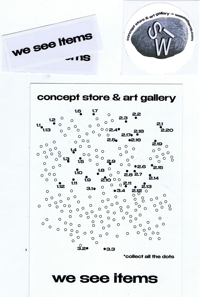
we see items concept store & art gallery - Konvolut
Technische
Angaben
-
14,8x10,5 cm, 4 Teile. keine weiteren Angaben vorhanden
1 Visitenkarte im Postkartenformat, beidseitig und schwarz-weiß bedruckt & 3 Sticker, in T.S.M.-Tüte
ZusatzInfos
-
Begleitmaterial zum we see items concept store & art gallery in der Altstadt von Tiflis.
|
Technische
Angaben
-
21x10,5 cm, keine weiteren Angaben vorhanden
Flyer zu den Veranstaltungen im MaximiliansForum
ZusatzInfos
-
In einer exklusiven Modenschau präsentiert SCHAAF am 02. Mai die aktuelle Kollektion “Don’t Tell The World That We Know” & eine Vorschau auf 2013.
Die anschließende 8-tägige Mode-Ausstellung beinhaltet auch einen POP-UP-STORE und ein OFFENES ATELIER. Im Store können einzelne Kollektionsteile gekauft und bei Bedarf in der Schnittgröße angepasst werden. Das Offene Atelier bietet Einblick in die Arbeit der Designer und die Möglichkeit zum künstlerischen Dialog.
VERNISSAGE & SHOW 02. Mai – 20 Uhr
AUSSTELLUNG & POP-UP-STORE & CAFÉ 03.–10. Mai – Täglich 11–20 Uhr
|
Titel
-
GHEN / arte - A cura del movimento arte genetica / Numero Unico - Numero 0/3.
Technische
Angaben
-
[18] S., 50x35 cm, keine weiteren Angaben vorhanden
Künstlerzeitung vom 25.06.1979, mehrfach gefaltet 25,5x17,5 cm, 2 gefaltete Bögen, sowie 5 Einzelseiten, gedruckt in schwarz und rot auf Zeitungspapier, jede Seite der 2 Bögen ist in kleine Einzelseiten unterteilt und je einem Künstler gewidmet, vier der Einzelseiten zeigen - großformatig - je eine Arbeit.
ZusatzInfos
-
Francesco Saverio Dòdaro - Poet, visueller Poet, Autor - 1930 in Bari geboren, rief nach seiner Zeit in Bologna und Paris und seinem Umzug nach Lecce 1976 das Genetic Art Movement ins Leben.
Er konzipierte und führte Regie bei der Serie: "Ghen arte" (Lecce, 1978), "Aesthetic violations" (Lecce, 1981), "Scritture" (Parabita, 1989), "Spagine. Infinite writings "(Caprarica di Lecce, 1989)," Compact Type. New narrative "(Caprarica di Lecce, 1990)," Diapoesitive. Scriptures for screens "(Caprarica di Lecce, 1990)," Mail Fiction "(Caprarica di Lecce, 1991)," Wall Word "(Lecce, 1992) - translated into Japanese and exhibited at the Hokkaido Museum of Literature in Sapporo -, "International Mail Stories" (Lecce, 1993), "Internet Poetry" (Lecce, 1995), "Walkman Fiction. Novels to listen "(Lecce, 1996)," E 800 European Literature ", in 5 languages (Lecce, 2000)," Narrative folds "(Lecce, 2001)," Poetic folds "(Lecce, 2001)," Folds of memory "(Lecce, 2001)," Naked leaves "(Doria di Cassano Jonio, 2003)," Literary posters "(Lecce, 2005),"Naked novels" (Lecce, 2006-07), "Literary papers" (Lecce, 2009), "792 Mail Theater" (Lecce, 2009), "New Page. Narrative in store ", (Lecce, 2009)," New Page. Theater in store "(Lecce, 2010)," New Page. Poetry in store »(Lecce, 2011).
Eine weitere Redaktion befand sich in Genua: Ghen Res Extensa Ligu.
2016 feierte das Genetic Art Movement sein 40-jähriges Bestehen.
|
Titel
-
Haeppi Piecis / temporary design store and exhibition space / Das unautonome Objekt
Technische
Angaben
-
21x9,7 cm, keine weiteren Angaben vorhanden
Einladungskarte zur Ausstellung im Rahmen der Open Art
ZusatzInfos
-
Ab dem 24.07.2013 eröffnet in der Maximilianstraße 33 in München das Haeppi Piecis, ein Design Concept Store mit angeschlossener Galerie.
Dieses temporäre Projekt ist das Produkt einer Zusammenarbeit der Münchner Kreativszene: Mode-, Produkt- und Schmuckdesigner, Musiklabels und junge Buchverlage haben sich mit Grafikdesignern und Künstlern zusammengetan und ein gemeinsames Gesamtwerk erschaffen.
Hamann & van Mier betreiben hier einen Shop für Künstlerbücher und Magazine.
Text von der Webseite
|

Technische
Angaben
-
322 S., 20,3x12,7 cm, ISBN/ISSN 9780692424285
Broschur
ZusatzInfos
-
Das Buch erschien im Rahmen der gleichnamigen Ausstellung "Streetopia" (2012) die in der Luggage Store Gallery in San Francisco eröffnet wurde und sich gegen ein geplantes Bauprojekt und damit gegen die Gentrifizierung der Stadt richtete.
After San Francisco’s new mayor announced imminent plans to “clean up” downtown with a new corporate “dot com corridor” and arts district - featuring the new headquarters of Twitter and Burning Man - curators Erick Lyle, Chris Johanson, and Kal Spelletich brought over one hundred artists and activists together with neighbourhood residents fearing displacement to consider Utopian aspirations and to plot alternate futures for the city. Opening in May 2012 at the Luggage Store Gallery, the resulting exhibition Streetopia was a massive anti-gentrification art fair that took place in venues throughout the city. For five weeks, Streetopia featured daily free talks, performances, and skillshares while operating a free community kitchen out of the gallery.
This book brings together all of the art and ephemera from the now-infamous show - featuring work by SWOON, Barry McGee, Emory Douglas, Monica Canilao, Rigo 23, Xara Thustra, Ryder Cooley, and many more. Using the format of an exhibition catalog as a jumping off point, the book also includes essays and interviews with key participants that consider the effectiveness of Streetopia’s projects while offering a deeper rumination on the continuing search for community - and for Utopia - in today’s increasingly homogeneous and gentrified neo-liberal cities in an era of unprecedented wealth disparity.
Text von der Website
|
Titel
-
Beuys on Sale - Artist Run Web-Store - Zines, Artists' Books & Art Prints
Technische
Angaben
-
14,8x10,5 cm, keine weiteren Angaben vorhanden
Werbepostkarte
ZusatzInfos
-
Werbekarte des Onlineshops für Künstlerbücher, Graphzines, Kunstdrucke namens Beuys On Sale und damit des Verlags Re:Surgo, des Labels Bongoût und dem hinter allem steckenden Duo Gfeller & Hellsgard in Berlin.
|
 
Technische
Angaben
-
[334] S., 18,5x13,5 cm, ISBN/ISSN 9781851498857
Broschur mit aufklappbarem Cover und Bauchbinde, Fadenheftung, teils aufklappbare Seiten.
ZusatzInfos
-
This award-winning contemporary art book is made completely from the perspective and language of bugs, from the front page to the final chapter, with no human writing and text, only the "writing" of bugs. Inspired by the marks left behind by a cicada walking across his sketchbook, contemporary artist Zhu Yingchun placed boards and "ink ponds" of dark-coloured vegetable juices in his garden for the bugs to crawl through. The resulting marks, were thousands of twisted characters, each with a charm of its own - the language of the bugs. The accompanying booklet explains the artist's concept and QR code links the reader to a video of the process.
"The bugs seem insignificant, but their strokes are beautiful," says Zhu Yingchun. "Art is not just those pieces hanging on walls and placed in exhibition halls. Everything in the world, including every life in nature, has the power to create beauty, and art is all around us.
Text von der Webseite.
|
Technische
Angaben
-
[52] S., 24x16,8 cm, Auflage: 200, 2 Stück. keine weiteren Angaben vorhanden
Broschur, mit Leuchtfarbe besprüht
ZusatzInfos
-
Publikation zum Projekt: Ab dem 24.07.2013 eröffnet in der Maximilianstraße 33 in München das Haeppi Piecis, ein Design Concept Store mit angeschlossener Galerie. Dieses temporäre Projekt ist das Produkt einer Zusammenarbeit der Münchner Kreativszene: Mode-, Produkt- und Schmuckdesigner, Musiklabels und junge Buchverlage haben sich mit Grafikdesignern und Künstlern zusammengetan und ein gemeinsames Gesamtwerk erschaffen. Verkauft und ausgestellt werden Designs aus den Bereichen Mode, Schmuck und Accessoires. Auch Hüte, Taschen, Porzellan oder Lampen sowie Platten und Bücher aus München können entdeckt und erstanden werden. Als Rahmenprogramm sind in den kommenden Monaten Ausstellungen, Konzerte, Performances und Installationen und Film-Abende geplant. Auch Vorträge, Workshops und Lesungen werden stattfinden.
Text von der Webseite
|
Technische
Angaben
-
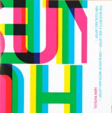
13x13 cm, keine weiteren Angaben vorhanden
Musik-CD in gefalteter Papphülle und transparenter Kunststoffhülle
ZusatzInfos
-
"My compositions have no concept. That's my concept. I just see them as a tool that stirs up the minds or consciousness of the people listening. I've never felt that a performer did injustice to my pieces, for a composition only comes to life in the particular context, the combination of the performer and the atmosphere of the public. I like to compose not only for instruments, but for "things" as well. Sound of things can be surprising, especially their artificial sound. For example, without looking, one would never guess that my tapping and dragging fingers across the surface of a cigar box that is connected to a laptop for what it is." (Tetsuya Hori)
|
Technische
Angaben
-
40 S., 28,5x20,5 cm, Auflage: 2.600, numeriert, ISBN/ISSN 20148542
Drahtheftung, Fanzine Deluxe Limited Edition Number
ZusatzInfos
-
This is an innovating project with personality..!
Box1466 concept is directly related to new tendencies, being music and visual arts in general the leitmotiv of each issue.
Photography, music, fashion, illustration, drawing, words and fantasies…!
Seeing, looking, reading, watching, listening..
Thanks to all those QR codes you will find in the magazine, you will be directly guided to more information online..!
The new concept of Box1466 is in its interactivity, that made it totally fresh and different to any other publication.
A new endless way to discover, to learn, to find out..
The aim of Box1466 is to transmit and divulge from an original point of view, its contents of interviews and visual proposal of fashion.
Box1466 is an Arty numbered deluxe limited edition independent publication.
Text von der Webseite und facebook
|

Technische
Angaben
-
[24] S., 21x14,7 cm, Auflage: 30, numeriert, signiert, keine weiteren Angaben vorhanden
Drahtheftung, zwei verschiedene Papiere, in Pergaminhülle
ZusatzInfos
-
'say cheese', 'please laugh', 'show your smile' - this is what people usually say, when they take a private picture of their friends or family. These pictures normally remain in the private sphere of the photographer and are only shown to a selected audience. For this conceptual and experimental photo-series such private images have been forcefully appropriated: individual prints have been taken randomly from drug stores and photo developers, the pictures where selected and then set in relation to others. The negatives of these images were not taken. Unlike the concept of the objet trouvé, where found objects and materials are the basis for creative work, the images used in this project are objets appropriés, they have been actively taken rather than found. They are documents of other peoples memories, memento mori of their existence, beautiful in their own right. By blurring and distorting them, the concept of remembering and forgetting, documentation and memory is questioned.
Text von der Webseite
|
Titel
-
Concept and Idea in Art – Künstlerbuch-Ausstellung im Kunstraum Alexander Bürkle - 150 Bücher aus der Sammlung der niederländischen Brokken-Zijp Foundation of Art werden in Freiburg ausgestellt
Technische
Angaben
-
1 S., 29,7x21 cm, keine weiteren Angaben vorhanden
Farbausdruck nach Webseite
ZusatzInfos
-
Ausstellung im Kunstraum Alexander Bürkle, Freiburg. Bis 15.01.2017
|
Titel
-
CONCEPT AND IDEA IN ART - A selection from the collection
Technische
Angaben
-
24 S., 30x22 cm, ISBN/ISSN 9789082590906
Drahtheftung, mit handschriftlichem Brief von Hans Brokken
ZusatzInfos
-
Begleitheft zur Ausstellung "Concept and Idea in Art - Werke aus der Sammlung Brokken Zijp Foundation of Art in Kunstraum Alexander Bürkle, Freiburg, 16.10.2016-15.01.2017, Künstlerbücher von Dieter Roth, Robert Barry, David Reed, Gerhard Richter, Richard Tuttle, Sol LeWitt und Christopher Wool
|
Technische
Angaben
-
24 S., 293,7x21 cm, 12 Teile. keine weiteren Angaben vorhanden
Flyer zur Einladung, Farblaserkopie eines Presseartikels aus der Badischen Zeitung vom 25.10.2016, Infopapiere zu den jeweiligen Räumen, in transparenter Kunststoffhülle
ZusatzInfos
-
Zur Ausstellung "Concept and Idea in Art - Werke aus der Sammlung Brokken Zijp Foundation of Art in Kunstraum Alexander Bürkle, Freiburg, 16.10.2016-15.01.2017
|

Technische
Angaben
-
140 S., 25x21,4 cm, ISBN/ISSN 9781907840104
Gelochte Seiten mit Musterbeutelklammern zusammen gehalten, in Klappumschlag, mit 18 roten Punkten beklebt. Innen teils andere Papiere
ZusatzInfos
-
The Piracy Project is an international publishing and exhibition project exploring the philosophical, legal and practical implications of book piracy and creative modes of reproduction. Through research and an international call for submissions, the Project has gathered a collection of more than 150 modified, appropriated and copied books from all over the world. The collection, which is catalogued online, is the starting point for talks and work groups around the concept of originality, the notion of authorship and politics of copyright. The Piracy Project is not about stealing or forgery. It is about creating a platform to innovatively explore the spectrum of copying, re-editing, translating, paraphrasing, imitating, re-organising, manipulating of already existing works. Here creativity and originality sit not in the borrowed material itself, but in the way it is handled. The Piracy Project is an collaboration between AND Publishing and Andrea Francke. The Piracy Project The Piracy Project is an international publishing and exhibition project exploring the philosophical, legal and practical implications of book piracy and creative modes of reproduction. Through research and an international call for submissions, the Project has gathered a collection of more than 150 modified, appropriated and copied books from all over the world. The collection, which is catalogued online, is the starting point for talks and work groups around the concept of originality, the notion of authorship and politics of copyright. The Piracy Project is not about stealing or forgery. It is about creating a platform to innovatively explore the spectrum of copying, re-editing, translating, paraphrasing, imitating, re-organising, manipulating of already existing works. Here creativity and originality sit not in the borrowed material itself, but in the way it is handled. The Piracy Project is an collaboration between AND Publishing and Andrea Francke.
Text von der Webseite
|
Titel
-
(U)LS Numéro 1 - SOME FALLEN UMBRELLAS AND SOMETHING ELSE
Technische
Angaben
-
43x29,2 cm, Auflage: 5.000, keine weiteren Angaben vorhanden
Blätter lose ineinander gelegt, gefaltet, Rotations-Offset
|
Titel
-
(U)LS Numéro 0 - Les Trophées - Documentation
Technische
Angaben
-
12 S., Auflage: 10.000, keine weiteren Angaben vorhanden
Blätter lose ineinander gelegt, Rotationsoffset
|
Technische
Angaben
-
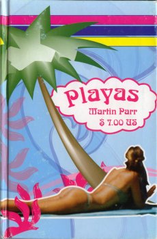
[64] S., 21x13,8 cm, keine weiteren Angaben vorhanden
Hardcover
ZusatzInfos
-
From Magnum: "Between 2006 and 2008 Martin Parr documented the differences in beach culture between Latin American countries whilst traveling with his wife Susie. Her text accompanies the photos in the book. The book is printed to look purposely cheap, with noticeable imperfections, somewhat like a book you'd find in a 99 cent store, complete with offset colors and gaudy clip-art style graphics.
This book was not distributed in the United States
|
Technische
Angaben
-
30,5x22x3 cm, keine weiteren Angaben vorhanden
Schachtel Hartpappe, Siebdruck, gestaltet von Fabienne Feltus, mit fünf Postern in A2, T-Shirt mit Grafik von Fabienne Feltus,
ZusatzInfos
-
In einer wunderbaren Kooperation mit dem LIVID Departmentstore in Dornbirn wurde das Thema “Helden” rauf und runtergespielt. Magazin anders gedacht. Als T-Shirt, Poster.
Text von Website.
Edition Fabienne Feltus für das Landjäger Magazin in Kooperation mit LIVID Department Store.
Poster Arbeiten von Florian Bayer (Illustration), Amrei Rüdisser (Text), Fabienne Feltus (Illustration), Lisa Rümmerle (Text), Daniel Furxner (Text), Sharmila Banerjee (Illustration), Pia-Maria Bach (Text), Alois Gstöttner (Text), Stefanie Hilgarth (Illustration), Elisabeth Breidenbrücker (Text), Velo (Text), Christof Nardin (Illustration), Peter Rüscher (Text), Christian Schachinger (Text)
|
Titel
-
The Nature of Photographs
Technische
Angaben
-
[142] S., 24,5x21 cm, ISBN/ISSN 9780714859040
Broschur
ZusatzInfos
-
The Nature of Photographs is the essential primer of photography, not only for students but for anyone with an interest in the medium. This book grew out of a college course that Stephen Shore taught for many years. Its aim is not to explore photographic content – the subject of an image – but to describe the physical and formal attributes of a photographic print, the very elements that form the tools a photographer uses to define and interpret that content. By teaching us how to look at photographs and helping us to see the world the way the photographer may have seen it, Shore also teaches us a way of looking at the world around us.
Text von der Webseite.
|
Technische
Angaben
-
[36] S., 18x14 cm, ISBN/ISSN 0898221293
Drahtheftung, Farblaserdruck
ZusatzInfos
-
2. Auflage
"Interstatial is a visually engaging photographic documentation of a coast-to-coast road trip taken in August of 2003. Glicksberg's photographs mark her geographical progress while hinting at an inner journey, reflected in images of crumbling buildings, isolated structures, and the Fresh Start convenience store advertising "New Beginnings Everyday."; with text by Piotr Orlov
Text von der Webseite.
|
Titel
-
56 Broken Kindle Screens - Photographed E Ink, Collected Online, Printed on Demand
Technische
Angaben
-
78 S., 17,5x10,8 cm, Auflage: Print on Demand, ISBN/ISSN 9781105949340
Broschur
ZusatzInfos
-
56 Broken Kindle Screens is a print on demand paperback that consists of found photos depicting broken Kindle screens. The Kindle is Amazon’s e-reading device which is by default connected to the company’s book store.
The book takes as its starting point the peculiar aesthetic of broken E Ink displays and serves as an examination into the reading device’s materiality. As the screens break, they become collages composed of different pages, cover illustrations and interface elements.
Text von der Webseite
|

Technische
Angaben
-
152 S., 23,5x16,5 cm, Auflage: 1.000, keine weiteren Angaben vorhanden
Broschur
ZusatzInfos
-
Magazin für experimentelle Musik und Kunst.
20 Seconds ist ein reines Printmagazin für experimentelle Musik und Kunst. Es wird von und für Designer, Autoren und Fotografen gemacht, die das Gefühl haben, dass sie durch das, was sie lesen und sehen, nicht genug herausgefordert werden.
Vor allem aber geht es bei 20 Seconds darum, sich mit dem zu beschäftigen, was für uns relevant ist. Als Gemeinschaft sind wir von Natur aus dazu verdrahtet, zu diskutieren, zu debattieren und zu teilen. Inspiriert von anderen Publikationen, die beweisen, dass Print nicht tot ist, ebenso wenig wie Ehrlichkeit oder Unabhängigkeit, geht es bei 20 Seconds Magazine darum, diese Ausdrucksformen zu dokumentieren.
Es ist auch ein Dialog, der auf dem Fließenden beruht. Und das Gespräch ist etwas, von dem wir glauben, dass es so lange dauern kann wie die Tinte auf den Seiten.
Text von der Webseite
Übersetzt mit www.DeepL.com/Translator (kostenlose Version)
|
Technische
Angaben
-
160 S., 23,5x16,5 cm, Auflage: 1.000, keine weiteren Angaben vorhanden
Broschur
ZusatzInfos
-
Magazin für experimentelle Musik und Kunst.
|
Technische
Angaben
-
160 S., 23,5x16,5 cm, Auflage: 1.000, keine weiteren Angaben vorhanden
Broschur
ZusatzInfos
-
Magazin für experimentelle Musik und Kunst.
|
Technische
Angaben
-
160 S., 23,5x16,5 cm, Auflage: 1.000, keine weiteren Angaben vorhanden
Broschur
ZusatzInfos
-
Magazin für experimentelle Musik und Kunst.
|
Titel
-
Art Store - affordable & outstanding fine art prints
Technische
Angaben
-
11,2x16 cm, keine weiteren Angaben vorhanden
6 Postkarten
|
Titel
-
unpictured land - record store day
Technische
Angaben
-
9,3x9,2 cm, keine weiteren Angaben vorhanden
Mini-CD und Leporello aus Transparentpapier, in bestempelter Pappschachtel
|
Titel
-
super paper no 050 All I want for my birthday is a big booty ho When I die, bury me inside the Gucci store
Technische
Angaben
-
40 S., 45x30,6 cm, Auflage: 15.000, keine weiteren Angaben vorhanden
Blätter lose zusammengelegt, farbiger Druck auf Zeitungspapier
|
Technische
Angaben
-
30,5x22x3 cm, keine weiteren Angaben vorhanden
Schachtel Hartpappe, Siebdruck, gestaltet von Florian Bayer, mit fünf Postern in A2, einem Einzelblatt (Werbung Kurzfilmfestival Tostner Burg), T-Shirt mit Grafik von Florian Bayer,
ZusatzInfos
-
In einer wunderbaren Kooperation mit dem LIVID Departmentstore in Dornbirn wurde das Thema Helden rauf und runtergespielt. Magazin anders gedacht. Als T-Shirt, Poster.
Text von Website.
Edition Florian Bayer für das Landjäger Magazin in Kooperation mit LIVID Department Store.
Poster Arbeiten von Florian Bayer (Illustration), Amrei Rüdisser (Text), Fabienne Feltus (Illustration), Lisa Rümmerle (Text), Daniel Furxner (Text), Sharmila Banerjee (Illustration), Pia-Maria Bach (Text), Alois Gstöttner (Text), Stefanie Hilgarth (Illustration), Elisabeth Breidenbrücker (Text), Velo (Text), Christof Nardin (Illustration), Peter Rüscher (Text), Christian Schachinger (Text)
|
Technische
Angaben
-
30,5x22x3 cm, keine weiteren Angaben vorhanden
Schachtel Hartpappe, Siebdruck, gestaltet von Christof Nardin, mit fünf Postern in A2, T-Shirt mit Grafik von Christof Nardin,
ZusatzInfos
-
In einer wunderbaren Kooperation mit dem LIVID Departmentstore in Dornbirn wurde das Thema Helden rauf und runtergespielt. Magazin anders gedacht. Als T-Shirt, Poster.
Text von Website.
Edition Christof Nardin für das Landjäger Magazin in Kooperation mit LIVID Department Store.
Poster Arbeiten von Florian Bayer (Illustration), Amrei Rüdisser (Text), Fabienne Feltus (Illustration), Lisa Rümmerle (Text), Daniel Furxner (Text), Sharmila Banerjee (Illustration), Pia-Maria Bach (Text), Alois Gstöttner (Text), Stefanie Hilgarth (Illustration), Elisabeth Breidenbrücker (Text), Velo (Text), Christof Nardin (Illustration), Peter Rüscher (Text), Christian Schachinger (Text)
|
Technische
Angaben
-
14,8x10,5 cm, 2 Stück. keine weiteren Angaben vorhanden
Werbekarte für den Record Store, die Buchhandlung und die Galerie
|
Technische
Angaben
-
256 S., 24x16 cm, 2 Stück. ISBN/ISSN 18676510
Klappbroschur. Verschiedene Papiere. Hinten eingelegt ein 48-seitiges Booklet mit Contemporary Typefaces, international und griechisch
ZusatzInfos
-
Im Herbst/Winter 2017/18 warf das Slanted Team einen Blick auf die zeitgenössische Designszene Athens. Die Ausgabe wird thematisch ergänzt durch Illustrationen, Fotografien, Interviews und Essays
|

Technische
Angaben
-
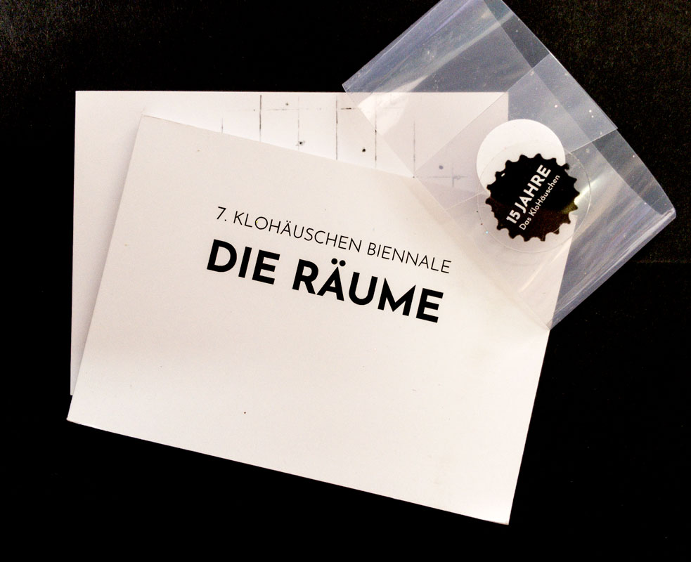
2 S., 20,8x9,6 cm, 2 Stück. keine weiteren Angaben vorhanden
Karte, beidseitig in Schwarz-Weiß bedruckt, zwei davon leporelloartig gefaltet
ZusatzInfos
-
Flyer zur 7. KloHäuschen Biennale "Die Räume", die vom 13.07.- 03.08.2024 stattfand.
Schon seit 2012 richtet das KloHäuschen seine eigene Biennale aus. Und obwohl es damit schon bei den internationalen Großevents mitspielt und schon fast um die halbe Welt gereist ist haben wir es noch nie so wirklich in die Gesellschaft der freien „Kunsträume“ eingeführt. Das soll sich jetzt ändern. Denn gleichzeitig wird das KloHäuschen 15 – es ist höchste Zeit!
Aber was ist denn das für eine Gesellschaft, diese „Räume“? Gastgeber* für zeitgenössische Kunst. Für Ausstellung, Performance, Dialog. Für Newcomer & Alte Hasen. Für bisher Ungesehenes, Unerwartetes – und manchmal auch Unplanbares. Lokal und international, klein und größer (und wir haben nur die bis zu einer bestimmten Größe besucht). Manche stehen mitten auf der Straße – andere wollen entdeckt werden. Manche findet man In den kleinsten Ecken – und manchmal auch nur für eine bestimmte Zeit. Sie alle sind nicht-kommerziell (und finden verschiedenste Wege, ihren Raum trotzdem zu halten). Alle vertreten vor allem ihre Gäste – und nicht nur sich selbst. Und alle sind selbst-organisiert, entscheiden und agieren so frei wie möglich – auf eigene Verantwortung, und auf eigenes Risiko.
Also diese offenen Räume der Kunst laden wir zur Jubiläums-Biennale ins KloHäuschen ein. Vor allem die Münchner plus einige dem KloHäuschen verbundene Räume aus dem „Ausland“ (Ebersberg, Dresden, New York, …). Und jeder Raum kommt mit einer eigenen Ausstellung mit jeweils 7 Künstler*n. Alle ins KloHäuschen. Über 30 Räume haben zugesagt. Über 30 spannende Ausstellungen mit insgesamt mehr als 200 beteiligten Künstler*n.
Text von der Webseite
|
Titel
-
Oh So Pretty - Punk in Print 1976-80
Technische
Angaben
-
512 S., 28x21,5 cm, ISBN/ISSN 9780714872759
Broschur
ZusatzInfos
-
A compelling visual portrait of a time, place, and subculture that raised a middle finger to modern society from the collection of Toby Mott.
Oh So Pretty: Punk in Print 1976-80 is an unrivalled collection of visually striking ephemera from Britain’s punk subculture. It presents 500 artefacts - 'zines,' gig posters, flyers, and badges - from well-known and obscure musical acts, designers, venues, and related political groups. While punk was first and foremost a music phenomenon, it reflected a DIY spirit and instantly recognizable aesthetic that was as raw and strident and irrepressible as the music. As disposable as the items in this book once were, together they tell a story about music, history, class, and art, and document a seismic shift in society and visual culture.
Text von der Verlagswebseite
|
Titel
-
Konvolut Expanded Media Editions
Technische
Angaben
-
38 S., 29,7x21 cm, 15 Teile. keine weiteren Angaben vorhanden
Lieferverzeichnis, Kopien von Presseartikeln, Briefpapiere, Karte, Briefumschlag, Flyer, Presseinfos
ZusatzInfos
-
Infos zum Magazin UFO, Lagerkatalog, Karte des Platfon Record Store mit Inside the BUNKER, At home with William S. Burroughs, Abendstern Ausgabe 48 vom 26.11.1973,
|
Technische
Angaben
-
76 S., 24,2x16,6 cm, ISBN/ISSN 26728478
Broschur
ZusatzInfos
-
Vierte Ausgabe der Literaturzeitschrift, die 2023 als Frühlingsausgabe erschienen ist.
Es beteiligten sich türkisch-, griechisch- und englischsprachige Künstler*innen.
|
Titel
-
7. KloHäuschen Biennale Die Räume Die Ausstellung
Technische
Angaben
-
272 S., 7,3x10,5 cm, Auflage: 400, 2 Stück. ISBN/ISSN 9783689190286
2 Bücher mit Banderole zusammen gehalten, Broschur
ZusatzInfos
-
15 Jahre Das KloHäuschen
Schon seit 2012 richtet das KloHäuschen seine eigene Biennale aus. Und obwohl es damit schon bei den internationalen Großevents mitspielt und schon fast um die halbe Welt gereist ist haben wir es noch nie so wirklich in die Gesellschaft der freien „Kunsträume“ eingeführt. Das soll sich jetzt ändern. Denn gleichzeitig wird das KloHäuschen 15 – es ist höchste Zeit!
Aber was ist denn das für eine Gesellschaft, diese „Räume“?
Gastgeber* für zeitgenössische Kunst. Für Ausstellung, Performance, Dialog. Für Newcomer & Alte Hasen. Für bisher Ungesehenes, Unerwartetes – und manchmal auch Unplanbares. Lokal und international, klein und größer (und wir haben nur die bis zu einer bestimmten Größe besucht). Manche stehen mitten auf der Straße – andere wollen entdeckt werden. Manche findet man In den kleinsten Ecken – und manchmal auch nur für eine bestimmte Zeit.
Sie alle sind nicht-kommerziell (und finden verschiedenste Wege, ihren Raum trotzdem zu halten). Alle vertreten vor allem ihre Gäste – und nicht nur sich selbst. Und alle sind selbst-organisiert, entscheiden und agieren so frei wie möglich – auf eigene Verantwortung, und auf eigenes Risiko.
Also diese offenen Räume der Kunst laden wir zur Jubiläums-Biennale ins KloHäuschen ein. Vor allem die Münchner plus einige dem KloHäuschen verbundene Räume aus dem „Ausland“ (Ebersberg, Dresden, New York, …). Und jeder Raum kommt mit einer eigenen Ausstellung mit jeweils 7 Künstler*n. Alle ins KloHäuschen. Über 30 Räume haben zugesagt. Über 30 spannende Ausstellungen mit insgesamt mehr als 200 beteiligten Künstler*n.
Und das KloHäuschen selber?
Das nimmt sich als Raum ausnahmsweise mal zurück (so gut es das halt hinbekommt) und überlässt zu seinem Jubiläum seinen Gästen die große Bühne.
Text von der Webseite
|
Technische
Angaben
-
[16] S., 25x17 cm, Auflage: 700, keine weiteren Angaben vorhanden
Drahtheftung, Cover mit Siebdruck,
ZusatzInfos
-
Katalog zur Ausstellung vom 13.-24.10.2013 in The Store Front, Popps Packing, Hamtramck, Detroit, USA
|
Technische
Angaben
-
signiert, keine weiteren Angaben vorhanden
Schwarz-Weiß-Fotokopien, Collage, Schreibmaschine
|
Titel
-
Photographie als Medium - 10 Thesen zur konventionellen und konzeptionellen Photographie
Technische
Angaben
-
196 S., 20x13 cm, ISBN/ISSN 3980005747
ZusatzInfos
-
Die konventionelle Fotografie spielt sich nach Krauss innerhalb des Mediums ab und entwickelt eine medienimmanente Sprache, die lediglich Anregungen von der Kunst erhält. In der konzeptionellen Fotografie ist sie nicht Selbstzweck, sondern Medium zur Realisierung von künstlerischen Vorstellungen. Die »Kunst mit Fotografie« äußerte sich erstmalig in den Experimenten der 20er Jahre als Fotogramm, Fotomontage und Fotocollage und fand ihre Fortsetzung durch das Einbeziehen der Fotografie bei Pop Art, Happening und Concept Art
|
Titel
-
Foundations of a theatre / Concept.Foto. Drawing 1990/91/93/94
Technische
Angaben
-
11x15 cm, keine weiteren Angaben vorhanden
Spiralbindung
|
Titel
-
Drukwerk Briefumschlag - International Concept
Technische
Angaben
-
9,5x14,5 cm, keine weiteren Angaben vorhanden
Verschiedene Papierschnipsel in einem durchsichtigem Umschlag.
ZusatzInfos
-
Inhalt eines Briefumschlags an Wolfgang Rostek mit der Aufschrift "Drukwerk"
|
Titel
-
Alles ist Windhauch - Künstlerische Handlungsanweisungen für Bücher: Clegg und Gutman, On Kawara, Sol LeWitt, Marcel Duchamp
Technische
Angaben
-
10 S., 29,7x21 cm, keine weiteren Angaben vorhanden
Laserausdruck nach PDF, geklammert
ZusatzInfos
-
Abstract: Die Handlungen, die Bücher immer fordern, zum Beispiel Nehmen oder Weglegen, Aufschlagen oder Seiten-Betrachten, werden bewusst, wenn Künstler wie Sol LeWitt oder Clegg & Guttmann ihre Rezipienten auffordern, mit Büchern wirklich etwas zu tun. Ihre künstlerischen Handlungsanweisungen sind nicht zu verwechseln mit Künstlerbüchern, wo Künstler nicht nur Texte illustrieren, sondern mit den Möglichkeiten, die Bücher bieten, ihre künstlerischen Vorstellungen überhaupt erst entwickeln. – Während Bücher und Bibliotheken heute scheinbar an Bedeutung verlieren, wird das Medium Buch von Künstlern, geradezu umgekehrt proportional, besonders kommentiert. – Die künstlerischen Handlungsanweisungen mit Büchern haben ihren Vorläufer bei Marcel Duchamp, der bei seinem Unhappy Readymade 1917 dazu aufforderte, ein Geometriebuch auf den Balkon zu hängen, so dass der Wind seine Probleme darin finden konnte. Hier ist die Assoziation an das Buch Kohelet richtig – und damit eine Reflexion darüber, was überhaupt getan wird, was wer warum tut, was Bestand hat, was flüchtig ist.
|
Titel
-
Digitalisierung und Künstliche Intelligenz ... aus der Sicht der Science Fiction
Technische
Angaben
-
2 S., 29,7x21 cm, keine weiteren Angaben vorhanden
Farblaserkopie beidseitig
ZusatzInfos
-
Auslage bei UNLIMITED SYSTEMS - INFINITE LOOP im digitalartspace Galerie Karin Wimmer 16.07.-04.09.2022. Artistic design Annegret Bleisteiner und Wolfgang Diller, Project Concept Annegret Bleisteiner und Toni Wirthmüller, Curatorin Lotte van den Hoogen.
Infoblatt zur Videoarbeit über Digitalisierung und Künstliche Intelligenz (KI), Die Rettung der Erde ist digital, KI und virtuelle Welten.
|
Titel
-
One Million German Passports
Technische
Angaben
-
24 S., 46,8x31,5 cm, 2 Stück. ISBN/ISSN 9783981924077
Blätter lose ineinander gelegt
ZusatzInfos
-
Begleitpublikation zur Installation in der Rotunde der Pinakothek der Moderne in München, 29.03.-27.08. 2023
Am 28. März wurde „One Million German Passports“, eine Installation des Künstlers Alfredo Jaar in der Rotunde der Pinakothek der Moderne eröffnet. Eine Million deutsche Pässe sind hier dicht an dicht zu einem Kubus von 6m x 6m x 80cm gestapelt, hinter einer gläsernen Hochsicherheitswand zu sehen. Die Zahl referiert, laut Alfredo Jaar, auf die Zahl der Menschen, die die ehemalige Bundeskanzlerin Angela Merkel 2015 in Deutschland willkommen hieß. Sie soll aber auch an die Zahl der Menschen erinnern, die sich später von ihr und ihrer Partei, der CDU, distanzierten und 2017 die rechtsextreme Partei AfD wählten. Alfredo Jaar bezieht sich in diesem polarisierenden Werk über die Situation in Deutschland und Europa hinaus auch ganz allgemein auf die globale Migration und berührt damit grundsätzliche Fragen zu Flucht, Einwanderung und Staatsbürger:innenschaft.
Eine solch politisch und gesellschaftlich herausforderndes Werk kann als engagierte Concept Art verstanden werden und erfordert in seiner minimalistischen Ästhetik nach einer Kontextualisierung. Dazu veröffentlicht das Architekturmuseum der TUM eine 20 Seiten starke Zeitung mit 15 Beiträgen von internationalen Expert:innen, Wissenschaftler:innen und Schriftsteller:innen
Text von der Webseite
|
Titel
-
Strategien der Aufstandsbekämpfung - Counterinsurgency Strategies
Technische
Angaben
-
[12] S., 21x14,8 cm, signiert, 5 Teile. keine weiteren Angaben vorhanden
Drahtheftung, Karte mit handschriftlichem Gruß beigelegt
ZusatzInfos
-
Challenge: Mapping New Relations Between Art, War and Society
Madrid - SdA Innovation Challenge, Spring, 2025
Can you solve it?
How to Differentiate Between Art and Cognitive Warfare?
On the one hand, art is weaponized and securitized; on the other, warfare is producing new models of inescapable reality enhanced in cognitive and artificial ways. What concept of art could be separated from war? Or, if that is not even the purpose anymore, how does one distinguish weaponized art that is friendly from art that is hostile?
Friday, January 17, 2025, 6--9 pm Information event
Saturday, February 22, 2025, 5-9 pm Pilehing event
Herausforderung: Kartierung neuer Beziehungen zwischen Kunst, Krieg und Gesellschaft
Madrid - SdA-Innovationswettbewerb, Frühjahr, 2025
Können Sie die Aufgabe lösen?
Wie kann man zwischen Kunst und und kognitiver Kriegsführung unterscheiden?
Auf der einen Seite wird die Kunst bewaffnet und abgesichert, auf der anderen Seite produziert die Kriegsführung neue Modelle einer unausweichlichen Realität, die auf kognitive und künstliche Weise verbessert werden. Welcher Begriff von Kunst könnte vom Krieg getrennt werden? Oder, wenn das nicht einmal mehr der Zweck ist, wie unterscheidet man dann bewaffnete Kunst, die freundlich ist, von Kunst, die feindlich ist?
Freitag, 17.01.2025, 18 bis 21 Uhr Informationsveranstaltung
Samstag, 22.02.2025, 17-19 Uhr Pitching-Veranstaltung
Übersetzt mit DeepL
|
Titel
-
69 , A Ti O Tem Pojma Nimas - 69, But You Have No Idea Of It
Technische
Angaben
-
[69], S., 27x19,2 cm, Auflage: 150, ISBN/ISSN 9789616400619
Leineneinaband mit Schutzumschlag. Aus dem Buchblock ausgestanzte Seiten in den Ausschnitt eingelegt, kopfüber beidseitig bedruckt. Beigelegter Brief
ZusatzInfos
-
My work "69. but you have no idea of it" means a concept of non-linear reading and some hundred thousends milliards of combinations of possible connected readings, i.e. the same number of readers could read this book each in his own combination. You can read my book in 276! different combinations, which is this many:
276.000.000.000.000.000.000.000.000.000.000.000.000.000.000.000.000.000.000.000.000.000.000.000.000.000.000.000.000.000.000.000.000.000.000.000.000.000.000.000
|
Titel
-
Young, Fresh and Relevant Issue 2
Technische
Angaben
-
32 S., 21x14,8 cm, Auflage: 200, keine weiteren Angaben vorhanden
Laserprint, Drahtheftung, material 314
ZusatzInfos
-
'Young, Fresh and Relevant' is an ongoing, open submission journal exploring the concept of artist writing. The journal is in English and is partly translated into German
|
Titel
-
69 - but you have no idea of it
Technische
Angaben
-
1 S., 29,7x21 cm, keine weiteren Angaben vorhanden
Laserausdruck nach Email vom slowenischen Autor
ZusatzInfos
-
My work »69. but you have no idea of it« means a concept of non-linear reading and some hundred thousends milliards of combinations of possible connected readings, i.e. the same number of readers could read this book each in his own combination. You can read my book in 276! different combinations, which is this many:
276.000.000.000.000.000.000.000.000.000.000.000.000.000.000.000.000.000.000.000.000.000.000.000.000.000.000.000.000.000.000.000.000.000.000.000.000.000.000.000
|
Technische
Angaben
-
[132] S., 28x21 cm, Auflage: 1.000, ISBN/ISSN 9781908806017
Drahtheftung, eingelegt ein Werbeflyer
ZusatzInfos
-
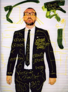
Estate Of is the new publication series from Antenne Publishing. Published twice a year in a magazine-like stapled format, each edition is given to a single artist working with photographs as a space to realise projects. Estate Of aims to become a meeting point between an informal physical object, and a substantial body of work from an individual artist.
Kronos by Victor Boullet is the first publication in the Estate Of series.
Victor Boullet’s title refers to the Greek god Kronos, a deity known for its doublesidedness, a concept closely connected to his project The Institute of Social Hypocrisy. The publication Kronos is a means to carry his work forward into a newer form of expression, whilst maintaining a constant sense of dichotomy.
Text von der Webseite
|

Technische
Angaben
-
352 S., 21x15 cm, ISBN/ISSN 9782915859416
Broschur mit Banderole, eingelegt ein Informationsblatt
ZusatzInfos
-
Originalausgabe erschienen bei Artists Press, Bern, 1980.
This book is the third and final version of the first artist’s book published in 1960 by herman de vries, who is currently the author of more than one hundred publications.
The story of this book dates back to 1960. Closely associated with the Zero Group, but also drawn to the buddhist concept of emptiness, herman de vries had just produced a series of white monochromes when he self-published a twenty-page booklet in Arnhem. It had no title, its cover was blank and its pages were unprinted. It contained nothing but a short final poem celebrating, in four languages, the superabundance of white: “wit is overdaad”. In 1962, this manifesto appeared in another version, now entitled wit: two hundred blank pages, four white collages by the artist and an introduction, itself completely blank, by the poet J. C. van Schagen, published in arnhem in only five copies by M. J. Israel. It was followed in 1967 by a second “revised” edition, wit weiss: two hundred and fifty blank pages, pocket-sized, in five hundred copies, published by Hansjörg Mayer in Stuttgart. The only printed elements were the artist’s name, the title and the publisher’s name on the cover, the word “introduction” and the name of its author on the very first page and a colophon on the final page. In 1980 the Artists Press in Berne published the “third revised edition”, in a larger format and with more pages. The original title wit was translated into english and japanese and into sanskrit with a word that means “white” in the sense of bright, pure, immaculate. The title itself does not appear on the book, which remains completely blank. It is printed with the paratext on a broad strip of paper in the form of a detachable publicity strip. The inside flap contains a brief statement initially dating back to the 1962 edition, stating that this book incorporates all aspects of reality. Of the five thousand copies advertised, only a hundred were published. It is this last edition, the most radical, which is republished here, the only addition being the french translation of the statement.
On 1 april 2012, herman de vries wrote of his book, insisting on the importance of the final comma:
white is white
0 = 0
no name
no idea
not even emptiness,
Text von der Webseite
|
Technische
Angaben
-
2 S., 29,7x21 cm, keine weiteren Angaben vorhanden
Farblaserkopie nach Email-Einladung
ZusatzInfos
-
Exhibition concept Marielle Nitoslawska
|
Technische
Angaben
-
keine weiteren Angaben vorhanden
|
Titel
-
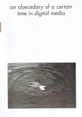
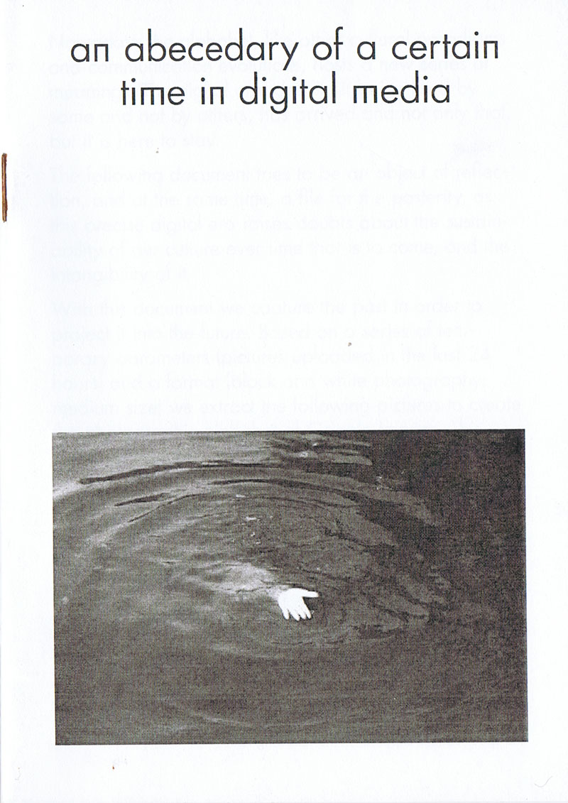
An Abecedary of a Certain Time in Digital Media
Technische
Angaben
-
[32] S., 14,8x10,5 cm, keine weiteren Angaben vorhanden
Drahtheftung
ZusatzInfos
-
Heft mit einem "fotografischen Alphabet" bestehend Schwarz-Weiß Bildern, die bei der Buchstabensuche als erstes Ergebnis bei Google Bildern erschienen sind.
"Nowadays the alphabet, like other cultural paradigms and communication evolutions, hosts a new series of menaings. The digital era, despite it being liked by some and not by others, has arrived and not only that, but is there to stay. The following document tries to be an object of reflection, and the same time, a file for the posterity, as this precise digital era raises doubts about the sustainability of our culture over time that is to come, and the intangibility of it. With this document we capture the past in order to project it into the future. Based on a series of temporary parameters (pictures uploaded in the last 24 hours) and a format (black and white photography, medium size) we extract the following pictures to create the photographic alphabet of Google Images. This confirms the initial concept; the documentation which is exhibited here never again belonged to the momentary alphabet on the 3th of December in the present year, so we manage to capture the present (already the past as you read these precise words) and we leave it physically alive in the future, making the common belief of printing as old fashioned and didgital as actual lose its sense, finding the way to make contemporary, in other words, tangible or visible today, something which doesn't exist on the web anymore."
Text aus dem Heft
|
Technische
Angaben
-
25x19,2 cm, ISBN/ISSN 9783943514605
Softcover, fadengeheftet, mit Schutzumschlag aus drei Papierbögen, verschiedene Papiere
ZusatzInfos
-
Makulatur, a German word that derives from lat. maculatura ’something stained’, refers to misprinted paper that is discarded at the beginning of the printing process as use- and worthless. In 2010, the graphic designer Manuel Raeder started to collect and preserve misprinted sheets of all the publications he designed not only for his own publishing house BOM DIA BOA TARDE BOA NOITE but also for fellow artists and institutions.
Text von der Website.
|
Titel
-
The Lost Concept Of Professionalism In Media & Arts - A Tribute To Papa Nuevo
Technische
Angaben
-
[28] S., 20x14,3 cm, Auflage: 100, numeriert, signiert, keine weiteren Angaben vorhanden
Drahtheftung, Digitaldruck, in Briefumschlag, Post-it mit handschriftlicher Notiz
|
Technische
Angaben
-
106 S., 21x14,8 cm, Auflage: Print on Demand, keine weiteren Angaben vorhanden
Broschur
ZusatzInfos
-
Schwarz-Weiß-Drucke, Nr. 020 aus der Reihe 100for10.
Adam Hayes is a specialist in hand-rendered typography and intricate, intelligent illustration. His prolific work style has generated an impressive portfolio that reflects an interest in vernacular lettering and a fascination with urban and natural landscapes. Adam’s creative process see’s his simple pencil sketches transformed and refined into elaborate and optimistic illustration. Each project is concept-driven, allowing his work to grow and maintain a sense of energy and sophistication. A graduate of the Royal College of Art, Adam has since established a diverse client base which welcomes collaboration with global companies, charitable organisations and small, local start-ups.
|
Technische
Angaben
-
106 S., 21x14,8 cm, Auflage: Print on Demand, keine weiteren Angaben vorhanden
Broschur
ZusatzInfos
-
Schwarz-Weiß-Drucke, Nr. 039 aus der Reihe 100for10.
Alessandro Apai is a young freelance illustrator and graphic artist from Italy and current based in Barcelona. His works are inspired by perfectly normal everyday interactions and social experiences. His aim is to use the drawing’s practice like a vehicle to documents and interpret his daily observation of the world and to could translate whatever concept in images. He had work on commissioned projects for clients like the Guardian, Zeit Magazin, it’s Nice That and many others. He also use to work on personal projects like the weekly series “Relaxed Sunday with Family” started in 2014, that you can follow each Sunday.
|
Titel
-
Trittbrettfahrer der Geschichte
Technische
Angaben
-
32 S., 10x15 cm, Auflage: 350, ISBN/ISSN 9783959051873
Postkarten als Buch gebunden
ZusatzInfos
-
In seinem Postkartenbuch "Trittbrettfahrer der Geschichte" präsentiert der Fotograf Jens Klein 32 fotografische Ansichten von Denkmälern des neunzehnten und zwanzigsten Jahrhunderts, die allesamt "mythischen" Ereignissen und Personen der deutschen Geschichte gewidmet sind: von der Völkerschlacht bei Leipzig bis zum Ende des Zweiten Weltkriegs, von Bismarck bis Thälmann. Die Bilder stammen aus der Deutschen Fotothek in Dresden. Die Auswahl der Bilder gibt weder eine chronologische Abfolge noch eine formale Einordnung vor.
|
Technische
Angaben
-
84 S., 23,5x16 cm, 3 Teile. ISBN/ISSN 9788089894109
Broschur, Klappumschlag, Brief und Text beigelegt
ZusatzInfos
-
This catalogue is published on the occasion of the award of the Werkstattpreis 2018 and my solo-exhibition so oft so soft, 2018 at Kunststiftung Erich Hauser.
Text von der Webseite
|
Titel
-
if I had a mind... (ich stelle mir vor...) - concept-art, project-art
Technische
Angaben
-
[208] S., 23x24 cm, 2 Stück. ISBN/ISSN 3770105710
Broschur, zahlreiche, meist ganzseitige Schwarz-Weiß-Abbildungen
ZusatzInfos
-
Fotos, Reproduktionen von dokumentarischen Material, Karten, Skizzen etc.
|
Titel
-
Livres d' Artistes, Collection Semaphore
Technische
Angaben
-
160 S., 29x15 cm, 2 Stück. ISBN/ISSN 2733500856
Softcover, Fadenheftung, Index
ZusatzInfos
-
erschienen zur Ausstellung im Centre Georges Pompidou, Paris, 12.06.-17.10.1985. Ausstellung organisiert von der Bibliothèque publique d'information und der Bibliothèque Nationale.
Mit 10 Sichtweisen auf das Künstlerbuch verschiedener Autoren und Künstler.
Kretschmer & Großmann in Danksagung erwähnt.
|
Titel
-
Out of print. An archive as artistic concept
Technische
Angaben
-
254 S., 27x19,5 cm, Auflage: 2.000, ISBN/ISSN 9783928761512
ZusatzInfos
-
Katalog zu 7 Ausstellungen über Künstlerbücher und anderes.
Founded by Guy Schraenen, The Archive for Small Press & Communication (ASPC) at the Neues Museum Weserburg in Bremen reflects a period of alternative artistic activity beginning in the sixties, in which artists drew on a wide range of radical methods to create graphic and sound works that showed their anti-traditional leanings and their ground-breaking ideas. The exhibition Out of Print, which has toured to several cities around the world, presented an extensive selection of works from the ASCP. The accompanying catalogue also included a manifesto by Guy Schraenen.
Text von der Webseite
|
Titel
-
Kunstforum International, Band 012
Technische
Angaben
-
236 S., 22,2x15 cm, keine weiteren Angaben vorhanden
Broschur
|
Titel
-
Der Greif Ausgabe 01 Juli 2008
Technische
Angaben
-
50 S., 35x25 cm, Auflage: 1.000, 2 Stück. keine weiteren Angaben vorhanden
Drahtheftung
ZusatzInfos
-
Der Greif ist ein werbefreies Magazin für zeitgenössische Fotografie.
Inhalt der ersten Ausgabe: The first issue evolves from an initiative from Felix von Scheffer and Simon Karlstetter in only two weeks in the beginning of July 2008. All 25 photographers and authors are from the Ammersee-region. Advertising-free concept and combination of the works is the main subject from the beginning. The first issue is sold out since March 2010.
Text von der Webseite
|
Titel
-
OFF-Biennale Budapest - Call for contributions to map artistic/curatorial self-organizations worldwide
Technische
Angaben
-
2 S., 29,7x21 cm, keine weiteren Angaben vorhanden
Ausdruck einer Email vom 28.2.2015
ZusatzInfos
-
Independent. Contemporary. Art. 24 April – 31 May 2015.
OFF-Biennale Budapest is a series of exhibitions and art events in and beyond the city of Budapest. Its concept is different from traditional biennials as we know them. Not affiliated with any institution, it is a voluntary collaborative initiative of artists, groups of artists, curators, art managers, gallerists and collectors. OFF-Biennale Budapest is a civil initiative, whose aim is to bring a segment of culture, contemporary art, closer to the public at large. OFF proclaims the importance of independent thinking and action, breaking away from clichés and habitual routines. It is meant to demonstrate that contemporary art can foster and catalyse this kind of activity – in other words, that contemporary art is much more than mere luxury and a source of aesthetic pleasure.
Text von der Webseite
|
Titel
-
Possible Content for 18 Pages - Volume II - A Set of Lines, A Stack of Paper
Technische
Angaben
-
[80] S., 29,7x21 cm, Auflage: 500, ISBN/ISSN 9783957632746
Broschur, mit zahlreichen Abbildungen, drei Bände in Banderole,
ZusatzInfos
-
"A Set of Lines, A Stack of Paper" is the second in a series of exhibitions and publication based on a wide-reaching research about writing with the title 'Possible Content for 18 Pages'. The original typewritten manuscript of Vilém Flusser's essay 'The Gesture of Writing' provides the thematic and formal-aesthetic foundation for reflecting the act of writing at the intersection of linguistic, visual, physical and spatial communication. 'To write,' says the philosopher about the basic requirements that should lead to a complete piece of writing, we need 'a blank surface, for instance a white leaf of paper, an instrument which contains a matter that contrasts with the whiteness of the paper, the letters of the alphabet, the convention which gives a meaning to the letters, 'orthography' = correct writing, the rules which order that language, what is called 'grammar', an idea to be expressed in a language, and a motive to express that idea'. Understanding the act of writing as a culturally embedded gesture, 'A Set of Lines, A Stack of Paper' covers artistic, literary, as well as curatorial and editorial fields of action and combines them. The book is published on the occasion of the correspondent exhibition at KARST, Plymouth (June 5 - July 5, 2015). The publication comprises an exhibition documentation with installation views and a curatorial statement. Furthermore, the author Maria Fusco situates the concept of the exhibition in an actual context of literature.
The participating visual artists expand the topic of the exhibition with artistic contributions especially made for the book.
Text von der Webseite
|
Titel
-
Six years: The dematerialization of the art object from 1966 to 1972 ...
Technische
Angaben
-
272 S., 21,5x17,5 cm, ISBN/ISSN 9780520210134
Hardcover, Exlibris der Pratt Institute Library, mit Ausmusterungsstempeln
ZusatzInfos
-
Titelergänzung: The dematerialization of the art object from 1966 to 1972 : a cross-reference book of information on some esthetic boundaries : consisting of a bibliography into which are inserted a fragmented text, art works, documents, interviews, and symposia, arranged chronologically and focused on so-called conceptual or information or idea art with mentions of such vaguely designated areas as minimal, antiform, systems, earth, or process art, occurring now in the Americas, Europe, England, Australia, and Asia (with occasional political overtones), edited and annotated by Lucy R. Lippard.
In Six Years Lucy R. Lippard documents the chaotic network of ideas that has been labeled conceptual art. The book is arranged as an annotated chronology into which is woven a rich collection of original documents—including texts by and taped discussions among and with the artists involved and by Lippard, who has also provided a new preface for this edition. The result is a book with the character of a lively contemporary forum that offers an invaluable record of the thinking of the artists — a historical survey and essential reference book for the period.
Text von der Webseite
Ursprünglich publiziert 1973 bei Praeger, New York
|
Titel
-
Krytyka Polityczna Athens
Technische
Angaben
-
272 S., 23,5x16,5 cm, signiert, ISBN/ISSN 16440919
Broschur, mit Widmung, gefaltetes Blatt eingelegt, Cover manuel bearbeitet, mit Glitzer
ZusatzInfos
-
Dear Reader,
In your hands is the Athenian issue of Krytyka Polityzcna. The Warsaw-based journal unites polymorphous freedom struggles in geographic Europe. This book is an anarchist, anti-capitalist, anti-fascist artwork. A hypothesis, and yet one that continues to be written actively on the ground. It clashes migration and education of the status quo, the effect and the cause of current violence.
The publication documents an initiative, Universitas*, and accompanies the forthcoming Symposion, The School of Everything.
This book contains the contributions of people who have recently moved to Athens from the Middle East, of Athenians who have lived here a long time, as well as of those who are based in Berlin but frequently visit Athens. brought together, they form a de-elitized and de-colonized remix of knowledge.
The chapters in this book are intertwined and in each part the reader will find contributions relevant to the whole. The authors are all united by their portrayal in anti-phrenological drawings.
In Athens, despite the invention of the State, streams of interlapping cultural influences never stopped pulsating. Such an experience of fluid identity demonstrates that citizenship is an outdated concept of class separation and nationalism. The devastating contradiction: human rights are only valid in the economically privileged zones. The failure to collaborate with the revolution in Syria dispels the last illusions of an occidental civilization and unveils the truth: we all live in the absolute financial dictatorship.
This publication includes several essays and statements on education. These are written by thinkers, philosophers, “activists”, and artists who are affiliated with the Avtonomi Akadimia, a disobedient grassroots university in Athens which claims education as a form of art. These texts, poems, manifestos and sketches of educational models are published in lieu of the abstracts for an upcoming Symposion entitled: “The School of Everything”.
We build an educational system which consists of indignant initiatives for sharing knowledge, and of proposals by thinkers who see education as key. We shift from learning to sharing. We decriminalize sharing because we would like to enjoy the pleasure of giving. We liberate ourselves from the strictures of “Homo Sapiens”, a construct imposed upon life.
We will transform the educational system of Europe.
The clash of migration and education will release a Promethean fire.
Text von der Webseite
In collaboration with aneducation and the Public Programs of documenta 14
|
Titel
-
Tinnitus Tales - le Forbici di Manitù and Friends (SD010)
Technische
Angaben
-
27x28,5 cm, keine weiteren Angaben vorhanden
Plattenhülle, gestanzt mit 3 einklappbaren Teilen, beiliegend gestanzte Pappschlaufe mit handbeschrifteter DVD, Infoblatt zur Edition
ZusatzInfos
-
What do Martin Luther and Pete Townshend, Ozzie Osbourne and Oscar Wilde, Ludwig Van Beethoven and Star Trek’s Dr. Spock have in common? They all painfully suffered from tinnitus, a permanent hiss heard in one or both ears. The condition affects a large percentage of the world population (5-10%) and represents a real “occupational illness” for musicians and rock fans. On the subject, surprisingly, an inexplicable silence is observed by the music press and industry. At the current state of medical research, there is no effective cure for chronic tinnitus and the unpleasant humming can only get worse if you do not protect the ears properly.
In the works for nearly five years, the triple concept album Tinnitus Tales (a 10" vinyl record and two CDs) conceived by Le Forbici di Manitù (i.e. Manitù Rossi and Vittore Baroni, the second long suffering from tinnitus) with the collaboration of over fifty guest musicians, bands and international visual artists, breaks the veil of silence with a series of songs that address the topic blending humor and empathy. The songs are inspired by well-known cases of people suffering from tinnitus, such as Andy Partridge of XTC or Bono and The Edge of U2. To make this "educational audio project" a more collective effort, several old and new friends - many of them with tinnitus problems - were invited to record their own versions of the songs by Le Forbici di Manitù or to contribute original compositions on the subject (included in the CD 1 Songs).
Text von der Webseite
|
Titel
-
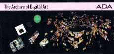
The Archive of Digital Art ADA - The Archive of Digital Arts goes Web 2.0!
Technische
Angaben
-
8,8x21 cm, keine weiteren Angaben vorhanden
Infokarte
ZusatzInfos
-
As a pioneer in the field of Media Arts research, the ARCHIVE OF DIGITAL ART (ADA) documents the rapidly evolving field of digital installation art for more than a decade now. This complex, research-oriented overview of works at the intersection of art, science, and technology has been developed in cooperation with international media artists, researchers and institutions, as a collective project.
Since todays digital artworks are processual, ephemeral, interactive, multimedia-based, and fundamentally context dependent, because of their different structure, they require a modified, we called it an ‚expanded concept of documentation‘. ADA represents the scientific selection of 500 international artists of approx. 5.000 evaluated artists. We ascribe high importance to artistic inventions like innovative interfaces, displays or software.
Text von der Webseite
|
Titel
-
DAS TREFFEN DREIER PUNKTE - Kapitel 1
Technische
Angaben
-
[48] S., 19x12,3 cm, keine weiteren Angaben vorhanden
Gefaltete Einzelblätter, mit Gummiband gebunden.
ZusatzInfos
-
Katalog zur Ausstellung DAS TREFFEN DREIER PUNKTE, 01.-31.07.2019, Berlin, im Rahmen von INTERIORS TO BEING.
INTERIORS TO BEING takes visitors and invited artists into an intimate encounter within the homes, gardens and streets of Berlin as well as the lives of strangers.
Text von der Webseite.
INTERIORS TO BEING spans time and space as a collective happening through the cityscape of Berlin. Six curators from Berlin have developed formats around the specifics of the work of a total of 51 artists and curators. The chosen formats range from traditional exhibitions, walks, salons and discussions to gatherings and performances.
The project unfolds over the course of the month of July in six chapters that flow into one another, occasionally overlapping. INTERIORS TO BEING expands radically outwards, realizing half of its projects in Berlin’s public space.
The city of Berlin is a partner of INTERIORS TO BEING as any curator or participating artists in the program would be. The cityscape functions anthropomorphically–with the city’s growth and continual change impacting the way artists move within it. INTERIORS TO BEING internalizes these changes through the framework of its community. All contributors to INTERIORS TO BEING are part of the extensive creative network of PICTURE BERLIN (founded in 2009, a not-for-profit artist initiated hybrid residency/art academy), which is a community made up of more than two hundred international artists and curators, two-thirds of whom are based in Berlin.
The red thread running through all events is the dérive, a term devised by Situationist Guy Debord to describe an aimless wandering through different urban environments that leads to the development of a psycho-geographical awareness. This concept beautifully sums up the way INTERIORS TO BEING works as a project in the city of Berlin.
Text von der Webseite.
|
Titel
-
HIDDEN TREASURES - Katipel 2
Technische
Angaben
-
[40] S., 19x12,3 cm, keine weiteren Angaben vorhanden
Gefaltete Einzelblätter, mit Gummiband gebunden, Wendeheft.
ZusatzInfos
-
Katalog zur Ausstellung HIDDEN TREASURES, 03.,07.,13.07.2019, Berlin, im Rahmen von INTERIORS TO BEING.
INTERIORS TO BEING takes visitors and invited artists into an intimate encounter within the homes, gardens and streets of Berlin as well as the lives of strangers.
INTERIORS TO BEING spans time and space as a collective happening through the cityscape of Berlin. Six curators from Berlin have developed formats around the specifics of the work of a total of 51 artists and curators. The chosen formats range from traditional exhibitions, walks, salons and discussions to gatherings and performances.
The project unfolds over the course of the month of July in six chapters that flow into one another, occasionally overlapping. INTERIORS TO BEING expands radically outwards, realizing half of its projects in Berlin’s public space.
The city of Berlin is a partner of INTERIORS TO BEING as any curator or participating artists in the program would be. The cityscape functions anthropomorphically–with the city’s growth and continual change impacting the way artists move within it. INTERIORS TO BEING internalizes these changes through the framework of its community. All contributors to INTERIORS TO BEING are part of the extensive creative network of PICTURE BERLIN (founded in 2009, a not-for-profit artist initiated hybrid residency/art academy), which is a community made up of more than two hundred international artists and curators, two-thirds of whom are based in Berlin.
The red thread running through all events is the dérive, a term devised by Situationist Guy Debord to describe an aimless wandering through different urban environments that leads to the development of a psycho-geographical awareness. This concept beautifully sums up the way INTERIORS TO BEING works as a project in the city of Berlin.
Text von Der Webseite.
|
Titel
-
THE MIDDLE STUFF - Kapitel 4
Technische
Angaben
-
[36] S., 19x12,3 cm, keine weiteren Angaben vorhanden
Gefaltete Einzelblätter, mit Gummiband zusammengehalten, Wendeheft.
ZusatzInfos
-
Katalog zur Ausstellung THE MIDDLE STUFF, 05.-12.07.2019, Berlin, im Rahmen von INTERIORS TO BEING.
INTERIORS TO BEING takes visitors and invited artists into an intimate encounter within the homes, gardens and streets of Berlin as well as the lives of strangers.
INTERIORS TO BEING spans time and space as a collective happening through the cityscape of Berlin. Six curators from Berlin have developed formats around the specifics of the work of a total of 51 artists and curators. The chosen formats range from traditional exhibitions, walks, salons and discussions to gatherings and performances.
The project unfolds over the course of the month of July in six chapters that flow into one another, occasionally overlapping. INTERIORS TO BEING expands radically outwards, realizing half of its projects in Berlin’s public space.
The city of Berlin is a partner of INTERIORS TO BEING as any curator or participating artists in the program would be. The cityscape functions anthropomorphically–with the city’s growth and continual change impacting the way artists move within it. INTERIORS TO BEING internalizes these changes through the framework of its community. All contributors to INTERIORS TO BEING are part of the extensive creative network of PICTURE BERLIN (founded in 2009, a not-for-profit artist initiated hybrid residency/art academy), which is a community made up of more than two hundred international artists and curators, two-thirds of whom are based in Berlin.
The red thread running through all events is the dérive, a term devised by Situationist Guy Debord to describe an aimless wandering through different urban environments that leads to the development of a psycho-geographical awareness. This concept beautifully sums up the way INTERIORS TO BEING works as a project in the city of Berlin.
Text von der Webseite.
|

Technische
Angaben
-
[64] S., 19x12,3 cm, keine weiteren Angaben vorhanden
Gefaltete Einzelblätter, mit Gummiband zusammengehalten, Wendeheft.
ZusatzInfos
-
Katalog zur Ausstellung HOSTING, 02.-31.07.2019, Berlin, im Rahmen von INTERIORS TO BEING.
INTERIORS TO BEING takes visitors and invited artists into an intimate encounter within the homes, gardens and streets of Berlin as well as the lives of strangers.
INTERIORS TO BEING spans time and space as a collective happening through the cityscape of Berlin. Six curators from Berlin have developed formats around the specifics of the work of a total of 51 artists and curators. The chosen formats range from traditional exhibitions, walks, salons and discussions to gatherings and performances.
The project unfolds over the course of the month of July in six chapters that flow into one another, occasionally overlapping. INTERIORS TO BEING expands radically outwards, realizing half of its projects in Berlin’s public space.
The city of Berlin is a partner of INTERIORS TO BEING as any curator or participating artists in the program would be. The cityscape functions anthropomorphically–with the city’s growth and continual change impacting the way artists move within it. INTERIORS TO BEING internalizes these changes through the framework of its community. All contributors to INTERIORS TO BEING are part of the extensive creative network of PICTURE BERLIN (founded in 2009, a not-for-profit artist initiated hybrid residency/art academy), which is a community made up of more than two hundred international artists and curators, two-thirds of whom are based in Berlin.
The red thread running through all events is the dérive, a term devised by Situationist Guy Debord to describe an aimless wandering through different urban environments that leads to the development of a psycho-geographical awareness. This concept beautifully sums up the way INTERIORS TO BEING works as a project in the city of Berlin.
Text von der Webseite.
|
Titel
-
RAUMANEIGNUNG - Kapitel 6
Technische
Angaben
-
[64] S., 19x12,3 cm, keine weiteren Angaben vorhanden
Gefaltete Einzelblätter, mit Gummiband zusammengehalten, Wendeheft.
ZusatzInfos
-
Katalog zur Ausstellung RAUMANEIGNUNG, 19.-31.07.2019, Berlin, im Rahmen von INTERIORS TO BEING.
INTERIORS TO BEING takes visitors and invited artists into an intimate encounter within the homes, gardens and streets of Berlin as well as the lives of strangers.
INTERIORS TO BEING spans time and space as a collective happening through the cityscape of Berlin. Six curators from Berlin have developed formats around the specifics of the work of a total of 51 artists and curators. The chosen formats range from traditional exhibitions, walks, salons and discussions to gatherings and performances.
The project unfolds over the course of the month of July in six chapters that flow into one another, occasionally overlapping. INTERIORS TO BEING expands radically outwards, realizing half of its projects in Berlin’s public space.
The city of Berlin is a partner of INTERIORS TO BEING as any curator or participating artists in the program would be. The cityscape functions anthropomorphically–with the city’s growth and continual change impacting the way artists move within it. INTERIORS TO BEING internalizes these changes through the framework of its community. All contributors to INTERIORS TO BEING are part of the extensive creative network of PICTURE BERLIN (founded in 2009, a not-for-profit artist initiated hybrid residency/art academy), which is a community made up of more than two hundred international artists and curators, two-thirds of whom are based in Berlin.
The red thread running through all events is the dérive, a term devised by Situationist Guy Debord to describe an aimless wandering through different urban environments that leads to the development of a psycho-geographical awareness. This concept beautifully sums up the way INTERIORS TO BEING works as a project in the city of Berlin.
Text von der Webseite.
|

Technische
Angaben
-
288 S., 31x26,2 cm, ISBN/ISSN 9780500517635
Hardcover mit Schutzumschlag
ZusatzInfos
-
Hipgnosis created some of the most innovative and surreal cover art of the 1960s, 70s, and early 80s for the biggest names of the era—Pink Floyd, Led Zeppelin, Wings, Yes, Genesis, 10cc, Peter Gabriel, Bad Company, Syd Barrett, and Black Sabbath, to name just a few.
The sublime prism cover for Pink Floyd’s The Dark Side of the Moon continues to be one of the most pervasive images in all popular culture. Hipgnosis’s highly conceptual approach and graphic appeal earned them five Grammy nominations for cover design, and they profoundly influenced not only the history of music, but also all other creative fields from advertising to fashion.
Hipgnosis Portraits explores an endless stream of creative ideas in two sections. Part I, "Imagination," tells the story behind the artwork from germination through to the final sleeve design, supported by a wide array of archival materials. Part II, "Realization," contains beautiful and extremely photographic portraits of the musicians the agency counted as clients. Several of these images were taken but not used for projects and have remained buried in archives ever since.
The book is filled with playful, abstract compositions from a remarkably prolific collective that redefined the possibilities of concept-driven art and design.
Text von der Webseite artbooksonline.eu
|

Technische
Angaben
-
14,8x10,6 cm, keine weiteren Angaben vorhanden
Drahtheftung, Programmheft
ZusatzInfos
-
Zur Veranstaltung 08.09.-09.10.2022 in München
VARIOUS OTHERS is the international format of the Munich art scene. Its most ambitious players—galleries, artist-run spaces, and institutions—invite you to get to know the city’s most important art venues in all their diversity. In collaboration with international partners, VARIOUS OTHERS offers artists, collectors, curators, gallery owners, and art enthusiasts from all over the world contemporary art of the highest quality and relevance.
With its splendid kick-off during the second weekend of September, VARIOUS OTHERS heralds the start of the fall art season and is a fixed event in the international art calendar. With its up-to-date, varied, and high-quality program of exhibitions and events, VARIOUS OTHERS promotes the visibility of Munich as a vibrant art city.
Through our partnership concept—galleries and artist-run spaces invite partners to jointly realize exhibitions—we strengthen international exchange and collaboration and share those values with our guests and partners. During four rich weeks, we invite our guests and friends to experience great sites of contemporary art in Munich and get to know the artists who work here—and thus discover new things. ...
Text von der Webseite
|
Titel
-
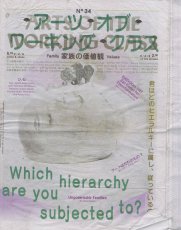
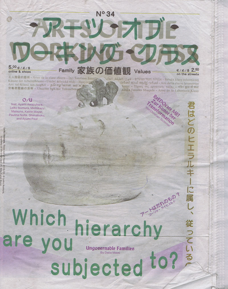
Arts of the Working Class No. 34 - Family Values
Technische
Angaben
-
56 S., 35,2x25,8 cm, keine weiteren Angaben vorhanden
Lose ineinander gelegte Blätter, Druck auf Zeitungspapier, Einlage einer Doppelseite in der Mitte der Zeitung: Berlin Global, The Berlin Exhibition at the Humboldt Forum
ZusatzInfos
-
„Arts of the Working Class“ ist eine Straßenzeitung für Armut, Reichtum und Kunst. Sie erscheint alle zwei Monate und enthält Beiträge von Künstlern und Denkern aus verschiedenen Feldern und in verschiedenen Sprachen. Sie richtet sich an die Arbeiterklasse, also an alle, und es geht um alles, das allen gehört. Jeder, der sie verkauft, verdient mit. Jeder Künstler, dessen Arbeit beworben wird, gestaltet mit.
Is our family like a tree, firmly rooted, or like a fan, unfolding in many directions? The notion of family has long been framed as a stable, secure entity. Yet today, family values are shaped by forces that generate profound insecurity— economic, ecological, and social. Drawing from Astra Taylor's insights in The Age of Insecurity, this issue exam- ines how systems designed to create security, like money and property, paradoxically deepen our anxiety and uncertainty.
As we approach the end of a year marked by wars and destabilization, we rethink the family nucleus as more than just a biological or historical unit. We explore it through artists like Ayumi Paul, Danh Vo, and Leiko Ikemura, who offer alternative visions of interconnectedness. Taylor’s argument that capitalism is an “insecurity-producing machine” applies here, as the traditional family model is manipulated by power structures to uphold inequality, creating both division and a false sense of safety.
Inspired by Japanese graphics from the Edo period (1603–1868), safeguarded at the Langen Foundation— celebrating its 20th anniversary as a family-run art collection—we explore how contemporary artists reinterpret the era’s sustainable practices of togetherness, where human and ecological bonds coexisted in both peace and crisis. Through artists like Michikazu Matsune and Ayami Awazuhara, we see how family ties, like other social structures, are fluid and shaped by their surroundings. Yet, as Taylor notes, insecurity invites solidarity. Even the privileged are not immune to financial or environmental precarity, as Joshua Citarella and Catherine Liu discussed in their conversation on the rise of the new managerial class.
As curator Sohrab Mohebbi reminds us, “Art is where we practice freedom,” and that freedom opens new possibilities for collective strength. In this light, artists like Paulina Nolte, Malte Bartsch, and Katrin Mayer explore how expanding our concept of families—and by extension, cities and societies—can offer a path toward resilience. We hope you enjoy this edition, carefully curated to introduce Arts of the Working Class in Japan first as an e-paper and now in print on the streets of Berlin and elsewhere.
Ist unsere Familie wie ein Baum, fest verwurzelt, oder wie ein Fächer, der sich in viele Richtungen entfaltet? Der Begriff der Familie wurde lange Zeit als stabile, sichere Einheit verstanden. Doch heute sind die Werte der Familie von Kräften geprägt, die zu tiefgreifender Unsicherheit führen - wirtschaftlich, ökologisch und sozial. Auf der Grundlage von Astra Taylors Erkenntnissen in The Age of Insecurity (Das Zeitalter der Unsicherheit) wird in dieser Ausgabe untersucht, wie Systeme, die Sicherheit schaffen sollen, wie Geld und Eigentum, paradoxerweise unsere Angst und Unsicherheit vertiefen.
Da wir uns dem Ende eines von Kriegen und Destabilisierung geprägten Jahres nähern, überdenken wir die Kernfamilie als mehr als nur eine biologische oder historische Einheit. Wir erforschen sie mit Hilfe von Künstlern wie Ayumi Paul, Danh Vo und Leiko Ikemura, die alternative Visionen der Zusammengehörigkeit anbieten. Taylors Argument, dass der Kapitalismus eine „Unsicherheit produzierende Maschine“ ist, trifft hier zu, da das traditionelle Familienmodell von den Machtstrukturen manipuliert wird, um Ungleichheit aufrechtzuerhalten und sowohl Spaltung als auch ein falsches Gefühl von Sicherheit zu schaffen.
Inspiriert von japanischen Grafiken aus der Edo-Periode (1603-1868), die in der Langen Foundation - die ihr 20-jähriges Bestehen als familiengeführte Kunstsammlung feiert - aufbewahrt werden, erforschen wir, wie zeitgenössische Künstler die nachhaltigen Praktiken des Miteinanders dieser Epoche, in der menschliche und ökologische Bindungen sowohl in Frieden als auch in Krisen koexistierten, neu interpretieren. Anhand von Künstlern wie Michikazu Matsune und Ayami Awazuhara sehen wir, dass Familienbande wie andere soziale Strukturen fließend sind und von ihrer Umgebung geprägt werden. Doch, wie Taylor anmerkt, lädt Unsicherheit zur Solidarität ein. Selbst die Privilegierten sind nicht immun gegen finanzielle oder umweltbedingte Prekarität, wie Joshua Citarella und Catherine Liu in ihrem Gespräch über den Aufstieg der neuen Managerklasse erörterten.
Der Kurator Sohrab Mohebbi erinnert uns daran, dass „Kunst der Ort ist, an dem wir Freiheit praktizieren“, und dass diese Freiheit neue Möglichkeiten für kollektive Stärke eröffnet. Vor diesem Hintergrund untersuchen Künstler wie Paulina Nolte, Malte Bartsch und Katrin Mayer, wie die Erweiterung unseres Konzepts von Familien - und damit auch von Städten und Gesellschaften - einen Weg zur Resilienz bieten kann. Wir wünschen Ihnen viel Spaß mit dieser Ausgabe, die sorgfältig kuratiert wurde, um Arts of the Working Class in Japan zunächst als E-Paper und nun in gedruckter Form auf den Straßen von Berlin und anderswo vorzustellen.
Von der Website, übersetzt mit DeepL
|