|
Technische
Angaben
-
15x10 cm, ISBN/ISSN 3885370638
verschiedene Papiere
|
Technische
Angaben
-
288 S., 20x14 cm, keine weiteren Angaben vorhanden
Leinenband mit Schutzumschlag, rechts gebunden, farbiger Schnitt
ZusatzInfos
-
it is an anagrammatic erotic encounter between a he and a she, whose entire vocabulary is derived from the word sweethearts
|
Technische
Angaben
-
7,3x28,7 cm, keine weiteren Angaben vorhanden
Einzelblätter mit Kunststoffschiene gehalten
|
Technische
Angaben
-
31x31 cm, Auflage: 500, keine weiteren Angaben vorhanden
LP Vinyl in Hülle
|
Titel
-
Re-Writing Freud - 4 The Interpretation of Dreams
Technische
Angaben
-
752 S., 19,8x12,6 cm, Auflage: 1.000, signiert, 2 Stück. ISBN/ISSN 0953676587
Softcover, Taschenbuch. Translated by a Lingo algorithm, programmed by Christine Morris
ZusatzInfos
-
For this book work, Re-Writing Freud the artist Simon Morris has re-written Sigmund Freud’s The Interpretation of Dreams. A computer programme (designed by Christine Morris) randomly selects words, one at a time from Freud’s 222,704 word text and begins to reconstruct the entire book, word by word, making a new book with the same words, every time the programme is re-started. This book is one instantiation of that process, scrupulously typeset according to the dimensions, fonts, chapter divisions and paragraph lengths of the 1976 Penguin paperback edition of Freud’s work, and printed on equivalent paper stocks.
Text von der Webseite
|

Technische
Angaben
-
13x13 cm, Auflage: 200, keine weiteren Angaben vorhanden
Musik-CD mit 6 Blättern aus Transparentpapier in transparenter Kunststoffhülle, cover art: Olaf Hochherzd
ZusatzInfos
-
recorded in 2004 - 2007.
Pets EP is the first record by Olaf Hochherz. Four extraordinary and rich compositions and one spoken word piece.
Sculpted with self-coded computer programs and lots of love for detail.
2004 wurde Olaf von einer Hochschule für Musik vor die Tür gesetzt: Die Ansichten der Lehrenden wirkten seinen Vorstellungen von dem was elektroakustische Musik sein könnte ungut entgegen. Just am gleichen Tag traf er einen Teamangehörigen von naivsuper, und man beschloss dass er seine Musik dort veröffentlichen sollte, da sich hier Ideen von elektroakustischer Musik produktiv begegneten.
"Pets sind 5 Stücke einer CD oder der Versuch eine geräuschbasierte Lebensform zu beschreiben. Eine die sich in die Nische zwischen Natur und Kultur zu klemmen scheint. pets sind die akustischen Bewohner von ´nature-culture´, haarige Staubknäul, die erst ohne Grund hin und her eilen und sich dann ganz plötzlich tot stellen. Überlebende also. Überlebende die angeschoben werden, sich aber manchmal selbst bewegen, mal schnell mal langsam, die unerwartet sprechen und unsanft verstummen. Es sind Klangkreaturen aus der Welt der Kleinstrobotik, die uns ihre akustischen Zustände und ihre kommunikationslose Sprache überbringen, durch Lautsprecher und Sprecher, letztlich nur um doch ihre Vergänglichkeit willkommen zu heissen.
Die Klänge enstehen mit Hilfe eines selbstgeschriebenen Programms, welches eine technische Analyse des Ausgangsmaterials (Sprechen, Geklapper und Geschmatze) durchführt. Diese computergestützte Analyse findet aber in einem andern Verständnis von dem was wesentlich an den Klängen sei, statt: Nicht dass, was man hört ist für den Computer entscheidend, sondern die Struktur, die von ihm erzeugt wird. Es kommt also zu einer Verschiebung zwischen dem Ausgangsmaterial und seiner Darstellung durch den Computer. Dennoch bleicht ein gebrochener Bezug zum Ausgangsmaterial erfahrbar. Die Bearbeitung fÜhrt so zu Ergebnissen die willkürlich erscheinen, die aber bisweilen Regelmässigkeiten aufweisen, welche Verständnis vermitteln.
Entscheidend ist, dass aus dieser Methode der Klangerzeugung, Klänge und Sequenzen entstehen, die ihre eigenen Regeln mitbringen. Dies ist auch der Schnittpunkt zwischen den elektronischen Kompositionen und dem Stück, welches den Klang der Sprache herausstellt. Hier zeigt sich Sprache als Klangereigniss losgelösst von Grammatik und Inhalt. Die Grammatik die die klangliche Bewegung in eine Struktur zwängt wird ausgeschaltet und übrig bleibt der Spass einer klanglichen "Willkür".
Anders formuliert ist pets eine Antwort auf die Frage, was die Dinge und Gegenstände unseres Lebensraums, nach der Emanzipation von ihrer Funktionalität für Geräusche und Klänge von sich geben würden
|
Technische
Angaben
-
48x33 cm, 2 Stück. keine weiteren Angaben vorhanden
Plakat, vermutlich beschnitten
ZusatzInfos
-
Atem Books is an independent publishing house based in Catalunya focused on photography & illustration, contemporary drawing and thinking created by emerging artists from around the world. Our aims are: to help emerging artists to get their work more known, create a collection of contemporary works, to gather illustrators, photographers & art lovers. Atem Books has been publishing Carpaccio Magazine since April 2009. Atem Books is a non-profit organization, so all the money earnt is always invested in new publications.
Why ‘Atem’?
‘Atem’ stands for “wind, breath” in german. This word is inspired by an illustrated poetry book published by Paul Celan (poet) and Gisèle Celan (illustrator) called Atemkristall.
Who we are
Atem Books curators are María Cerezo and Emma Llensa. We both do all the works involved with mantaining Atem Books.
What we can do
We’re also offering our services to help you self-publish your book (both digital -pdf, epub, mobipocket-, Ipad and Iphone apps and print). Whether if you need advise on how to start self publishing a book or you need our services as curators, designers, layouters and image retouchers, just ask us what we can do for you.
We’re also offering our services to help you create your own website and, if you need one, how to create an e-commerce to sell your own goods. And, of course, we can give you marketing and self-promotion advises and guidelines.
Atem Books is 100% independent!
We don’t receive any external money. This project survives with the earns we do selling our publications.
Von der Webseite
|
Titel
-
Alle Worte sind aus! All words have run out!
Technische
Angaben
-
14,8x21 cm, keine weiteren Angaben vorhanden
Postkarte, Einladung zur Ausstellungseröffnung
ZusatzInfos
-
Karaoke – spoken not sung!
Speech Karaoke – as the name suggests – works in a similar way as a traditional karaoke. Instead of choosing between songs from a booklet, the user chooses between speeches. Within a relaxed atmosphere one can listen to speeches delivered by other karaoke bar guests – or try out how it feels to interpret someone´s speech.
Speech Karaoke is a constantly expanding project by The Speech Karaoke Action Group. When the Speech Karaoke-project arrives to a new city, local speeches are added to the Karaoke archive.
The project was created in Finland, the promised land of karaoke bars.
Karaoke - gesprochen, nicht gesungen!
Speech Karaoke - wie der Name schon sagt - funktioniert ähnlich wie eine traditionelle Karaoke. Anstatt zwischen Liedern aus einem Booklet zu wählen, wählt der Benutzer zwischen Reden. In entspannter Atmosphäre kann man sich die Reden anderer Karaoke-Bar-Gäste anhören - oder ausprobieren, wie es sich anfühlt, die Rede eines anderen zu interpretieren.
Speech Karaoke ist ein ständig wachsendes Projekt von The Speech Karaoke Action Group. Wenn das Speech Karaoke-Projekt in einer neuen Stadt ankommt, werden die dortigen Reden dem Karaoke-Archiv hinzugefügt.
Das Projekt wurde in Finnland ins Leben gerufen, dem gelobten Land der Karaoke-Bars.
Übersetzt mit DeepL, Text von der Webseite
|
Titel
-
Why is Green a Red Word ?
Technische
Angaben
-
29,7x21,7 cm, Auflage: 250, numeriert, keine weiteren Angaben vorhanden
3 Hefte, 1 Mappe mit gefalteten losen Blättern, 1 Leporello, 1 Karte in transparenter Kunststoffhülle (aussen signiert und numeriert)
|
Titel
-
1-6579 Ein Auszug 2009/2010
Technische
Angaben
-
500 S., 29,5x20,5 cm, keine weiteren Angaben vorhanden
ZusatzInfos
-
Designed in Microsoft Word
|
Titel
-
Vortrag zur NetArt Ausstellung Cynet Art 2000, Hygiene Museum Dresden
Technische
Angaben
-
8 S., 29,7x21 cm, keine weiteren Angaben vorhanden
LaserAusdruck nach Word-Dokument
|
Titel
-
Leaf Spine Word Sign / Artists Books from the Workshop of Hank Hine
Technische
Angaben
-
144 S., 30,5x19,3 cm, ISBN/ISSN 9783928762922
Festeinband mit Schutzumschlag, Fadenheftung
ZusatzInfos
-
Autoren: Stefan Gronert, Hank Hine, Robert Rainwater
Künstlerbücher sind eine eigene Qualität von Buch, aber ebenso eine eigene Wertsphäre von bildender Kunst, da sie als vollständige Kunstwerke von Künstlern hergestellt werden. Hank Hine hat in seinem 1975 in San Fransisco gegründeten Verlag Limestone Press/Hine Editions mit den unterschiedlichsten Künstlern zusammengearbeitet, die für ein breites Spektrum zeitgenössischer Bestrebungen und Positionen stehen. Alle Künstler haben mit Hank Hine direkt oder in enger Zusammenarbeit mit ihm und seinen Mitarbeitern gearbeitet, wobei Hine immer wieder zum Experimentieren ermutigte, für Improvisationen offen war und für die Realisierung der Bücher nach unkonventionellen Wegen suchte.
Text von der Webseite
|
Titel
-
Der Pfeil Nr. 1 - Zeigefinger
Technische
Angaben
-
[74] S., 26x33,6 cm, Auflage: 100, ISBN/ISSN 9783945247006
., offener Rücken
ZusatzInfos
-
DER PFEIL conceives itself as a fictional space, which by means of a series of publications, spreads transportable works and positions. Each issue is devoted to the connotation of a term and accompanying questions as: to what extend are diversified agendas and significances triggered through one word, and how can they later be traced back? As a fragmented, ongoing dictionary, various artistic approaches are gathered in what we call "Edizin", with all the unique contributions released in an edition of 100 - in order to un-tighten the terms from their tasks.
Text von der Webseite
|

Technische
Angaben
-
352 S., 21x15 cm, ISBN/ISSN 9782915859416
Broschur mit Banderole, eingelegt ein Informationsblatt
ZusatzInfos
-
Originalausgabe erschienen bei Artists Press, Bern, 1980.
This book is the third and final version of the first artist’s book published in 1960 by herman de vries, who is currently the author of more than one hundred publications.
The story of this book dates back to 1960. Closely associated with the Zero Group, but also drawn to the buddhist concept of emptiness, herman de vries had just produced a series of white monochromes when he self-published a twenty-page booklet in Arnhem. It had no title, its cover was blank and its pages were unprinted. It contained nothing but a short final poem celebrating, in four languages, the superabundance of white: “wit is overdaad”. In 1962, this manifesto appeared in another version, now entitled wit: two hundred blank pages, four white collages by the artist and an introduction, itself completely blank, by the poet J. C. van Schagen, published in arnhem in only five copies by M. J. Israel. It was followed in 1967 by a second “revised” edition, wit weiss: two hundred and fifty blank pages, pocket-sized, in five hundred copies, published by Hansjörg Mayer in Stuttgart. The only printed elements were the artist’s name, the title and the publisher’s name on the cover, the word “introduction” and the name of its author on the very first page and a colophon on the final page. In 1980 the Artists Press in Berne published the “third revised edition”, in a larger format and with more pages. The original title wit was translated into english and japanese and into sanskrit with a word that means “white” in the sense of bright, pure, immaculate. The title itself does not appear on the book, which remains completely blank. It is printed with the paratext on a broad strip of paper in the form of a detachable publicity strip. The inside flap contains a brief statement initially dating back to the 1962 edition, stating that this book incorporates all aspects of reality. Of the five thousand copies advertised, only a hundred were published. It is this last edition, the most radical, which is republished here, the only addition being the french translation of the statement.
On 1 april 2012, herman de vries wrote of his book, insisting on the importance of the final comma:
white is white
0 = 0
no name
no idea
not even emptiness,
Text von der Webseite
|
Technische
Angaben
-
90 S., 29,6x20,9 cm, Auflage: 400, ISBN/ISSN 9783868740097
Broschur. Mit Sticker auf dem Cover
ZusatzInfos
-
In 1972, Ulises Carrión produced his first artist's book "SONNET(S)" which consists of a 44 variations of a sonnet by Dante Gabriel Rosetti titled "Heart"s Compass".Using the langage like a material, Carrión writes Rossetti's poem over and over again on a typewriter, in slightly different versions. This book today is considered Carrión’s first “artists book”, where he still uses language, but quite differently.
In 2009 Michalis Pichler, in a similar approach but using a computer, probably word or open office, created 44 new variations and published a book titled "SOME MORE SONNET(S)". - On the last page of this book announced a multitude of OTHER SONNET(S), mostly imaginary.
Text von der Webseite
|
Titel
-
Artemisia 2 - mot pour mot / word for word
Technische
Angaben
-
150 S., 21x15 cm, keine weiteren Angaben vorhanden
Broschur
|
Technische
Angaben
-
32 S., 21x14,9 cm, ISBN/ISSN 07384777
Drahtheftung, Schwarz-Weiß-Fotokopien, Umschlag hellblaues Papier
ZusatzInfos
-
Reprint von Pritty Cool Fanzines (2016 ?)
|
Titel
-
Europe, an artist’s-eye view: City Guides collection
Technische
Angaben
-
20,8x14,8x4 cm, 2 Stück. keine weiteren Angaben vorhanden
10 Hefte, Broschur und Drahtheftung, Softcover, mit Gummiband zusammen gehalten, Druck auf farbige Papiere
ZusatzInfos
-
One of the modul-dance project key elements is the promotion of mobility, so that artists receiving its support follow itineraries across Europe to develop their creative work and present it to different audiences.
Modul-dance presents a collection of modul-dance city guides. Each of the guides in this collection shows a city from the viewpoint of a local artist, who proposes his or her own particular route to artists in transit, seeking to put them in connection with their host city. While these city routes share some basic features, each one is different and in their differences lies a wealth of gazes, aesthetics, approximations to the local and much more. In a word, they form a mirror of the diversity that modul-dance has always fostered. Athens, Barcelona, Bassano del Grappa, Dresden, London, Stockholm, Vienna, Toulouse, Paris and Poznań, ready to be discovered.
Text von der Webseite
|
Titel
-
99 Worte zum Mitnehmen auf eine einsame Insel
Technische
Angaben
-
[32] S., 22x15,6 cm, Auflage: 120, numeriert, signiert, 2 Stück. keine weiteren Angaben vorhanden
Drahtheftung. Cover Risographie, 6 mehrfarbige Word-Einfügen-Formen-Grafiken
ZusatzInfos
-
Mit Wortbeiträgen von 99 Leuten für das Archiv für Gebrauchs- und Benutztexte
|
Titel
-
we you - We Get The Word Out
Technische
Angaben
-
2 S., 15x10 cm, keine weiteren Angaben vorhanden
Postkarte
ZusatzInfos
-
Postkarte des CCMC, Nikosia
|
Technische
Angaben
-
2 S., 15x10 cm, keine weiteren Angaben vorhanden
Postkarte
ZusatzInfos
-
Werbepostkarte des CCMC, Nikosia
|
Technische
Angaben
-
2 S., 21x14,8 cm, keine weiteren Angaben vorhanden
Flyer,
ZusatzInfos
-
Flyer des CCMC, Nikosia: We help civil society communicate its messages to the public
|
Technische
Angaben
-
[8] S., 21x14,8 cm, keine weiteren Angaben vorhanden
Ein Blatt, mehrfach gefaltet,
ZusatzInfos
-
Prospekt des CCMC, Nikosia, über die Arbeit des Projektes
|
Technische
Angaben
-
35 S., 29,7x21 cm, keine weiteren Angaben vorhanden
PDF-Datei nach Word-Text
|
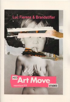
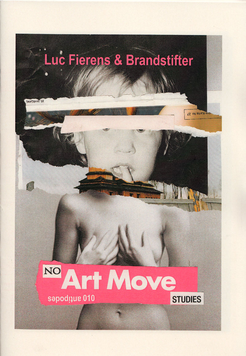
Titel
-
antipodes 010 - No Art Move Studies
Technische
Angaben
-
[24] S., 21x14,6 cm, Auflage: 100, numeriert, keine weiteren Angaben vorhanden
Drahtheftung
ZusatzInfos
-
No Art Move Studies is a postal collage collaboration by Luc Fierens (Belgium) and Brandstifter (Germany). Luc Fierens is a collagist provocateur researching the relation between word & image. He makes connections and projects with independet networks like mail-art or visual poetry.
Text aus dem Heft
|
Titel
-
Zwisen Apostel und Anker. Lügenmärmen, Gesmimte
Technische
Angaben
-
[20] S., 21x21 cm, Auflage: 33, numeriert, signiert, 2 Teile. keine weiteren Angaben vorhanden
Drahtheftung, Schutzumschlag mit ausgeschnittener Form. Mit beigelegter signierter Postkarte.
ZusatzInfos
-
Aus Scan und Texterkennung von August Strindbergs Kurzgeschichte Der Geist in der Flasche entwickelte Collage aus Scan-Fragmenten und Word-Texten. Der Text wurde entnommen der Anthologie Lügenmärchen aus alter und neuer Zeit, Stuttgart 1962.
|
Titel
-
Kleine Reihe Band 09. Clemente Padín - Word, Action and Risk
Technische
Angaben
-
48 S., 21x15 cm, ISBN/ISSN 9783928761840
Drahtheftung
ZusatzInfos
-
Diese Broschüre erschien anlässlich zur Ausstellung "Clemente Padín. Word, Action and Risk", 19.06.-05.09.2010, in Kooperation mit dem Museo de Arte Contemporanea de la Universidade de Sao Paulo, dem Instituto Cervantes und dem Forschungsverbund Künstlerpublikationen.
|
Titel
-
ENDURING FREEDOM - The Poetry of the President
Technische
Angaben
-
[20] S., 21,1x15 cm, Auflage: 124, numeriert, keine weiteren Angaben vorhanden
Fadenheftung mit aufklappbarem Cover
ZusatzInfos
-
Speeches that George W. Bush made shortly after the 9/11 attacks, are turned into poetry in this book. The tone varies as we witness consolatory words and war speech. What does not change is the intensity of the rhetoric used. The poems first appeared in the Dutch literary magazine Armada, tijdschrift voor wereldliteratuur, No. 24, December 2001. The edition is printed on a paper that adds its own voice to the project in the form of a watermark. It reads “conqueror”, the brand name of the paper. Not only does that word seem to describe the voice in the book, it is also a description of itself. the watermark as a rhetoric, as a conquest.
|
Technische
Angaben
-
25x19,2 cm, ISBN/ISSN 9783943514605
Softcover, fadengeheftet, mit Schutzumschlag aus drei Papierbögen, verschiedene Papiere
ZusatzInfos
-
Makulatur, a German word that derives from lat. maculatura ’something stained’, refers to misprinted paper that is discarded at the beginning of the printing process as use- and worthless. In 2010, the graphic designer Manuel Raeder started to collect and preserve misprinted sheets of all the publications he designed not only for his own publishing house BOM DIA BOA TARDE BOA NOITE but also for fellow artists and institutions.
Text von der Website.
|
Technische
Angaben
-
[32] S., 28,7x8,3 cm, ISBN/ISSN 9783943514940
Broschur, Softcover, in Papierbanderole
ZusatzInfos
-
Eleven Poems is a collection of 11 poems printed on single sheets that can be used as page markers to interrupt whatever else you are reading. Each poem is based on descriptions of natural phenomena, to talk about everyday situations of human social behavior. Valentina Jager’s work is primarily related to the world of actions approached via sculpture, written and spoken word, furniture design, and installation.
Text von der Website.
|
Technische
Angaben
-
106 S., 20,9x13,8 cm, ISBN/ISSN 9780312427580
Broschur, Lesezeichen von Book Depository liegt bei
ZusatzInfos
-
The Apache dance - The public is not invited (and never has been) - Le tout New York on a cubist horst - Greenberg, Rosenberg & Flat - Hello Steinberg (goodbye, Greenberg) (you, too, Rosenberg)(Joy returns to Cultureburg) - Up the fundamental aperture.
Erstveröffentlichung 1975
|
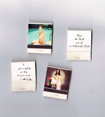
Titel
-
Streichholzbriefchen – I got a clit
Technische
Angaben
-
4,8x3,8 cm, 4 Teile. keine weiteren Angaben vorhanden
Konvolut aus vier bedruckten Streichholzheftchen, teils handbeschrieben.
ZusatzInfos
-
Teil einer Installation, die in der Ausstellung "Marlene McCarty – Mund Verkehr: In die Hose gegangen" in der NGBK Berlin, 6.06.–12.07.1992 gezeigt wurde. Aus der Pressemitteilung zur Ausstellung:
Marlene McCarty’ (1957) Interesse gilt dem Machtgebaren und den patriarchalen Strukturen, der von ihnen geprägten männlichen Umgangssprache. Die alltäglichen Sprüche die ihr, einer Frau, auf den Straßen New Yorks zugerufen werden, die unverstellten oder unverschämten Aufforderungen mit denen sie konfrontiert wird, sind das Ausgangsmaterial für ihre künstlerischen Strategien wie für ihre Kunstobjekte.
Marlene McCarthy zur Installation: “This is a floor sculpture and it’s 15,000 matchbooks. They’re standard matchbooks you can order from a catalog. On one side they have pinup girls on them, and on the other side I had them print, ‘I got a clit so big I don’t need a dick.’ If you’ll notice, clit and dick are handwritten. The company had called me up and were like, ‘Ummm, we have a problem. We can print dick but we can’t print THAT OTHER WORD.’ She wouldn’t even say the word clit. So I said OK, take the mechanical—this was in the olden days—and just slice the dick and the clit off. Then I got some friends together and we wrote them all in by hand. I’m reproducing these for the retrospective, but the curator is worried about whether we can have NYU students writing dick and clit 15,000 times. Maybe the seniors can do it.”
Texte von den Webseiten.
|
Titel
-
Dutch Issue of RUW! 01 - Unbekannterweise
Technische
Angaben
-
[28] S., 33x23,5 cm, Auflage: 50, numeriert, signiert, keine weiteren Angaben vorhanden
geklammerte Einzelblätter in Hartpappe-Umschlag Digitaldruck, verschiedene Drucktechniken auf verschiedene Materialien: Papiere, Stoff, Collage
ZusatzInfos
-
A magazine which consist of only handmade prints. RUW! is the combination of the word ‘raw’ , as in the American magazine ‘RAW’, founded in the 80’s by Art Spiegelman and Francoise Mouly and the German word ‘rau, pronounced as the Dutch word ‘ruw’. It emphasizes madness as the madness in ‘Tales of ordinary Madness’ by Charles Bukowski.
Text von der Website.
|

Technische
Angaben
-
[2] S., 17x12,2 cm, keine weiteren Angaben vorhanden
Postkarte, beidseitig bedruckt
ZusatzInfos
-
Einladungskarte zur Ausstellung Written Room in der Galerie Karin Sachs vom 15.09.-27.10.2018.
The Persian script is turned into an ornament. Covering the white walls of the museums, the characters serve Forouhar as “paper” for her own text. The room becomes a “written room”. Whereas the white walls of the gallery room are raised to a universal norm and an unmarked instance, the Oriental ornament stands for difference or the deviating.
The writing is also strange, if not alien, because it is illegible for Western visitors – as an “incomprehensible” text it becomes a pure ornament. In defying attempts by Western visitors to assign its meaning, the script remains locked into its irreducible pictorial graphicness and indissoluble representation. The meaning cannot be grasped. at best, the inscribed ping-pong balls, which cover the base of the installation, can be grasped in the tactual sense. The legibility is made even more difficult by the movement of the ping-pong balls, which due to their spherical form also offer no stable vertical or horizontal reading axes. they form new patterns over and over again, are always in motion, and become incoherently disjointed.
Even if one has a command of Persian, the characters prove to be nothing more than word fragments and syllables, which are not subject to a linear order. The script ornamentation covers the whole room. Viewers entering the rooms are surrounded by patterns, forcing them to give up their sovereign, distanced standpoint.
Text von der Website der Künstlerin.
|
Titel
-
The Making Of The Americans
Technische
Angaben
-
36 S., 22,8x15,2 cm, Auflage: Print on Demand, ISBN/ISSN 580088985832
Drahtheftung, Softcover, Digitaldruck
ZusatzInfos
-
Now "there is no such thing as repetition" in The Making of Americans, because I deleted it. Herein, every word and punctuation mark is retained according to its first (and hence last) appearance in Gertrude Stein's 925-page edition of the book.
Text aus dem Vorwort des Heftes.
|
Titel
-
Collected Lyrics, 1970-2015
Technische
Angaben
-
320 S., 24x16,5 cm, ISBN/ISSN 9781408863008
Hardcover, Schutzumschlag
ZusatzInfos
-
An American original, Patti Smith is a multi-disciplined artist and performer. Her work is rooted in poetry, which infused her 1975 landmark album, Horses. A declaration of existence, Horses was described as `three chords merged with the power of the word'. it was graced with the now iconic portrait by Robert Mapplethorpe, the subject of her award-winning memoir Just Kids. Initially published in 1998, Patti Smith's Complete Lyrics was a testimony to her uncompromising poetic power. Now, on the fortieth anniversary of the release of Smith's groundbreaking album, Collected Lyrics has been revised and expanded with more than thirty-five additional songs, including her first, 'Work Song', written for Janis Joplin in 1970, and her most current, 'Writer's Song', to be recorded in 2015. The collection is liberally illustrated with original manuscripts of lyrics from Smith's extensive archive. Patti Smith's work continues to retain its relevance, whether controversial, political, romantic or spiritual. Collected Lyrics offers forty-five years of song, an enduring commemoration of Smith's unique contribution to the canon of rock and roll.
Klappentext
2. Auflage
|

Technische
Angaben
-
[124] S., 18x13,5 cm, ISBN/ISSN 9782954197401
Broschur, Buchrücken aufklappbar, gefaltetes Plakat in eingeklebter Papierhülle, Posterformat 85,4x64cm, in Schutzhülle mit Aufkleber
ZusatzInfos
-
A journal written at the third person that seeks to depict Antoine d’Agata’s quest – the inexorable course from void to void.A literary and photographic experiment where words, sometimes descriptive, sometimes poetic, intersect with images in a narrative continuity. An example of the photographer’s existential choice and form of resistance which leads toward the subject’s disappearance and the ego’s negation within the neutral spectrum of the image while insisting on an intimate involvement with its matter and a perfect superposition of art and life. The pictures have been treated and reduced to the simple black and white contrast, following the main axis of this editorial project: shaplessness and the sense of fading-out. This flattening to a drawing effect releases the image as a shadow, a border between a recognizable sign and a blurry, ambiguous one, so that the photograph is both “trace” and “other”. The book, whose main language is English, also foresees a separate and folded poster, including texts in French on one side and, for the first time, in Italian on the other printed on a background colour image. The two languages allow to include texts in their original version, but allude as well to the artist’s double origins. In line with the book, the poster also reflects d’Agata’s search direction towards the interlacing of word and image and it finally refers to the idea of a topographic description of passions. Member of the Magnum agency, Antoine d’Agata (1961) is one of the most influential photographers of his generation. He lives in both Paris and Marseilles and he works around the world. He is represented by the gallery Les Filles du Calvaire, Paris.
Text von der Webseite.
|
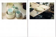
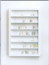
Titel
-
MONO.KULTUR #40 Edmund de Waal - W is for White
Technische
Angaben
-
44 S., 20x15 cm, ISBN/ISSN 18617085
Drahtheftung, auf verschiedenem Papier gedruckt
ZusatzInfos
-
Edmund de Waal is a potter. His pots, plates, and vessels are the result of craft and mastership, but they are also so much more than that: they are experiments in form and function, abstractions of thoughts on silence and space, on repetition and failure, on substance and fragility, on memory contained. Edmund de Waal is an artist. He arranges his objects in complex choreographies that are as mysterious as they are mesmerizing. Displayed in galleries and institutions worldwide, his considered installations play with architectural concerns, integrating ideas of space, light and obscurity. Edmund de Waal is a writer. Whether he sculpts with words or with clay, what Edmund de Waal works with are concepts, ideas, and desires. In a body of work that is at odds with our times and yet oddly successful, his writings and objects overlap and integrate each other in an attempt to understand and transcend our complex relationship with objects and our surroundings. In an interview with mono.kultur structured like an A-Z of notes and ideas, Edmund de Waal talked about his rules of attachment, the impossibility of repetition, and why ‘doubt’ is the most beautiful word. Visually, the issue takes inspiration from that most perfect of materials: porcelain. Printed entirely in double-sided splendour, the two finishings of the paper – shiny gloss and smooth matt – evoke the texture of ceramics before and after glazing.
Text von der Website.
|
Titel
-
What Discussions do Artist Publisher Want to Have?
Technische
Angaben
-
1 S., 29,7x21 cm, 2 Stück. keine weiteren Angaben vorhanden
Laserausdruck nach PDF
ZusatzInfos
-
Where can artist publishers, zine makers, librarians, artist book archivists, print activists, and others in this self-organized community hang out when there isn’t a fair, a fest, an event, or gathering to bring us together? Temporary Services, 2019
Temporary Services have created a new online discussion forum for artist book publishing called Artist Publisher. Please tear off a tab, visit the site, spread the word, and join them in multiple discussions around artist book making, zine publishing, printing, distribution, archiving and more.
Text vom Flyer
|
Technische
Angaben
-
80 S., 23,6x16,5 cm, Auflage: 1.000, keine weiteren Angaben vorhanden
Drahtheftung, Schwarz-Weiss Offsetdruck
ZusatzInfos
-
Does anyone remember Plastic Bertrand? They thought he’d be unforgettable. And do you remember when the word plastic had a positive ring to it? In a scene from Mad Men a child is running around with a plastic bag over his head and his mother doesn’t bat an eyelash. It was the sixties. But even then, usage of the word could be confusing: plastic bomb, plastic surgery, plastic sculpture. Let us build an imaginary bridge between Henry Moore and rubbery explosives. Naturally, I’m building mine out of plastic. I can’t imagine it any other way. Plastic is the pre-manufactured utopia of the past. Plastic is the present. Plastic Bertrand is sure to make a comeback soon. Ça plane pour moi. Text von der Webseite.
|
Titel
-
Ding / Unding. Die Entgrenzung des Künstler*innenbuchs
Technische
Angaben
-
[12] S., 21x21 cm, 2 Stück. keine weiteren Angaben vorhanden
Sammlung loser Blätter, doppelseitig schwarzweiß bedruckt, oben gelocht, vom Benutzer mit Musterklammern zusammengeheftet. Umschlag farbig
ZusatzInfos
-
Katalog zur Ausstellung 13.02.-14.04.2019 in der Graphischen Sammlung der ETH Zürich.
Die Ausstellung «Ding, Unding» wirft einen Blick auf Künstler*innenbücher der Graphischen Sammlung ETH Zürich. Bob Brown (1886–1959) war Anfang der 1930er Jahre überzeugt: «Books are antiquated word containers» – und obwohl er schon damals der Meinung war, dass Bücher veraltet seien, haben sich bis heute die Prophezeiungen des Tods des Mediums alles andere als eingelöst. Immer wieder erweitern Kunstschaffende unsere Vorstellung, was überhaupt noch als Buch gelten kann. Muss es gebunden sein? Gedruckt? Aus Papier bestehen?
Was bleibt, ist einerseits das Buch als Ding. Wenn Leporellos sich zu Räumen entfalten oder Bücher als Reise-Orakel konzipiert werden, wie bei Željka Marušic/Andreas Helblings (Zusammenarbeit 1998 – 2006) Nada, geht es nicht länger um einfache Informationsübertragung, sondern um eine spielerische Untersuchung des Objekthaften. Andererseits kann das Buch auch zum Unding werden, wenn es statt seinen Objektcharakter zu zelebrieren, vielmehr ein Dasein an der Schwelle führt. Die in überdimensionale Buchstaben zerlegten Wörter in Christopher Wools (*1955) Black Book, die kaum auf einen Blick lesbar sind und ungebundene Bücher, bei denen sich die festgelegte Ordnung und Narrative aufzulösen scheinen, sträuben sich gegen ihren eigenen Status als Objekt. Ebenso sind post-digitale Publikationsformen, wie Print-on-Demand, Undinge, reflektieren sie doch oft ihre Position zwischen digitalem Code und analogem Objekt. «Ding, Unding» untersucht das Künstler*innenbuch zwischen seinem eigenen Zelebrieren, kritischer Reflexion und möglicher Auflösung. Kuratorin: Lena Schaller
Text von der Webseite
|
Titel
-
Ding / Unding. Die Entgrenzung des Künstler*innenbuchs
Technische
Angaben
-
42x29,7 cm, 2 Stück. keine weiteren Angaben vorhanden
Faltflyer A3, gefaltet auf A5, beidseitig bedruckt
ZusatzInfos
-
Einladung und Flyer/Plakat zur Ausstellung 13.02.-14.04.2019 in der Graphischen Sammlung der ETH Zürich.
Die Ausstellung «Ding, Unding» wirft einen Blick auf Künstler*innenbücher der Graphischen Sammlung ETH Zürich. Bob Brown (1886 – 1959) war Anfang der 1930er Jahre überzeugt: «Books are antiquated word containers» – und obwohl er schon damals der Meinung war, dass Bücher veraltet seien, haben sich bis heute die Prophezeiungen des Tods des Mediums alles andere als eingelöst. Immer wieder erweitern Kunstschaffende unsere Vorstellung, was überhaupt noch als Buch gelten kann. Muss es gebunden sein? Gedruckt? Aus Papier bestehen?
Was bleibt, ist einerseits das Buch als Ding. Wenn Leporellos sich zu Räumen entfalten oder Bücher als Reise-Orakel konzipiert werden, wie bei Željka Marušic/Andreas Helblings (Zusammenarbeit 1998 – 2006) Nada, geht es nicht länger um einfache Informationsübertragung, sondern um eine spielerische Untersuchung des Objekthaften. Andererseits kann das Buch auch zum Unding werden, wenn es statt seinen Objektcharakter zu zelebrieren, vielmehr ein Dasein an der Schwelle führt. Die in überdimensionale Buchstaben zerlegten Wörter in Christopher Wools (*1955) Black Book, die kaum auf einen Blick lesbar sind und ungebundene Bücher, bei denen sich die festgelegte Ordnung und Narrative aufzulösen scheinen, sträuben sich gegen ihren eigenen Status als Objekt. Ebenso sind post-digitale Publikationsformen, wie Print-on-Demand, Undinge, reflektieren sie doch oft ihre Position zwischen digitalem Code und analogem Objekt. «Ding, Unding» untersucht das Künstler*innenbuch zwischen seinem eigenen Zelebrieren, kritischer Reflexion und möglicher Auflösung. Kuratorin: Lena Schaller
Text von der Webseite
|
Titel
-
ruine 04 – Als Hallo Die Mündliche Welt Verliess
Technische
Angaben
-
36 S., 22x16 cm, Auflage: 75, numeriert, 3 Teile. ISBN/ISSN 9783947250127
Drahtheftung, Schwarz-Weiß-Digitaldruck, beigelegt ein gefalteter Flyer, zusammen in gefaltetem Blatt A3 mit Prägedrucken, eingelegt eine bedruckte Magnetfolie, Hoffentlich nicht anale Phase
ZusatzInfos
-
Zum Release und zur performativen Lesung in der 404 Bar in München am 15.05.2018 ab 20 Uhr.
Kyrill Constantinides Tank, born in Munich in 1990, studied art education at the Academy of Fine Arts in Munich. Here he made his first experiences with live performances and performances, both solo and in collectives and bands (i.e.org.i.e.n, LadeKabel, Lappenforum). In addition to sculptural and painting activities, he further developed his performative practice, in which the spoken text became the main protagonist. During a semester abroad in Athens he played sound collages, live improvisations and discussions with his friends in the self-organised exhibition space Circuits and Currents via the radio station CircuitsOnAir.
Text von der Webseite
|
Titel
-
The Polar Tombola: A Book of Banished Words
Technische
Angaben
-
128 S., 15,5x23 cm, Auflage: 300, numeriert, ISBN/ISSN 9780992809126
Broschur
ZusatzInfos
-
gedruckt in Northumberland.
When we hear about change in the Arctic, it’s often related to climate, but Arctic regions are also experiencing dramatic cultural change. In the last two centuries 21 indigenous Arctic languages have become extinct, and even more are now considered endangered. Even the official language of Greenland is ‘vulnerable’ according to UNESCO’s Atlas of World Languages in Danger.
The Polar Tombola explores the issue of endangered languages from the perspective of a poet and book artist. What happens to an individual’s experience of the world when their language begins to disappear? How will future scientists study the Arctic ecosystem without access to specialist vocabularies? What role has the printed word played in the evolution of dialects? How might we visualise language loss? ...
Text von der Webseite
|
Titel
-
Small Publishers Fair 2019 - Key to Publishers
Technische
Angaben
-
[2] S., 29,7x21 cm, keine weiteren Angaben vorhanden
Einzelblatt
ZusatzInfos
-
Ausstellerliste und Hallenplan mit den Ständen zur Messe vom 15.-16.11.2019 in der Conway Hall, Red Lion Square, London WC1R 4RL.
The Small Publishers Fair is the annual gathering of small press publishers, writers, artists, poets and book designers. 65 publishers from across the UK and around the world together with a featured exhibition, readings and talks in the historic Conway Hall, the centre of humanism and literary Bloomsbury. FREE ENTRY
Text von der Webseite
|
Titel
-
Small Publishers Fair 2019
Technische
Angaben
-
16 S., 21x14,7 cm, 2 Stück. keine weiteren Angaben vorhanden
Drahtheftung
ZusatzInfos
-
Katalog zur Messe vom 15.-16.11.2019 in der Conway Hall, Red Lion Square, London WC1R 4RL.
The Small Publishers Fair is the annual gathering of small press publishers, writers, artists, poets and book designers. 65 publishers from across the UK and around the world together with a featured exhibition, readings and talks in the historic Conway Hall, the centre of humanism and literary Bloomsbury. FREE ENTRY
Text von der Webseite
|
Titel
-
Friedrich Nietzsche - Also sprach Zarathustra
Technische
Angaben
-
86 S., 19x12 cm, 2 Stück. ISBN/ISSN 9783905846508
Broschur, 1 Exemplar eingeschweisst
ZusatzInfos
-
etkbooks #050 - Hartmut Abendschein, Friedrich Nietzsche, "Also" sprach Zarathustra - Zählung, Dichtung, Diagramme
“In allen, die Nietzsches «Also sprach Zarathustra» gelesen haben, dürften die adverbial gebrauchten vier Buchstaben ›also‹ vieltönig nachsummen und nachklingen. «Man darf vielleicht den ganzen Zarathustra unter die Musik rechnen», schreibt Nietzsche auch in seiner Selbsterklärungs- und Lebensberatungsschrift «Ecce homo». Da die quantitative Nietzsche-Forschung noch nicht wirklich begonnen hat, prescht Hartmut Abendschein schon mal vor, zählt die Vorkommen, verzeichnet die Vorkommenspositionen des Wörtchens ›also‹ und diagrammatisiert diese mit One-Click-Tools. (…) Diese visuelle Studie zielt auf die Entheiligung und Reästhetisierung eines berüchtigten Textes mit Hilfe statistischen Bestecks und einem darauf beruhenden Missbrauch von Diagrammen. Die zentrale Instanz, die Nietzsche im «Zarathustra» für tot erklärt, hat übrigens auch vier Buchstaben. Das andere four-letter word, das ubiquitäre ›also‹, überlebt hingegen den Text.” (Frank Fischer)
Text von der Webseite
|
Titel
-
Antragsformular zur kostenlosen Eintragung in das Portal Archive in Bayern
Technische
Angaben
-
4 S., 29,7x21 cm, keine weiteren Angaben vorhanden
Laserausdruck nach Word-Dokument
ZusatzInfos
-
Zur Aktualisierung der Angaben auf der Webseite Archive in Bayern
|
Titel
-
Beresheet - elektronische Geschichte in fünf Akten - Libretto
Technische
Angaben
-
14,8x10,5 cm, keine weiteren Angaben vorhanden
Broschur
ZusatzInfos
-
Natürlich taucht das Bärtierchen auch im musikalischen Pendant zur Installation wieder auf. Am 27.06.2020, zeitgleich zur Ausstellungseröffnung (im Apartment der Kunst, München), veröffentlicht Delfrati sein Debütalbum Beresheet, „eine elektronische Geschichte in fünf Akten“. Jedem dieser fünf Kapitel liegt eine Emotion zugrunde (Verzweiflung, Wut, Resignation, Ehrgeiz, Akzeptanz), die den Wahlmünchner überkommt, wenn er an ungreifbare Dinge wie den Klimawandel, Massensterben oder das Internet denkt, also Konzepte, die Zeit, Raum und das Vorstellungsvermögen des Menschen weit übersteigen. „Hyperobjekte“ nennt der US-amerikanische Philosoph Timothy Morton solche Konzepte und Delfratis Theorie zufolge könnten auch Bärtierchen als solche „Hyperobjekte“ gelten. So widmet er Morton den Album-Opener.
... The central piece of the artwork consists of a large bean bag shaped as such an animal: this practicable sofa functions as a main hub for the audience to lay down and take part in the hearing of a music album. Its combination of spoken narration, techno and synth-pop ballads tells a story that stretches through the ages from the big bang towards an imagined, absurd and distant future. ...
Text von der Webseite
|
Titel
-
Bring in weight - Eine Kritik am Populismus
Technische
Angaben
-
[8] S., 21x14,8 cm, keine weiteren Angaben vorhanden
zweifach gefalteter Flyer
ZusatzInfos
-
Zur Veranstaltung im Kunstpavillon 28.-29.08.2020
Die Demokratie, aber auch die Kultur und der Liberalismus (im Sinne des freien Denkens) sind von Absonderung geprägt, von der Konzentration auf die Wünsche und Bedürfnisse des Einzelnen.
Das Projekt BIW versammelt im Geiste eines kollektiven Denkens internationale Künstler*innen, die ihre eigenen, künstlerischen oder theoretischen Positionen einbringen, um Kritik an diesen Entwicklungen zu üben - und in Form eines offenes Dialogs sowie Sound-, Musik- und Spoken Word-Performances populistische Narrative auf ihren Gehalt abzuklopfen. Hierbei sind kritische Stimmen und Anregungen der Besucher*innen herzlich willkommen …
Text von der Webseite
|
Technische
Angaben
-
[28] S., 33x23 cm, Auflage: 50, numeriert, signiert, keine weiteren Angaben vorhanden
geklammerte Einzelblätter in Umschlag Digitaldruck, verschiedene Drucktechniken auf verschiedene Materialien: Papiere, Collage, Malerei
ZusatzInfos
-
A magazine which consist of only handmade prints. RUW! is the combination of the word ‘raw’ , as in the American magazine ‘RAW’, founded in the 80’s by Art Spiegelman and Francoise Mouly and the German word ‘rau, pronounced as the Dutch word ‘ruw’. It emphasizes madness as the madness in ‘Tales of ordinary Madness’ by Charles Bukowski.
Text von der Website.
|
Titel
-
Dutch Issue of RUW! 03 - The Photo Issue - Wir sind Helden
Technische
Angaben
-
[28] S., 33x23 cm, Auflage: 50, numeriert, signiert, keine weiteren Angaben vorhanden
geklammerte Einzelblätter in Umschlag, digitale Fotodrucke auf verschiedenen Papieren, beigelegt ein Anschreiben von Hans Könings
ZusatzInfos
-
A magazine which consist of only handmade prints. RUW! is the combination of the word ‘raw’ , as in the American magazine ‘RAW’, founded in the 80’s by Art Spiegelman and Francoise Mouly and the German word ‘rau, pronounced as the Dutch word ‘ruw’. It emphasizes madness as the madness in ‘Tales of ordinary Madness’ by Charles Bukowski.
Text von der Website.
|
Titel
-
GHEN / arte - A cura del movimento arte genetica / Numero Unico - Numero 0/3.
Technische
Angaben
-
[18] S., 50x35 cm, keine weiteren Angaben vorhanden
Künstlerzeitung vom 25.06.1979, mehrfach gefaltet 25,5x17,5 cm, 2 gefaltete Bögen, sowie 5 Einzelseiten, gedruckt in schwarz und rot auf Zeitungspapier, jede Seite der 2 Bögen ist in kleine Einzelseiten unterteilt und je einem Künstler gewidmet, vier der Einzelseiten zeigen - großformatig - je eine Arbeit.
ZusatzInfos
-
Francesco Saverio Dòdaro - Poet, visueller Poet, Autor - 1930 in Bari geboren, rief nach seiner Zeit in Bologna und Paris und seinem Umzug nach Lecce 1976 das Genetic Art Movement ins Leben.
Er konzipierte und führte Regie bei der Serie: "Ghen arte" (Lecce, 1978), "Aesthetic violations" (Lecce, 1981), "Scritture" (Parabita, 1989), "Spagine. Infinite writings "(Caprarica di Lecce, 1989)," Compact Type. New narrative "(Caprarica di Lecce, 1990)," Diapoesitive. Scriptures for screens "(Caprarica di Lecce, 1990)," Mail Fiction "(Caprarica di Lecce, 1991)," Wall Word "(Lecce, 1992) - translated into Japanese and exhibited at the Hokkaido Museum of Literature in Sapporo -, "International Mail Stories" (Lecce, 1993), "Internet Poetry" (Lecce, 1995), "Walkman Fiction. Novels to listen "(Lecce, 1996)," E 800 European Literature ", in 5 languages (Lecce, 2000)," Narrative folds "(Lecce, 2001)," Poetic folds "(Lecce, 2001)," Folds of memory "(Lecce, 2001)," Naked leaves "(Doria di Cassano Jonio, 2003)," Literary posters "(Lecce, 2005),"Naked novels" (Lecce, 2006-07), "Literary papers" (Lecce, 2009), "792 Mail Theater" (Lecce, 2009), "New Page. Narrative in store ", (Lecce, 2009)," New Page. Theater in store "(Lecce, 2010)," New Page. Poetry in store »(Lecce, 2011).
Eine weitere Redaktion befand sich in Genua: Ghen Res Extensa Ligu.
2016 feierte das Genetic Art Movement sein 40-jähriges Bestehen.
|
Titel
-
Puzzle - Streichholzbrief
Technische
Angaben
-
8x6,2 cm, 2 Teile. keine weiteren Angaben vorhanden
15-teiliges Schiebepuzzle, Streichholzbrief, beide beidseitig bedruckt
ZusatzInfos
-
Das Schiebepuzzle besteht aus den Buchstaben A-O, Text mit Golddruck, rückseitig TWC The Woorld Company, Win a World.
Streichholzbrief: ART is not created equal. Impress her with Adib Fricke Fine Art Products. Rückseite: Look Ma, no more bad pictures. Yes Darling, Daddy bought pictures by Adib Fricke.
Adib Fricke ist ein deutscher Künstler, der mit Wörtern und Text arbeitet.
Texte von den Objekten und aus Wikipedia.
|
Titel
-
Dutch Issue of RUW! 04 - Contorted
Technische
Angaben
-
[32] S., 33x23 cm, Auflage: 50, numeriert, signiert, keine weiteren Angaben vorhanden
geklammerte Einzelblätter in Umschlag, digitale Fotodrucke auf verschiedenen Papieren, beigelegt ein Anschreiben von Hans Könings
ZusatzInfos
-
A magazine which consist of only handmade prints. RUW! is the combination of the word ‘raw’ , as in the American magazine ‘RAW’, founded in the 80’s by Art Spiegelman and Francoise Mouly and the German word ‘rau, pronounced as the Dutch word ‘ruw’. It emphasizes madness as the madness in ‘Tales of ordinary Madness’ by Charles Bukowski.
Text von der Website.
|
Technische
Angaben
-
[40] S., 14,9x11 cm, Auflage: 50, keine weiteren Angaben vorhanden
Fadenheftung, Digitaldruck, Cover mit Siebdruck
ZusatzInfos
-
The The is a list in the form of a passport-sized booklet, a series of two-word combinations in which the first word (which is a variable) is followed by the word ‘the’. The words on the pages unfold as a sequence of statements whereby the object always remains ‘the’. These alternating texts have a self-reflexive mantra: for the, eat the, shit the, cut the, cure the, reject the, elect the, fight the, end the.
Auskunft des Autors
|
Titel
-
Dutch Issue of RUW! 05 - MUD
Technische
Angaben
-
[30] S., 33x23 cm, Auflage: 50, numeriert, signiert, keine weiteren Angaben vorhanden
geklammerte Einzelblätter in Umschlag, digitale Fotodrucke auf verschiedenen Papieren; Zeichnungen, Gemaltes, Geschriebenes, Collagen, C/Prints, Linoldruck, Kugelschreiber, und andere Techniken auf Fotokarton, handgeschöpftem- und anderem Papier.
ZusatzInfos
-
A magazine which consist of only handmade prints. RUW! is the combination of the word ‘raw’ , as in the American magazine ‘RAW’, founded in the 80’s by Art Spiegelman and Francoise Mouly and the German word ‘rau, pronounced as the Dutch word ‘ruw’. It emphasizes madness as the madness in ‘Tales of ordinary Madness’ by Charles Bukowski.
Text von der Website.
|
Titel
-
visual writing re-connected
Technische
Angaben
-
38 S., 21x21 cm, Auflage: 500, 2 Teile. keine weiteren Angaben vorhanden
Drahtheftung, beiliegend ein DinA4-Blatt mit einer Kurzbiographie von Luc Fierens, die Auflistung seiner Einzel- sowie Gruppen-Ausstellungen bis zum Jahr 2021 und mit zwei Zitaten über ihn von Geof Huth und Laura Monaldi.
ZusatzInfos
-
Katalog mit der Abbildung von Collagen und visuellen Gedichten aus den Jahren 1986 bis 2005.
"Luc Fierens lives in Belgium, centrally networked into a vast web ... and with visual poets working in the area of collage writing" (Anabasis - Leftwich 2004) "
"Luc Fierens is an active mail-artist since 1984, when he began delivering his distinctive flavor of poesia-visiva-inspired visual poetry to individuals, exhibitions, and archives around the planet. His method of production is collage, a particular brand of verbo-visual collage that makes it points by abrupt collocations of disparate fragments of image and word. " (Geof Huth 2007)"
Text von der Webseite
|
Titel
-
The Word - The Text - The Letter
Technische
Angaben
-
9,6x20,5 cm, keine weiteren Angaben vorhanden
Beidseitig bedruckte Karte
ZusatzInfos
-
Einladungskarte zur Ausstellung "The Word - The Text - The Letter: Visual and Concrete Poetry", die im Zentrum für zeitgenössische Kunst Warschau vom 18.12.1989 - 15.01.1990 stattfand. Kuratiert von Klaus Groh.
|
Titel
-
Dutch Issue of RUW! 06 - Spleen
Technische
Angaben
-
[36] S., 31,22,4 cm, Auflage: 50, numeriert, signiert, keine weiteren Angaben vorhanden
geklammerte Einzelblätter in Umschlag, digitale Fotodrucke auf verschiedenen Papieren; Zeichnungen, Gemaltes, Geschriebenes, Collagen, C/Prints, Linoldruck, Kugelschreiber, und andere Techniken auf Fotokarton, handgeschöpftem - und anderem Papier.
ZusatzInfos
-
A magazine which consist of only handmade prints. RUW! is the combination of the word ‘raw’ , as in the American magazine ‘RAW’, founded in the 80’s by Art Spiegelman and Francoise Mouly and the German word ‘rau, pronounced as the Dutch word ‘ruw’. It emphasizes madness as the madness in ‘Tales of ordinary Madness’ by Charles Bukowski.
Text von der Website.
|
Technische
Angaben
-
10,8x10,8 cm, 2 Stück. keine weiteren Angaben vorhanden
quadratische Kabelschilder aus witterungsbeständigem Kunststoff mit Wandbefestigung, Siebdruck
ZusatzInfos
-
Beschilderung für das Mural "Solidarity", das zur documenta 14 in Athen entstand und weitere Aktionen wie Spoken Word-Performance, Open Air öffentliche Performance
|
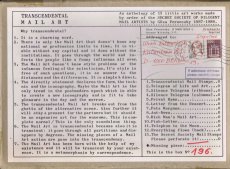
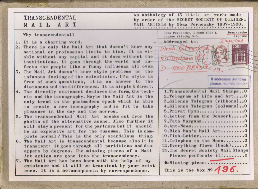
Titel
-
Transcendental Mail Art - An anthology of 13 little art works made by order of the Secret Society of Diligent MAIL ARTISTS 1987-1988
Technische
Angaben
-
13 S., 22,5x31,0x2,5 cm, numeriert, signiert, keine weiteren Angaben vorhanden
Lose Blätter in Graukarton-Box, Offsetlithografie, Collageelemente (Tapete) und Bleistift, farbige Künstlerstempel, diverse Materialien, zum Teil handcoloriert
Beigelegt ist ein Dokument zur Überlassung von Publikationen Géza Perneczkys durch Ulli Kattenstroth an Hubert Kretschmer, sowie ein Versandetikett mit seiner Anschrift in Berlin.
ZusatzInfos
-
Nr.196 einer nicht näher bezifferten Auflage. Die Box ist frankiert und gelaufen (Mail Art) an Ulli Kattenstroth. Signiertes Deckblatt und 13 signierte Originalarbeiten von Perneczky. Die Box ist mit einem Etikett über Titel, Inhalt, und einer Begriffsdefinition von "Transcendental Mail Art" versehen:
"Why transcendental?
1. It is a charming word.
2. There is only the Mail Art that doesn't know any national or profession limits to time. It is viable without any capital and it does without the institutions. It goes through the world and infects the people like a funny influenza all over.
3. The Mail Art doesn't know style problems or the infamous feeling of the eclecticism. It's style is free of such questions, it is an an answer to the distances and the differences. It is simple & direct.
4. The directly statement declares the form, the technic and the iconography. Maybe the Mail Art is the only trend in the postmodern epoch which is able to create a new iconography and is fit to take pleasure in the day and the morrow.
5. The transcendental Mail Art breaks out from the ghetto of the alternative scene. Also further it will stay a present for the partners but it should be an expensive art for the museums. This is complete normal / This is the only scandalous thing.
6. The Mail Art is transcendental because also it is transient: it goes through all partitions and disappers by degrees. The missing pieces of a Mail Art action are gone into the transcendency.
7. The Mail Art has been born with the help of my existence and it will be transient by your existence. It is a metamorphosis by correspondence.
|