Gesucht wurde Impression, Medienart , Sortierung DatensatzNr., aufsteigend. Phrasensuche, die genaue Zeichenfolge ist in allen Ergebnissen enthalten: 39 Treffer
Hinweise zum Copyright und ServiceAAP Archive Artist Publications - Munich - www.artistbooks.de
185 Blatt S., 28x21,5 cm, Auflage: 1.000, keine weiteren Angaben vorhanden Offsetdruck nach original Fotokopierarbeiten, je Künstler 25 Seiten, First Edition
Siegelaub in einem Interview: The Xerox book - I now would prefer to call it the Photocopy book, so that no one gets the mistaken impression that the project has something to do with Xerox – was perhaps one of the most interesting because it was the first where I proposed a series of requirements for the project, concerning the use of a standard size paper and the amount of pages the container within which the artist was asked to work.
Das Buch ist/war die Ausstellung
13x13 cm, keine weiteren Angaben vorhanden Musik-CD in gefalteter Papphülle mit Beiblatt in transparenter Kunststoffhülle, cover art: Stephane Leonard
ZusatzInfos
music by Daniel Lopatin aka Dania Shapes.
Soundsystem Pastoral was recorded by Daniel Lopatin aka Dania Shapes during the winter of 2004 using synthesizers, a first generation digital sequencer, and a freeware sound editor. It was remixed in 2006 for the release on naivsuper.
Celebrating the potential of amateurishness, decadence and romance in the realm of digital audio arts, Lopatin looks to marry the aesthetic sensibilities of experimental electronics with his allegiance to the classic 'beauty' in music. 'Glitch' is less a process for Lopatin -- rather it is an aesthetic impression which Lopatin emulates by hand. Pairing the residual effects of romantic, heart string melodies with steroidal, detailed, maximalist noise, Dania Shapes' audible bricolage is a tribute to both the beautiful and the broken all at once.
Working with simple tools such as handheld tape recorders, retro synthesizers, and a personal computer, Lopatin creates conceptual systems and processes to create a solo music that's beautiful and inventive, with interesting textures and unexpected sonic interventions. The music has a lush, ambient quality, but an edge as well. Throughout the CD, one finds a subtle use of repetition. The pieces are formally well-conceived and never contrived. The music is clearly indebted to heroes of electronica such as Christian Fennesz, William Basinski, and Brian Eno. and it has links to classic experimentalists such as David Tudor and David Behrman. Yet Lopatin maintains a more song-based musical position that results in an accessible product that will attract fans of ambient, post-rock, and experimental music
108 S., 13,5x20,4 cm, Auflage: 25, numeriert, keine weiteren Angaben vorhanden Broschur. Offset, Fotokopie, Cover Siebdruck
ZusatzInfos
Accounted For, 2006 collects 54 train receipts in order to document, in chronological order, the trips a railway traveller took in 2006. The blue-and-white pattern found on Belgian Railways tickets is printed offset over photocopies of one year’s worth of travel expenses (the individual receipts record the date and destination of each trip), thus giving the impression of continuous movement. Accounted For, 2006 was printed in downtown Lima, Peru in 2009, some three years after the train trips actually took place.
Text von der Webseite
The Pepsi Challenge
Oversized ‘promises’ in the form of real estate advertisements are promoting the new city along the lines of global real estate and living standards. ‘The perfect union to all you desire’ and ‘We believe luxury is best served in small quantities’ first seen along Varthur Road in Whitefield, Bangalore, caught my attention. The second one leaves a particularly ironic, tangy, protestant-flavoured impression, seen from the German point of view.
Questions emerged about the Indian caste system, the sense of community, modesty and personal goals.
The design of this urbanity also reminds me of earlier journeys to the United Arab Emirates and Shanghai. The new urbanity becomes exchangeable, custom-tailored and its ‘ultra-luxurious villas’ accessible ‘for the chosen few’ of the Pepsi Generation.
But what happens to the majority of a city’s population and its needs, uncertain ownership and neglect of basic amenities? Can it withstand the pressure flashed on every corner of the city? Do these promises affect social cohesion? ...
Text von der Webseite
This volume is the lasting legacy of Elvgren’s slide collection. It helps us build a more complete picture of his artistic process and it offers a valuable insight into the development of glamour photography. However, the lasting impression of the collection is of a man who loved and appreciated the female form. Its real beauty and impact lies in the knowledge that one of the greatest masters of the illustrated pin-up took his inspiration from the very real flesh of womanly curves in all of their natural glory.
Text von der Website.
Schwarz-Weiß-Drucke
When Oliver was a boy in the late seventies he once saw his neighbour, a graphic designer at the distinguished Rosenthal porcelain factory, driving by in a gold-coloured Porsche. This powerful and lasting impression was the impetus for him to study graphic design at the Lette-Verein Berlin and illustration at Hamburg’s University of Applied Sciences. After his graduation he also worked internationally as a graphic artist in San Diego, California, and since the year 2000 has been pursuing successfully his career as a designer in Berlin. Amongst his clients are music and publishing houses, the world-famous dance-club Berghain, as well as the Berlin-based daily newspaper taz for which he regularly provides artistic illustrations for political and cultural articles.
[32] S., 19x13 cm, Auflage: 500, keine weiteren Angaben vorhanden Drahtheftung, Schwarz-Weiss Offsetdruck
ZusatzInfos
The William Crawford Estate is owned and represented by Ampersand Gallery. William Crawford's drawings were discovered in an abandoned house in Oakland, California. His work brings to mind characteristics of prison drawings, an impression confirmed by the fact that several were made on the backs of prison roster sheets dated 1997. These printouts, however, were cut down the middle, so the exact prison from which they originate is unknown. But given their origin in the Bay Area and the fact that several drawings include San Francisco landmarks, it's possible that Crawford made the work in a California state prison. Other than this information drawn from the archive itself, nothing is known about Crawford's life. Indeed, we only know his name because he signed just a few of the drawings, either as Bill, William or WM Crawford. The archive appears to have consisted of several books, with individual drawings in sequences of 30 or more adding up to tell complex visual stories. Several include written captions or fragments of conversation between male and female characters. These sequences, however, have been broken up over the years and reach us now in a fragmentary and fascinating collection of hundreds of delicate pencil drawings. The work conveys the intense sense of sexual longing of a man with an urge to tell dynamic stories. The drawings, which resemble the eroticism of Eric Stanton, the exaggerated male anatomy of Tom of Finland or the ample breasts of a John Currin, show scantily dressed women, drug use, cuckolding and orgies. The details of his interiors, the hairdos and style of dress suggest that Crawford might have come of age in the late 70s or early 80s. A cast of recurring figures populate the drawings, notably one man with a short afro and a moustache who often figures at the center of events, presumably the artist William Crawford himself. Remarkably, given the number of drawings, there is little to no repetition in the work. Crawford’s inventive eye for sexual positions, facial expressions and gestures of hand and body was vast and masterful. Simple geometric details and architectural subtleties define the unusual settings where the action unfolds. We see rooms shown from unusual angles, features that are hinted at, erased or altogether omitted and articles of clothing that are drawn with obsessive precision. This singular and original drawing style compels us to immerse ourselves in the world William Crawford created, more dream than documentation, more fantasy than perversion. Crawford's drawings have been widely exhibited, notably at Galerie Susanne Zander (Cologne and Berlin), Zieher, Smith and Horton (New York), Freddy (Baltimore) and upcoming solo exhibitions at FARAGO (Los Angeles) and Richardson (New York). His work is also featured in the latest issue of Richardson Magazine and was included in "System and Vision" at David Zwirner, an exhibition organized in collaboration with Delmes & Zander. Reviewing it, The New Yorker wrote, "William Crawford's orgiastic illustrations on the backs of prison rosters haven an erotic intensity that rivals anything by Hans Bellmer or Pierre Klossowski."
Text von der Webseite
Attention! This is not a drill! Please be advised that the following pages you are about to read may give you the impression that you actually have no idea what space is and never have. Later on, this may turn out to be true. It should also be noted that exploration of the subject requires controlled conditions and safety measures even when conducted by professionals. Contemplations about the definitions of space are highly dangerous procedures and should not be attempted at home. All liability for collateral damage from any cognitive activities undertaken by laymen as a result of the ideas contained herein is hereby excluded. Thank you for your understanding.
Text von der Webseite
160 S., 24x16,2 cm, keine weiteren Angaben vorhanden Broschur, beigelegt ein kleines drahtgeheftetes Notizheft und ein Leporello mit dem Jahresprogramm der tgm
... In the tgm annual yearbook the different aspects of out self-perception are assigned primary colours. The educational programme is presented in blue. The events (conferences, trips, presentation etc.) and the people on and behind the stage are shown in red, and the yellow notebook in the the middle separating the two topics is an invitation to participate. This strict and simplistic composition is not accidental, but an expression of the impression Milch+Honig want to make. furthermore it indicates the (colour) system of the tgm’s soon to be launched new website. These changes in and through our time are taken into account and prepared for the future in the tgm annual theme ...
... All diese Aktivitäten sind auch in diesem Jahr wieder in einem Buch dokumentiert: Vorsitzende Christina John visualisierte hier all die Aspekte, die die tgm auszeichnet, in gestalterischen Details: »Das Fortbildungsprogramm ist in blau dargestellt. Events wie Konferenzen, Reisen oder Vorträge sowie die Menschen vor und hinter den Kulissen der tgm sind in Rot getaucht und das gelbe Notizbuch, das die beiden Themen teilt, lädt zum Mitmachen ein«, erzählt uns die Kreative. Die im Jahrbuch erreichte strenge und einfache Kompositionen ist also kein Zufallsprodukt, sondern die visuelle Übersetzung des Eindrucks, den die tgm hinterlassen will. Zugleich ist dieses Schema schon der passenden Link zur neu gestalteten Website der tgm ...
Texte von den Webseiten, Foto Milch+Honig
20,9x30 cm, 6 Teile. keine weiteren Angaben vorhanden Klebebindung, Hartcover, Injektdruck, Pappschachtel mit Textilbeschichtung mit 2 eingeklebten Kurstoffpäckchen, einmal mit Linsen und einmal mit Reis. Zusammensetztbarer Vogel aus Karton, 2x Postkarten, Zuckerpäckchen eingeklebt, Vorder -und Rückseite bestempelt und beklebt.
[102] S., 15x21 cm, keine weiteren Angaben vorhanden Spiralbindung, Transparentfolie, Injektdruck, Sticker auf dem Cover und der letzten Seite, Rückseite (innen) gestempelt
14 S., 33x43 cm, Auflage: 7, numeriert, signiert, keine weiteren Angaben vorhanden Grafikmappe, Titelseite ausgeschnitten und bestempelt, im Ausschnitt aufgeklebte farbige Buchstaben aus Moosgummi. Mappe enthält eingeklebte Titelliste und 14 Blätter mit aufgeklebten Collagen. Injektdruck.
14 Blätter von Peter Müller mit Impressionen und Collagen. Die Motive zeigen, Menschen, Tiere, Essen, Landschaft, Sterne, Fantasievolles, Comicfiguren etc.
9,5x36,5 cm, keine weiteren Angaben vorhanden Leporello, aufklappbar, Klebebindung, Hartcover, Rücken aus Leder, Metall Applikation angebracht, Injektdruck
15 S., 26,5x31 cm, keine weiteren Angaben vorhanden Umschlag mit bedruckter Vorderseite enthält 15 Blätter mit Motiven, Rückseite des Umschlags bestempelt, Injektdruck
Abbildungen der Arbeiten nicht in Originalgröße Seitenverhältnis wurde aber eingehalten. Das Buch enthält sämtliche Hefte und Einzelarbeiten mit den jeweiligen Titeln. Das Buch enthält Collagen, Grafiken, Impressionen, Fantasievolle Bilder, Gottesbilder, Landschaftsmotive, Zitate, Wortspiele etc.
6 S., 44x33,5 cm, keine weiteren Angaben vorhanden Umschlag mit Stickern und Stempeln an der Vorder- und Rückseite enthält 6 Blätter die bedruckt sind, Injektdruck
46 S., 14x18,5 cm, keine weiteren Angaben vorhanden Aufklappbare Box aus Karton mit beidseitigen bedruckten Kärtchen, Vorder- und Rückseite der Box ist bestempelt genauso wie die Innenseiten, Injektdruck
21,5x21 cm, keine weiteren Angaben vorhanden Box enthält Karten mit farbigen beklebten Grafiken, Karten werden durch dünnes durchsichtiges Papier getrennt, Hartcover, Rückseite der Box aus Filzgewebe, Vorder- und Innenseite der Box bedruckt und beklebt, Injektdruck
77 S., 11,5x16 cm, keine weiteren Angaben vorhanden Leder Box, auf Vorderseite der Box ist Papier Applikation angeklebt, Box enthält 77 Postkarten, Injektdruck, Innenseite der Box ist beklebt und bestempelt
12 S., 16x56 cm, keine weiteren Angaben vorhanden Metallnieten angebracht an Kunststoffstreifen, Textilrücken, Filzstreifen an der Innenseite angeklebt, Injektdruck, betempelt von Innen und außen, Faden zum zusammen binden angeklebt, Hardcover, Rückseite jeder Seite bestempelt
30x38 cm, keine weiteren Angaben vorhanden Box bemalt und bestempelt, enthält Stoffbeutel mit 12 Buttons, mit Faden zum Zusammenbinden, 3 Pappfiguren mit Plattform, Umschlag mit Holzplatte mit Applikation, aufklappbare Karte mit Holz Applikation, Karte mit Faden, bedruckt von beiden Seiten, 2 Karten, Heft mit Drathheftung, mit eingeklebten Bildern Softcover, 3 Karten mi Motiven bedruckt, Injektdruck, Papier, Leporello mit Fotografien von Mündern mit Lippenstift, 2 bestempelte Umschläge mit Fotografien, 3 Hefte mit Ringbindung, Rollbuch, 1 Karte mit Motiv, 15 Blätter mit Motiven, manche sind verbunden durch Metallnieten, 1 Heft mit Fadenheftung, 4 Karten beidseitig bedruckt, weitere 6 Karten mit Motiven und Farb Applikation, 1 Heft (nicht aufklappbar), 2 Karten mit Motiv an Vorder- und Rückseite angebracht, Leporello (geklebt), 1 Fotografie, Blatt mit Textausschnitt, 1 Sticker, 2 Karten mit Motiv, Injektdruck. Insgesamt 68 Teile.
Zur Ausstellung 28.04.-23.07.2023. Das Institut Mathildenhöhe zeigt in den Bildhauerateliers des Museum Künstlerkolonie die Fotoserie „Andauernde Heimkehr“ von Jan Kricke (*1977). Diese komponierte Abfolge von Fotografien, die alle im Außenraum zwischen 2007 und 2020 entstanden sind, bilden – losgelöst von einer Chronologie – eine Reise jenseits einer erkennbaren physischen Route. Es sind Eindrücke nicht konkreter Orte, flüchtige Impressionen von Naturstrukturen oder Lichtspielen, die auf eine ganz eigene Art die urbane Energie und Schnelligkeit der Street Photography in die Landschaftsfotografie übertragen.
Text von der Webseite
Nennung der aktuellen Ausstellungen im Jahr 2024 (Juli-Oktober) im "Le centre des livres d'artistes" (Le cdla), Auflistung der neuesten Titel in der Sammlung sowie Nennung des derzeitigen Praktikanten und der Künstlerin in Residenz.
Auf jeder der cdla Karten befindet sich der Hinweis:
Die Informationskarte des Cdla wird als digitale Datei verbreitet und kann Ihnen auf Anfrage auch in Papierform zugesandt werden.
Die Rückseite wurde dieses mal von Matthieu Saladin gestaltet und trägt den Namen "Lisibilité (-37,21%) aus dem Jahr 2024. Diese besteht lediglich aus dem Satz: "Impression à -37,21% soit le pourcentage des voix obtenues par l'extrême droite au second tour des élections législatives de 2024" (dt. Druck auf -37,21% entspricht dem Prozentsatz der Stimmen, die die extreme Rechte im zweiten Wahlgang der Parlamentswahlen 2024 erhalten hat).
Nennung der aktuellen und kommenden Ausstellungen im Jahr 2024 und 2025 (Oktober-Mai) im "Le centre des livres d'artistes" (Le cdla), Auflistung der neuesten Titel in der Sammlung sowie Nennung des derzeitigen Praktikanten und der Künstlerin in Residenz.
Auf jeder der cdla Karten befindet sich der Hinweis:
Die Informationskarte des Cdla wird als digitale Datei verbreitet und kann Ihnen auf Anfrage auch in Papierform zugesandt werden.
Die Rückseite wurde dieses mal von Matthieu Saladin gestaltet und trägt den Namen "Lisibilité (-68%) aus dem Jahr 2024. Diese besteht lediglich aus dem Satz: "Impression à -68% soit le pourcentage d'augmentation des émissions mondiales de CO2 liées à la combustion d'énergie fossile et aux procédés idustriels depuis les années 1990" (dt. Druck auf -68%, d.h. der prozentuale Anstieg der weltweiten CO2-Emissionen aus der Verbrennung fossiler Energieträger und industriellen Prozessen seit den 1990er Jahren).
Nennung der aktuellen und kommenden Ausstellungen im Jahr 2024 und 2025 (November-Mai) im "Le centre des livres d'artistes" (Le cdla), Auflistung der neuesten Titel in der Sammlung sowie Nennung des derzeitigen Praktikanten und der Künstlerin in Residenz. Diese mal mit einer Widmung an den am 06. November verstorbenen Künstler Daniel Spoerri.
Auf jeder der cdla Karten befindet sich der Hinweis:
Die Informationskarte des Cdla wird als digitale Datei verbreitet und kann Ihnen auf Anfrage auch in Papierform zugesandt werden.
Die Rückseite wurde dieses mal von Matthieu Saladin gestaltet und trägt den Namen "Lisibilité (-42%) aus dem Jahr 2024. Diese besteht lediglich aus dem Satz: "Impression à -42% soit le pourcentage des salarié es français es en détresse psychologique" (dt. "Druck auf -42%, d.h. der Anteil der französischen Arbeitnehmer*innen die psychisch krank sind").
Nennung der aktuellen und kommenden Ausstellungen im Jahr 2024 und 2025 (November-Mai) im "Le centre des livres d'artistes" (Le cdla), Auflistung der neuesten Titel in der Sammlung sowie Nennung des derzeitigen Praktikanten und der Künstlerin in Residenz.
Auf jeder der cdla Karten befindet sich der Hinweis:
Die Informationskarte des Cdla wird als digitale Datei verbreitet und kann Ihnen auf Anfrage auch in Papierform zugesandt werden.
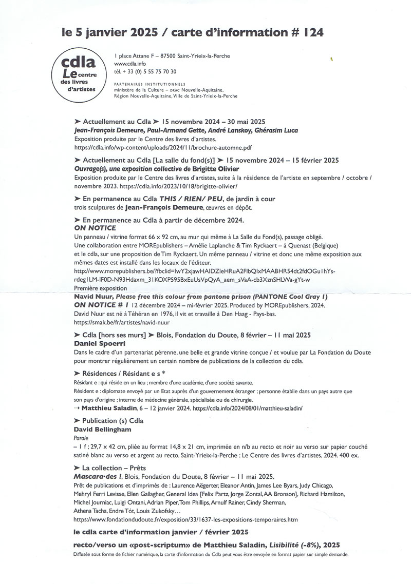
Die Rückseite wurde dieses Mal von Matthieu Saladin gestaltet und trägt den Namen "Lisibilité (-8%) aus dem Jahr 2025. Diese besteht lediglich aus dem Satz: "Impression à -8 %, soit le pourcentage d’augmentation des dépôts de dossiers de surendettement par les ménages français en un an." (dt. "Druck auf -8%, d. h. der prozentuale Anstieg der von französischen Haushalten eingereichten Überschuldungsanträge innerhalb eines Jahres.").
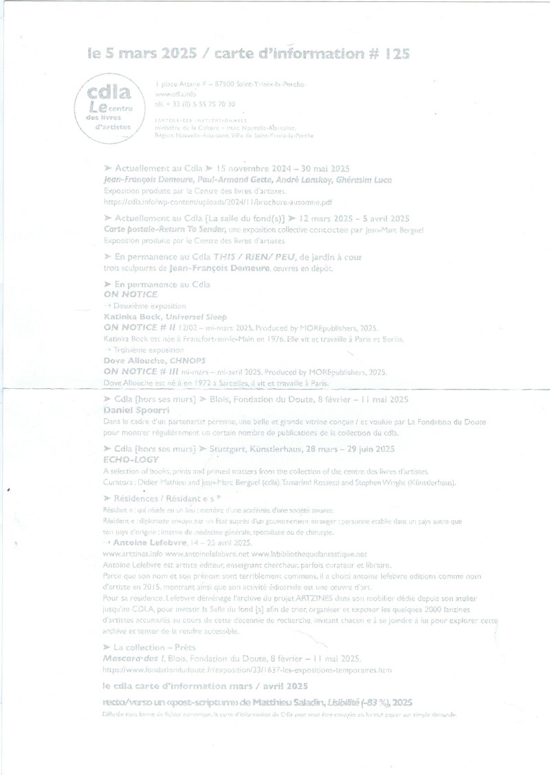
Sehr blasser Druck. Nennung der aktuellen und kommenden Ausstellungen im Jahr 2025 im "Le centre des livres d'artistes" (Le cdla), Auflistung der neuesten Titel in der Sammlung.
Auf jeder der cdla Karten befindet sich der Hinweis:
Die Informationskarte des Cdla wird als digitale Datei verbreitet und kann Ihnen auf Anfrage auch in Papierform zugesandt werden.
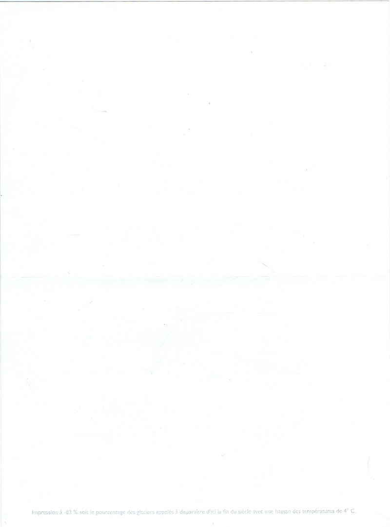
Die Rückseite wurde dieses Mal von Matthieu Saladin gestaltet und trägt den Namen "Lisibilité (-83%) aus dem Jahr 2025. Diese besteht lediglich aus dem Satz: "Impression à -83 %, soit le pourcentage des glaciers appelés à disparaitre d'ici la fin du siècle avec une hasusse des Températures de 4°C." (dt. "Druck auf -83%, das ist der Prozentanteil der Gletscher die von hier bei einem Temperaturanstieg von 4°C bis zum Ende des Jahrhunderts verschwunden sein werden.").
Copyrighthinweis: Das Copyright für die abgebildeten Publikationen bleibt bei den jeweiligen Rechteinhabern (Autoren, Künstlern, Fotografen, Gestaltern, Publizisten). Die Abbildungen und Textzitate dienen der künstlerischen und wissenschaftlichen Recherche.
Hier werden Werke dokumentiert, die sonst nur schwer oder gar nicht zugänglich wären. Wer nicht damit einverstanden ist, dass sein Werk auf dieser Webseite gezeigt wird, kann die Abbildung umgehend durch mich löschen lassen.
Für wissenschaftliche Recherchen können die großen Abbildungen auf Antrag freigeschaltet werden.
Wenn Sie als Rechteinhaber möchten, dass Ihre Abbildungen bei Klick größer gezeigt werden (Höhe x Breite = ca. 800 x 1200 Px), dann melden Sie sich bitte bei mir: